


Norwegian Cruise Line
The Torch Doha
The Dock at Montrose Beach
Hilton
Butlins
All B-Side Archives
Subscribe to B-Side RSS


Online
- FPO (For Print Only) / Celebrating the reality that print is not dead by showcasing the most compelling printed projects.
- Art of the Menu / Cataloguing the underrated creativity of menus from around the world.
- Quipsologies / Chronicling the most curious, creative, and notable projects, stories, and events of the graphic design industry on a daily basis.
- Speak Up (2002 – 2009) / Discussing, and looking for, what is relevant in, and the relevance of, graphic design. Archives Only.
- Word It (2003 – 2010) / Encouraging creative diversity in the community through monthly, one-word challenges. Archives Only.
- Brand New Classroom (2010 – 2011) / Providing a space for critique and opinions on student identity work. Archives Only.
Publishing
- The 2010 Brand New Awards / 2011, self-published.
- Flaunt: Designing effective, compelling and memorable portfolios of creative work / 2010, self-published.
Events & Judged Competitions
- Brand New Conference / A one-day event on the development of corporate and brand identity projects by some of today’s most active and influential practitioners from around the world.
- Brand New Awards / Celebrating the best identity work produced around the world.
- FPO Awards / Celebrating the best print work from around the world.
Writing
- Graphic Design, Referenced: A Visual Guide to the Language, Applications, and History of Graphic Design / 2009, Rockport.
- Women of Design: Influence and Inspiration from the Original Trailblazers to the New Groundbreakers / 2008, HOW Books.
- The Word It Book: Speak Up Presents a Gallery of Interpreted Words / 2007, HOW Books.
Graphic Design
- Department of Design / Designing corporate and brand identities and full development of printed and digital matter for clients.

A B-Side BY Armin
The Dock at Montrose Beach

As an ex-Chicagoan I felt compelled to post this. Located on Montrose Beach, the largest beach along Lake Michigan in Chicago, The Dock at Montrose Beach is one of only three full service restaurants to be found along the coast of the city. Hanging by the lake is one of the most awesome things about Chicago, now it can be done from a nice patio deck enjoying fine food. Logo was designed by JL Murtaugh from no_grand. I generally don’t opine on the B-Side, but I just love the simplicity and childlike adorableness of this. A couple more logo configurations below or after the jump.
Continue reading this entry

DATE: May.03.2011 POSTED BY: ArminCATEGORY: Hospitality The B-Side COMMENTS:

TAGS: blue, chicago, sans serif,

A B-Side BY lauren
Hilton
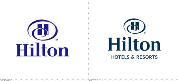
Since its founding 90 years ago in Cisco, Texas, Hilton Hotels & Resorts (formerly Hilton Hotels) has developed over 3,600 hotels in 81 countries. In a press release, a representative states, “Our name and core mark are both recognizable and incredibly powerful. This evolution reflects the modern style and world-class resorts that define our brand today.”
Thanks to Nicholas E. Carrier-Damon for the tip.
DATE: Mar.02.2011POSTED BY: ArminCATEGORY: Hospitality The B-Side COMMENTS:
TAGS:
A B-Side BY Armin
Butlins
![]()
First established in 1936 in the British seaside town of Skegness, Butlins operates three popular holiday family resorts in the UK. This year they celebrate their 75th anniversary.
Thanks to Tom Peet for first tip.
DATE: Jan.10.2011POSTED BY: ArminCATEGORY: Hospitality The B-Side COMMENTS:
Opinion BY Armin
A Tree Grows in D
![]()
Over the years, I have stayed a few times at DoubleTree hotels. What I remember most about it is just how big their rooms are. Although I have no doubt that this memory is amplified in direct correlation to the consistent shrinking of most other rooms I have stayed at recently. Another memorable aspect of DoubleTree? They welcome you with a remarkably delicious warm cookie in your room — they give out 30,000 of them a day across the world in over 240 cities. And you know what else? They are owned by Hilton. But, until now, you would probably have no idea. First opened in 1969, DoubleTree was an independent hotel until 1997 when it became part of Promus Hotel Corporation, which then became part of Hilton Worldwide in 1999. With an identity redesign announced this week “in front of more than 1,900 hotel owners, operators and corporate executives at the company’s first-ever Global Partnership Conference in Orlando” Hilton is making sure people know DoubleTree is, well, by Hilton.
Continue reading this entry
DATE: Oct.15.2010POSTED BY: ArminCATEGORY: Hospitality COMMENTS:
TAGS: brown, hilton, illustration, serif,
Opinion BY Armin
Shielded Mountain
I don’t ski, among other things I would rather not do. But judging from the number of tips about it, it looks like plenty of Brand New readers do, or at least plenty of them have an odd attraction to following news from ski resorts around the world. Killington Resort in the town of Killington, Vermont boasts about being the biggest (and meanest) set of ski slopes in the East Coast as well as having one of the most productive snowmaking infrastructures in the whole U.S.. For those that understand skiing lingo here is all that Killington offers. While other ski resorts in the region have gained ground on the market, Killington is going with a new marketing campaign, and identity, created by Factory Design Labs to cement back its position as the leader, and with this vintage tag line revived, “The Beast of the East,” their work has been cut out for them.
Continue reading this entry
DATE: Nov.13.2009POSTED BY: ArminCATEGORY: Hospitality COMMENTS:
TAGS:
Opinion BY Armin
Hilton Trades Beverly Hills for Beveled Hills
Founded 90 years ago, with a modest hotel in Cisco, Texas, Hilton Hotels now encompass 3,300 properties in 77 countries through ten different brands, including Waldorf Astoria, Hilton, Doubletree, Embassy Suites, and Hampton Inn & Suites, among others. This amalgam of hospitality powerhouses was most recently known as The Hilton Family but as of yesterday, it will be going by the more corporate Hilton Worldwide. The name, and identity change designed by Landor, coincide with the move of their headquarters from glitzy Beverly Hills to, um, non-glitzy McLean, Virginia.
Continue reading this entry
DATE: Sep.24.2009POSTED BY: ArminCATEGORY: Hospitality COMMENTS:
TAGS:
Opinion BY Armin
Tropicana Gets Salsa-ier
My experience of Las Vegas is limited to two business trips about two or three years ago, which included a self-guided tour of various hotels and casinos in broad daylight (i.e., somewhat depressing to be honest; not for the lack of fun but for the never-ending stream of people at the slot machines at 7:00 am). There are two kinds of casinos: The nostalgic ones that hold on to the gritty glory days of the 1960s, 70s and 80s like The Flamingo, Harrah’s and The Sands with all of their decor and graphics show their age; and then there are the new age casinos like Wynn, Rio and The Venetian, with completely tricked out decor and clean carpets. Tropicana, originally established in 1957 falls in the former group but will soon, in 2010, join the latter as it is completely renovated by its new owners in a “a hot Havana-like vibe.”
Continue reading this entry
DATE: Aug.19.2009POSTED BY: ArminCATEGORY: Hospitality COMMENTS:
TAGS:
BY Armin
Super 8! Get 2 for 1! For Just $9.99!
![]()
If staying at an Econolodge is too highbrow for you, perhaps one of the 2,000-plus locations of Super 8 Worldwide (formerly just Super 8 Motel) would satisfy. Because I believe everything I read in Wikipedia, I now know this is “the world’s largest budget hotel chain,” which is a testament to the ubiquity of these motels as you drive through any and all states in the U.S., and how well it has blended into the background since its inception in 1973. The new logo was introduced back in April of this year but has slowly begun to be displayed in about twenty of the properties, including a recent unveiling at the first Super 8 to grace the landscape of Aberdeen, South Dakota. As with any hotel rebranding, this one is meant to signal a change in the amenities and services offered by the chain — there is a press release to tell you all about it.
Continue reading this entry
DATE: Aug.19.2008POSTED BY: ArminCATEGORY: Hospitality COMMENTS:
TAGS:
BY Armin
Econo Logo
![]()
I was first tipped to this rebranding back in March of this year — thanks Clifton Alexander— but I didn’t make much of it. Having never stayed in an Econo Lodge hotel and, from looking at a few photos, being convinced that I would not want to do so in the future for fear of being maimed by a freak with a mask coming out of the hallway as I put a dollar bill in a vending machine, I decided to not follow up on it. But as promised in the press release, “this summer, travelers can anticipate to begin to see the updated logo on exterior signage on new Econo Lodge hotels,” more people have sent in e-mails about it, so I’m finally putting it up. Another reason of why I may not have been eager to post it is because there is probably not much to say: Mediocre-but-satisfactory hotel chain has a mediocre-but-quirky wordmark replaced for a mediocre-period shiny swoosh that shimmers — oh, and it has a clever TV ad involving a princess, a frog and a logo. I have to admit though, the swooshy “e” could have gone somewhere in the right hands, but definitely can not say the same for the condensed typeface that looks like the bastard child of Rotis Sans and Optima.
DATE: Aug.06.2008POSTED BY: ArminCATEGORY: Hospitality COMMENTS:
TAGS:
BY Armin
Missing Person: Benny the Bellman
![]()
If the image above is confusing, it’s simply reflective of a confusing situation, for which I have no explanation — and, oddly enough, I don’t mean that sarcastically, I literally don’t know what’s going on as there is no information online and the one lead I had did not reply to my queries. The new hotels.com logo on the upper-left corner of the After section was first leaked at trademork.com back in early February when the Expedia, Inc.-owned reservation service filed a trademark registry with the United States Patent and Trademark Office; shortly after, it appeared in a TV commercial; and only this past week the logo was reflected in the hotels.com web site, with no fanfare whatsoever — the logo was designed by TBWA \ Chiat \ Day (they won the account back in November of last year) in collaboration with outside design firms (names withheld so as not to upset anyone). This logo looks to be in representation of the U.S. market, while the other, chipper, scriptier logo has been designed for the Europe, Middle East and Africa (EMEA) markets and can be seen at the EMEA version of hotels.com. So, there you have it, two new logos replacing one logo — which is not all that strange, you’ll remember Sunglass Hut had a European logo that later teletransported to this side of the swamp. However, there is no word on what happened to Benny the Bellman, the perennially content mascot of hotels.com, that has carried its customers bags since his introduction in the late 90s — when it was renamed from its original Hotel Reservations Network. It’s hard to assess his disappearance, as I would think he was pretty recognizable, but maybe he represented some sort of social class distinction that became politically incorrect, I don’t know. The new logos are okay: The scripty logo is pretty and happy, maybe too playful; and the elevator logo is an interesting idea, but I don’t think it’s well executed or that it makes for an interesting visual. I won’t miss Benny, but I will always wonder about his fate… maybe he now restfully sleeps with the fishes.
DATE: Mar.16.2008POSTED BY: ArminCATEGORY: Hospitality COMMENTS:
TAGS:


Books about logo design, the designers that create them and the meaning of branding.
