


Online
- FPO (For Print Only) / Celebrating the reality that print is not dead by showcasing the most compelling printed projects.
- Art of the Menu / Cataloguing the underrated creativity of menus from around the world.
- Quipsologies / Chronicling the most curious, creative, and notable projects, stories, and events of the graphic design industry on a daily basis.
- Speak Up (2002 – 2009) / Discussing, and looking for, what is relevant in, and the relevance of, graphic design. Archives Only.
- Word It (2003 – 2010) / Encouraging creative diversity in the community through monthly, one-word challenges. Archives Only.
- Brand New Classroom (2010 – 2011) / Providing a space for critique and opinions on student identity work. Archives Only.
Publishing
- The 2010 Brand New Awards / 2011, self-published.
- Flaunt: Designing effective, compelling and memorable portfolios of creative work / 2010, self-published.
Events & Judged Competitions
- Brand New Conference / A one-day event on the development of corporate and brand identity projects by some of today’s most active and influential practitioners from around the world.
- Brand New Awards / Celebrating the best identity work produced around the world.
- FPO Awards / Celebrating the best print work from around the world.
Writing
- Graphic Design, Referenced: A Visual Guide to the Language, Applications, and History of Graphic Design / 2009, Rockport.
- Women of Design: Influence and Inspiration from the Original Trailblazers to the New Groundbreakers / 2008, HOW Books.
- The Word It Book: Speak Up Presents a Gallery of Interpreted Words / 2007, HOW Books.
Graphic Design
- Department of Design / Designing corporate and brand identities and full development of printed and digital matter for clients.

BY Armin
Mexicana’s New Eagle
![]()
Since I travel at least once a year to Mexico and more often than not Mexicana offers the lowest price tickets I regularly find myself in their more-cramped-than-usual seats surrounded by an overall aging identity and look. The old Mexicana logo also suffered in that it resembled its biggest competitor, Aeromexico which, overall, has built a much stronger and sophisticated visual identity. Last week, Mexicana unveiled a remarkably different identity to separate it from its competitor.
Continue reading this entry

DATE: Dec.01.2008 POSTED BY: ArminCATEGORY: Aviation COMMENTS:

TAGS:

BY Armin
Slant-tastic
![]()
Sterling Airlines, a European low-fare carrier based in Copenhagen, Denmark was formed in 2005 with the merger of Sterling European Airlines A/S (SEA) and Maersk Air A/S and it recently updated its identity — I’m not sure if the old identity was only three years old or if it was carried over from SEA, an airline that has been in business since 1962 and I assume had more brand equity than Maersk Air. (As a side note, do check out a barf bag with an old SEA logo). The old identity was not particularly good: With its Valentine’s Day theme and mini airplane blowing smokehearts out of its behind, feels too cute for its own good. But the new one is plain (get it? plain = plane?) disastrous: It uses the tail of an airplane as part of its logo, something that seems awfully redundant; the shiny “S” appears to have some odd dimension that makes it look like a double wedge; and, by itself, the “S” is rather unpleasant looking. Unfortunately, there aren’t too many saving graces to this logo, other than, perhaps, it’s ultra confident new slogan, “We would fly with us”, which I do like. Below you can see old and new versions of the livery… including the even more unfortunate execution of the backwards-slanted “S” to fit the other side of the tail. !teewS.
Continue reading this entry
DATE: Mar.31.2008POSTED BY: ArminCATEGORY: Aviation COMMENTS:
TAGS:
BY Armin
Spirited Away
![]()
Here is one that almost passed under the radar and is not as fresh as our usual offerings. Back in very late September, Florida-based Spirit Airlines unveiled a new logo and livery that would replace the current identity that was merely five years old — one that, in use, happened to look pretty darn nice for a low fare airline [see the prior livery design after the jump]. The new identity “celebrates the colors of the Caribbean and Latin America regions” and reflects the main routes of the airline, which flies half of its flights (and growing) to destinations in those sunny regions. Besides the new 70s-styled, italicized Helvetica wordmark, Spirit has also introduced a “stylized” S [seen on the new livery after the jump] that further emphasizes their Caribbeanness, with each color getting a clever name and association: Caliente Red, Low Fares; Palm Tree Green, On-time and Reliable; Sunshine Yellow, Clean New Planes; Ocean Blue, Friendly Staff. So there you have it. The previous identity was purposedly more business like and the planes (from the outside, at least) looked like you were getting more for your money, while the new ones feel like they would not exceed your expectations. At all. The new identity feels like a step back and like it would belong better in the 80s. But, hey, you would be going to the Caribbean, right? Who cares what decade it looks like you are flying in.
Continue reading this entry
DATE: Dec.17.2007POSTED BY: ArminCATEGORY: Aviation COMMENTS:
TAGS:
BY John Feldhouse
The Kangaroo With More Power
![]()
Qantas — Queensland and Northern Territory Aerial Services for long — unveiled a new logo and identity this past Tuesday, after 23 years of using the previous identity. Designed by Hulsbosch Communications — if you have patience for Flash sites, you can see some images on their web site — an Australian firm with a proven record of designing airline identities, the new logo is a subtle but beautiful change.
Continue reading this entry
DATE: Jul.25.2007POSTED BY: John FeldhouseCATEGORY: Aviation COMMENTS:
TAGS:
BY Armin
Delta: Dealt a Good Hand
![]()
Like most major airlines this century, Delta Air Lines has had it rough: A number of restructurings, route changes, personnel cuts, the precipitous (and, I imagine, costly) rise and fall of its low-fare carrier Song, and eventually its filing for bankruptcy. But as has been apparent in the last two or three years people are back in the air and flying their butts off, crowding every possible plane at every possible hour, so it’s no surprise that Delta (and United before it) have been able to slowly exit from such sad, demoralizing state. On April 30, Delta emerged from bankruptcy protection as an independent carrier and what better way to celebrate than in style? With a new logo and new livery design, courtesy of New York-based Lippincott Mercer.
Continue reading this entry
DATE: May.02.2007POSTED BY: ArminCATEGORY: Aviation COMMENTS:
TAGS:
BY David Weinberger
Large Ticket to Malta, Please

Does XL mean Excel? Up, up and away? Beating expectations? Getting ahead? To be superior? To surpass? Or does it just mean extra-large?
Continue reading this entry
DATE: Dec.20.2006POSTED BY: David WeinbergerCATEGORY: Aviation COMMENTS:
TAGS:
BY David Weinberger
Brussels Sprouts Some New Logos

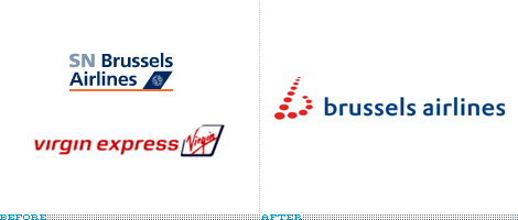
Recently, Brussels Airport clarified their name to be, well, “Brussels Airport” and added a tagline. Also, SN Brussels Airline, who took control of Virgin Express last year, and also uses Brussels Airport as a hub has just announced that the new, single airline brand will be Brussels Airlines.
Continue reading this entry
DATE: Nov.15.2006POSTED BY: David WeinbergerCATEGORY: Aviation COMMENTS:
TAGS:


Books about logo design, the designers that create them and the meaning of branding.
