


Online
- FPO (For Print Only) / Celebrating the reality that print is not dead by showcasing the most compelling printed projects.
- Art of the Menu / Cataloguing the underrated creativity of menus from around the world.
- Quipsologies / Chronicling the most curious, creative, and notable projects, stories, and events of the graphic design industry on a daily basis.
- Speak Up (2002 – 2009) / Discussing, and looking for, what is relevant in, and the relevance of, graphic design. Archives Only.
- Word It (2003 – 2010) / Encouraging creative diversity in the community through monthly, one-word challenges. Archives Only.
- Brand New Classroom (2010 – 2011) / Providing a space for critique and opinions on student identity work. Archives Only.
Publishing
- The 2010 Brand New Awards / 2011, self-published.
- Flaunt: Designing effective, compelling and memorable portfolios of creative work / 2010, self-published.
Events & Judged Competitions
- Brand New Conference / A one-day event on the development of corporate and brand identity projects by some of today’s most active and influential practitioners from around the world.
- Brand New Awards / Celebrating the best identity work produced around the world.
- FPO Awards / Celebrating the best print work from around the world.
Writing
- Graphic Design, Referenced: A Visual Guide to the Language, Applications, and History of Graphic Design / 2009, Rockport.
- Women of Design: Influence and Inspiration from the Original Trailblazers to the New Groundbreakers / 2008, HOW Books.
- The Word It Book: Speak Up Presents a Gallery of Interpreted Words / 2007, HOW Books.
Graphic Design
- Department of Design / Designing corporate and brand identities and full development of printed and digital matter for clients.

Opinion BY Clinton Duncan
Smile, you are on Candid Airport
![]()
Gatwick Airport, formerly London Gatwick airport, is the world’s 28th busiest airport, and until 2009, was owned by BAA, or British Airports Authority, just one amongst the many it owned in the south-east of England. Forced to sell after a government review came to the conclusion that one operator owning every airport in town was uncompetitive, the new owners turned to the experienced hands of branding consultancy Lewis Moberly.
Continue reading this entry

DATE: Sep.17.2010 POSTED BY: Clinton DuncanCATEGORY: Aviation COMMENTS:

TAGS: airport, lewis moberly, script,

Opinion BY Armin
Follow-up: United Airlines
Allow to me quote myself from something I said a little over three months ago: “In all likelihood we will see a new logo in the next year or two.” Boy was I wrong as a drunk at the race track. It wasn’t two years. Or a year. Barely a financial quarter has passed before United Airlines — the resulting moniker of the merger between it and Continental — changed its logo. And if you thought it couldn’t get worse, bet again.
Continue reading this entry
DATE: Aug.12.2010POSTED BY: ArminCATEGORY: Aviation COMMENTS:
TAGS: continental airlines, merger, sans serif, united,
Opinion BY Christian Palino
The Virgin’s New Clothes
Virgin Atlantic have spent the last year and a half working with London’s Circus and johnson banks to reposition and rebrand Richard Branson’s “high quality, value for money” airline. The airline, born in 1984 under Branson’s ever-growing Virgin empire, quickly became profitable (selling a 49% stake to Singapore Airlines in 1999) and has pioneered offerings from new service experiences like flat beds to biofuel usage.
Continue reading this entry
DATE: Aug.11.2010POSTED BY: Christian PalinoCATEGORY: Aviation COMMENTS:
TAGS: johnson banks, livery, metallic finish, sans serif, virgin,
Opinion BY Armin
Flight of the Condor
As the largest domestic and international carrier in Argentina, Aerolíneas Argentinas has been transporting passengers to, from and within this beautiful land since the early 1950s. With a new mission “To connect Argentineans and contribute towards the integration and economic and social development of our country, promoting the national territory as a tourist, cultural and business destination,” Aerolíneas Argentinas is introducing a new identity designed by Futurebrand.
Continue reading this entry
DATE: Jun.25.2010POSTED BY: ArminCATEGORY: Aviation COMMENTS:
TAGS: argentina, futurebrand, italic, livery, sans serif,
Opinion BY Armin
The United and Continental Airline Mashup
Yesterday, United and Continental Airlines, the third- and fourth-largest U.S. carriers respectively, announced they would be merging, creating the first-largest carrier. While the media focuses on numbers of flights, ramifications for shareholders and what will happen to customers’ frequent flyer miles we focus our attention on what really matters: The literal merger of two infinitely different brands. As I see it, United has always had the cooler, hipper personality with its Saul Bass-designed tulip icon and Pentagram-crafted wordmark (and livery) as well as its lovely mid-00s TV advertising campaign by Fallon. Continental, on the other hand and despite its globe logo having matching Saul Bass origins is, well, bland. Competent, but boring. Last updated by Lippincott in the early 1990s, making the globe more refined and the typography more formal. So how can these two identities come together? Well, rather painfully.
Continue reading this entry
DATE: May.04.2010POSTED BY: ArminCATEGORY: Aviation COMMENTS:
TAGS: continental airlines, lippincott, logo, merger, pentagram, saul bass, serif, united,
Opinion BY Sam Becker
The Logo Olympics
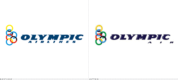
Olympic Airlines, once the national airline of Greece, has recently been sold by the Greek government to a private investment group. The new logo and name (now shortened in the 1980s fashion to Olympic Air) are supposed to signal a change in the company’s culture and offering. To that end the company has held a grand logo contest in the Olympic tradition of competition. Read on to see who took home the silver and bronze.
Continue reading this entry
DATE: Oct.27.2009POSTED BY: Sam BeckerCATEGORY: Aviation COMMENTS:
TAGS:
Opinion BY Armin
Customers Rewarded with New Plane
“Air Miles” seems such a loose term that any airline could own and have little chance at being its own brand. Which just goes to show that I’m neither Canadian nor good at accruing miles. Air Miles is a very popular reward program in Canada where everyday purchases made at or with participating products or services add up to coveted, well, air miles for some much desired traveling. According to this article, two thirds of Canadian households participate in the Air Miles program. That’s a lot. While Canada seems to be the most successful Air Miles, the program (and brand) runs independently in other parts of the world, like the UK, Spain and the Netherlands. The company isn’t that old, it was established in the mid 1980s, but its logo, and specifically the plane in its logo, looks like, indeed, it has been flying all this time.
Continue reading this entry
DATE: Oct.16.2009POSTED BY: ArminCATEGORY: Aviation COMMENTS:
TAGS:
BY Armin
Spanair Logo, the People’s Choice
![]()
Spanair, a 20-year-old international airline with hubs in Madrid and Barcelona, has recently undergone some management changes when its previous full owner, Scandinavian Airlines Systems, gave 80% of its share of the company to a new group of investors. As with other management changes, this lead to the redesign of Spanair’s identity. The job went to Morillas Brand Design, who led Spanair to two very viable solutions for a new logo. The obvious next step — sarcasm! — was to put those two identity options to public voting. Between May 5 and 11, close to 80,000 people voted and mid-May, the winner was announced.
Continue reading this entry
DATE: May.26.2009POSTED BY: ArminCATEGORY: Aviation COMMENTS:
TAGS:
BY Armin
Air France Sheds Some Stripes
![]()
Operating since 1933, Air France has become one of the biggest and most recognized airlines in the world, traveling to nearly 100 countries. A new identity, replacing its last update since 1975, has been designed by Brandimage. A brief video explains a little bit about the change.
Continue reading this entry
DATE: Feb.11.2009POSTED BY: ArminCATEGORY: Aviation COMMENTS:
TAGS:
BY Armin
A New Eagle Guacamaya for TACA
![]()
Connecting the American content, from South to North and for 77 years, TACA —Transportes Aéreos del Continente Americano (Air Transport of the American Continent) — unveiled a new identity at the end of September. (Sorry for the delay on this one!). I believe the golden thingies in the old logo were super streamlined eagles, and they were in need of a major overhaul that they handsomely received from Lippincott. This is a really great update, the new icon is elegant and dynamic with an inherent motion that most airline logos strive for but rarely achieve even when they “italicize” every element of the identity. The wordmark is also rather nice, and it evolves the extended serif from the previous logo with a custom sans serif that complements the icon very well. The one thing I don’t get is the purple “crest” at the top of the eagle’s head, it seems a little unnecessary to add that third color. And the one thing that did disappoint was the livery, it just seems like the identity would have lent itself to a much more engaging and attractive design on the airplane. Nonetheless, one of my favorite icons of the year.
Continue reading this entry
DATE: Dec.15.2008POSTED BY: ArminCATEGORY: Aviation COMMENTS:
TAGS:


Books about logo design, the designers that create them and the meaning of branding.
