


Online
- FPO (For Print Only) / Celebrating the reality that print is not dead by showcasing the most compelling printed projects.
- Art of the Menu / Cataloguing the underrated creativity of menus from around the world.
- Quipsologies / Chronicling the most curious, creative, and notable projects, stories, and events of the graphic design industry on a daily basis.
- Speak Up (2002 – 2009) / Discussing, and looking for, what is relevant in, and the relevance of, graphic design. Archives Only.
- Word It (2003 – 2010) / Encouraging creative diversity in the community through monthly, one-word challenges. Archives Only.
- Brand New Classroom (2010 – 2011) / Providing a space for critique and opinions on student identity work. Archives Only.
Publishing
- The 2010 Brand New Awards / 2011, self-published.
- Flaunt: Designing effective, compelling and memorable portfolios of creative work / 2010, self-published.
Events & Judged Competitions
- Brand New Conference / A one-day event on the development of corporate and brand identity projects by some of today’s most active and influential practitioners from around the world.
- Brand New Awards / Celebrating the best identity work produced around the world.
- FPO Awards / Celebrating the best print work from around the world.
Writing
- Graphic Design, Referenced: A Visual Guide to the Language, Applications, and History of Graphic Design / 2009, Rockport.
- Women of Design: Influence and Inspiration from the Original Trailblazers to the New Groundbreakers / 2008, HOW Books.
- The Word It Book: Speak Up Presents a Gallery of Interpreted Words / 2007, HOW Books.
Graphic Design
- Department of Design / Designing corporate and brand identities and full development of printed and digital matter for clients.

BY Armin
A Lost Sense of Wonder?
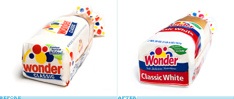
While attending the International Balloon Race at the Indianapolis Speedway in 1921, as the story goes, Vice President of the Taggart Baking Company, Elmer Cline, came up with the name — which subsequently inspired the logo — of their soon-to-be-introduced loaf of bread as he was struck in wonder by the sight of the balloons in the sky. And for more than eighty years, Wonder Bread has been an icon of all things American, and, more yummily, of all things sandwich. Few things are as delicious as a peanut butter and jelly sandwich in classic white wonder bread as it sticks to the top of your mouth. Just don’t count the calories. But back on track: With an increasing number of products and SKUs that were growing inconsistent in their design, Wonder has just redesigned the complete line of packaging and has modified its logo. In charge of the redesign was Kansas City-based Willoughby Design, who was been working with Wonder since the late 1990s.
Continue reading this entry

DATE: Apr.06.2009 POSTED BY: ArminCATEGORY: Consumer products COMMENTS:

TAGS:

BY Armin
Baked, Not Fried is the New Shaken, Not Stirred
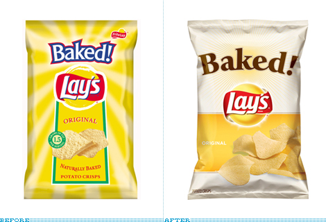
Unlike your run of the mill, delicious chips that are fried in fatty goodness, Frito Lay’s Baked! chips — exclamation point theirs — are, as the name exclamingly implies, baked for the health-conscious consumer. Where most chips contain 10 grams of fat, Baked! touts only 1.5 grams. I don’t buy chips often, only when I’m road-tripping and that has happened, like, three times in the past five years so I somewhat embarrassingly admit that I had no idea of the existence of Baked! Lay’s, which have been on the market since 1996. I must be a sucker for pretty things but I have to say that seeing this new packaging does tempt me to look for them on my next road trip or, more likely, on my next trip to the grocery store.
Continue reading this entry
DATE: Mar.30.2009POSTED BY: ArminCATEGORY: Consumer products COMMENTS:
TAGS:
BY Armin
Better Logo = Happier Cows
![]()
Originally established as a butter producer in 1905, Valio has grown to produce numerous dairy products in its more than hundred-year-old history and in February it introduced a new identity that will begin to roll out across their product line this month and into 2011. Hopefully our Finnish readers can contribute any thoughts about the presence of this brand in Finland.
Continue reading this entry
DATE: Mar.24.2009POSTED BY: ArminCATEGORY: Consumer products COMMENTS:
TAGS:
BY Armin
Oh Snap, Snapple
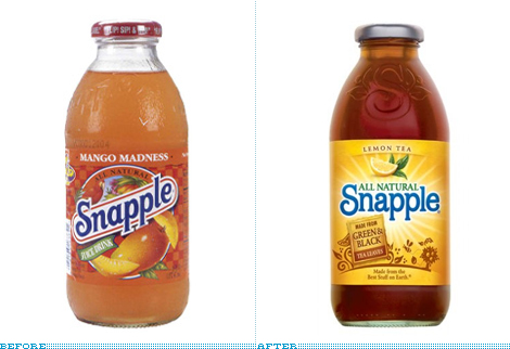
Back in December of 2007 we reported on a new range of teas by Snapple and the introduction of a new logo. While that look hadn’t yet affected the main Snapple teas I preemptively bemoaned their imminent disappearance so you may read most of my reasoning in that post. This month, along with a new formula, Snapple introduced the new bottle and label design for their core range of teas.
Continue reading this entry
DATE: Mar.18.2009POSTED BY: ArminCATEGORY: Consumer products COMMENTS:
TAGS:
BY Armin
Cheerier Cheer
![]()
No more than sixteen months ago we reported on the change of the Cheer detergent logo and packaging, and since then we have seen good things (I think) like the introduction of the Cheer Laundress, a lady whose hands you would want your clothes in. It seemed like the brand was moving on. So, it’s very surprising that not even with a year and a half in the market Cheer’s logo and label have changed once again.
Continue reading this entry
DATE: Mar.11.2009POSTED BY: ArminCATEGORY: Consumer products COMMENTS:
TAGS:
BY Christian Palino
Scientific Beauty
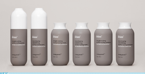
Living Proof considers itself a rather unconventional beauty product company — gathering scientists outside of the beauty field under Bob Langer, an MIT Institute Professor, lead by the former Senior VP of Marketing for L’Oreal and backed by Polaris Venture Partners in Cambridge. Their first product to get out in the wild is a line of No Frizz solutions that employ PolyfluoroEster rather than the traditional method of utilizing silicone — they’ve got a great video describing the process on their products page (right column, “watch” button). Living Proof’s elevator pitch:
Continue reading this entry
DATE: Feb.24.2009POSTED BY: Christian PalinoCATEGORY: Consumer products COMMENTS:
TAGS:
BY Armin
Sprite Gets More Sprite
![]()
After a little break from soda discussion — although the eternally climbing comment count here suggests otherwise — here is a fresh one, Sprite. Just in time for the NBA All-Star’s Slam Dunk contest which Sprite sponsors they are putting into use a new, dynamic and active logo that, in context, is actually quite decent. I’m not sure I fall for the “explosive” starburst but there is something interesting about the way the lettering and the lemon/lime interact with it. Also, I realize there is this other Sprite logo, but I can’t figure out or don’t remember if it was just temporary, but the new logo certainly seems like an evolution of that. And reader Jared Ramey pointed out that the logo might be based on this. So for a mass consumer brand trying to appear cutting edge and “with it” this is not bad. Not my style or my thing, but not bad.
Thanks to Christopher Martin and Jared Ramey for the tip.
DATE: Jan.30.2009POSTED BY: ArminCATEGORY: Consumer products COMMENTS:
TAGS:
BY Armin
Sweet White Space
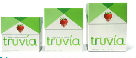
I had been meaning to write about the packaging and identity that Pentagram partner Paula Scher did recently for the new player in the sweetener category, Truvia. Then, with the swirl of the Holidays and the craziness of trying to finish things before and around them, I just kind of forgot. A couple of days ago, while grocery shopping with my parents and the rest of the Vit clan in a grocery store five or forty-three times bigger than our Brooklyn Key Food, the new Truvia packaging literally stopped me in my tracks as I reached for my own preferred sweetener (Splenda).
Continue reading this entry
DATE: Dec.29.2008POSTED BY: ArminCATEGORY: Consumer products COMMENTS:
TAGS:
BY Armin
This Logo comes with a Two-Year Warranty
![]()
CREDIT UPDATE: The new Seal was designed by Louise Fili.
I must be making all the wrong consumer choices because I had never seen or heard about the Good Housekeeping Seal that adorns the packaging (and in some cases the advertising) of everything from washers and dryers, to cell phones, and even to movers. The Seal, issued by the Good Housekeeping Research Institute — a 17,000-square-foot (since 2006 when it moved to the Hearst building) lab and kitchen testing facility with scientists and engineers as its staff — is given to products that pass their rigorous tests, granting them not just use of the seal, but entry into the its namesake magazine, Good Housekeeping, which only takes advertisers whose claims and promises can be corroborated by the Institute. The seal gives consumers a two-year warranty on any approved product and will happily issue refunds if necessary. The Seal was introduced in 1909 and, to celebrate its 100th anniversary, a new version has been released.
Continue reading this entry
DATE: Nov.26.2008POSTED BY: ArminCATEGORY: Consumer products COMMENTS:
TAGS:
BY Armin
Winston Shows Some Enthusiasm
![]()
Time for a palate cleanser after all that soda talk: Founded in 1979, Wine Enthusiast Companies has been providing all things wine — from products like glassware, refrigerators and wine racks, to tasting events, and to a magazine for, um, wine enthusiasts — to the ever growing market of wine consumers, from experts to novices and everything in between. For better or for worse, wine has become less the domain of experts who can sniff and swirl their way through a tasting flight to a broader market that buys their wine from Costco. (A good friend of mine and wine snob, actually praises their selection so that last sentence isn’t meant as an insult). Wine Enthusiast Co. realizes the need to expand into a broader market and that its identity should reflect the eclectic wine audience. Working with New York-based CBX, they created a whole new identity for their broad range of offerings.
Continue reading this entry
DATE: Oct.27.2008POSTED BY: ArminCATEGORY: Consumer products COMMENTS:
TAGS:


Books about logo design, the designers that create them and the meaning of branding.
