


UnderConsideration is a graphic design enterprise that runs a network of blogs, publishes books, organizes live events and judged competitions, and designs for clients.

Online
Publishing
Events & Judged Competitions
Writing
Graphic Design
Online
- FPO (For Print Only) / Celebrating the reality that print is not dead by showcasing the most compelling printed projects.
- Art of the Menu / Cataloguing the underrated creativity of menus from around the world.
- Quipsologies / Chronicling the most curious, creative, and notable projects, stories, and events of the graphic design industry on a daily basis.
- Speak Up (2002 – 2009) / Discussing, and looking for, what is relevant in, and the relevance of, graphic design. Archives Only.
- Word It (2003 – 2010) / Encouraging creative diversity in the community through monthly, one-word challenges. Archives Only.
- Brand New Classroom (2010 – 2011) / Providing a space for critique and opinions on student identity work. Archives Only.
Publishing
- The 2010 Brand New Awards / 2011, self-published.
- Flaunt: Designing effective, compelling and memorable portfolios of creative work / 2010, self-published.
Events & Judged Competitions
- Brand New Conference / A one-day event on the development of corporate and brand identity projects by some of today’s most active and influential practitioners from around the world.
- Brand New Awards / Celebrating the best identity work produced around the world.
- FPO Awards / Celebrating the best print work from around the world.
Writing
- Graphic Design, Referenced: A Visual Guide to the Language, Applications, and History of Graphic Design / 2009, Rockport.
- Women of Design: Influence and Inspiration from the Original Trailblazers to the New Groundbreakers / 2008, HOW Books.
- The Word It Book: Speak Up Presents a Gallery of Interpreted Words / 2007, HOW Books.
Graphic Design
- Department of Design / Designing corporate and brand identities and full development of printed and digital matter for clients.

BY Armin
In Brief: Obama Runner-Ups
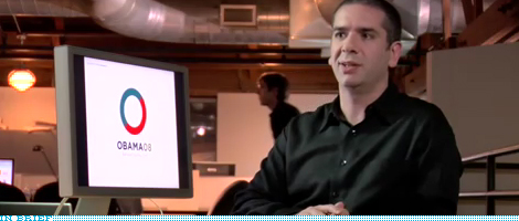
Sol Sender, the man behind the Obama ‘08 logo, recently joined VSA Partners as a strategist and, to celebrate, they posted a really amazing two-part interview on their web site, talking about the logo explorations and identity contenders to the iconic “O.” David Airey at Logo Design Love has unpacked the visual highlights of the interview, which makes for a great set. What I love about all this work is that it shows that the “O” wasn’t just a fluke but that it was the result of a proper identity exploration with a sound strategy and that good things happen when good designers are involved. Even in a market as crap-filled as Presidential campaign identities.
It’s important to note that Sender did the logo and initial identity standards but it was art director John Slabyk and creative director of new media Scott Thomas who extended the identity into novel and exciting executions, like the mutable logos for different sectors of the population.
It’s important to note that Sender did the logo and initial identity standards but it was art director John Slabyk and creative director of new media Scott Thomas who extended the identity into novel and exciting executions, like the mutable logos for different sectors of the population.

DATE: Dec.13.2008 POSTED BY: ArminCATEGORY: In Brief COMMENTS:

TAGS:

BY Armin
In Brief: Kiss This, Mexico City
![]()
Every now and then it’s worthy to remind us of the horrible perils of spec work. Whether designers should do it or not is really not the question, each person can decide what to do, but what’s clear is that the creative process and its manifestation is what suffers the most. A few months ago, Mexico City, through its Department of Tourism announced a contest to design the official logo for the city. Using the I♥NY logo as an example of what it wanted to achieve it then set the following parameters: The logo should depict the Angel de la Independencia monument and it should revolve around the theme of Bésame Mucho, the (rather lovely) song by Consuelo Velázquez. Anybody in the world could participate and vie for the prize of MX$1,000,000 (around US$73,000) to be filtered through a judging panel and the final winner selected by on-line voting. From 8,000 entries five finalists have been selected (one has already been removed for copyright issues) and are available for voting. The results are disheartening (other than the idea of No. 4). You can also see a number of the entries on a Flickr pool; this one is pretty fabulous (semi-NSFW). As a fellow Mexican and designer, it’s really sad to see this, Mexico City (if Lance Wyman proved anything) could have an exciting and vibrant identity and someone leading the process, not just a silly contest that dangles money in front of people. So, dear Mexico City, here is a tip: Hire a professional.
Thanks to Juan Carlos Hernández Cámara for the tip, who has a nice rundown (in Spanish) of each finalist.
DATE: Dec.02.2008POSTED BY: ArminCATEGORY: In Brief COMMENTS:
TAGS:
BY Armin
In Brief: Women of Design, Now Available
Bryony and I are extremely proud to announce that Women Of Design: Influence and Inspiration from the Original Trailblazers to the New Groundbreakers, a book we worked on for almost a year, is now officially on the market. An arduous but fulfilling task that celebrates the work of some of the best designers, writers, editors and thinkers in the world of graphic design. We have put together a comprehensive one-page preview web site that you can visit for an overview of the book or you can skip the formalities and purchase it from Amazon. We hope you enjoy it, whether you buy it, borrow it, flip through it at the bookstore, or even if you just use the “Look Inside” feature at Amazon.
DATE: Nov.25.2008POSTED BY: ArminCATEGORY: In Brief COMMENTS:
TAGS:
BY Armin
In Brief: Death Metal Branding
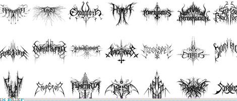
An interview with Christophe Szpajdel, the Paul Rand of this peculiar sub genre in the discipline of identity and designer of “more than 7,000 logos, mostly for black- and death-metal bands from all over the world.”
Thanks to Yotam Hadar for the tip.
DATE: Nov.20.2008POSTED BY: ArminCATEGORY: In Brief COMMENTS:
TAGS:
BY Joe Marianek
In Brief: Obama’s Website in the Mirror
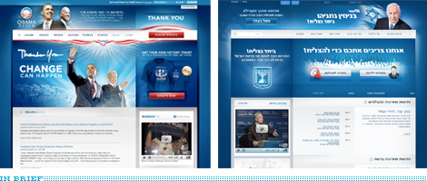
The image above requires very little explanation except to say that Obama’s brand is fast becoming a template for success. Benjamin Netenyahu’s campaign website, is inspired by Barack Obama’s. Borrowed elements include layout, typography, color, gradients, buttons, photography, silhouettes and more below the fold. “Imitation is the greatest form of flattery,” said one of Netanyahu’s top advisers, in this New York Times article.
Thanks to Michael Freimuth for the tip.
DATE: Nov.18.2008POSTED BY: J. MarianekCATEGORY: In Brief COMMENTS:
TAGS:
BY Armin
In Brief: The MLB Logo, Whoddunit?
![]()
More than two weeks ago The Wall Street Journal reported on Jerry Dior, the uncredited designer of the Major League Baseball logo that has been the league’s identifier since the late 1960s and has spawned endless iterations for other professional sports. Dior isn’t looking for fame or fortune, just acknowledgment from the league who, despite having enough supporting stories from Dior’s peers, is still looking for some sort of magical evidence that Dior did the logo. Paul Lukas of Uniwatch, recently interviewed Dior about the logo and there is some great stuff in there: “I just did it, y’know? It was fast. I think I spent just an afternoon on it.”
Thanks to Stuart McCoy for the tip.
DATE: Nov.11.2008POSTED BY: ArminCATEGORY: In Brief COMMENTS:
TAGS:
BY Armin
In Brief: Pepsi gets Official

I think this should give us some closure on this whole odyssey: Pepsi has sent to twenty-five lucky “digital and social media influencers” three separately-shipped packages unveiling the new identity and packaging, flaunting the old Pepsi logos as if this new work was honoring what came before it. The package also included a DVD with a little motion piece that you can watch here.
Thanks to James Bowie for the tip.
DATE: Oct.28.2008POSTED BY: ArminCATEGORY: In Brief COMMENTS:
TAGS:
BY Armin
In Brief: Vancouver 2010 Identity

If you can get past the too-clever term of “Transmoflection,” here is a great video about the development of the visual identity for the 2010 Winter Olympic Games in Vancouver
DATE: Oct.06.2008POSTED BY: ArminCATEGORY: In Brief COMMENTS:
TAGS:
BY Armin
In Brief: Mad is as MAD does
There isn’t much I can add to the comprehensive write up over at the Pentagram blog, so rather than repeat what they said, you should go ahead and read for your own pleasure about the new identity for the recently re-opened Museum of Art and Design in New York’s Columbus Circle designed by Michael Bierut and our own regular contributor Joe Marianek.
DATE: Sep.29.2008POSTED BY: ArminCATEGORY: In Brief COMMENTS:
TAGS:
BY Armin
In Brief: Corporate Mind Survey
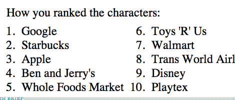
The Department of Psychology at Harvard University is currently running a study that examines how people perceive the ‘mental’ capacities of corporations. Based on 13 corporations, you will take tests — awesomely labeled like Worth, Punishment, Morality, Guilt and Desire — that take between 5 and 10 minutes to complete. The real kick is seeing how you rank your brands. For example, the image above shows the results of the brands I like the most: As much as I rely on my Starbucks coffee every single day, and as as much as I use Apple products to make a living, it is Google the brand that I like the most. And so it is, as I use it almost everyday too many times a day.
DATE: Aug.22.2008POSTED BY: ArminCATEGORY: In Brief COMMENTS:
TAGS:


Books about logo design, the designers that create them and the meaning of branding.
