


UnderConsideration is a graphic design enterprise that runs a network of blogs, publishes books, organizes live events and judged competitions, and designs for clients.

Online
Publishing
Events & Judged Competitions
Writing
Graphic Design
Online
- FPO (For Print Only) / Celebrating the reality that print is not dead by showcasing the most compelling printed projects.
- Art of the Menu / Cataloguing the underrated creativity of menus from around the world.
- Quipsologies / Chronicling the most curious, creative, and notable projects, stories, and events of the graphic design industry on a daily basis.
- Speak Up (2002 – 2009) / Discussing, and looking for, what is relevant in, and the relevance of, graphic design. Archives Only.
- Word It (2003 – 2010) / Encouraging creative diversity in the community through monthly, one-word challenges. Archives Only.
- Brand New Classroom (2010 – 2011) / Providing a space for critique and opinions on student identity work. Archives Only.
Publishing
- The 2010 Brand New Awards / 2011, self-published.
- Flaunt: Designing effective, compelling and memorable portfolios of creative work / 2010, self-published.
Events & Judged Competitions
- Brand New Conference / A one-day event on the development of corporate and brand identity projects by some of today’s most active and influential practitioners from around the world.
- Brand New Awards / Celebrating the best identity work produced around the world.
- FPO Awards / Celebrating the best print work from around the world.
Writing
- Graphic Design, Referenced: A Visual Guide to the Language, Applications, and History of Graphic Design / 2009, Rockport.
- Women of Design: Influence and Inspiration from the Original Trailblazers to the New Groundbreakers / 2008, HOW Books.
- The Word It Book: Speak Up Presents a Gallery of Interpreted Words / 2007, HOW Books.
Graphic Design
- Department of Design / Designing corporate and brand identities and full development of printed and digital matter for clients.

BY Armin
In Brief: Winning Redesigns
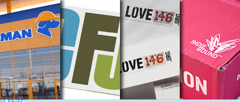
The winners of the 2009 ReBrand 100 Global Awards have been announced, with lovely before/after images of those in the Best Of and Distinction tiers. A great collection of redesigns.
Thanks to Dave McCanless for the tip.

DATE: Mar.05.2009 POSTED BY: ArminCATEGORY: In Brief COMMENTS:

TAGS:

BY Armin
In Brief: Now on Twitter
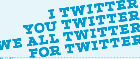
In the past few weeks we have received numerous inquiries about whether we had a Twitter account which, prior to these, was something we hadn’t even considered, but seeing that Twitter is the hot thing right now, we would be remiss to not be part of it. What we decided makes the most sense is to have a Twitter not just for Brand New but for all of UnderConsideration, including the other blogs as well as our forays into client-driven work or publishing. The goal is to provide some insight about what goes on at UC headquarters — basically whatever me and Bryony are up to — and share what we are working on and doing. Of course, for all you dear tipsters, feel free to Tweet us! You can find us @ucllc.
DATE: Feb.26.2009POSTED BY: ArminCATEGORY: In Brief COMMENTS:
TAGS:
BY Armin
In Brief: Tropicana Hits Command-Z

“I’m incredibly surprised by the reaction,” added [Peter Arnell], referring to the complaints about his agency’s design work, but “I’m glad Tropicana is getting this kind of attention.” Um, yeah, it’s the wrong kind of attention, the kind you would never want your client to get because of your work. Way to work the press. In terms of design justice coming down upon crappy design, this day is as big as it gets. Every year from here henceforth, on February 23rd, corporations should be allowed to take back a design mistake and repent… a branding Yom Kippur if you will.
Apologies for the late start this morning, major server issues. Photo by Flickr user justinlai.
DATE: Feb.23.2009POSTED BY: ArminCATEGORY: In Brief COMMENTS:
TAGS:
BY Armin
In Brief: MoMA Reboot
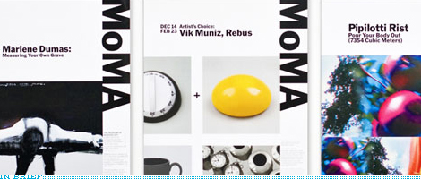
One of the hardest challenges is reinvigorating a brand and visual identity without changing the logo, it’s as if you were trying to do a fashion makeover with a pair of jeans that have been in the closet for years. To continue the lame jeans analogy: A good pair of jeans goes well with everything, so MoMA’s simple, iconic logo is prime material for building around it. Pentagram partner Paula Scher established a new identity system in collaboration with Julia Hoffmann, MoMA�s Creative Director for Graphics and Advertising, who produced all of the examples on Pentagram’s web site.
DATE: Feb.17.2009POSTED BY: ArminCATEGORY: In Brief COMMENTS:
TAGS:
BY Armin
In Brief: The Wrong Kind of Breathtaking
“You know if we roll, we roll big.” Those were the words in 2006 that sent Agency.com’s viral video of pitching for the Subway account to internet infamy and advertising douchebaggery. Well, brand identity has found its equivalent. Yesterday, at the massively trafficked reddit.com, a new user posted a PDF to the presentation — humbly titled “Breathtaking” — accompanying the redesign of the Pepsi logo by Arnell Group. The contents are at once hilarious, pretentious and delirious as they try to establish Pepsi as the center of the universe. Some select pages are posted here and the PDF should still be publicly available somewhere on the internets. Long live the internet as a tool for exposing lameness.
Continue reading this entry
DATE: Feb.10.2009POSTED BY: ArminCATEGORY: In Brief COMMENTS:
TAGS:
BY Armin
In Brief: Logo as Plot of Land

London-based design agency Airside has posted two great entries on their blog about the design of the identity for Airplot, Greenpeace’s initiative to stop the proposed construction of a third runway at Heathrow airport. The first post to highlight is the one that shows Airside’s process and how they arrived at the solution and the second (although they posted this one first) shows the different applications. Worth a look and a read.
DATE: Feb.03.2009POSTED BY: ArminCATEGORY: In Brief COMMENTS:
TAGS:
BY Armin
In Brief: The Arabic Brand Experience

If you’ve ever wondered what everyday logos, brands and packaging look like on the other side of the world — depending on where you are we might be the other side of the world, so consider this a rhetoric opening — J. Jason Smith of Graphicology has captured some great photos of Western logos and their Arabic Doppelgängers in his recent visit to Dubai. One set of photos for logos and one set for packaging.
DATE: Jan.20.2009POSTED BY: ArminCATEGORY: In Brief COMMENTS:
TAGS:
BY Armin
In Brief: Cartoon Chameleons

Motion design studio Capacity has repackaged the on-air graphics of the Cartoon Network (CN). The main attraction of the redesign are the Noods, blank amorphous characters that absorb an endless array of colors, textures and personalities to represent the diversity of the CN’s own line-up and cast of characters. It may be easy to dismiss the Noods as a rip-off or imitation of Kidrobot’s Dunny, but there is something very appropriate and relevant in their introduction to the CN brand. The animations by Capacity are pretty amazing too and you can see them all in a loving montage.
DATE: Jan.16.2009POSTED BY: ArminCATEGORY: In Brief COMMENTS:
TAGS:
BY Armin
In Brief: Logos with Jimmy Fallon
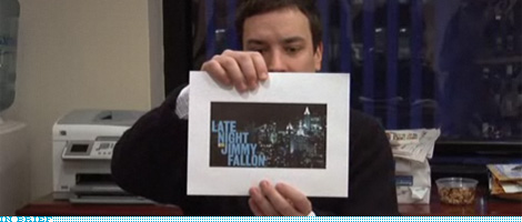
Less than two months from now, on March 2, Jimmy Fallon will make his debut as Conan O’Brien’s successor with Late Night with Jimmy Fallon. Over the last months Fallon has been video blogging all sorts of preemptive shenanigans, and yesterday’s entry was about helping him choose one logo from the three presented by Emily Oberman and Bonnie Siegler of Number Seventeen (designers of the Saturday Night Live opening titles for the last fourteen years). So, if you are ready for someone calling a logo “this guy here” and get excited about logos on mugs then go visit with Fallon.
Thanks to Aaron Jamison for the tip.
DATE: Jan.13.2009POSTED BY: ArminCATEGORY: In Brief COMMENTS:
TAGS:
BY Armin
In Brief: Clockwise
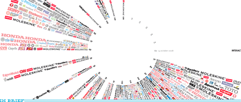
Back in May we saw miss Jane chronicle all the logos of the brands and products she interacted with everyday. Now, Tanner Woodford has taken that idea to the next level as a class assignment at the Visual Communication Design program at Arizona State University. He has taken the 1,035 logos he logged in one day and arranged them in a 24-hour clock.
DATE: Dec.18.2008POSTED BY: ArminCATEGORY: In Brief COMMENTS:
TAGS:


Books about logo design, the designers that create them and the meaning of branding.
