


Lightolier by Yevgeniya Ryaboy

ASSIGNMENT
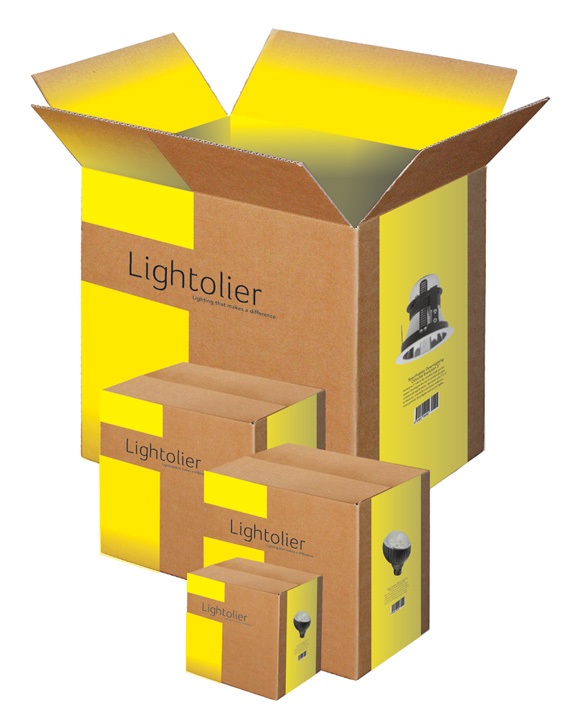
Redesign the corporate identity for Lightolier, a lighting manufacturer.

Redesign the corporate identity for Lightolier, a lighting manufacturer.
SCHOOL
School of Visual Arts
New York
School of Visual Arts
New York
COURSE
Typography
Typography
INSTRUCTOR
R. Poulin
R. Poulin
Approach
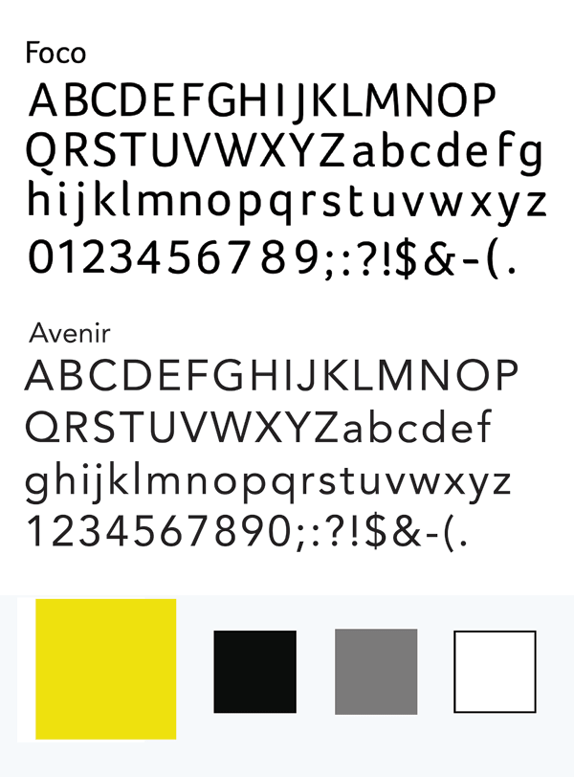
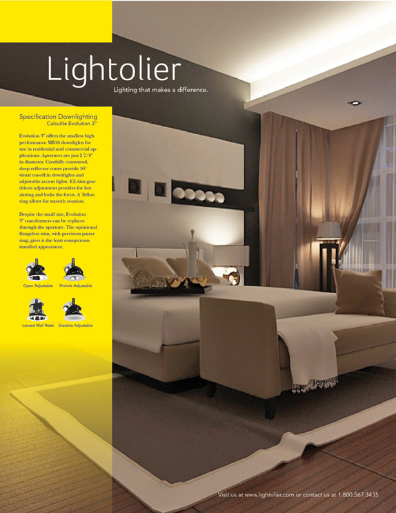
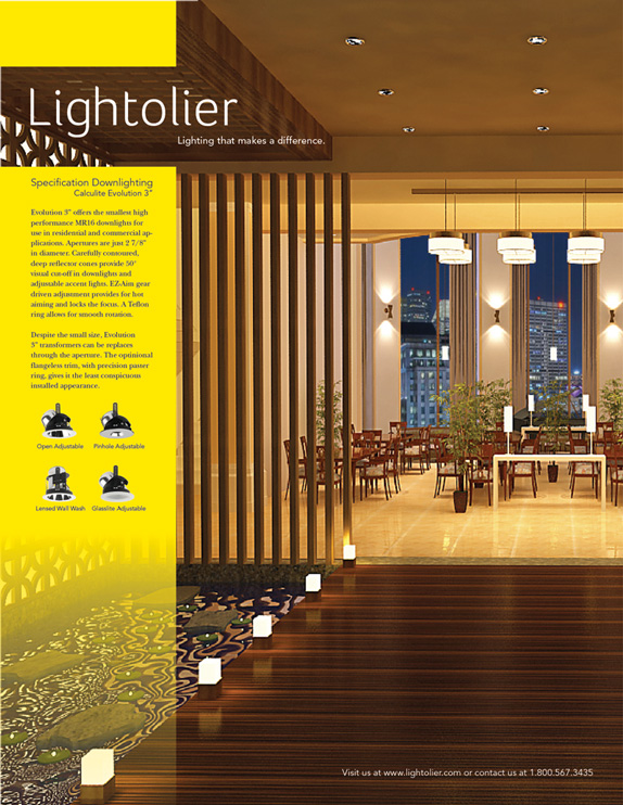
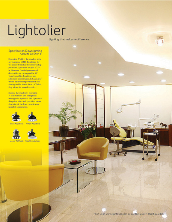
Lightolier was founded in 1904 so I approached the assignment by researching the history of the brand. My goal was to refresh the identity while not straying from the tradition and integrity of this company. I chose the typeface Foco for the logo because the clean straight edges represent the architectural quality of the brand while the rounded edges and curved terminals show movement which can be associated with electricity. The “t” has a cross stroke only on one side which gives the appearance of light hitting the letter. It’s a legible typeface with a warm, inviting, and friendly touch.
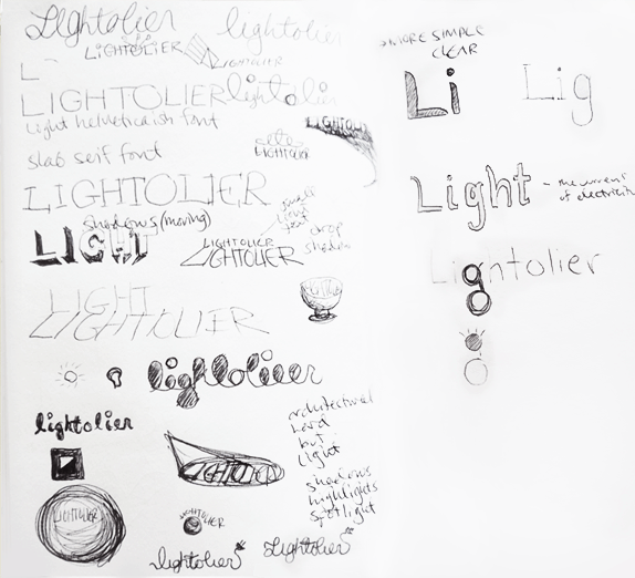
Sketches and Process
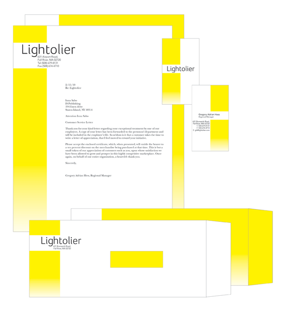
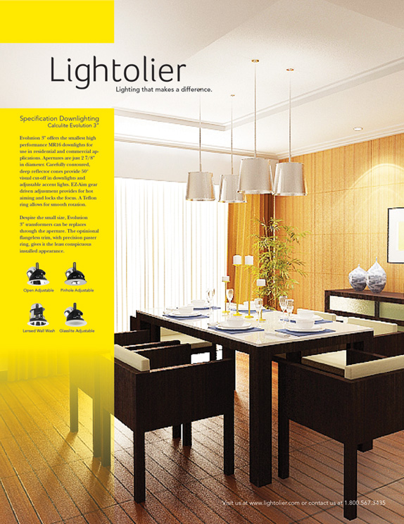
Solution

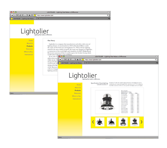
Yevgeniya’s Website


DATE: May.31.2011 POSTED BY: Lauren DickensCATEGORY: Consumer Product COMMENTS:

TAGS: identity, lightolier, student,

Comments › Jump to Most Recent


Celebrating the reality that print is not dead by showcasing the most compelling printed projects.

Corraling the most relevant and creative on- and off-line bits that pertain to the design community — and said community is openly invited and encouraged to add their hard-earned links.

Describing, tracking and explaining culture, commerce, politics, media, sports, brands — everything possible, really — through design.

Discussing, and looking for, what is relevant in, and the relevance of, graphic design. [Archives Only]

Encouraging creative diversity in the community through monthly, one-word challenges. [Archives Only]

Designing corporate and brand identities and full development of printed and digital matter for clients and us.