


Online
- FPO (For Print Only) / Celebrating the reality that print is not dead by showcasing the most compelling printed projects.
- Art of the Menu / Cataloguing the underrated creativity of menus from around the world.
- Quipsologies / Chronicling the most curious, creative, and notable projects, stories, and events of the graphic design industry on a daily basis.
- Speak Up (2002 – 2009) / Discussing, and looking for, what is relevant in, and the relevance of, graphic design. Archives Only.
- Word It (2003 – 2010) / Encouraging creative diversity in the community through monthly, one-word challenges. Archives Only.
- Brand New Classroom (2010 – 2011) / Providing a space for critique and opinions on student identity work. Archives Only.
Publishing
- The 2010 Brand New Awards / 2011, self-published.
- Flaunt: Designing effective, compelling and memorable portfolios of creative work / 2010, self-published.
Events & Judged Competitions
- Brand New Conference / A one-day event on the development of corporate and brand identity projects by some of today’s most active and influential practitioners from around the world.
- Brand New Awards / Celebrating the best identity work produced around the world.
- FPO Awards / Celebrating the best print work from around the world.
Writing
- Graphic Design, Referenced: A Visual Guide to the Language, Applications, and History of Graphic Design / 2009, Rockport.
- Women of Design: Influence and Inspiration from the Original Trailblazers to the New Groundbreakers / 2008, HOW Books.
- The Word It Book: Speak Up Presents a Gallery of Interpreted Words / 2007, HOW Books.
Graphic Design
- Department of Design / Designing corporate and brand identities and full development of printed and digital matter for clients.

intl. In Brief by Clyde Araujo posted BY Brand New
Follow-up: UEFA EURO2012
A kind representative from Brandia Central sent us additional visuals of the UEFA EURO 2012 identity. I know what you’re thinking — “Ooh purty.” (Or maybe not). Either way, the question remains, are they appropriate to the sport of football? The only set that stood out is the black and white set for its intricate craftsmanship. As contrived as they may seem, they do pay homage effectively to Wycinanki. And like Wycinanki, they are mere decorations for a competition of champions.
Continue reading this entry

DATE: Jan.08.2010 POSTED BY: Brand NewCATEGORY: In Brief COMMENTS:

TAGS:

In Brief BY Armin
Don’t Design the 25th Identity of space150
I’m not a stubborn man and I am not too proud to take back something I have said. Your opinions on the subject of the space150 identity contest do matter to me and I don’t take them for granted. What I already said is how I feel about this specific case, but I don’t have to make everyone see things the same way, especially when it comes to such firecracker subject like spec work and even more so when I don’t even feel that passionate in favor of it in comparison to how most of you feel against it with every right and reason. Over the past years we have run our share of contests (on Speak Up specifically) and I can say first-hand that not everyone does things with bad intentions, so every now and then I am willing to give someone the benefit of the doubt as I did in this case. I apologize to anyone that felt let down by our support of the contest and let me emphasize that I value our industry’s time and creativity as much as everyone who expressed their concerns. To put an end to this matter, if you will graciously accept it as such — and if not, well, there is not much more I can do — we will not be following the contest on Brand New or FPO and will no longer encourage your participation. The post from yesterday will remain up with an update at the bottom for future reference. If this apology makes me look like a wuss conforming to public pressure I can tell you I prefer that over appearing as a an a**hole — which I am not, I’m, like, totally nice.
DATE: Dec.16.2009POSTED BY: ArminCATEGORY: In Brief COMMENTS:
TAGS:
In Brief BY Armin
Design the 25th Identity of space150
As a standard rule I do not post logo contests on Brand New and, believe me, I get asked a lot. But I am happy to make an exception in this case. Space150 is a design firm with offices in Los Angeles, Minneapolis, and New York City and every 150 days they redesign their identity. Everything: Business cards, letterhead, logo, web site, promotional materials, the whole package. Over the last ten years space150 has reinvented itself 24 times, done either in-house or by commissioning an outside firm. For their 25th reinvention they have decided to make it an open contest, with the winner getting his or her idea produced 100% as envisioned, from start to finish.
Continue reading this entry
DATE: Dec.15.2009POSTED BY: ArminCATEGORY: In Brief COMMENTS:
TAGS:
In Brief BY Armin
Follow-up: Aol. Animations
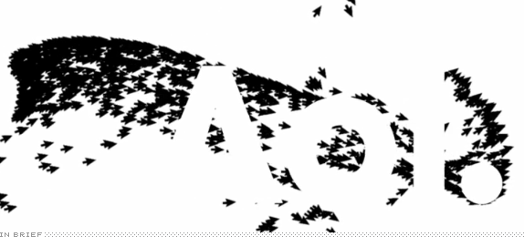
A very quick follow-up on the rebranding of Aol. Sheffield-based Universal Everything has posted seven “reveal” animations that range from trippy to, well, trippy. My favorite is the flock of cursors. Update: Wolff Olins has also posted the work on their web site, as well as aol.com sporting the new look. Aol became officially independent today.
First spotted at Creative Review.
DATE: Dec.10.2009POSTED BY: ArminCATEGORY: In Brief COMMENTS:
TAGS:
In Brief BY Armin
McGreen

The German outpost of the fast food mega chain, McDonald’s, recently announced that around 100 of its restaurants in Germany will change their well-known red backdrops to a deep green by the end of 2009. McDonald Germany’s VP, Holger Beeck, stated that the move is “out of respect for the environment.” But Germany isn’t the first to go green, France has been leading the European greening since 2006, when it launched the internal L’Eco Journal and its web site now features the logo against said deep green. This move is part of a bigger effort by McDonald’s to actually be green philosophically, more than just aesthetically, as chronicled in the McDonald’s 2009 Global Best of Green report. There are a couple of items for discussion: a) Is literally going green too lame? And b) does it hurt the brand by moving away from the very recognizable red? My take is, on the former, yes it’s kind of lame but at least they picked a nice green and, on the latter, McDonald’s has such a broad palette of brand icons — from the mnemonic Parapapapa sound to the Big Mac to the yellow arches — that substituting red is no big deal… in fact, just look how cool and recognizable it looks against black in the U.S. web site.
Thanks to Yves for first tip.
DATE: Dec.01.2009POSTED BY: ArminCATEGORY: In Brief COMMENTS:
TAGS:
In Brief BY Armin
To Everyone…

Yes, I know, it’s corny to give thanks on Thanksgiving but whatever. (In part it buys me time to take a break from the daily posting!). But most importantly I do want to thank everyone that visits and comments and especially everyone that sends in the tips, you have no idea how useful it is to have such an engaged audience that can help us build the content for our site — since May of 2007, I can see that my inbox holds at least 2,700 e-mails with tips, so keep them coming. Brand New is now 3 years old and it’s been quite a thrill to see it grow the way it has. So, thanks again. Regular posting resumes on Monday.
DATE: Nov.26.2009POSTED BY: ArminCATEGORY: In Brief COMMENTS:
TAGS:
In Brief BY Armin
Groovy Lines
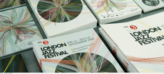
Now in its seventeenth year, the London Jazz Festival (LJF) has grown from a showcase of local talent to a world-class event spanning ten days of what are surely life-affirming sounds. There are a couple of reasons why we are turning our attention to the LJF today. The first is that, well, it’s a striking identity job by London based IWANT Design, who created what amounts to a visualization of the various sounds and energy emanating from the festival. The second is that I first saw this work right around the time we were covering scribble-heavy identities like Telecom and Burnley and my first thought was that this is how a scribble-heavy identity is supposed to be made. It’s not only a graphic feast but it serves a conceptual purpose that fits the mood and audience of the festival, and is not just some randomly generated scribbles that happen to look like fun.
Continue reading this entry
DATE: Nov.20.2009POSTED BY: ArminCATEGORY: In Brief COMMENTS:
TAGS:
In Brief BY Armin
Follow-up: Art Directors Club
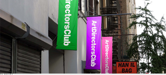
In retrospect I should have originally approached Trollbäck + Company for further details on the new Art Directors Club identity. I typically do but, for whatever reason, I skipped that part of the process. To make things right — especially since the comments were very, let’s say, spirited — and to give the identity the fair overview it deserves (just as the rest of everything we show here) this is a follow-up showing the complete identity system. Whether this makes the logo more palatable or not is, of course, up for discussion. Jakob Trollbäck has shared with us a PDF of the full presentation — of which there excerpts below — and some rationale for their work.
Continue reading this entry
DATE: Nov.18.2009POSTED BY: ArminCATEGORY: In Brief COMMENTS:
TAGS:
In Brief BY Armin
Big Wings, Tiny Type
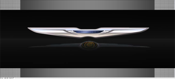
I’m treating this as an In Brief because there isn’t much to go by and details are still sketchy. Not to mention that the available images look like roadkill. As many of you may have caught, Chrysler announced a bunch of things this past week in relation to their emerging from the bottom of the auto industry barrel — our blogging colleagues at idsgn have put together something more comprehensive than I was willing to on this Friday morning. On their web site, Chrysler has made available a lot of PDFs covering their Plan, among them is a PDF on the brand going forward, showing a new logo. First, my god, what an abominate design on those PDFs, really embarrassing. Second, the new logo might just as well say “CHOCOLATE” in there because the ratio of wings to type is ridiculously high. And I really don’t foresee these wings, which look average at best, building enough graphic equity to come to signify Chrysler, especially in an industry where the big players have some of the most instantly recognizable logos. Good luck fellas!
Thanks to David Holm for first tip.
DATE: Nov.06.2009POSTED BY: ArminCATEGORY: In Brief COMMENTS:
TAGS:
In Brief BY Armin
Something Blue, Something Borrowed, Something Windmillish
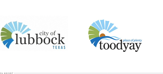
I believe this is a first: The Chief Financial Officer of the City of Lubbock, Texas wrote to the Shire of Toodyay, an area in Western Australia and asked for permission to repurpose the Shire’s logo for Lubbock. The Shire of Toodyay agreed to the use and at no charge either. The City of Lubbock then proceeded to lop off a water-like appendage from the icon to now symbolize a windmill — as Lubbock has a strong windmill tradition and is home to the Windmill Museum — and then typed in their name. Above anything else, I am most perplexed by how the CFO of a Texas city is aware of the identity of an area, not even a city, on the other side of the world. But I guess this proves the old adage: Ask, and ye shall receive. “Hi, Apple? This is Armin Vit, Principal of UnderConsideration, I was wondering if I could borrow your logo? No? Okay, thanks.” … “Hi, Nike? This is Armin Vit…”
Thanks to James Bowie at Quipsologies for first tip.
DATE: Oct.21.2009POSTED BY: ArminCATEGORY: In Brief COMMENTS:
TAGS:


Books about logo design, the designers that create them and the meaning of branding.
