


Online
- FPO (For Print Only) / Celebrating the reality that print is not dead by showcasing the most compelling printed projects.
- Art of the Menu / Cataloguing the underrated creativity of menus from around the world.
- Quipsologies / Chronicling the most curious, creative, and notable projects, stories, and events of the graphic design industry on a daily basis.
- Speak Up (2002 – 2009) / Discussing, and looking for, what is relevant in, and the relevance of, graphic design. Archives Only.
- Word It (2003 – 2010) / Encouraging creative diversity in the community through monthly, one-word challenges. Archives Only.
- Brand New Classroom (2010 – 2011) / Providing a space for critique and opinions on student identity work. Archives Only.
Publishing
- The 2010 Brand New Awards / 2011, self-published.
- Flaunt: Designing effective, compelling and memorable portfolios of creative work / 2010, self-published.
Events & Judged Competitions
- Brand New Conference / A one-day event on the development of corporate and brand identity projects by some of today’s most active and influential practitioners from around the world.
- Brand New Awards / Celebrating the best identity work produced around the world.
- FPO Awards / Celebrating the best print work from around the world.
Writing
- Graphic Design, Referenced: A Visual Guide to the Language, Applications, and History of Graphic Design / 2009, Rockport.
- Women of Design: Influence and Inspiration from the Original Trailblazers to the New Groundbreakers / 2008, HOW Books.
- The Word It Book: Speak Up Presents a Gallery of Interpreted Words / 2007, HOW Books.
Graphic Design
- Department of Design / Designing corporate and brand identities and full development of printed and digital matter for clients.

In Brief BY Armin
MOCA Reverts to the 1980s
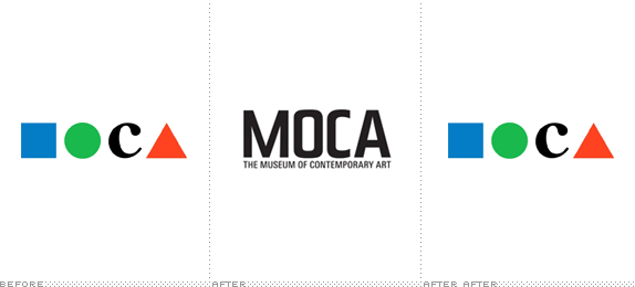
They say that trends take thirty years to come around, so if you are scared of what the 1980s looked like, get ready to relive it all once again or for the very first time, depending on when your parents did it. One of the first signs — at least in the field of identity design — of the Eightiespocalypse is the resurrection of the original logo for the Los Angeles Museum of Contemporary Art, designed by Chermayeff & Geismar. Alissa Walker at Fast Company reports further, including the elusive comment from the Chermayeff & Geismar headquarters that they are not “at liberty to discuss the rebranding,” a tasty tidbit considering the other ambiguous note that the logo is a “work-in-progress that may undergo additional alterations.” C’mon Cavaricci, we are rooting for you next!
Thanks to Yotam Hadar for the tip.

DATE: May.21.2010 POSTED BY: ArminCATEGORY: In Brief COMMENTS:

TAGS: 1980s, chermayeff and geismar, moca,

In Brief BY Armin
Every[blank] Every[blank]™
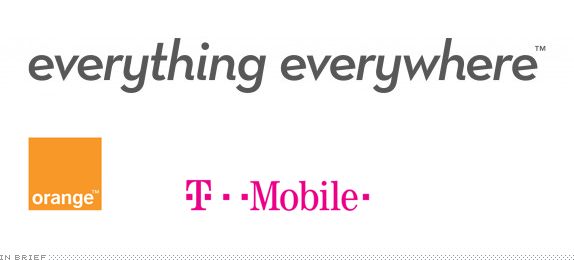
What do you get when you combine two of the biggest telecommunications companies in the UK? The answer is fairly straightforward: You get everything, everywhere. And that’s exactly what the new parent company, starting operations on July 1, 2010, will be called. Everything Everywhere™. It will represent the new 50:50 joint venture of France Telecom (owner of Orange) and Deutsche Telekom (owner of T-Mobile) in the UK market to establish itself as the leading mobile service provider with a combined 30 million subscribers. However, to keep things interesting, both Orange and T-Mobile will continue performing as separate brands, each with their already established brand, but behind the scenes it will all be Everything Everywhere™ — a press release has further details. According to this story in The Guardian, the moniker was “developed by the merged company’s internal team with help from T-Mobile’s ad agency Saatchi & Saatchi and Orange’s agency Fallon, both of whom are part of Publicis.” Since there is two months left before the launch of the new company it will be interesting to see if this trendy but, ultimately, uninspired wordmark — typeset in Neutraface Italic — will remain as the corporate identity or if there is something a little more fitting or, heck, at the very least more bombastic, for these two big brands. I guess we should be lucky we didn’t get another Continental/United-style mashup.
Continue reading this entry
DATE: May.14.2010POSTED BY: ArminCATEGORY: In Brief COMMENTS:
TAGS: fallon, italic, joint venture, orange, saatchi and saatchi, t-mobile,
In Brief BY Armin
Marlboro? What Marlboro?
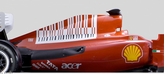
If looking at the above image suddenly inspires an unprecedented urge to grab a smoke and start puffing away, that’s because Marlboro wants you to buy their cigarettes. Or at least that’s how the conspiracy theory goes. Dutifully reported by our blogging peer, Graphicology, it turns that the Ferrari Formula One racing team is trying to sneak an allusion of the Marlboro logo through their speedy car’s new paint job in the form of an abstract bar code that supposedly resembles a Marlboro pack — a tactic made necessary due to a ban on tobacco advertising by the European Union. Fact or fiction? You decide.
DATE: May.07.2010POSTED BY: ArminCATEGORY: In Brief COMMENTS:
TAGS: ferrari, formula one, marlboro, subliminal,
In Brief BY Armin
CS5-mania
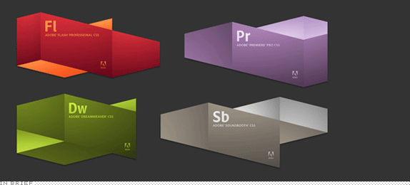
In case you somehow missed the announcement, this week saw the launch of the much awaited (not really, I think) Adobe CS5. Following the pattern where two versions are visually alike (CS1 and CS2, CS3 and CS4) CS5 comes with a brand new coat of fancy paint, meant very much to signify that this is a whole new version you must get right now. While CS1 and CS2 were well-known for their Meta Design-designed packaging and CS3 and CS4 became well know for the implacably strict icon set, CS5 looks like it’s making a push for coolest launch screen version. Designed in-house the new CS5 iconography is highly polished and well developed, while the packaging, designed by Tolleson Design, isn’t too shabby either. Our fellow brand-fiends at idsgn have put together a comprehensive overview of the whole CS5 branding.
DATE: Apr.16.2010POSTED BY: ArminCATEGORY: In Brief COMMENTS:
TAGS:
In Brief BY Armin
Behind the Scenes of April Fools 2010
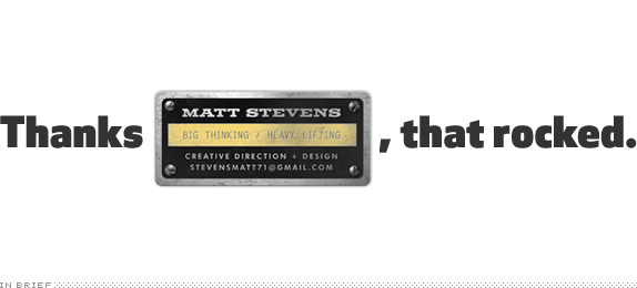
“I know this doesn’t fit the mold for your site,” wrote Matt Stevens to me on March 12, “but thought you might be interested. A little rebrand I did for fun.” I was amused by the exercise but, to be perfectly honest, I wasn’t in any enthusiastic rush to post it on Brand New so, like dozens of other e-mails we receive for the site, I left it unanswered. As April Fools approached, I panicked that I didn’t have anything prepared — this just goes to show you how tight an operation we run around here. After debating some lame ideas, I remembered Matt’s Dunkin’ Donuts post and realized it had all the ingredients of a convincing April Fools: A well-known brand, an established visual system, and the potential that it could indeed change at any moment. I asked Matt if his original post had gotten a lot of hits, just to make sure that it hadn’t been picked up by a bunch of blogs and ruin the surprise. Luckily for us, it hadn’t. And, boy, has that changed overnight! I am eternally grateful to Matt for letting us use his hard work for our and your amusement. And, as many made it clear in the comments, I thought the work that went into it was pretty amazing and even as I put it all together to give it a formal critique I was amazed at how well the whole identity came together under his vision. So, once more, thanks Matt, and thanks everyone for playing along another year.
DATE: Apr.02.2010POSTED BY: ArminCATEGORY: In Brief COMMENTS:
TAGS:
In Brief BY Armin
Penguin See, Penguin Do
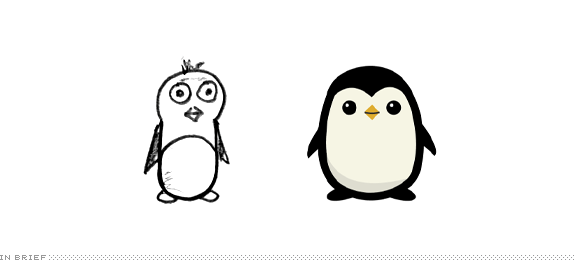
Alex Cornell, a current MBA student at San Francisco’s Academy of Art, and intern at the place of business of artist/musician Scott Hansen, ISO50, has enviable poise and talent for blogging about design and designing for the blogging audience. In case you missed it, he recently rebranded Playboy as a school assignment, showcasing all of his process. Alex was recently hired to design the logo for Plancast, a start-up that offers “a service for sharing your upcoming plans with friends,” and putting his professional money where his student mouth is — or something to that effect — he has posted a very nice round-up of his process that is very much worth a look.
DATE: Mar.19.2010POSTED BY: ArminCATEGORY: In Brief COMMENTS:
TAGS:
In Brief BY Armin
Oscarama for Logorama
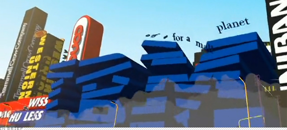
In dozens of years of watching the Oscars I had never cared about the outcome of the Best Animated Short Film, but this year it was different as in the running was a 16-minute film done almost entirely out of, literally, thousands of logos. Created by the French collective H5, and winner of the 2009 Academy Award for Best Animated Short Film, Logorama is not only a clever idea that brings to life some of the most ubiquitous marks of our time, but one that manages to exploit the meaning and conceptions we have of those marks and the brands behind them — whether it’s the villain of the movie, Ronald McDonald, spouting “Loser” after the Enron logo drops from the sky, or “White Trash” when the Kmart logo follows it. Logorama is relentless in its inclusion of corporate, consumer and cultural icons and they become ever so vivid through a crude animation style that complements rather well the prickly language and chaotic plot, which is “Spectacular car chases, an intense hostage crisis, wild animals rampaging through the city and even more…”. Images and a trailer for the short film have been floating around the web for the last few months and the full video has been spotted on and off. The official, legal video can be seen in some countries through iTunes for $1.99, and until further announcement it’s also available at Vimeo (embedded below). [Boy, I haven’t even posted this and the video is already gone; below are some screen captures and instead of buying a cup of coffee today, spend it on this movie, it’s worth it]. There are plenty of memorable moments, so don’t even dare to blink.
Continue reading this entry
DATE: Mar.09.2010POSTED BY: ArminCATEGORY: In Brief COMMENTS:
TAGS:
In Brief BY Armin
Ready for The Brand Quiz, Hotshot?

If you have some time to kill between now and Monday (or any day after that actually) perhaps you would like to test your brand awareness by taking The Brand Quiz, a fairly difficult challenge that asks you to name a brand based on two color hints and two ambiguous hints. I’m somewhat embarrassed to admit I only scored 14/21, but I had a root canal and wisdom tooth pulled out on Tuesday, so I’m pretty sure something, somewhere got dislodged in the process. If you think you can do 21/21 there is still the challenge of doing it in less time than your opponents. The quiz has been put together by London-based VYRE.
DATE: Feb.26.2010POSTED BY: ArminCATEGORY: In Brief COMMENTS:
TAGS:
In Brief BY Armin
The Many Faces of Chiquita
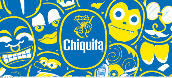
The banana industry is probably not the first one you think of in terms of fun creative prowess, despite the fact that “banana” is one of the funniest words in any language. I also doubt that many of us are discerning in what brand of banana we purchase at the store, we simply grab whatever is stacked at the produce section. Nonetheless, one banana brand stands out from the rest, Chiquita. Their bananas easily identifiable by the blue sticker, which has been placed by hand on every single banana since 1963, and has been used as a promotional tool over the years. The latest sticker campaign, created by DJ Neff uses the shape of the sticker to create more than twenty kooky characters and serves as the basis for a significant online attraction. The rest of the work and a great interview with Neff can be read at design:related, a great case study for injecting fun into a brand.
Thanks to John Olson for first tip.
DATE: Feb.17.2010POSTED BY: ArminCATEGORY: In Brief COMMENTS:
TAGS:
In Brief BY Armin
Follow-up: Old Spartan, for the Win
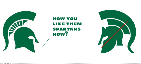
“After careful consideration,” states MSU Athletics Director Mark Hollis in a letter to Spartan Nation, “we will use the current Spartan logo design, first used in the late 1970s, to build our visual brand identity.” In the words of a not-so-famous sportscaster, Boom goes the dynamite. After a very loud outcry formed around the proposed redesign of the Spartan head, the public voice has won. Yes designers, be afraid, be very afraid.
PS. Apologies for the slowness today. Some technical difficulties have plagued us all week and I’m still trying to resolve them.
Thanks to Adam Meller for first tip.
DATE: Feb.09.2010POSTED BY: ArminCATEGORY: In Brief COMMENTS:
TAGS:


Books about logo design, the designers that create them and the meaning of branding.
