


Vujadeacute; by Michiel Koers
I was asked to design a identity system for Vujadé, a training and communication advise company. The only constraints I had where in the briefing: The company wanted its identity system to look modern and a bit obstinate (in a positive way, i have quite a hard time finding the correct word for this).

Saxion Hogescholen
Enschede
Graduation Internship
Ewald Klein Herenbrink, Remy Bosch
Approach
I started by sketching to generate lots of ideas. Most of them had something to do with transportation, since Vujadé helps it’s clients to move in a new direction, past old communication problems. I wasn’t really getting anywhere good. Then I thought of using a key and a keyhole as a metaphor for helping clients get past their problems. I didn’t really like that either. Finally the idea of using a labyrinth struck me, and I really liked it. It symbolises the search for solutions to the communication problems clients have. I discovered that not being satisfied too early can steer your design in complete different directions than you first thought you would arrive at.
When I had an idea of the direction I wanted to take the design I started looking for a cool typeface. I could go pretty wild with them, since the clients asked for the identity to be a bit obstinate. Nothing was too weird. I chose a cool looking, square font to mimic the different roads in a labyrinth.
After a lot of fine-tuning I arrived at the final logo and started to design the stationery, site and twitter page. For this I had to create a way to incorporate the labyrinth in a subtle way in the design, without it becoming to distracting. You can see the result on the back of the business card, for example.
Sketches and Process
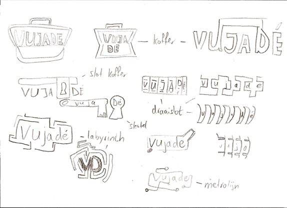
A selection of sketches.
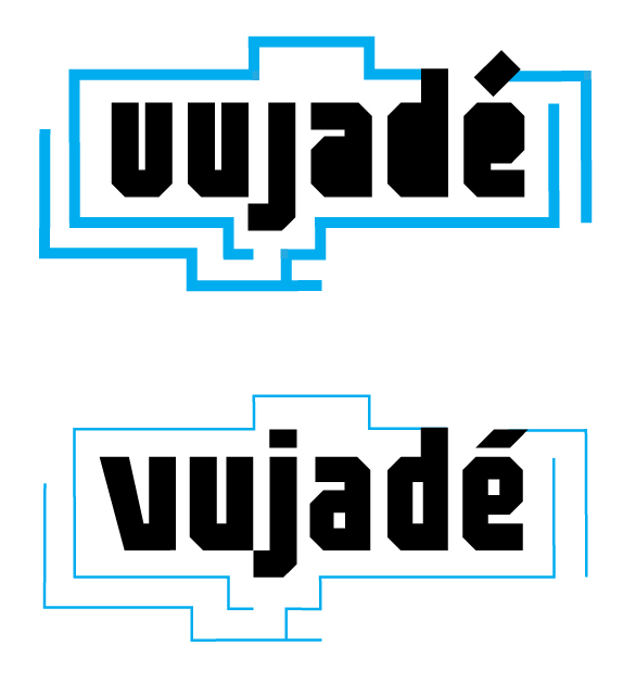
The top image is a rough version of the logo. On the bottom the final version of the logo after refinement. Some of the changes made: adding counters to the letters, redrawn V and apostrophe on the e, improved tracking and using thinner lines for the labyrinth.
Solution
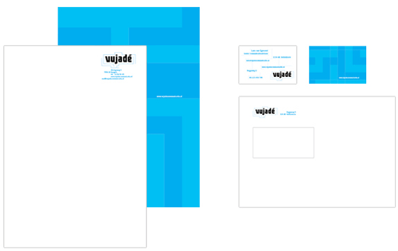
Stationary.
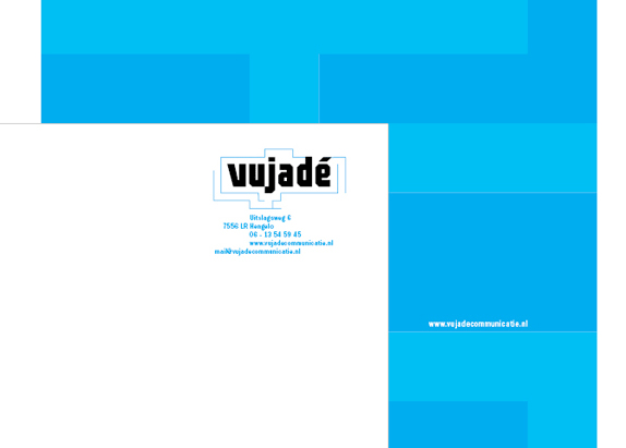
A closer look at the letter paper..
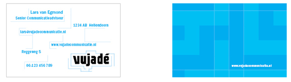
A closer look at the business card.
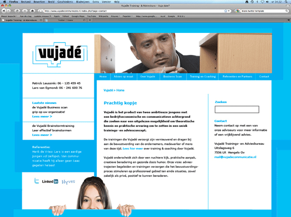
Website.
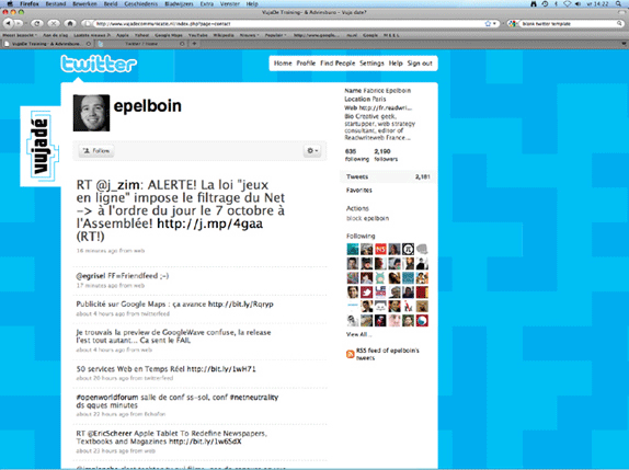
Twitter Page.
Michiel Koers’s Website


DATE: Jul.26.2010 POSTED BY: BryonyCATEGORY: Service COMMENTS:

TAGS: logo, stationery, twitter, typography, vujade, website,


Celebrating the reality that print is not dead by showcasing the most compelling printed projects.

Corraling the most relevant and creative on- and off-line bits that pertain to the design community — and said community is openly invited and encouraged to add their hard-earned links.

Describing, tracking and explaining culture, commerce, politics, media, sports, brands — everything possible, really — through design.

Discussing, and looking for, what is relevant in, and the relevance of, graphic design. [Archives Only]

Encouraging creative diversity in the community through monthly, one-word challenges. [Archives Only]

Designing corporate and brand identities and full development of printed and digital matter for clients and us.