


Online
- FPO (For Print Only) / Celebrating the reality that print is not dead by showcasing the most compelling printed projects.
- Art of the Menu / Cataloguing the underrated creativity of menus from around the world.
- Quipsologies / Chronicling the most curious, creative, and notable projects, stories, and events of the graphic design industry on a daily basis.
- Speak Up (2002 – 2009) / Discussing, and looking for, what is relevant in, and the relevance of, graphic design. Archives Only.
- Word It (2003 – 2010) / Encouraging creative diversity in the community through monthly, one-word challenges. Archives Only.
- Brand New Classroom (2010 – 2011) / Providing a space for critique and opinions on student identity work. Archives Only.
Publishing
- The 2010 Brand New Awards / 2011, self-published.
- Flaunt: Designing effective, compelling and memorable portfolios of creative work / 2010, self-published.
Events & Judged Competitions
- Brand New Conference / A one-day event on the development of corporate and brand identity projects by some of today’s most active and influential practitioners from around the world.
- Brand New Awards / Celebrating the best identity work produced around the world.
- FPO Awards / Celebrating the best print work from around the world.
Writing
- Graphic Design, Referenced: A Visual Guide to the Language, Applications, and History of Graphic Design / 2009, Rockport.
- Women of Design: Influence and Inspiration from the Original Trailblazers to the New Groundbreakers / 2008, HOW Books.
- The Word It Book: Speak Up Presents a Gallery of Interpreted Words / 2007, HOW Books.
Graphic Design
- Department of Design / Designing corporate and brand identities and full development of printed and digital matter for clients.

Follow-Up BY Armin
Follow-Up: Mathaf, Arab Museum of Modern Art

Funny how things work out: On Friday of last week, same day as the Brand New Awards judging, we published the Mathaf identity design by Wolff Olins. I published it hesitantly because the images and explanations found online were very scarce, Clinton did a very good job in cobbling together a review based on that, so I went with it. Although Wolff Olins’ entry had arrived at the office earlier in the week I hadn’t had a chance to leaf through it. It was until Friday, when the judges were discussing it, that I was able to see the extent of the identity. When they selected it as Best of Show I was bummed that the post we had about it was not representative of the work. Now that the Mathaf identity has a brighter spotlight on it, I’m very pleased to be able to show some of the images in the entry so that you can see what the judges saw. In Friday’s post we had also wrongly attributed the custom typeface to Tarek Atrissi Design — they were responsible for the hand-drawn type shown here now in its completion, and the thin, mono weight typeface was designed by Pascal Zoghbi from 29ArabicLetters.
Continue reading this entry

DATE: Apr.13.2011 POSTED BY: ArminCATEGORY: Culture COMMENTS:

TAGS: bnawards, mathaf, wolff olins,

A B-Side BY Armin
Bauhaus Dessau Foundation
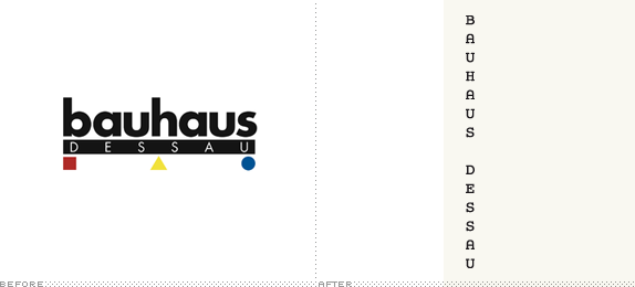
Housed in the historical Bauhaus building, the Bauhaus Dessau Foundation, established in 1994 is “a centre of research, teaching and experimental design” based on “conserving, researching into and passing on the Bauhaus heritage”. Its new identity has been designed by Hort, based on a modified Courier, system fonts, black-and-white, and a strict grid system.
Thanks to Luke Alexander Atkinson for the tip.
DATE: Apr.11.2011POSTED BY: ArminCATEGORY: Culture The B-Side COMMENTS:
Opinion BY Clinton Duncan
Typography: Where East Meets West
![]()
Mathaf, Arab Museum of Modern Art (pronounced mat-haf) is a new modern art museum in Doha, Qatar. Its mission is to showcase modern and contemporary art from the region, shifting existing perceptions of arts practice in the Arab world, and provide a forum for dialogue and scholarship. An existing building, in the traditional style, was redesigned by French architect Jean-François Bodin and the new branding was handled by the Dubai office of Wolff Olins with two custom typefaces, one by Tarek Atrissi Design and another by Pascal Zoghbi from 29ArabicLetters.
Continue reading this entry
DATE: Apr.08.2011POSTED BY: Clinton DuncanCATEGORY: Culture COMMENTS:
TAGS: arabic, custom, hand-drawn, museum, tarek atrissi, wolff olins,
A B-Side BY Armin
Frankfurt Book Fair
![]()
The Frankfurt Book Fair (Frankfurter Buchmesse in German), running since 1949, is the world’s largest book fair in the world, attracting publishers from all countries representing every single book genre and industry imaginable — it is a great launching pad for new titles as well as for wheelings and dealings for securing international rights licenses and partnerships. Their logo has been redesigned for the upcoming fair this October.
Thanks to Sriparna Ghosh for the tip.
DATE: Apr.05.2011POSTED BY: ArminCATEGORY: Culture The B-Side COMMENTS:
TAGS: condensed, germany, icon, sans serif,
Opinion BY Armin
Artistic Triangle Threesome
![]()
Established in 1965 as an independent agency of the federal government by the United States Congress, the National Endowment for the Arts (NEA) grants funds that “support artistic excellence, creativity, and innovation for the benefit of individuals and communities.” To date it has provided over $4 billion, funding over 130,000 grants. A little over a year ago, the NEA came under the scrutiny of the design industry when it launched a $25,000-contest, accompanied by a hefty 28-page RFP that asked for speculative work, to “represent the phrase ‘art works’ in a single image.” The mantra of NEA Chairman, Rocco Landesman, “Art Works” has three meanings: “the works of art themselves, the ways art works on audiences, and art as work.” This month, the NEA has launched Art Works as what seems like a hybrid of awareness campaign and new logo. The Art Works identity has been created by Hoon Kim, principal of New York-based Why Not Smile who was selected as the winner of the contest.
Continue reading this entry
DATE: Mar.01.2011POSTED BY: ArminCATEGORY: Culture COMMENTS:
TAGS: sans serif, triangle,
A B-Side BY Armin
Canadian Opera Company
![]()
Established in 1950 as Royal Conservatory Opera Company and renamed Canadian Opera Company in 1997, the COC is the largest opera company in Canada. The old logo reflected its new home at The Four Seasons Centre where they started performing in 2006. The new logo was introduced in January, designed by Endeavour (who also designed the old logo).
Thanks to Robbie Raskin for the tip.
DATE: Feb.21.2011POSTED BY: ArminCATEGORY: Culture The B-Side COMMENTS:
TAGS: canada, sans serif,
A B-Side BY Armin
Matias Nadal
![]()
Matias Nadal is a music composer working in film, advertising, and television. Designed by Barcelona-based Rocío Martinavarro his name’s initials, MN, are rendered as the black keys of a keyboard piano, his main tool for expression. More applications at Rocío’s website.
DATE: Feb.16.2011POSTED BY: ArminCATEGORY: Culture The B-Side COMMENTS:
TAGS: icon,
A B-Side BY Armin
Swedish Travelling Exhibitions
![]()
Established in 1965, Riksutställningar (Swedish Travelling Exhibitions) is an organization devoted to organizing and mobilizing art exhibitions not just in Sweden but all of Europe. Its new identity was designed by Stockholm, Sweden-based Gabor Palotai. “Built upon a square and a comma, the graphic profile communicates stability and changeability. The square frames several perspectives: a picture frame, the boxes used to transport the exhibitions, and the rooms where exhibitions are displayed. As a continuation without an end, the comma represents the mission of the travelling exhibition: to remake, rethink, and rebuild.” More applications here.
DATE: Jan.21.2011POSTED BY: ArminCATEGORY: Culture The B-Side COMMENTS:
TAGS: flexible identity, icon, sans serif, sweden,
A B-Side BY Armin
The Lawrence Public Library
![]()
The Lawrence Public Library in Lawrence, KS has just updated with a, well, simple new logo. “It combines the enduring, classic shapes of a square and circle, representing the library as a strong community anchor.” A bit more of where that came from on this newsletter PDF.
Thanks to Travis Swicegood for the tip.
DATE: Jan.06.2011POSTED BY: ArminCATEGORY: Culture The B-Side COMMENTS:
TAGS: geometric, red, sans serif,
Opinion BY Clinton Duncan
Living Art
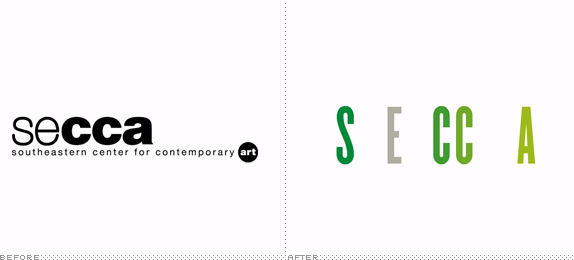
SECCA, or the South Eastern Centre Contemporary Art, is a contemporary art centre in North Carolina. Originally founded in 1956, the organization really got going in 1976 thanks to a philanthropic bequest of industrialist James G Hines’s 32-acre estate. In 2010, after an extensive renovation, they turned to Pentagram partner Luke Hayman for a new visual identity to compliment their shiny, newly updated art space.
Continue reading this entry
DATE: Sep.10.2010POSTED BY: Clinton DuncanCATEGORY: Culture COMMENTS:
TAGS: animation, green, museum, pentagram, sans serif,


Books about logo design, the designers that create them and the meaning of branding.
