


Online
- FPO (For Print Only) / Celebrating the reality that print is not dead by showcasing the most compelling printed projects.
- Art of the Menu / Cataloguing the underrated creativity of menus from around the world.
- Quipsologies / Chronicling the most curious, creative, and notable projects, stories, and events of the graphic design industry on a daily basis.
- Speak Up (2002 – 2009) / Discussing, and looking for, what is relevant in, and the relevance of, graphic design. Archives Only.
- Word It (2003 – 2010) / Encouraging creative diversity in the community through monthly, one-word challenges. Archives Only.
- Brand New Classroom (2010 – 2011) / Providing a space for critique and opinions on student identity work. Archives Only.
Publishing
- The 2010 Brand New Awards / 2011, self-published.
- Flaunt: Designing effective, compelling and memorable portfolios of creative work / 2010, self-published.
Events & Judged Competitions
- Brand New Conference / A one-day event on the development of corporate and brand identity projects by some of today’s most active and influential practitioners from around the world.
- Brand New Awards / Celebrating the best identity work produced around the world.
- FPO Awards / Celebrating the best print work from around the world.
Writing
- Graphic Design, Referenced: A Visual Guide to the Language, Applications, and History of Graphic Design / 2009, Rockport.
- Women of Design: Influence and Inspiration from the Original Trailblazers to the New Groundbreakers / 2008, HOW Books.
- The Word It Book: Speak Up Presents a Gallery of Interpreted Words / 2007, HOW Books.
Graphic Design
- Department of Design / Designing corporate and brand identities and full development of printed and digital matter for clients.

BY Armin
That Wacky Wacom
![]()
Wacom, the Japanese company responsible for the addictive tablets — try to pry one from any designer and you will suffer the consequences — unveiled a new identity and brand positioning last week, aimed at making headway into the general consumer market while maintaining its attention on the professional, hardcore user. The new company motto, “Open Up. Sense More.” — both technological and slightly kinky — is intended to lead the way in the new appreciation of this company, while their latest tablet design, Bamboo, hopes to cash in on the more general public willing to put their mouse, and carpal tunnel syndrome, behind them. The old logo — with its mid-80s corporate design sensibility — has been replaced with a monoweight, mid-00s techie sensibility. (Do note the legacy of using the same shape, though inverted, for the W and M). The identity has been designed by Wolff Olins, them of London 2012 fame and of bright-color propensity (evident throughout the new Wacom web site). While the revised wordmark is a considerable improvement, the introduction of The Color Thing, all bouncy and weird, is a detriment to an otherwise simple evolution. What the meaning of The Color Thing is, is beyond my comprehension and, once refrained to question its existence, why it’s so unbelievably static — make it spin in 3D! make it morph! make it pulsate! anything except bounce like a color version of Pong — is even more baffling and demoralizing. Unless The Color Thing comes alive, really alive, signaling the technological savvy of Wacom, it is a gratuitous visual element with little potential for recognizable traction. Or maybe in its ugliness, like that of London 2012, it will find its audience. One thing is for sure, it will unlikely lose its current, devoted audience of designers and retouchers who can zip across the screen faster than the The Color Thing can bounce from one edge of the screen to the other.

DATE: Sep.25.2007 POSTED BY: ArminCATEGORY: Graphics Industry COMMENTS:

TAGS:

BY Armin
Photoshop 2.0: The Wrong Kind of 2.0
![]()
Of all the design applications we use — InDesign, Illustrator, Quark, Flash, Dreamweaver, et al — Photoshop has long been the most popular beyond our industry. Lawyers, architects, accountants, restaurateurs, your dad, mom, brother and sister all know Photoshop. Even if it’s only to ask, “You can Photoshop that, right?” in hopes of magically fixing an underexposed photograph, an old set of frown lines, a muffin top, or to erase a building and reveal the building behind it. Photoshop, like Google and Xerox before it, has also become a verb: Photoshoping this, having Photoshoped that, and thou Photoshopeth. Despite its growing complexity over the years, Photoshop feels like Adobe’s darling, enjoying a myriad of spin-offs targeted to creative tangents like photographers, retouchers and even novices — a treatment no other application in its suite enjoys to such extent. Adding all these versions up in 2007 results in the following line-up: Photoshop CS3, Photoshop CS3 Extended, Photoshop Lightroom, Photoshop Elements, Photoshop Album Starter Edition. Certainly, they need a unique unifying logo! Not.
Continue reading this entry
DATE: Sep.19.2007POSTED BY: ArminCATEGORY: Graphics Industry COMMENTS:
TAGS:
BY Armin
Baseline, Interrupted
![]()
Since 1995, the International Typographics Magazine, Baseline has been published independently by Bradbourne Publishing Limited — the enterprise formed by Hans Dieter Reichert and Mike Daines when they purchased the magazine from the defunct Letraset. For the past twelve years, the magazine has been financed, edited, designed and produced through Hans’ London-based design firm HDR Visual Communication three times a year amidst the rest of their client work. To say that this is a labor of love is putting it mildly. For those (like me) that enjoy the newsstand experience, Baseline has always stood out on the shelves in more way than one. First, the size, sticking out atop the rest of the standardized rags; second, the content, as it continually provides unexpected and less trodden topics; and lastly, that peculiar, jittery, all-inclusive, passive-ransom-note logo.
Continue reading this entry
DATE: Aug.30.2007POSTED BY: ArminCATEGORY: Graphics Industry COMMENTS:
TAGS:
BY Armin
Fresh Face(s)
To my surprise, Brand New has been steamrolling over identity work for almost a year now and it’s been non-stop, so I just wanted to take a quick moment to acknowledge our newest regular contributors and give them an official welcome. John Feldhouse, Joe Marianek and Ryan Hembree were all lured by the siren song of the rebrand and now spend their precious free time presenting identities for everyone to enjoy. Welcome, fellas. In other housekeeping announcements, I would also like to point you to our newly redesigned headquarters page at underconsideration.com which, as Joe rightly pointed out, smells like pumpkin pie. Hope you enjoy it. And finally, a corny yet heartfelt Thank You to everyone that comments and visits day in and day out.
DATE: Aug.21.2007POSTED BY: ArminCATEGORY: Graphics Industry COMMENTS:
TAGS:
BY David Weinberger
The Color of Nothing
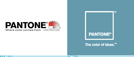
In the last 3 days, there were no less than three different taglines on the Pantone website . On the home page, locked up with the logo was, “Where color comes from.” If you went to the “About” section, you would have seen, “The Power of Color” locked up with a different wordmark. On Monday, Pantone launched a new logo designed by G2, the branding arm of Grey Global Group, complete with the new tagline, “The color of ideas.”
Continue reading this entry
DATE: Nov.07.2006POSTED BY: David WeinbergerCATEGORY: Graphics Industry COMMENTS:
TAGS:


Books about logo design, the designers that create them and the meaning of branding.
