


Online
- FPO (For Print Only) / Celebrating the reality that print is not dead by showcasing the most compelling printed projects.
- Art of the Menu / Cataloguing the underrated creativity of menus from around the world.
- Quipsologies / Chronicling the most curious, creative, and notable projects, stories, and events of the graphic design industry on a daily basis.
- Speak Up (2002 – 2009) / Discussing, and looking for, what is relevant in, and the relevance of, graphic design. Archives Only.
- Word It (2003 – 2010) / Encouraging creative diversity in the community through monthly, one-word challenges. Archives Only.
- Brand New Classroom (2010 – 2011) / Providing a space for critique and opinions on student identity work. Archives Only.
Publishing
- The 2010 Brand New Awards / 2011, self-published.
- Flaunt: Designing effective, compelling and memorable portfolios of creative work / 2010, self-published.
Events & Judged Competitions
- Brand New Conference / A one-day event on the development of corporate and brand identity projects by some of today’s most active and influential practitioners from around the world.
- Brand New Awards / Celebrating the best identity work produced around the world.
- FPO Awards / Celebrating the best print work from around the world.
Writing
- Graphic Design, Referenced: A Visual Guide to the Language, Applications, and History of Graphic Design / 2009, Rockport.
- Women of Design: Influence and Inspiration from the Original Trailblazers to the New Groundbreakers / 2008, HOW Books.
- The Word It Book: Speak Up Presents a Gallery of Interpreted Words / 2007, HOW Books.
Graphic Design
- Department of Design / Designing corporate and brand identities and full development of printed and digital matter for clients.

BY Christian Palino
Dollar Brand
![]()
Dollar General has 8,400 retail stores, $10.5 billion in annual sales and everyday low prices on everyday products. Its new identity has been designed by Interbrand Design Forum, who share with us the positioning and rationale they worked with.
Continue reading this entry

DATE: Apr.24.2009 POSTED BY: Christian PalinoCATEGORY: Retailers COMMENTS:

TAGS:

BY Armin
Grocery Store Cleans up its Act
![]()
From the few things I was able to read online and a couple of details our tipster shared, it sounds like Unimarc, a grocery store chain in Chile established in 1961, was in dire need of updating their identity and signal change. Whether it was all around sub-par cleanliness or dealing with the expiration dates of their products by placing new labels over the existing ones with dates further into the decaying future, Unimarc needed to clean up its act.
Continue reading this entry
DATE: Apr.22.2009POSTED BY: ArminCATEGORY: Retailers COMMENTS:
TAGS:
BY Brand New
You Don’t Know Dick
![]()
Guest Review by Chris Thorpe
Since 1968, Dick Smith Electronics has provided Australian consumers with a wide range of electronic products, from transistor radio kits and cables to computers and cameras. Founded by entrepreneur (and more recently aviator) Dick Smith, it used a series of marketing gimmicks (including creating a fake iceberg and sailing it into Sydney Harbour) to raise its public profile until it was sold to Woolworths in 1980. As part of Woolworths’ recent rebranding, the identity has been changed to reflect the updated style of the rest of the Woolworths Group. It is also an attempt to counter general perceptions of the company as a budget retailer, along with absorbing Dick Smith Powerhouse and Tandy Electronics, creating a unified electronics store for the Woolworths Group under the name Dick Smith. This logo, designed by Hoyne Design, is part of an attempt to move the retailer towards a consumer electronics brand, and also includes substantial changes to the store displays and graphics.
Continue reading this entry
DATE: Apr.03.2009POSTED BY: Brand NewCATEGORY: Retailers COMMENTS:
TAGS:
BY Christian Palino
Coat of Animals
![]()
Hudson’s Bay Co., founded in 1670 by King Charles II, is a huge Canadian retailer with over 600 retail locations all across Canada. They have four diverse outfits: The Bay is their full-line department store, Zellers is their mass-merchandise department store, Home Outfitters is the kitchen, bed and bath arm of the operations, and Field’s (sorry, no site) follows up as the deep discount offering.
Continue reading this entry
DATE: Mar.19.2009POSTED BY: Christian PalinoCATEGORY: Retailers COMMENTS:
TAGS:
BY Armin
A Bright New Day for Dia
![]()
Short for Distribuidora Internacional de Alimentacion (roughly International Provision Distributor), Dia is a Carrefour-owned, hard-discount grocery store — meaning, from what I understand, that they can reduce costs wildly by minimizing operations and simplifying their stores — with a vast presence in Spain with more than 2,900 stores and can also be found around the world in Greece, Turkey, Argentina, Brazil, and China. Last year, Interbrand redesigned a new identity for Dia, replacing the generic but oh-so-European-looking Avant Garde with a custom lettering wordmark, and in recent months stores have been upgraded to the new look and store design. I really like the new logo, the letterforms are very well integrated and resolved, the “a” is downright great and I will even let go of the missing tittle (thanks for the term Mike), because in this case it does reflect positively on the overall shape. You can see some images of the stores at Dia’s corporate web site.
Thanks to Romeo Calonghi for the tip.
DATE: Mar.13.2009POSTED BY: ArminCATEGORY: Retailers COMMENTS:
TAGS:
BY Armin
Gracious Typography
![]()
With more than 75,000 square feet of retail space across three locations in New York — including their Upper East Side location which requires three separate street addresses — Gracious Home has been providing an eclectic inventory since it was founded in 1963. From cheap light bulbs, garbage cans and wire hangers to expensive chandeliers, duvets and furniture, you can buy absolutely anything you might imagine. You might even find, I’m told, celebrities like Sean Connery, Woody Allen, Adam Sandler, Jerry Seinfeld, Jackie Onassis. Buying the duvets I’m sure, not the wire hangers. What has made Gracious Home such a landmark over the years, apart from their inventory, is their service and their on-demand requests, keeping a “Want Book” of all the items customers may have wanted and fulfilling their requests no matter how rare or hard to come by. Earlier this year, Gracious Home did away with their discount-looking wordmark more appropriate for a small hardware store and introduced a sophisticated serif that looks as if it belongs to a century where people rode in horse-drawn carriages, men wore top hats, women wore crinolines and tabs were kept on ledgers — all this, meant as a compliment. The new wordmark was designed by Mucca.
DATE: Mar.06.2009POSTED BY: ArminCATEGORY: Retailers COMMENTS:
TAGS:
BY Christian Palino
Which Brush is Mightier?
![]()
Let me start by acknowledging that I like to cook, but I’m a bit of a purist when it comes to tools in the kitchen — I don’t get into all the gadgets — I own one chef’s knife for my cutting needs, cook my bread in the oven and consider a Moka far superior to something like this. That being said, I still enjoy visiting shops like Sur La Table to see all the whiz-bang they have to offer. Sur La Table originally opened as a shop selling hard-to-find French kitchenware in Seattle’s Pike Place Market, but is now more akin to Starbucks than a Seattle indie joint.
Continue reading this entry
DATE: Feb.20.2009POSTED BY: Christian PalinoCATEGORY: Retailers COMMENTS:
TAGS:
BY Armin
Duane Reade, the Luxury Pharmacy
![]()
Duane Reade, the most ubiquitous pharmacy and umbrella-seller-on-a-rainy day in New York with close to 250 stores — one seemingly on every corner and across a Starbucks — has begun rolling out a new upscale identity. In general we don’t cover many local redesigns with limited exposure but given that Duane Reade is sort of an institution around these parts I feel obligated to cover it. The first sights of the new logo were spotted back in early November and a few more stores have updated since. Their web site indicates nothing about the change, and I had hoped that by now something more concrete would be available. So the best we have is a faux-official logo above first cobbled together by Paul Sahner, as well as plenty of citizen brandjournalism on Flickr.
Continue reading this entry
DATE: Jan.28.2009POSTED BY: ArminCATEGORY: Retailers COMMENTS:
TAGS:
BY Armin
Global Beer
![]()
Yesterday, with approval from shareholders, Anheuser-Busch InBev was officially launched as the merger of two breweries: Belgium-based InBev — which was formed in 2004 through its own merger of Interbrew and Brazilian AmBev — and St. Louis-based Anheuser-Busch, established in 1860. The combined power, staff, inventory and line of products has created the world’s largest brewer, representing powerhouse consumer brands like Budweiser, Stella Artois, Beck’s and Bass, and in addition, the new company has a 50% ownership of Mexico’s Grupo Modelo which sells the relaxing Corona, and they have a 27% share in China’s Tsingtao which produces its delicious eponymous beer.
Continue reading this entry
DATE: Nov.19.2008POSTED BY: ArminCATEGORY: Retailers COMMENTS:
TAGS:
BY Armin
The Sweet, Funny Smell of Coffee
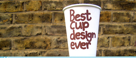
This is a slightly off-format entry, I have to admit. It’s not a redesign, it’s not about a logo, and it’s not quite about packaging, at least not mass consumer packaging. But it is about branding at a relatively micro level, which may speak more directly to the kinds of clients the majority of us work on from day to day. So, this is a peek at the work that UK-based designer and illustrator Jim Smith has created over the past decade for Puccino’s, a coffee retailer with franchise locations around the UK that has differentiated itself through humor and an off-beat attitude. And it has been the cups, in-store graphics and myriad little packages that have fully given Puccino’s its unique brand through a consistent style, approach and tone of voice. Following is a brief interview with Jim who has just designed six, brand new cups.
Continue reading this entry
DATE: Nov.14.2008POSTED BY: ArminCATEGORY: Retailers COMMENTS:
TAGS:


Books about logo design, the designers that create them and the meaning of branding.
