


Online
- FPO (For Print Only) / Celebrating the reality that print is not dead by showcasing the most compelling printed projects.
- Art of the Menu / Cataloguing the underrated creativity of menus from around the world.
- Quipsologies / Chronicling the most curious, creative, and notable projects, stories, and events of the graphic design industry on a daily basis.
- Speak Up (2002 – 2009) / Discussing, and looking for, what is relevant in, and the relevance of, graphic design. Archives Only.
- Word It (2003 – 2010) / Encouraging creative diversity in the community through monthly, one-word challenges. Archives Only.
- Brand New Classroom (2010 – 2011) / Providing a space for critique and opinions on student identity work. Archives Only.
Publishing
- The 2010 Brand New Awards / 2011, self-published.
- Flaunt: Designing effective, compelling and memorable portfolios of creative work / 2010, self-published.
Events & Judged Competitions
- Brand New Conference / A one-day event on the development of corporate and brand identity projects by some of today’s most active and influential practitioners from around the world.
- Brand New Awards / Celebrating the best identity work produced around the world.
- FPO Awards / Celebrating the best print work from around the world.
Writing
- Graphic Design, Referenced: A Visual Guide to the Language, Applications, and History of Graphic Design / 2009, Rockport.
- Women of Design: Influence and Inspiration from the Original Trailblazers to the New Groundbreakers / 2008, HOW Books.
- The Word It Book: Speak Up Presents a Gallery of Interpreted Words / 2007, HOW Books.
Graphic Design
- Department of Design / Designing corporate and brand identities and full development of printed and digital matter for clients.

Opinion BY Armin
Don’t Mind the Gap, or the Square
![]()
Established in 1969 in San Francisco, Gap is one of the most popular American clothing brands — net sales of $3.8 billion in 2009 can attest to it. With 1,140 stores in the U.S. and almost 300 more abroad, Gap pushes simple and unfuzzy clothing at very reasonable prices and of very reasonable quality. Through their advertising they have established a cool, breezy, and sophisticated brand visual language that ties everything together nicely and, until now, their logo was the perfect little bow to keep it all together. Without any fanfare, Gap rolled out a new logo yesterday. When I first saw it I thought it would just be a seasonal change, but now there is little doubt it’s a new logo: the file on their website is called newlogo.png.
Continue reading this entry

DATE: Oct.06.2010 POSTED BY: ArminCATEGORY: Retailers COMMENTS:

TAGS: blue, helvetica, retail, sans serif,

Opinion BY Armin
Textile Exposé
![]()
Established in 1973, Hemtex is the leading store of home textile products in the Nordic region with 189 stores in Sweden (where it has the most at 143), Finland, Denmark, Norway and Estonia. Hemtex produces, designs, and/or commissions most of its products, while others are carefully selected from existing inventory. Its range spans everything from towels, to pillows, to curtains in playfully minimalist patterns and simple color palettes. Hemtex recently introduced a new identity designed by Stockholm Design Lab.
Continue reading this entry
DATE: Sep.22.2010POSTED BY: ArminCATEGORY: Retailers COMMENTS:
TAGS: sans serif, stockholm design lab, sweden, texture,
Opinion BY Armin
Eat! Organic! Mouths!
Opened in 2009 as one of the most committed and focused stores in providing organic and environmentally conscious products — from produce to laundry detergent to milk — in Stockholm, Hermans Ekohandel has grown in popularity and in ambitions, leading it to redesign its identity and rename its store, to Eat! Ekoaffären, with the help of Stockholm-based Bedow Creative.
Continue reading this entry
DATE: Jul.21.2010POSTED BY: ArminCATEGORY: Retailers COMMENTS:
TAGS: bedow creative, illustration, script, sweden,
Opinion BY Armin
Snake Lettering
If there is a reason to run your own blog is so that you can break your own rules when you please. For the most part, we cover big, national and global organizations or, at the very least, regional ones here on Brand New — the only way for a relatively unknown, small organization to get on here is, as stated in our selection criteria, to be “a very compelling design story.” Snakes make for very compelling design stories. Heading south from downtown Austin, Texas into the über-cool area of South Congress, the very first shop that you see is Luther’s. Barely a year old, Luther’s is an apparel and accessories shop for bad-ass (or wannabe bad-asses) men and women, carrying hardcore jeans, boots, shirts, fedoras and a range of products like hair pomade that are, literally, impossible to find anywhere else in Texas. And the decor, set against exposed brick, is all Texas Rock ‘n’ Roll. This past Friday, the fine folks at House Industries passed through our little town to open an exhibit they set up at Luther’s and they took the opportunity to give the store a little more attitude with a revised logo.
Continue reading this entry
DATE: Apr.14.2010POSTED BY: ArminCATEGORY: Retailers COMMENTS:
TAGS:
INTL. REVIEW BY Paul Vickers POSTED BY Brand New
En Garde, Bad Logos
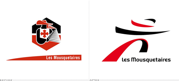
Les Mousquetaires (The Musketeers), is a leading French super and hypermarket chain founded in 1969, employing 130,000 people across Europe in over 4,000 stores, with a turnover of €35 million (US$47 million) in 2008. The name is, of course, a direct reference to Alexandre Dumas’ 19th century novel about the adventures and escapades of a group of sword fighting, good living, soldier friends in the reign of Louis 13th of France. The Musketeers are synonymous of friendship, adventures and the good life in France and are part of popular culture, an association this supermarket has happily adopted.
Continue reading this entry
DATE: Mar.05.2010POSTED BY: Brand NewCATEGORY: Retailers COMMENTS:
TAGS:
INTL. REVIEW BY ANDREW SABATIER POSTED BY Brand New
Facing Another Smile
Argos is the largest general merchandise and home retailer in the UK with a network of 750 stores throughout Great Britain and Northern Ireland. Known mostly for a catalogue-based selling system, Argos is a multi-channel retailer that lays claim to a 30-year heritage and defined by a unique retail experience. Argos is a high volume, fast-paced and highly effective commercial goods delivery mechanism, servicing more than 130 million customers per year and boasting an annual turnover over £4 billion (US$6 billion). A lightweight brand, Argos is most certainly not.
Continue reading this entry
DATE: Mar.03.2010POSTED BY: Brand NewCATEGORY: Retailers COMMENTS:
TAGS:
Opinion BY Armin
Caribou Coffee Leaps into the Future
When it comes to coffee retail chains, it’s easy to think of Starbucks as the number one, but who exactly is number two? Until this morning, as I sipped my Starbucks coffee, I would have never guessed it was Caribou Coffee, with nearly 500 locations in 16 U.S. states (compared to the 11,000-plus of Starbucks). Originally established in Minneapolis in 1992, Caribou’s main presence is in the Midwest and some lower East Coast states. I have, literally, gone into a Caribou only once in Atlanta and it was a fairly convincing experience as the brand relies heavily in a kind of ski lodge environment and look that makes you feel cozy and warm. The coffee wasn’t bad either. Over the weekend, Caribou announced a new identity crated by Minneapolis-based Colle+McVoy.
Continue reading this entry
DATE: Mar.01.2010POSTED BY: ArminCATEGORY: Retailers COMMENTS:
TAGS:
Opinion BY Armin
Carrefour Fades (to Color)
With more than 15,000 stores in 35 countries generating more than 100 billion Euros in sales, the French supermarket chain Carrefour is undeniably one of the world’s most prominent retailers and purveyors of, to put it simply, good stuff at decent prices. Unflinching in its identity design, the icon and typography have remained consistent since 1966 — only nine years after Carrefour’s launch — when the C-in-a-diamond icon made its appearance next to a typewriter-style wordmark. This September 4th, along with a new campaign titled “Positive is Back,” Carrefour has introduced a new wordmark and a slightly modified icon.
Continue reading this entry
DATE: Sep.08.2009POSTED BY: ArminCATEGORY: Retailers COMMENTS:
TAGS:
Opinion BY Armin
“The Shack”? Aw, Shucks
With apologies to any real advancements and actual inventory at Radio Shack, but the first thing that comes to mind when I think of Radio Shack is old or rudimentary technology: the Walkman, phone chord extensions and weird adapters you never knew existed or were needed, among other remnants from 1980s electronic consumer products. My brand impression of Radio Shack is a brand that never made the jump to the twenty-first century and, caught between becoming a hardware manufacturer or product retailer, it never caught on to the likes of Best Buy and Circuit City nor Dell, Gateway and much less Apple. In an effort to get out of this funk, Radio Shack launched yesterday a new marketing initiative to position itself as The Shack. “Our friends,” they claim “call us the Shack.” With friends like that, who needs enemies?
Continue reading this entry
DATE: Aug.07.2009POSTED BY: ArminCATEGORY: Retailers COMMENTS:
TAGS:
BY Armin
Sexy Serifs
![]()
Let’s boil this down to simple facts to get started. Victoria’s Secret = Sexy. Trajan = Not Sexy. I assume I do not need to delve into the sexyness of Victoria’s Secret and as far as Trajan’s lack of sexiness, well, it’s really not its fault but its overuse suffered throughout the years. The problem with using Trajan as the logo for Victoria’s Secret is that it is no different than, say, Will Smith’s I am Legend or a hundred other movie posters. Mucca Design has evolved the logo of Victoria’s Secret to something that’s more unique and well crafted, taking the basic letterforms of Trajan and finessing them ever so slightly. And amazing how looser tracking adds elegance to small caps.
Continue reading this entry
DATE: Jun.22.2009POSTED BY: ArminCATEGORY: Retailers COMMENTS:
TAGS:


Books about logo design, the designers that create them and the meaning of branding.
