


Online
- FPO (For Print Only) / Celebrating the reality that print is not dead by showcasing the most compelling printed projects.
- Art of the Menu / Cataloguing the underrated creativity of menus from around the world.
- Quipsologies / Chronicling the most curious, creative, and notable projects, stories, and events of the graphic design industry on a daily basis.
- Speak Up (2002 – 2009) / Discussing, and looking for, what is relevant in, and the relevance of, graphic design. Archives Only.
- Word It (2003 – 2010) / Encouraging creative diversity in the community through monthly, one-word challenges. Archives Only.
- Brand New Classroom (2010 – 2011) / Providing a space for critique and opinions on student identity work. Archives Only.
Publishing
- The 2010 Brand New Awards / 2011, self-published.
- Flaunt: Designing effective, compelling and memorable portfolios of creative work / 2010, self-published.
Events & Judged Competitions
- Brand New Conference / A one-day event on the development of corporate and brand identity projects by some of today’s most active and influential practitioners from around the world.
- Brand New Awards / Celebrating the best identity work produced around the world.
- FPO Awards / Celebrating the best print work from around the world.
Writing
- Graphic Design, Referenced: A Visual Guide to the Language, Applications, and History of Graphic Design / 2009, Rockport.
- Women of Design: Influence and Inspiration from the Original Trailblazers to the New Groundbreakers / 2008, HOW Books.
- The Word It Book: Speak Up Presents a Gallery of Interpreted Words / 2007, HOW Books.
Graphic Design
- Department of Design / Designing corporate and brand identities and full development of printed and digital matter for clients.

A B-Side BY Armin
Johns Hopkins University
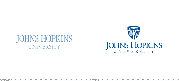
About: (Est. 1876) Johns Hopkins University (informally Johns Hopkins, JHU, or just Hopkins) is a not-for-profit private research university based in Baltimore, Maryland. The university was founded on January 22, 1876, and named for its benefactor, the philanthropist Johns Hopkins. Johns Hopkins maintains campuses in Maryland; Washington, D.C.; Italy; China and Singapore. Johns Hopkins pioneered the concept of the modern research university in the United States and has ranked among the world’s top of such universities throughout its history. As of 2011, thirty-seven Nobel Prize winners have been affiliated with Johns Hopkins, and the university’s research is among the most cited in the world. (Source: Wikipedia).
Design by: N/A.
Ed.’s Notes: Could be worse, I guess. The elements in the shield all seem to come three different logos (or clip art libraries). A few applications below (or after the jump).
Relevant links: Announcement.
Select quote: “The final design for the main university logo is based on existing iconography and is rooted in the official academic seal. The book represents knowledge and discovery, the globe symbolizes the university’s worldwide reach, and the crest of Lord Baltimore indicates the university’s connection to its community. Some schools and divisions, like the Bloomberg School of Public Health and the Applied Physics Laboratory, feature their own unique graphics, enclosed within a shield shape that is common to all the logos.”
Continue reading this entry

DATE: Jun.13.2013 POSTED BY: ArminCATEGORY: Education The B-Side COMMENTS:

TAGS: blue, serif, shield, university,

A B-Side BY Armin
West Chester University
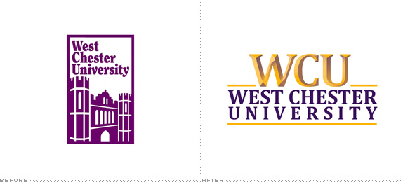
About: (Est. 1812) “West Chester University has evolved into a comprehensive university which excels in teacher education, business, health, natural and social sciences, music and the arts. Ranked among Kiplinger’s 100 best values in public colleges for its academic quality and affordability, the University is committed to providing access and serving the educational needs of a diverse student body. The second-largest school in Pennsylvania’s State System of Higher Education and the fourth-largest university in the Philadelphia area, West Chester is a leading resource and partner in fostering the region’s economic, social and cultural vitality. Its 400-acre campus is situated in the beautiful, historically significant Brandywine Valley. Today, West Chester University offers more than 80 undergraduate and 70 master’s degree and graduate certificate programs.”
Design by: Erica Thompson with help from graphic designer, Joan Lordan.
Ed.’s Notes: I don’t know what’s worse, the cheap chiseled effect or the horrendous tracking difference between “West Chester” and “Uiversity”? Why choose. Both are. A few different views of the logo below (or after the jump).
Relevant links: WCU New Logo Unveiling.
Select quote: “In spring 2012, concurrent with the strategic planning process, Dr. Greg Weisenstein, president, invited the Marketing Committee to develop a new logo for West Chester University to give WCU’s main graphic image a fresh, updated look.”
Continue reading this entry
DATE: May.16.2013POSTED BY: ArminCATEGORY: Education The B-Side COMMENTS:
TAGS: chisel, university,
Opinion BY Armin
Oklahoma City University
![]()
About: (Est. 1904) “Oklahoma City University is a coeducational, urban private university located in Oklahoma City, in the Uptown district. The university is affiliated with the United Methodist Church and offers a wide variety of degrees in the liberal arts, fine arts, sciences and business. The only Oklahoma institution listed in the top tier of the regional, master’s-level university category by U.S. News and World Report, Oklahoma City University is also listed in Forbes’ “Best Christian Colleges” & “100 Best College Buys.”“
Design by: Pentagram (DJ Stout, Austin).
Ed.’s Notes: It’s definitely an improvement but it’s hard to associate that kind of star drawing with higher education than Hollywood/Entertainment industry. Type is super pretty though. A few application image below (or after the jump) and more at the link.
Relevant links: Pentagram case study.
Select quote: “Before Stout and Delgado redesigned it, OCU’s primary logo featured a silhouetted likeness of the university’s iconic Gold Star Tower, a 286-foot red brick tower built in 1953 to honor Methodists who died in World War II. The tower, an Oklahoma City landmark located prominently in the center of campus, is topped off with a 200-pound star positioned at the end of a long pole like a star on a Christmas tree. ‘OCU’s sports teams are called The Stars after the Gold Star Tower, and many of the university’s celebrity alumni, like the Tony Award-winning Kristin Chenoweth, are singers and dancers and ‘stars’ of the stage,’ says Stout. ‘So it only seemed natural to turn their static star into a dancing star, with just a hint of the long pole it’s attached to at the top of that building.’”
Continue reading this entry
DATE: May.10.2013POSTED BY: ArminCATEGORY: Education The B-Side COMMENTS:
TAGS: blue, pentagram, serif, star, university,
Opinion BY Armin
UConn’s Academics and Athletics Come Together
![]()
Established in 1881, the University of Connecticut is one of the leading public research universities in the U.S., attracting over 30,000 students to its six campuses. Additionally, its athletics team, the Huskies, have won 15 NCAA national team championships in the Division I, mainly through their women’s basketball team. Earlier this month the university first announced a new logo to be adopted organization-wide that would also reflect a marketing name change to UConn and later introduced a revised athletics identity, both designed by — guess who? — the Nike Graphic Identity Group.
Continue reading this entry
DATE: Apr.25.2013POSTED BY: ArminCATEGORY: Education COMMENTS:
TAGS: athletics, mascot, nike, university,
A B-Side BY Armin
Suffolk University
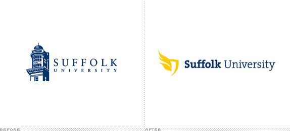
About: (Est. 1906) “Suffolk University is a private, non-sectarian, university located in Boston, Massachusetts and with 9,192 students (includes all campuses, 8,891 at the Boston location alone), it is the eighth largest university in Metro Boston. It was founded as a law school in 1906 and named after its location in Suffolk County, Massachusetts.” (Source :Wikipedia)
Design by: In-house.
Ed.’s Notes: That’s one awkward icon. Is it flames? Wings? Feathers? Lettuce leaves? Type is nice. One more image of the logo with department lock-ups below (or after the jump).
Relevant links: Suffolk University brand guidelines (PDF). Suffolk Journal article.
Select quote: “This new brand system gives us the tools to build a more unified and dynamic university image,” said Greg Gatlin, Vice President of Marketing and Communications. “That will help us with marketing the university, recruiting, fundraising, communicating to current students, prospective students, alumni, employees, you name it. It’s more than just a logo. It’s a whole system of color, photography, typography, language. It’s really a new way of communicating who we are. The idea is to elevate the university’s brand and bring more people into the conversation.”.
Continue reading this entry
DATE: Apr.11.2013POSTED BY: ArminCATEGORY: Education The B-Side COMMENTS:
TAGS: shield, slab serif, university, wings,
A B-Side BY Armin
Gdańsk University of Technology
![]()
About: (Est. 1945) “The Gdańsk University of Technology (pol. Politechnika Gdańska) is a technical university in Gda?sk-Wrzeszcz, and one of the oldest universities in Poland. It has nine faculties and more than 24 thousand undergraduate, as well as about 400 doctoral students. In 2004 it employed 2500 people, including 1200 academics.” (Source: Wikipedia)
Design by: mamastudio.
Ed.’s Notes: It’s nice to know that it’s not only U.S. students that act all douchey and oppose university logos just because. (See Facebook link below). It’s even more annoying when the logo is actually good: those lion drawings are pretty sweet. Bigger view of the logo below (or after the jump).
Relevant links: Facebook logo opposition page. Press Release (in Polish).
Select quote (Google translated): “Decorative form of lions holding a shield replaced with a regular rhythm figures geometric contour lines. Silhouette of lions and a list of the initials of the name of the university with the emblem of the city of Gdansk in the shield are inseparable, linked at the level of the whole symbolic and figurative meaning.”
Continue reading this entry
DATE: Apr.02.2013POSTED BY: ArminCATEGORY: Education The B-Side COMMENTS:
TAGS: angle, blue, poland, university,
Opinion BY Armin
Executive Flock
![]()
Launched in 1999, the Executive Master of Science in Communications Management program (EMScom for short) is a 20-month, international part-time program for mid-career professionals at the Faculty of Communication Sciences in the Università della Svizzera Italiana in the Italian-speaking, and Italy-bordering city of Lugano, Switzerland. EMScom “prepares professionals in developing new perspectives in key management areas, including management of stakeholder relationships, public relations, reputation management, and corporate identity on a strategic level — all with the ultimate goal of enabling communicators to go beyond simply communication and to contribute to their organization’s corporate strategy.” Considered a leader in its field and wanting to raise their international profile, EMScom introduced a new identity designed by Moving Brands around the narrative of “Change your perspective” which highlights the “transformational process, both personally and professionally, that stakeholders identified as essential to the course.”
Continue reading this entry
DATE: Mar.18.2013POSTED BY: ArminCATEGORY: Education COMMENTS:
Opinion BY Armin
Follow-up of Follow-up: University of California
It’s official. The University of California has issued a press release confirming that they have revoked their new logo.
This controversy has created a major distraction for the UCOP External Relations Division as it pursues its broader mission: communicating to all Californians the vital contributions UC makes to the quality of their lives and the prosperity of the state.
The controversy has been fueled in large part by an unfortunate and false narrative, which framed the matter as an either-or choice between a venerated UC seal and a newly designed monogram.
Therefore, I have instructed the communications team to suspend further use of the monogram. For certain applications, this process could require a measure of time to complete. In due course, we will re-evaluate this element of the visual identity system.
— Daniel M. Dooley, senior vice president for external relations at the University of California Office of the President
Way to go 50,000-plus people. You win. Happy now? By next week you’ll have forgotten about even signing the petition but, in the course of that, you have caused irremediable damage in the confidence of the leadership team at UC to even consider doing anything new or different anytime soon that would potentially help improve your university system to succeed. Enjoy your seal.
DATE: Dec.14.2012POSTED BY: ArminCATEGORY: Education COMMENTS:
TAGS: controversy, university,
Opinion BY Armin
Follow-up: University of California
Although I prefer to never deviate from the format of our posts on Brand New — critiques of Before/After or New logos/identities — and keep things simple there is a bunch of stupidity going on right now about the recently released logo and identity for the University of California (UC) that deserves a response. (Read my original review here.) To summarize: A petition on Change.org, currently boasting over 50,000 supporters, is demanding that UC either keep the seal as its main logo or design a new logo to replace the new logo. Parallel to the petition, various news outlets (online and in print) have written about the petition and mostly skewed the conversation as to how bad this logo is; some going as far as calling it “one of the worst logo rebrands in history”. You can find all the relevant links in the aptly titled Facebook page, Stop the UC Logo Change. If you only read this paragraph and happen to be either in favor of the petition or have signed the petition and further expanded your thoughts and put them in writing of why this logo is so bad, here is what you need to know: shut up. Seriously. Shut. Up.
Continue reading this entry
DATE: Dec.12.2012POSTED BY: ArminCATEGORY: Education COMMENTS:
TAGS: rant,
A B-Side BY Armin
Vancouver Community College
![]()
About: (Est. 1965) “Vancouver Community College is a public community college in Vancouver, British Columbia, Canada. It is the largest and oldest community college in British Columbia, with over 140 certificate and diploma programs.[1] VCC has two campuses, Broadway and Downtown, both located in the city of Vancouver. The college accommodates 26,000 students each year from a variety of nations, about 8 percent of whom are international students.” (Source: Wikipedia)
Design by: N/A.
Ed.’s Notes: Very swooshy, sparkle-dusty video below (or after the jump) and a quote from the press release that pretty much explains it all.
Relevant links: Press release.
Select quote: “The logo development, part of VCC’s 2011 - 2014 Strategic Plan, included considerable input from internal and external groups, including staff, faculty, students, administrators, as well as stakeholders from business, industry and the community. The final logo selection represents the voices and insights of over 700 individuals.” (Emphasis mine).
Continue reading this entry
DATE: Dec.05.2012POSTED BY: ArminCATEGORY: Education The B-Side COMMENTS:
TAGS: sans serif, square, swoosh,


Books about logo design, the designers that create them and the meaning of branding.
