


Online
- FPO (For Print Only) / Celebrating the reality that print is not dead by showcasing the most compelling printed projects.
- Art of the Menu / Cataloguing the underrated creativity of menus from around the world.
- Quipsologies / Chronicling the most curious, creative, and notable projects, stories, and events of the graphic design industry on a daily basis.
- Speak Up (2002 – 2009) / Discussing, and looking for, what is relevant in, and the relevance of, graphic design. Archives Only.
- Word It (2003 – 2010) / Encouraging creative diversity in the community through monthly, one-word challenges. Archives Only.
- Brand New Classroom (2010 – 2011) / Providing a space for critique and opinions on student identity work. Archives Only.
Publishing
- The 2010 Brand New Awards / 2011, self-published.
- Flaunt: Designing effective, compelling and memorable portfolios of creative work / 2010, self-published.
Events & Judged Competitions
- Brand New Conference / A one-day event on the development of corporate and brand identity projects by some of today’s most active and influential practitioners from around the world.
- Brand New Awards / Celebrating the best identity work produced around the world.
- FPO Awards / Celebrating the best print work from around the world.
Writing
- Graphic Design, Referenced: A Visual Guide to the Language, Applications, and History of Graphic Design / 2009, Rockport.
- Women of Design: Influence and Inspiration from the Original Trailblazers to the New Groundbreakers / 2008, HOW Books.
- The Word It Book: Speak Up Presents a Gallery of Interpreted Words / 2007, HOW Books.
Graphic Design
- Department of Design / Designing corporate and brand identities and full development of printed and digital matter for clients.

In Brief BY Armin
In Brief: End of March Miscellany
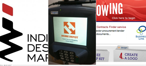
I had planned on writing a regular critique today, but the admin tasks of the Awards have overtaken UCllc headquarters. To tide you over for the end of the month here are three juicy bits, two of them involving funny business practices, and not funny-ha-ha.
Continue reading this entry

DATE: Mar.31.2011 POSTED BY: ArminCATEGORY: In Brief COMMENTS:


In Brief BY Armin
In Brief: March Miscellany
To start the month, some random bits from the world of identity.
Continue reading this entry
DATE: Mar.02.2011POSTED BY: ArminCATEGORY: In Brief COMMENTS:
In Brief BY Armin
In Brief: February Miscellany
Today you are getting another miscellany because of a major snowstorm in Austin, TX — three quarters of an inch! — that will put both of my daughters at home all day so every minute counts and must be optimized, meaning I can’t spend the necessary time on a proper review this morning. Still, some juicy things to keep you entertained this Friday.
Continue reading this entry
DATE: Feb.04.2011POSTED BY: ArminCATEGORY: In Brief COMMENTS:
In Brief BY Armin
In Brief: January Miscellany
To end the week, and almost the month, I am unloading three brand related stories that were getting backlogged in my e-mail. (And, yes, I know about the new NBCUniversal logo and I’m waiting for clearance on some official images.)
Continue reading this entry
DATE: Jan.28.2011POSTED BY: ArminCATEGORY: In Brief COMMENTS:
TAGS: esquire, landor, urban outfitters,
In Brief BY Armin
Best. Logos. Ever?
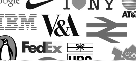
As a mid-week break from the routine we have a cross-blog, cross-media collaboration for you. The focus of the April issue of Creative Review will be “Dedicated to the art of logo design” and they have taken on the subjective challenge of making a definitive list of the Best 20 Logos Ever. They will ask for “the expert opinion of designers, academics and critics who will ultimately help us come up with 20 of the world’s greatest logo designs” but first, they need everyone’s opinion. They have already asked their early-rising European readers to nominate their Top 5 logo designs of all time. Now it’s time for Brand New readers to bring it. What are your Top 5 logos of all time?
UnderConsideration’s own five nominations are part of the experts opinions, so we will reveal those once the definitive list has been made. Plus, we haven’t come up with our nominations. It’s hard!. But if you are interested in a quick scan of what’s on our first draft: FedEx / BP / CN (Canadian National) / New Haven Railroad / Obama ‘08 Campaign / Playboy / International Paper / Batman / IBM / et al.
DATE: Jan.12.2011POSTED BY: ArminCATEGORY: In Brief COMMENTS:
TAGS:
In Brief BY Armin
Make the Logo Suckier
![]()
Brand New readers it is time to put your money where your mouth is: Think you know what makes a logo suck? You certainly have no shortage of comments when you see it. It’s time to put theory to practice. In How Low Can Your Logo? design studio Fuzzco is “testing your capacity to willingly create that which you spend your entire life trying not to create: the worst logo ever.” The client is fake, Excellencico, who offers “integrated turn-key solutions to the ever-changing, world-class, international business marketplace.” The brief is fake, asking for “the logo convey the forward-thinking nature of our company without looking too futuristic or flashy but we also don’t want anything too conservative or neutral. ‘Just right’ is the vibe we are looking for.” Yes, it’s fake, but not unrealistic. After the audience votes on the worst, we will be judging along with Chris Erickson, Frank Chimero, Jessica Hische, Mikey Burton, and The Heads of State. (Worst judges ever.) So apply what you’ve learned here on Brand New and create the nastiest logo you can. For inspiration I leave you with my first paid logo (below or after the jump). It’s a good thing I can’t enter, because that would win by a landslide and I was trying to do a good logo.
Continue reading this entry
DATE: Nov.16.2010POSTED BY: ArminCATEGORY: In Brief COMMENTS:
TAGS: contest,
In Brief BY Armin
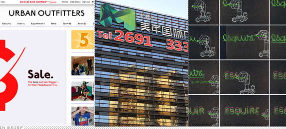
Too Urban Urban Outfitters
![]()
We received a lot of requests to review the logo currently adorning the header of the website of apparel, accessory and hipness retailer Urban Outfitters (UO) and as much as I hesitated to post it I think it’s worth getting it out of our system. I hesitated because this is not an identity change or, at the very least it is not being positioned as such by UO. I believe they change their website every three or four months, complete from the ground up, with new typographic treatments for their name. This iteration seems to have caught more attention because it’s not just really ugly but also because people are hungry for the next Gap-like meltdown. In contrast to the Gap, UO’s new look feels purposely ugly, it’s hip-ugly without a wink, and it shows that someone at UO subscribes to 032c magazine and its stretched typography aesthetic. The logo is only the tip of the iceberg on this. Everything on the new site follows the same annoying premises and it screams for attention to be noticed — again, unlike the Gap, where they expected people to just go about their business. In the spirit of “The Cult of the Ugly” I would urge everyone to consider this as a blip in the continuum of the UO identity and ride it out until the next iteration. But if you see your local UO changing their store sign to the above logo then, yeah, we’ll talk.
DATE: Nov.12.2010POSTED BY: ArminCATEGORY: In Brief COMMENTS:
TAGS: sans serif, urban outfitters,
In Brief BY Armin
Rebranding 101
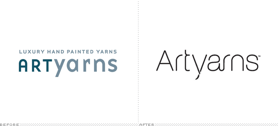
Although the above image indicates this is a typical “Before/After” it’s not really one. The redesigned Artyarns logo is one of three “brand makeovers” that small businesses have undergone through Project RE:Brand by American Express OPEN Forum which has paired them with a design firm or ad agency. This exercise is actually quite interesting, not so much because of the results — the above is the better of the three — but because it manages to cover many important aspects of a redesign that may be both unknown and scary for small businesses who are considering one. Each project comes with a case study as well as supporting articles that elaborate on topics like “Why Branding?” to “Tips for Competing in the Luxury Market.” These may not be the most groundbreaking white papers on our practice, but for the audience of American Express’ OPEN — small businesses and entrepreneurs — it’s perfect. Not too different from when you search for articles on how to repair a broken pipe under your sink: You would be better calling off a professional but at least you know where to start looking and learn to talk the same language. Or am I feeling too optimistic this morning?
DATE: Nov.09.2010POSTED BY: ArminCATEGORY: In Brief COMMENTS:
TAGS: case studies,
In Brief BY Armin
Follow-up: IHOP – KC
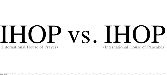
Last month we reported on the identity and application redesign of International House of Prayer (IHOP – KC) in Kansas City. Many were quick to note that the acronym was far too similar to that of the more broadly known IHOP, the International House of Pancakes. Well, it looks like many of you weren’t the only ones who found it disturbing. The pancake company has filed a lawsuit against the prayer organization for “trademark dilution and infringement,” causing “great and irreparable injury and confuses the public,” and of choosing the IHOP acronym with the “the intent being to misappropriate fame and notoriety of the food chain.” Is there merit in the lawsuit? Or should the pancakes speak for themselves and let the consumer decide between breakfast and prayer?
Thanks to Bryan Byczek for first tip.
DATE: Sep.17.2010POSTED BY: ArminCATEGORY: In Brief COMMENTS:
In Brief BY Armin
The Branding Comedy, Funny Only to those in Paradise
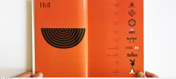
Based on Dante Alighieri’s The Divine Comedy, British designer Daniela Meloni has created the equally damning The Branding Comedy — as a project at the London College of Communication’s MA Graphic Branding and Identity program — placing well-known brands in the three rungs of the after-life: Hell, Purgatory, and Paradise. You can read the full document on Issuu or have a quick glimpse at Meloni’s Behance project page. Poor Linux.
DATE: Jul.26.2010POSTED BY: ArminCATEGORY: In Brief COMMENTS:
TAGS: branding,


Books about logo design, the designers that create them and the meaning of branding.
