


Online
- FPO (For Print Only) / Celebrating the reality that print is not dead by showcasing the most compelling printed projects.
- Art of the Menu / Cataloguing the underrated creativity of menus from around the world.
- Quipsologies / Chronicling the most curious, creative, and notable projects, stories, and events of the graphic design industry on a daily basis.
- Speak Up (2002 – 2009) / Discussing, and looking for, what is relevant in, and the relevance of, graphic design. Archives Only.
- Word It (2003 – 2010) / Encouraging creative diversity in the community through monthly, one-word challenges. Archives Only.
- Brand New Classroom (2010 – 2011) / Providing a space for critique and opinions on student identity work. Archives Only.
Publishing
- The 2010 Brand New Awards / 2011, self-published.
- Flaunt: Designing effective, compelling and memorable portfolios of creative work / 2010, self-published.
Events & Judged Competitions
- Brand New Conference / A one-day event on the development of corporate and brand identity projects by some of today’s most active and influential practitioners from around the world.
- Brand New Awards / Celebrating the best identity work produced around the world.
- FPO Awards / Celebrating the best print work from around the world.
Writing
- Graphic Design, Referenced: A Visual Guide to the Language, Applications, and History of Graphic Design / 2009, Rockport.
- Women of Design: Influence and Inspiration from the Original Trailblazers to the New Groundbreakers / 2008, HOW Books.
- The Word It Book: Speak Up Presents a Gallery of Interpreted Words / 2007, HOW Books.
Graphic Design
- Department of Design / Designing corporate and brand identities and full development of printed and digital matter for clients.

Opinion BY Armin
Sticks and Stones and Spikes
![]()
Scheduled to open in 2014, The Battle of Bannockburn project is a partnership between the National Trust for Scotland (NTS) and Historic Scotland to create a new visitor centre and landscaping at the site of the original battle of 1314 that, as described by NTS, is “one of the defining moments in Scottish history, [where] King Robert the Bruce routed the English forces of King Edward II to win a much-longed-for freedom for the Scots.” The identity for the project was designed by The Beautiful Meme with consultation from Bruno Maag of Dalton Maag; the logo was first released in July of 2012 and it just caught a second wind after winning the Best Identity of the Year at the UK’s Design Week Awards.
Continue reading this entry

DATE: Jun.10.2013 POSTED BY: ArminCATEGORY: Culture COMMENTS:


Opinion BY Armin
W FTW (for the Whitney)
![]()
Established in 1930, the Whitney Museum of American Art in New York is devoted to the art of the United States presenting a “full range of twentieth-century and contemporary American art, with a special focus on works by living artists.” Its permanent collection contains approximately 19,000 paintings, sculptures, prints, drawings, and photographs, representing more than 2,900 artists and is considered one of the finest in the world. Currently located on Madison Avenue at 75th Street since 1966, the Whitney will move to a Renzo Piano-designed building dozens of blocks south in the Meatpacking District facing the popular High Line in 2015. In preparation for this move, the museum has introduced a new identity designed by Amsterdam-based Experimental Jetset.
Continue reading this entry
DATE: May.22.2013POSTED BY: ArminCATEGORY: Culture COMMENTS:
TAGS: black, experimental jetset, flexible identity, museum, New York, stroke,
Opinion BY Armin
Hand Beats Filter in New Instagram Wordmark

Established in 2010 and hundreds of millions of photographs ago, Instagram is a “fun and quirky way to share your life with friends through a series of pictures”. Obviously, that’s an understatement. For its 100 million users, Instagram is as much part of life as texting and e-mailing and Facebook (who we all know paid a cool billion dollars to acquire Instagram in April of 2012 — who’s laughing now?) and its filters have established a new lingua franca for documenting food, clouds, and POV of places you are not in. Point being: Instagram is big. And important. Small changes are big changes. And its latest update, version 3.5, brought along with it a redesigned wordmark crafted by Denver, CO-based Mackey Saturday.
Continue reading this entry
DATE: May.06.2013POSTED BY: ArminCATEGORY: Culture COMMENTS:
Opinion BY Armin
Historic Houses Trust Presses Caps Lock Key
![]()
Established in 1980, the Historic Houses Trust of New South Wales in Australia protects and cares “for significant historic places, buildings, collections and landscapes with integrity, and enable people to enjoy and learn about them.” Along with twelve of the state’s most important historic houses, the trust also manages landscapes, a library and collections of paintings, furniture and objects. This month the trust announced it would be launching a new, public-facing brand under the name of Sydney Living Museums with the goal of increasing visits and awareness of this cultural institution. It will maintain Historic Houses Trust as the operational name. The new identity has been designed by Sydney-based Frost*.
Continue reading this entry
DATE: Apr.30.2013POSTED BY: ArminCATEGORY: Culture COMMENTS:
TAGS: australia, colorful, frost*, monogram, Sans Serif,
A B-Side BY Armin
Musée de la Civilisation
![]()
About: (Est. 1984) The Les Musées de la civilisation à Québec (Museum of Civilization of Quebec) is a museum located in Quebec City, Canada. “The Musée de la civilisation links the past, the present and the future. While remaining strongly rooted in the reality of Québec, it projects a new, attentive and dynamic outlook on all of human experience in its whole, and on civilizations from the world over.”
Design by: N/A.
Ed.’s Notes: Charlie Brown called, he wants his sweater stripe back. Kidding aside, decent evolution. Bigger view of the logo and sub-brands as well as introduction video below (or after the jump).
Relevant links: N/A.
Continue reading this entry
DATE: Apr.24.2013POSTED BY: ArminCATEGORY: Culture The B-Side COMMENTS:
A B-Side BY Armin
The Ringling
![]()
About: (Est. 1927) “The John and Mable Ringling Museum of Art [now just The Ringling] is the state art museum of Florida, located in Sarasota, Florida.Florida State University assumed governance of the Museum in 2000. [It] offers twenty-one galleries [and] more than 150,000 square feet have been added to the campus, which includes the art museum, circus museum, and Ca’ d’Zan, the Ringlings’ mansion, which has been restored, along with the historic Asolo Theater. New additions to the campus include the Visitor’s Pavilion, the Education, Library, and Conservation Complex, the Tibbals Learning Center complete with a miniature circus, and the Searing Wing, a 30,000-square-foot (2,800 m2) gallery for special exhibitions attached to the art museum.” (Source: Wikipedia)}
Design by: Wordlstudio.
Ed.’s Notes: This is exceedingly lame. Bigger view of the logo and how the logo works as sub-brands below (or after the jump).
Relevant links: Ringling “Our New Brand” page. Arts Sarasota story
Select quote: “The Ringling’s new brand identity captures the richness and diversity of its venues, collections and programs, as well as inspires curiosity and engagement from its visitors, members and community. It enhances the Ringling’s role as the cultural heart of Sarasota, the State Art Museum of Florida and one of the finest museums in the United States.”
Continue reading this entry
DATE: Apr.17.2013POSTED BY: ArminCATEGORY: Culture The B-Side COMMENTS:
TAGS: logo system, museum, serif,
Opinion BY Armin
Palestine Says
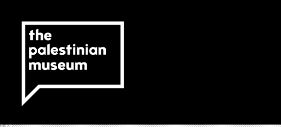
Breaking ground last week and set to open in the Fall of 2014 as a project of the Welfare Association, the Palestinian Museum in Birzeit, Palestine, is “dedicated to the exploration and understanding of the culture, history and society of Palestine and the Palestinian people.” Along with exhibits, the museum will engage in research, education programs, and cultural events through its hub in Birzeit as well as through local and international partnerships and its digital platform. The museum’s identity has been designed by London-based venturethree. An extended brochure can be found here (PDF).
Continue reading this entry
DATE: Apr.17.2013POSTED BY: ArminCATEGORY: Culture COMMENTS:
TAGS: black, museum, palestine, speech bubble, venturethree, white,
A B-Side BY Armin
Canberra 100
![]()
About: (Est. 1913) “Celebrating Canberra’s Centenary. In 2013, we mark 100 years since the naming of Canberra, our national capital and home of the Australian story. The Centenary of Canberra offers an opportunity for Australians to revisit and re-imagine their national capital — the city that tells the story of our country’s freedom, spirit, achievements and aspirations. Visit www.canberra100.com.au for the year-long program of celebrations.
Ed.’s Notes: As strange as this is, there is something appealing about it. Doesn’t mean I like it, but it does mean I don’t hate it. A few more applications below (or after the jump).
Relevant links: Canberra 100 site, Canberra 100 Logo Style Guide.
Select quote: “It has a contemporary feel which we believe will appeal to all Australians. It makes central use of a triangle, which references the triangles and circles at the heart of the Burley Griffin design, best displayed in Marion Mahony Griffin’s beautifully rendered ‘City and Environs’. It is also inspired by the iconic nature of new Parliament House which celebrates its 25th Anniversary in 2013. The font is New Johnston evolved from a popular sans-serif typeface from 1913. The logo is strong and clear with a simple message — Canberra and 100 years.”
Continue reading this entry
DATE: Apr.03.2013POSTED BY: ArminCATEGORY: Culture The B-Side COMMENTS:
TAGS: angle, australia, circles, Sans Serif,
Opinion BY Armin
Czech Radio Stripes Back
![]()
Established in 1923, Czech Radio (Český rozhlas) is the public radio broadcaster of the Czech Republic with four national stations — Czech Radio 1 - Radiozurnál (news, current affairs and music); Czech Radio 2 - Praha (entertainment and education); Czech Radio 3 - Vltava (cultural station); and Czech Radio 6 (analytics and current affairs) — as well as four specialized stations — Czech Radio Rádio Česko (news and current affairs), Czech Radio D-dur (classical music), Czech Radio Radio Wave (for young listeners), and Czech Radio Leonardo (popular educational service) — plus thirteen regional stations. In February Czech Radio introduced a new identity designed by Prague-based Marvil.
Continue reading this entry
DATE: Mar.28.2013POSTED BY: ArminCATEGORY: Culture COMMENTS:
TAGS: Czech Republic, radio, stripes,
Opinion BY Armin
ROM goes Portal on its Logo
![]()
Opened in 1914, the Royal Ontario Museum (ROM), an agency of the Government of Ontario, is Canada’s largest museum, with a dual focus on natural history and world cultures, attracting over one million visitors each year to its 30 galleries and six million objects in its collection. The museum is also well-known (and easily spotted) for its Daniel Libeskind-designed addition in 2007 that was part of an initiative dubbed “Renaissance ROM” for which the previous logo was designed. This week ROM introduced a new logo designed by New York, NY-based LaPlaca Cohen. (For a Government-owned museum, you know how much grief they must be getting for hiring Yanks.)
Continue reading this entry
DATE: Mar.21.2013POSTED BY: ArminCATEGORY: Culture COMMENTS:
TAGS: flexible identity, logo-as-window, museum, toronto,


Books about logo design, the designers that create them and the meaning of branding.
