


Online
- FPO (For Print Only) / Celebrating the reality that print is not dead by showcasing the most compelling printed projects.
- Art of the Menu / Cataloguing the underrated creativity of menus from around the world.
- Quipsologies / Chronicling the most curious, creative, and notable projects, stories, and events of the graphic design industry on a daily basis.
- Speak Up (2002 – 2009) / Discussing, and looking for, what is relevant in, and the relevance of, graphic design. Archives Only.
- Word It (2003 – 2010) / Encouraging creative diversity in the community through monthly, one-word challenges. Archives Only.
- Brand New Classroom (2010 – 2011) / Providing a space for critique and opinions on student identity work. Archives Only.
Publishing
- The 2010 Brand New Awards / 2011, self-published.
- Flaunt: Designing effective, compelling and memorable portfolios of creative work / 2010, self-published.
Events & Judged Competitions
- Brand New Conference / A one-day event on the development of corporate and brand identity projects by some of today’s most active and influential practitioners from around the world.
- Brand New Awards / Celebrating the best identity work produced around the world.
- FPO Awards / Celebrating the best print work from around the world.
Writing
- Graphic Design, Referenced: A Visual Guide to the Language, Applications, and History of Graphic Design / 2009, Rockport.
- Women of Design: Influence and Inspiration from the Original Trailblazers to the New Groundbreakers / 2008, HOW Books.
- The Word It Book: Speak Up Presents a Gallery of Interpreted Words / 2007, HOW Books.
Graphic Design
- Department of Design / Designing corporate and brand identities and full development of printed and digital matter for clients.

Opinion BY Armin
San Diego Zoo Gets Funky
![]()
Founded in 1916 the San Diego Zoo is one of the largest in the world, with “over 4,000 rare and endangered animals representing more than 800 species and subspecies” including a delicious (looking not tasting) panda. The San Diego Zoo, as a parent brand and non-profit organization, also operates the San Diego Zoo’s Wild Animal Park, and San Diego Zoo’s Institute for Conservation Research, and counts with more than 250,000 member households and 130,000 child memberships. Despite being all part of the same family, each entity had its own identity and it wasn’t clear that they were all fighting the same fight: Conservation. The San Diego Zoo has just introduced a new identity created by Landor that unifies the full San Diego Zoo organization under one visual identity and brand idea, “Ambassadors for Wildlife,” which grew out of the new tagline, “Wild at Heart.”
Continue reading this entry

DATE: Oct.27.2010 POSTED BY: ArminCATEGORY: Entertainment COMMENTS:

TAGS: custom, landor, large logo system, proprietary type, zoo,

Opinion BY Armin
The Many Layers of Oprah
![]()
In January of 2008 the mother of all talk show hosts, Oprah Winfrey, announced she would be launching her own network debuting in 2009. “The new multi-platform media venture,” read an ancient press release, “will be designed to entertain, inform and inspire people to live their best lives.” Then 2009 and 2010 happened and the network did not launch. But for those who are patiently waiting to be inspired to live their best lives the wait is now almost over. The Oprah Winfrey Network (OWN) will launch in January of 2011, coinciding a little bit better with Oprah putting a lid on her talk show, which goes off the air in late 2011 after 25 years of televised emotional tugs. OWN is set to replace the Discovery Health Channel and will be owned 50/50 by Discovery Communication and Oprah’s production company Harpo. Earlier this month OWN unveiled its new look. For the third time.
Continue reading this entry
DATE: Oct.26.2010POSTED BY: ArminCATEGORY: Entertainment COMMENTS:
TAGS: dimension, discovery communications, oprah, own,
Opinion BY Armin
I Want My Google TV
![]()
Google TV. It’s like a pizza rolled inside a burrito. Decadent, non-stop entertainment that brings together the web and the TV in the most seamless way possible yet. Announced in May, Google TV is now a consumer reality, with Sony shipping its internet-powered televisions, Google’s software included. As well as a couple of boxes by Sony and Logitech that allow you to add Google TV to an existing television. So things are now right in the world: You can watch YouTube clips of cats playing the piano in full HD. This past August, Google TV introduced the icon for its service.
Continue reading this entry
DATE: Oct.21.2010POSTED BY: ArminCATEGORY: Entertainment COMMENTS:
Follow-Up BY Armin
Follow-up: The Hub Launches
![]()
In February we reported on the logo for The Hub, a new channel launched by the partnership of Discovery Communications and Hasbro aimed at the 6 – 12-year-old demographic with programs like My Little Pony, Strawberry Shortcake, Transformers, and G.I. Joe. The Hub premiered this past Sunday on 10/10/10 with a very convincing on-air identity by Los Angeles-based Troika, who also developed the logo and have posted a nice case study on their site, some of it excerpted here.
Continue reading this entry
DATE: Oct.13.2010POSTED BY: ArminCATEGORY: Entertainment COMMENTS:
Opinion BY Christian Palino
The Virgin Left Behind
![]()
On July of this year, British Sky Broadcasting (BskyB) bought Virgin Media Television for £160m and in doing so acquired Virgin1, a channel offering programming like That 70s Show, I want to Work for Diddy, and Terminator: The Sarah Connor Chronicles (which achieved their highest viewing ratings). To help complete BskyB’s acquisition, they have rebranded Virgin1 to be Channel One.
Continue reading this entry
DATE: Oct.01.2010POSTED BY: Christian PalinoCATEGORY: Entertainment COMMENTS:
TAGS: loops, red, sans serif, television,
Opinion BY Armin
Wembley 2.0
![]()
As old stadiums around the world fall apart and new, shiny complexes with plenty of box suites and corporate naming rights rise, it’s the building as much as the memories within it that are demolished. And perhaps there isn’t an international venue as well known and famed as London’s Wembley Stadium, built in 1923 and host to world cup wins by the England national football team, the 1948 Summer Olympic Games, the Live Aid concert, and, um, WWF’s SummerSlam. All these happened before 2003, when Wembley was demolished giving way to a new version of Wembley that opened in 2007 with a design by Foster + Partners and Populous. Back in June Wembley introduced a new identity that spearheads their “four-year sponsorship programme,” an effort to look for a lead partner to pony up some money. The new identity has been designed by London-based Bulletproof.
Continue reading this entry
DATE: Sep.27.2010POSTED BY: ArminCATEGORY: Entertainment COMMENTS:
TAGS: illustration, london, sans serif, wembley,
Opinion BY Armin
Gazelephants in the Wild
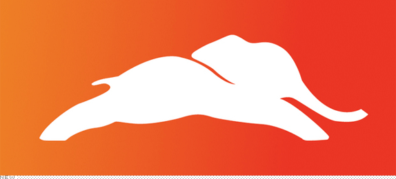
Launched earlier this month with a somewhat subdued splash, the RightNetwork is a new media company dedicated to the views of, well, The Right. The Republicans. The GOP. Presenting a “right-minded perspective that includes an entire spectrum of opinion from thoughtful and reserved to bold and brash” through original programming. It features Kelsey Grammer, aka Frasier Crane, as its spokesperson. Its content is available online and theoretically on TV, available on demand at relatively unpopular cable services like Verizon FiOS TV, Sky Angel, and Blue Ridge. And competing against other TV animals like NBC’s peacock, the RightNetwork is introducing the — wait for it — Gazelephant. “We wondered what would happen,” blogged Frasier, “if we combined the power of the largest land mammal on earth [and mascot of the Republican Party] with the agile, fast as all get-out, Gazelle.” Wonder no more readers.
Continue reading this entry
DATE: Sep.15.2010POSTED BY: ArminCATEGORY: Entertainment COMMENTS:
TAGS: elephant, mascot, monogram, orange, sans serif,
Guest Opinion by Mark Holtmann Posted BY Brand New
Two Triangles are Better than One
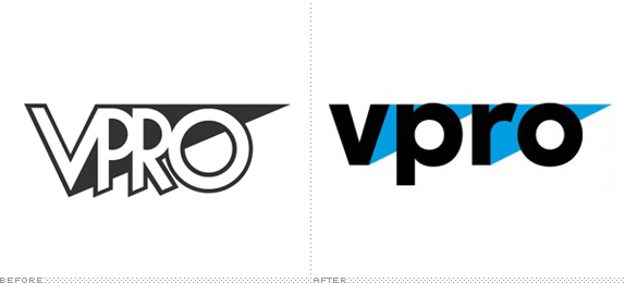
The Dutch public broadcasting organization VPRO (an acronym that translates into “Liberal Protestant Radio Broadcasting Company”) started its life in 1926 as a religious radio broadcaster. Over the years it became more liberal and less religious until, in the sixties, it planted itself firmly in the avant-garde by being the first television broadcaster showing a nude woman on national television. Since then the VPRO never left its nonconformist role, with slight stubbornness purposefully choosing those programs, topics and formats that the other broadcasting companies passed over. Although not well known outside of the Netherlands, the VPRO is the real deal. It continuously airs intelligent, cultural and quirky programs, the stuff that makes TV interesting.
Continue reading this entry
DATE: Sep.02.2010POSTED BY: Brand NewCATEGORY: Entertainment COMMENTS:
TAGS: flexible identity, sans serif, the netherlands, thonik, wordmark,
Opinion BY Armin
Cartoon Network Enters the Grid
Launched in 1992 by Atlanta-based Turner Broadcasting, the Cartoon Network was a godsend to, well, cartoon lovers with 24-hour cartoon programming, mostly re-runs. In the past few years, with original series and its hipster- and geek-attracting Adult Swim block in the wee hours of the night, Cartoon Network (CN) has become one of the most attractive and genuine channels on television. From its humble beginnings, CN is now broadcast in 166 countries. But its identity has been a little wobbly in the last two years or so with an initial switch from the well-known checkerboard logo to a short-lived, perspective acronym that, I’m guessing, didn’t fair too well as it just got shelved earlier this year when CN started to run a new on-air identity in May, designed by animation powerhouse Brand New School in collaboration with the talented in-house team at CN. This week a new range of on-air identity applications started to roll out.
Continue reading this entry
DATE: Aug.05.2010POSTED BY: ArminCATEGORY: Entertainment COMMENTS:
TAGS: animation, brand new school, cartoon network, on-air,
INTL. REVIEW BY Simon Wennberg POSTED BY Brand New
Who Let the Butterflies Out?
European broadcasters tend to place much focus on the brand of their respective parent corporation, which usually acts as an umbrella brand for all their outlets. This is very different from the American broadcasters where every network seems to be its own operation with loose branding ties within corporations (think MTV, VH1, etc. within Viacom). One weird aspect of the European model is that every once in a while the corporation makes a change in its identity which is then implemented on all its services. This means a sudden burst of rebrands of several television channels that either happen at once or over the course of a limited time-period. One recent example of this is Rai — short for Radiotelevisione Italiana, a state-owned public service broadcaster controlled by the Italian Ministry of Economy and Finance — which suddenly decided to give all its 13 channels new looks on May 18.
Continue reading this entry
DATE: Jun.07.2010POSTED BY: Brand NewCATEGORY: Entertainment COMMENTS:
TAGS: futura, Italy, large logo system, television,


Books about logo design, the designers that create them and the meaning of branding.
