


Online
- FPO (For Print Only) / Celebrating the reality that print is not dead by showcasing the most compelling printed projects.
- Art of the Menu / Cataloguing the underrated creativity of menus from around the world.
- Quipsologies / Chronicling the most curious, creative, and notable projects, stories, and events of the graphic design industry on a daily basis.
- Speak Up (2002 – 2009) / Discussing, and looking for, what is relevant in, and the relevance of, graphic design. Archives Only.
- Word It (2003 – 2010) / Encouraging creative diversity in the community through monthly, one-word challenges. Archives Only.
- Brand New Classroom (2010 – 2011) / Providing a space for critique and opinions on student identity work. Archives Only.
Publishing
- The 2010 Brand New Awards / 2011, self-published.
- Flaunt: Designing effective, compelling and memorable portfolios of creative work / 2010, self-published.
Events & Judged Competitions
- Brand New Conference / A one-day event on the development of corporate and brand identity projects by some of today’s most active and influential practitioners from around the world.
- Brand New Awards / Celebrating the best identity work produced around the world.
- FPO Awards / Celebrating the best print work from around the world.
Writing
- Graphic Design, Referenced: A Visual Guide to the Language, Applications, and History of Graphic Design / 2009, Rockport.
- Women of Design: Influence and Inspiration from the Original Trailblazers to the New Groundbreakers / 2008, HOW Books.
- The Word It Book: Speak Up Presents a Gallery of Interpreted Words / 2007, HOW Books.
Graphic Design
- Department of Design / Designing corporate and brand identities and full development of printed and digital matter for clients.

A B-Side BY Armin
Bolton Wanderers FC
![]()
About: (Est. 1874) “Bolton Wanderers Football Club is an English professional football club based in Horwich in the Metropolitan Borough of Bolton, who play in the Football League Championship. The club currently competes in the 2012-13 Championship, having been relegated from the Premier League at the end of the 2011-12 season, after finishing 18th.” (Source: Wikipedia)
Design by: N/A.
Ed.’s Notes: I guess it’s an improvement but, holy cow, that is some weird-ass typography.
Relevant links: Press release. Logo history.
Select quote: “The more modern, cleaner and dynamic design has been created following feedback from supporters, who expressed an overwhelming desire to see the long history of the club reflected in the crest. The new design sees the reintroduction of the Lancashire rose alongside the founding year of the club, 1877, in a reworking of the club’s popular crest from the late 1970s. The new crest’s compact design means it will be reproduced both more effectively and more prominently on a variety of Bolton Wanderers elements.
Thanks to Aaron Cotton for the tip.

DATE: Jun.26.2013 POSTED BY: ArminCATEGORY: The B-Side Sports COMMENTS:


Opinion BY Armin
Winter Olympics *
![]()
The XXIII Olympic Winter Games in 2018 will be hosted by Pyeongchang, South Korea after successfully winning the bid against Munich, Germany and Annecy, France and it will follow the 2014 Winter Games played in Sochi, Russia. In early May, the PyeongChang 2018 Organising Committee introduced the emblem for the Games, designed by Ha Jong-joo (no link available). All of the work is presented in a video included in this post (with some screen captures of the highlights for quick browsing) and a decent press release is available here.
Update: The logo was designed by Cheil Worldwide, with Ha Jong-joo as creative director. A couple more images have been added to the end of the post.
Continue reading this entry
DATE: Jun.19.2013POSTED BY: ArminCATEGORY: Sports COMMENTS:
TAGS: emblem, olympics, south korea, winter,
A B-Side BY Armin
Ottawa RedBlacks
![]()
About: (Est. 2010) “The Ottawa RedBlacks (French: Le Rouge et Noir d’Ottawa) are a CFL (Canadian Football League) franchise that has been awarded in the city of Ottawa, Ontario. […] The team will play at a remodeled Frank Clair Stadium, and will begin play in 2014 if construction remains on schedule.” (Source: Wikipedia).
Design by: N/A.
Ed.’s Notes:Compared to other CFL team logos this one is a champion. Compared to other sports logos, it’s about the same. Compared to clichés of Canada, this is, like not fucking polite at all. Bigger view of the logo and type-only version below (or after the jump).
Relevant links: CFL press release. SportsLogos.net story.
Select quote:“The REDBLACKS logo design pays tribute to our Ottawa football past by reviving the traditional “R” of the Rough Riders with a slight difference,” said REDBLACKS Governor and OSEG Partner John Ruddy. “The modern REDBLACKS “R” features two notches, which appear to have been cut with a saw, fused to a circular saw blade background. The blade represents many of the characteristics we hope our players will demonstrate; speed, unstoppable force, precision, balance, strong-as-steel and even dangerous. It also has a relationship to Ottawa’s founding as a lumber industry town.”
Continue reading this entry
DATE: Jun.12.2013POSTED BY: ArminCATEGORY: Sports The B-Side COMMENTS:
TAGS: canada, football, italic, slab serif,
A B-Side BY Armin
San Diego State Aztecs
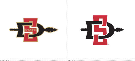
About: “The San Diego State Aztecs are the collegiate athletics and sports teams for San Diego State University (SDSU). San Diego State has organized programs for baseball, basketball, football, soccer, golf, gymnastics, rowing (crew), softball, tennis, track, swimming, diving, women’s volleyball, and water polo. The Aztecs compete in NCAA Division I. Its primary conference is the Mountain West Conference.” (Source: Wikipedia)
Design by: Osaki Creative Group.
Ed.’s Notes: Not much of a change in the main logo, but plenty of work done around secondary marks and consistent typography and other spear-y stuff. Plenty more images below (or after the jump).
Relevant links: Press release. SI.com. SDSU Logo and Style Guide (PDF).
Select quote: “A proliferation of identities and symbols creates confusion in the minds of audiences whose support we seek: students, prospective students, parents, alumni, athletes, and supporters. While logos and symbols are not the sole elements of an institutional ‘brand,’ they are its visual representation and extension. When that visual representation is disconnected or inconsistent, it follows that the perception of the institution can also become disconnected or inconsistent.
These are the reasons the SDSU logo identity has been streamlined, to minimize confusion and to strengthen the brand. SDSU has remained consistent with the brand by keeping the core symbol, the spear.
Aztec spears were long, wooden, and tipped with stone, obsidian or copper points. Among the favorite weapons the Aztecs used were the double-edged obsidian spears. The spear symbolizes offensive strength and power.”
Continue reading this entry
DATE: Jun.07.2013POSTED BY: ArminCATEGORY: Sports The B-Side COMMENTS:
Opinion BY Armin
Twinkle Twinkle Big Star
![]()
Originally established as the Minnesota North Stars in 1967, the Dallas Stars have been playing in the “Big D” since 1993 and are the only professional ice hockey team in Texas. They have won one Stanley Cup (in the 1998-99 season) but have missed the playoffs for the past five seasons. Looking to spice things up, the Stars unveiled its new uniforms and logo yesterday — although the logo leaked through the team’s mobile app at the end of May — designed by Reebok.
Continue reading this entry
DATE: Jun.05.2013POSTED BY: ArminCATEGORY: Sports COMMENTS:
A B-Side BY Armin
Everton FC
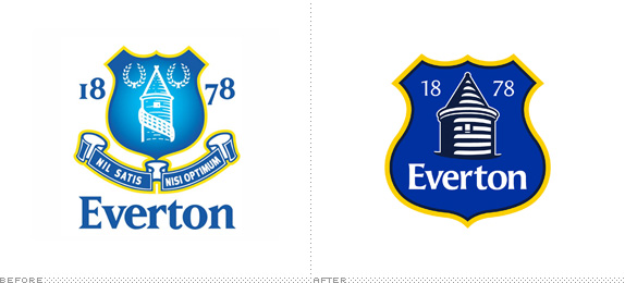
About: (Est. 1878) “Everton FC Everton Football Club is an English Premier League football club based in Liverpool. The club has competed in the top division for a record 110 seasons and have won the League Championship nine times. Everton have a rivalry with neighbors Liverpool F.C. and the two sides contest the Merseyside Derby. The club has been based at Goodison Park since 1892.” (Source: Wikipedia )
Design by: In-house.
Ed.’s Notes: A crappy logo gets less crappy. Fans complain. Organization freaks out. Apologizes. Promises to only use the logo for the next season then redesign it for the season after that with the help of its supporters. Dumbasses all of them: organization and fans. More images and links to the story below (or after the jump).
Relevant links: Evolution of the Crest. CreativeReview. Design Week on the Undo move.
Select quote: “Created following an extensive consultation process with fans, supporters’ groups and branding experts, our new Club Crest combines four historic elements of the outgoing Crest - the Tower, the shield, our name and the year of our formation - to form a concise, modern and dynamic representation of Everton.”
Continue reading this entry
DATE: Jun.03.2013POSTED BY: ArminCATEGORY: Sports The B-Side COMMENTS:
A B-Side BY Armin
American Athletic Conference
![]()
About: (Est. 2013) “The American Athletic Conference (sometimes shortened to The American) is an American collegiate athletic conference that will be established in 2013. Its charter member institutions are located primarily in the eastern and southern part of the United States. It will be headquartered in Providence, Rhode Island. The conference will participate in the National Collegiate Athletic Association (NCAA) Division I in athletic competitions; for football, it will be part of the Football Bowl Subdivision (FBS), formerly known as Division I-A.” (Source: Wikipedia).
Design by: N/A.
Ed.’s Notes: Pardon my French American, but holy shit, that is one terrible logo. Every single graphic decision here is wrong: Slab serif with like 12 different strokes? Wrong. Star with one point sticking out? Wrong. Individual circular gradient for each letter? So fucking wrong. Bigger view of another lock-up below (or after the jump).
Relevant links: Norwich Bulletin story. USA Today story.
Select quote:“It’s a bold look,” Aresco said. “Obviously this is a media world we live in, and we wanted to make sure we had the kind of mark that would be distinctive and would make an impact when people saw it. We wanted it to be something people would like and remember, but the notion really was to make it as simple as possible but also strong.”
![]()
Thanks to James I. Bowie for first tip.
DATE: May.31.2013POSTED BY: ArminCATEGORY: Sports The B-Side COMMENTS:
TAGS: gradient, ncaa, red-white-and-blue, slab serif,
In Brief BY Armin
AS Roma
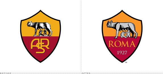
About: (Est. 1927) “Associazione Sportiva Roma (AS Roma), commonly referred to as simply Roma, is a professional Italian football (soccer) club based in Rome. Roma have won Serie A three times (in 1941-42, 1982-83 and in 2000-01) as well as winning nine Coppa Italia titles and two Supercoppa Italiana titles. AS Roma plays home games at the Stadio Olimpico (capacity 72,000+)—a venue they share with city rivals Lazio—which is the second largest of its kind in Italy.”
Ed.’s Notes: I don’t know about y’all but if I were the owner of the team I would have taken this opportunity to get rid of the cherubs sucking on the chupacabra’s tits. (I’m sure there is a logical explanation for it). (There is, obviously: it’s the story of Romulus and Remu). Also: Trajan? Et tu, Rome?
Relevant links: Press release.
Select quote: “The updated logo is a vibrant new take on AS Roma’s memorable crest, which has represented the Club since its inception. … AS Roma has tremendous brand equity that far outpaces that of nearly every European sports club. The Club has carefully evolved the logo to respect the past but represent the future.”
Continue reading this entry
DATE: May.30.2013POSTED BY: ArminCATEGORY: Sports The B-Side COMMENTS:
A B-Side BY Armin
Goal.com
![]()
About: (Est. 1958) “Goal.com is the world’s largest football website and is owned and powered by digital sports media business PERFORM. The success of the site is down to the hard work and dedication of over 400 editorial staff based in over 50 countries around the World who produce an average of 1,500 news stories per day in 15 languages across 22 editions. This unparalleled global reach and in-depth coverage of the world’s most popular game attracted over 23 million unique users in May 2011 (Source: Google Analytics) from more than 220 countries.”
Design by: Elmwood.
Ed.’s Notes: First, WTF was the old logo? Second, how awesome is the ™ symbol in a circle as the ball being kicked right into where it’s the hardest to stop?.
Relevant links: N/A.
Thanks to Nickolai Sukharev for first tip.
DATE: May.14.2013POSTED BY: ArminCATEGORY: Sports The B-Side COMMENTS:
TAGS: sans serif, soccer, uppercase,
Opinion BY Armin
Golden, Angry Bears
![]()
The University of California Athletic Department manages the 29 varsity athletic programs and various club teams of the University of California, Berkeley, that compete in the NCAA Division I in the Pac-12 Conference. The California Golden Bears (or just “Cal”) have won 82 national team titles in 15 different sports over its history and are consistently one of the winningest teams across all universities in the U.S., and its students have accrued 159 Olympic medals, 91 of which are gold, as participants in the Games. Last week, Cal introduced a new identity and uniforms designed by Nike’s Graphic Identity Group. (Yes, them again).
Continue reading this entry
DATE: Apr.16.2013POSTED BY: ArminCATEGORY: Sports COMMENTS:


Books about logo design, the designers that create them and the meaning of branding.
