
Opinion BY Armin
Gold Coast 2018 Bursting at the Seams
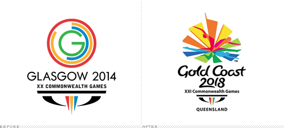
First celebrated in 1930, the Commnonwealth Games is an international, multi-sport event that occurs every four years and hosts athletes from the Commonwealth of Nations — 54 member states originally part of the British Empire — taking place in one of their cities. Certainly not as popular as the Olympics, but it is a significant sporting event for athletes and host cities. In 2018, the XXI Commonwealth Games will be played in the Gold Coast in Queensland, Australia. The emblem for the 2018 games was unveiled earlier this month and was designed by WiteKite (no website available).
Continue reading this entry

DATE: Apr.10.2013 POSTED BY: Armin
 CATEGORY: Sports
  COMMENTS:

TAGS: australia, burst, colorful, commonwealth,

Opinion BY Armin
WNBA Steps Inline
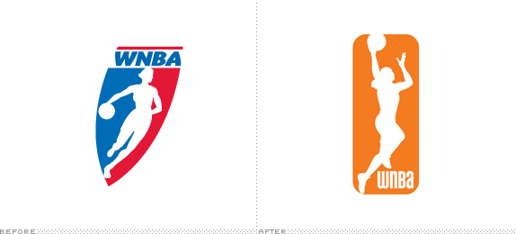
Established in 1996 when the NBA Board of Governors approved the concept of a women’s National Basketball Association, the WNBA began play in the summer of 1997 with eight teams and a few well-known stars at the time, like Sheryl Swoopes and Lisa Leslie. Four expansion teams have been added since and although attendance peaked in 1999 — with an average of 10,000 attendees per game — and dropping since, the WNBA is still considered the “most successful women’s professional team sports league in the world.” Last Thursday, the WNBA introduced a new logo and identity designed by New York, NY-based OCD | The Original Champions of Design. For a brief video of Laurel J. Richie, WNBA President (and 2010 Brand New Awards judge!), explaining the logo click here.
Continue reading this entry

DATE: Apr.08.2013 POSTED BY: Armin
 CATEGORY: Sports
  COMMENTS:

TAGS: basketball, inline, orange, original champions of design, wnba,

Opinion BY Armin
One Dog to Rule Them All
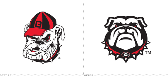
Established in the late 1890s, the Georgia Bulldogs are the athletic teams of the University of Georgia (est. 1785) and compete in the NCAA Division I and are members of the Southeastern Conference (SEC). The Bulldogs compete in 19 different sports and have won 39 national championships and 130 conference championships. To learn how serious the “’Dawgs” are about their sports: their football stadium seats 92,746 and is typically full. This week, the Bulldogs introduced a new identity system for the athletics program, designed by by Nike’s Graphic Identity Group.
Continue reading this entry

DATE: Apr.03.2013 POSTED BY: Armin
 CATEGORY: Sports
  COMMENTS:


Opinion BY Armin
Leaky Dolphins
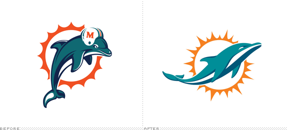
Established in 1966, the Miami Dolphins are part of the East Division of the American Football Conference in the National Football League (NFL) and are based in sunny Miami, FL. The Dolphins have won two Super Bowls, both in the early 1970s, and are the only team to have won all games in a single season but are best known for having Dan Marino as a QB for many years. Lately, not much has been noteworthy to the Dolphins until last December when a sketch of their new logo was leaked and then again in early March when another version was leaked until it was confirmed in late March that, indeed, a new logo was being introduced and unless they are leaked beforehand, new uniforms are set to appear later in April.
Continue reading this entry

DATE: Apr.02.2013 POSTED BY: Armin
 CATEGORY: Sports
  COMMENTS:


A B-Side BY Armin
Minnesota United FC
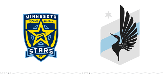
About: (Est. 2010) “Minnesota United FC represents the next era of professional soccer in the beautiful state of Minnesota. We are proud of who and what has come before us—from the raucous party that was the Kicks, the magical years the Thunder spent developing local talent, to the recent 2011 NASL Championship. Now we are excited for what the future holds. We seek to help the world’s game grow in the Twin Cities through strong play on the field and constant giveback off it.”
Design by: Zeus Jones.
Ed.’s Notes: Bigger view of the logo and sample applications below (or after the jump).
Relevant links: Zeus Jones case study. Minnesota FC United Press Release.
Select quote: “[We] whittled our many design ideas down into one that centered on Minnesota’s iconic loon, which has an active, aggressive nature that we thought was inspirational for a soccer team. The design also incorporates a star to tie to their past, as well as a blue stripe to represent the Mississippi river.”
Continue reading this entry

DATE: Mar.11.2013 POSTED BY: Armin
 CATEGORY: Sports The B-Side
  COMMENTS:


Opinion BY Armin
Leave it to Beaver (and Nike)
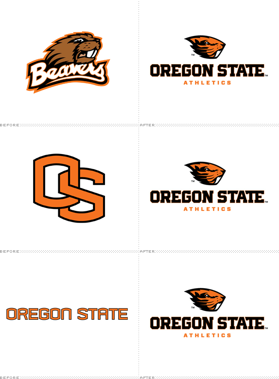
Playing in the NCAA’s Division I tier through the Pac-12 Conference — sorry non-Americans, I know that means absolutely nothing to you (not that I blame you and in the bigger picture it doesn’t really matter other than you should know that’s the higher echelon of college sports) — the Oregon State Beavers are the sports team of Oregon State University. They haven’t been overly successful in terms of winning — only three NCAA national championships in Wrestling, Cross Country, and Baseball — but they have big followings in their football and basketball programs. Yesterday, the Beavers introduced a new logo, identity system, and uniforms designed by Nike’s Graphic Identity Group. The new beaver and block typography will replace the old beaver (obviously) as well as the well-known “OS” monogram and typography (all shown in animated GIF form above).
Continue reading this entry

DATE: Mar.05.2013 POSTED BY: Armin
 CATEGORY: Sports
  COMMENTS:


A B-Side BY Armin
Paris Saint-Germain FC
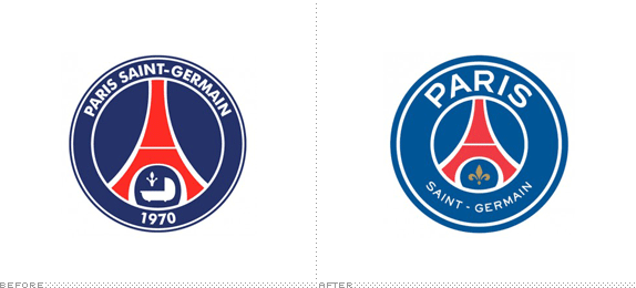
About: (Est. 1986) “Paris Saint-Germain Football Club, also known simply as Paris Saint-Germain and familiarly as Paris SG or PSG, is a professional association football club based in Paris, France. The club was founded on 12 August 1970, thanks to the merger of Paris FC and Stade Saint-Germain. PSG has been playing in the Ligue 1 since 1974, the current championship record, and is one of the most prestigious outfits in French football having won two League titles, eight French Cups, three League Cups and two Trophées des Champions.” (Source: Wikipedia)
Design by: Dragon Rouge
Ed.’s Notes: Meh (expressed with a French accent).
Relevant links: Press release. Dragon Rouge news with video
Select quote: “The city of light, which is an undisputed icon throughout the world, represents unparalleled leverage to propel Paris Saint-Germain up among the greatest global sporting brands. The new logo thus has the name ‘Paris’ clearly brought to the fore, with the Eiffel Tower at the heart of the logo. The base of the logo has the name ‘Saint Germain’ which continues to be associated with the brand, along with the fleur de lys emblem. The logo has a greater synthesis of ideas and a more immediate impact, and is now ideally placed to capture the imagination of football and sports fans around the world.”
Thanks to Plamen Jordanov for first tip.

DATE: Feb.25.2013 POSTED BY: Armin
 CATEGORY: Sports The B-Side
  COMMENTS:


Opinion BY Armin
The Name is Athletics, British Athletics
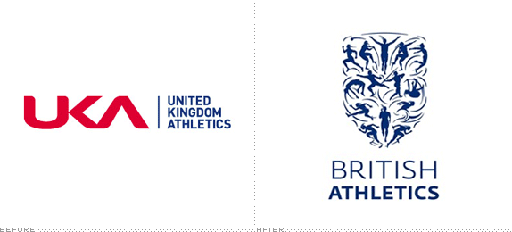
Established in 1999, UK Athletics (UKA) “oversees the development and management of the nation’s favourite Olympic and Paralympic sport, from grassroots right through to podium.” With the attention gained during the London Summer Olympic Games, UKA decided to launch a new brand, British Athletics, that sort of replaces the UK Athletics name and brand, except it does not. For confusion purposes, “British Athletics will be used in all external communications,” while UK Athletics will be “reflecting the governance and NGB duties of the organisation.” This article explains much better what that means. The new British Athletics logo was introduced earlier this year.
Update: The identity has been created by London-based SomeOne. More images and quotes have been added to this post.
Continue reading this entry

DATE: Feb.14.2013 POSTED BY: Armin
 CATEGORY: Sports
  COMMENTS:

TAGS: blue, olympics, sans serif, uk,

Opinion BY Armin
The Real Jaguars of Jacksonville
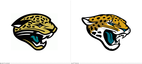
Joining the league as an expansion team in 1995, the Jacksonville Jaguars play in the South Division of the American Football Conference in the NFL. The team has done well over the last seventeen years, winning two division championships and making six playoff appearances. Yesterday, the Florida-based team announced a new identity to replace the one they’ve playing with since the beginning.
Continue reading this entry

DATE: Feb.06.2013 POSTED BY: Armin
 CATEGORY: Sports
  COMMENTS:


A B-Side BY Armin
Nebraska Huskers (Secondary Logo)
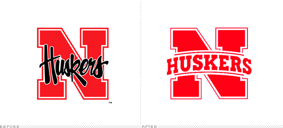
About: (Est. 2013) “The Nebraska Cornhuskers (often abbreviated to Huskers) is the name given to several sports teams of the University of Nebraska-Lincoln. The university is a member of the Big Ten Conference. The Cornhuskers compete in NCAA Division I, fielding 21 varsity teams in 15 sports.” (Source: Wikipedia)
Design by: Design department at The Collegiate Licensing Company.
Ed.’s Notes: This is ONLY for the secondary logo, not the main Nebraska university logo nor the main Huskers logo.
Relevant links: In-depth article from the Huskers about the change.
Thanks to Jim Kosmicki for the tip.

DATE: Jan.31.2013 POSTED BY: Armin
 CATEGORY: Sports The B-Side
  COMMENTS:

TAGS: college, red, slab serif,


