


Online
- FPO (For Print Only) / Celebrating the reality that print is not dead by showcasing the most compelling printed projects.
- Art of the Menu / Cataloguing the underrated creativity of menus from around the world.
- Quipsologies / Chronicling the most curious, creative, and notable projects, stories, and events of the graphic design industry on a daily basis.
- Speak Up (2002 – 2009) / Discussing, and looking for, what is relevant in, and the relevance of, graphic design. Archives Only.
- Word It (2003 – 2010) / Encouraging creative diversity in the community through monthly, one-word challenges. Archives Only.
- Brand New Classroom (2010 – 2011) / Providing a space for critique and opinions on student identity work. Archives Only.
Publishing
- The 2010 Brand New Awards / 2011, self-published.
- Flaunt: Designing effective, compelling and memorable portfolios of creative work / 2010, self-published.
Events & Judged Competitions
- Brand New Conference / A one-day event on the development of corporate and brand identity projects by some of today’s most active and influential practitioners from around the world.
- Brand New Awards / Celebrating the best identity work produced around the world.
- FPO Awards / Celebrating the best print work from around the world.
Writing
- Graphic Design, Referenced: A Visual Guide to the Language, Applications, and History of Graphic Design / 2009, Rockport.
- Women of Design: Influence and Inspiration from the Original Trailblazers to the New Groundbreakers / 2008, HOW Books.
- The Word It Book: Speak Up Presents a Gallery of Interpreted Words / 2007, HOW Books.
Graphic Design
- Department of Design / Designing corporate and brand identities and full development of printed and digital matter for clients.

A B-Side BY Armin
Pinch Provisions
![]()
Launched in 2004 as Ms. and Mrs. by a mother/daughter team, the newly named Pinch Provisions is a line of “premium emergency essentials,” personal care kits that, for example, feature in one single, small package hairspray, clear nail polish, nail polish remover, emery board, lip balm, earring backs, clear elastics, mending kit, safety pin, double-sided tape, stain remover, deodorant towelette, pain reliever, tampon, breath freshener, dental floss, and an adhesive bandage. The new name, identity, and package were done by New York, NY-based Beardwood. Image of the package and a slightly annoying video below (or after the jump).
Continue reading this entry

DATE: Jul.20.2012 POSTED BY: ArminCATEGORY: Consumer products The B-Side COMMENTS:


Opinion BY Armin
Nuts.fun
![]()
Launched in 1999 as NutsOnline and based on a family business dating back to 1929, the newly named Nuts.com is an online retailer of more than 200 varieties and treatments of nuts as well as dried fruit, snacks, chocolate, and coffee and tea. Based in New Jersey, Nuts.com has a 60,000-square-foot space and 80 employees. After living at www.nutsonline.com for thirteen years, the company was finally able to purchase www.nuts.com — details here — adopt it as its name, and design a new identity and packaging around it, which was designed by Pentagram partner Michael Bierut, quite literally this time: the logo and type are based on his own hand-drawn alphabet, digitized by Jeremy Mickel. The identity is complemented with nut character illustrations by Christoph Niemann.
Continue reading this entry
DATE: Jul.09.2012POSTED BY: ArminCATEGORY: Consumer products COMMENTS:
TAGS: colorful, hand-drawn, illustration, packaging, pentagram,
Opinion BY Armin
The Cow Jumped Over the Yoghurt
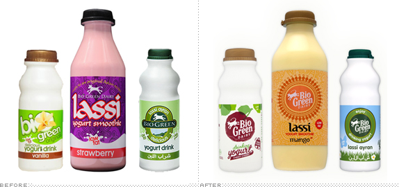
Launched in 1988 in the UK, Bio Green Dairy is a range of yoghurt-based products that includes real-fruit yoghurt drinks, Lassi Ayran drinking yoghurt, Lebanese style labneh yoghurt, and now a new series of exotic fruit Lassis. The new packaging across all lines has been redesigned by London-based Carter Wong Design.
Continue reading this entry
DATE: Jul.02.2012POSTED BY: ArminCATEGORY: Consumer products COMMENTS:
TAGS: animation, illustration, packaging, uk, yogurt,
Opinion BY Armin
Madefire Makesawesome
![]()
Launched earlier this June, Madefire is a new digital publishing platform for comics and graphic novels through two main features: a desktop web tool where creators can produce their stories, and an iPad that delivers the content, or “Motion Books,” on steroids with animation, music, and sound effects. Among notable artists contributing to the first wave of Motion Books is Watchmen creator Dave Gibbons with the comic “Treatment” and one of the founders of Madefire is Ben Wolstenholme, CEO of Moving Brands, who engaged his team to design the new publishing venture’s identity and user interface.
Continue reading this entry
DATE: Jun.26.2012POSTED BY: ArminCATEGORY: Consumer products COMMENTS:
TAGS: black, icon, moving brands, red, slab serif,
Opinion BY Armin
Strongbow’s ArcherArrow Man
![]()
First brewed in 1962, Strongbow is a dry cider owned by Heineken. The name (and logo) are based on Richard de Clare, described (by Strongbow Gold) as “a powerful, and often ruthless, 12th Century Norman warlord who earned his nickname ‘Strongbow’ for his expertise with a bow that was feared throughout the land.” Dude died of a foot infection. Popular in the UK and Australia, Strongbow is reportedly the number one selling cider in the world. Strongbow recently introduced a new logo and packaging designed by London-based Bulletproof.
Continue reading this entry
DATE: Jun.21.2012POSTED BY: ArminCATEGORY: Consumer products COMMENTS:
TAGS: bulletproof, cider, packaging, uk,
Opinion BY Armin
Happy District
![]()
First sold in 2005 and originally known as District Threads, District and District Made are two clothing lines offering t-shirts, bags, caps, and accessories that feature “fashion forward style, slim cuts and eye-candy colors in Juniors and Young Mens sizing.” Owned by SanMar, one of the largest suppliers — and exclusive distributors of brands like Gildan and Hanes — of wholesale, “blank” apparel and accessories, District is positioning itself to compete against fashion basics lines like American Apparel and Gap. Last week, SanMar introduced the revitalized brands and their new identity designed by Seattle, WA-based Creature.
Continue reading this entry
DATE: Jun.05.2012POSTED BY: ArminCATEGORY: Consumer products COMMENTS:
Opinion BY Armin
Gloves fit for the Six Million Dollar Man
![]()
First produced for hockey players in 1999, Bionic is a line of specialty performance gloves for sports like golf, baseball, fitness (weightlifting), tennis, racquetball, equestrian events and others, as well as a very popular line of gardening gloves. The gloves are the invention of orthopedic hand surgeon James Kleinert for sports equipment manufacturing company Hillerich & Bradsby, which more famously produces the Louisville Slugger bats. In March, Bionic introduced a new logo designed by New York, NY-based CBX.
Continue reading this entry
DATE: May.24.2012POSTED BY: ArminCATEGORY: Consumer products COMMENTS:
TAGS: monogram, sans serif, sports,
A B-Side BY Armin
Puffs
![]()
Introduced in 1960, Puffs is a line of facial tissue produced by Procter & Gamble. A new look was recently introduced. Image of the new boxes below (or after the jump).
Continue reading this entry
DATE: May.16.2012POSTED BY: ArminCATEGORY: Consumer products The B-Side COMMENTS:
A B-Side BY Armin
Logitech
![]()
Established in 1981, Logitech is a “world leader in products that connect people to the digital experiences they care about.” I’ve used their mice for ten years. Without much fanfare they introduced a revised, black and white version of their logo.
Thanks to Roman P. for the tip.
DATE: May.14.2012POSTED BY: ArminCATEGORY: Consumer products The B-Side COMMENTS:
TAGS: black, sans serif,
Opinion BY Armin
Shutterstock has you in its Sight
![]()
Established in 2003, Shutterstock is a provider of stock footage, stock photography, vectors, and illustrations, with a library that includes more than 19 million royalty-free images and over 500,000 footage clips from more than 35,000 contributing artists. Shutterstock gained some recognition for going against the pay-per-image-and-its-resolution with a subscription model that allows users to download as many as 25 images a day. This week Shutterstock introduced a new identity guided by Matt Angorn, Shutterstock Vice President and Creative Director, with Lippincott.
Continue reading this entry
DATE: May.03.2012POSTED BY: ArminCATEGORY: Consumer products COMMENTS:
TAGS: flexible identity, lippincott, sans serif, stock,


Books about logo design, the designers that create them and the meaning of branding.
