


Online
- FPO (For Print Only) / Celebrating the reality that print is not dead by showcasing the most compelling printed projects.
- Art of the Menu / Cataloguing the underrated creativity of menus from around the world.
- Quipsologies / Chronicling the most curious, creative, and notable projects, stories, and events of the graphic design industry on a daily basis.
- Speak Up (2002 – 2009) / Discussing, and looking for, what is relevant in, and the relevance of, graphic design. Archives Only.
- Word It (2003 – 2010) / Encouraging creative diversity in the community through monthly, one-word challenges. Archives Only.
- Brand New Classroom (2010 – 2011) / Providing a space for critique and opinions on student identity work. Archives Only.
Publishing
- The 2010 Brand New Awards / 2011, self-published.
- Flaunt: Designing effective, compelling and memorable portfolios of creative work / 2010, self-published.
Events & Judged Competitions
- Brand New Conference / A one-day event on the development of corporate and brand identity projects by some of today’s most active and influential practitioners from around the world.
- Brand New Awards / Celebrating the best identity work produced around the world.
- FPO Awards / Celebrating the best print work from around the world.
Writing
- Graphic Design, Referenced: A Visual Guide to the Language, Applications, and History of Graphic Design / 2009, Rockport.
- Women of Design: Influence and Inspiration from the Original Trailblazers to the New Groundbreakers / 2008, HOW Books.
- The Word It Book: Speak Up Presents a Gallery of Interpreted Words / 2007, HOW Books.
Graphic Design
- Department of Design / Designing corporate and brand identities and full development of printed and digital matter for clients.

Opinion BY Armin
ITV Follows New Script
![]()
Established in 1955, ITV (originally for Independent Television Authority) is the biggest commercial television network in the UK and is the main competition of the BBC and Channel 4. ITV operates five different channels: ITV1, ITV2, ITV3, ITV4, and CITV covering everything from reality TV to sports to drama to sitcoms to children programming. Last week, at its upfronts event, ITV unveiled a new umbrella logo for its company and all its channels to be rolled out on January 2013 along with supporting new on-air packaging for all channels. The design has been done in-house. For the most comprehensive coverage and reporting about all the changes, please see this Digital Spy story.
Continue reading this entry

DATE: Nov.21.2012 POSTED BY: ArminCATEGORY: Entertainment COMMENTS:

TAGS: flexible identity, overlay, script, tv, uk,

Opinion BY Armin
Galavisión Lacks Vision
![]()
Launched in 1979 and owned by Univision, Galavisión is the leading Spanish language cable network in the United States and is described as “the direct, sexy, funny and alternative cable network that brings the best of modern Mexico to U.S. Hispanics.” The channel’s programming is a mix of comedy, lifestyle, documentary, “supernatural-themed programs”, and, of course, telenovelas, drawing much of its content from the Mexican TV superpower, Televisa. Earlier this month, Galavisión introduced a new logo designed by New York, NY-based PMcD Design.
Continue reading this entry
DATE: Nov.13.2012POSTED BY: ArminCATEGORY: Entertainment COMMENTS:
TAGS: monospace, orange, Sans Serif, spanish, tv,
A B-Side BY Armin
The CW
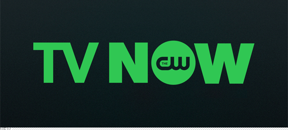
About: “The CW Network was formed as a joint venture between Warner Bros. Entertainment and CBS Corporation. The CW is America’s fifth broadcast network and the only network targeting women 18-34. The network’s primetime schedule includes such popular series as America’s Next Top Model, Gossip Girl, Hart of Dixie, 90210, Supernatural, Arrow, Nikita, Beauty and the Beast, Emily Owens, M.D., and The Vampire Diaries.”
Design by: Troika.
Ed.’s Notes: I realize this doesn’t quite fall under “new” and it’s not exactly a logo redesign. More of an identity redesign through the on-air package. Montage video below (or after the jump).
Relevant links: Troika case study (plenty of images, mostly guideline and attitude stuff).
Continue reading this entry
DATE: Nov.07.2012POSTED BY: ArminCATEGORY: Entertainment The B-Side COMMENTS:
A B-Side BY Armin
Republic Records
![]()
About: Republic Records, formerly known as Universal Republic Records, is a music label for top-selling artists like Nicki Minaj, Drake, Gotye, and the Avett Brothers.
Design by: Pentagram (Paula Scher)
Ed.’s Notes: Plenty of applications at the link below.
Relevant links: Pentagram news.
DATE: Nov.05.2012POSTED BY: ArminCATEGORY: Entertainment The B-Side COMMENTS:
TAGS: black, lowercase, music, pentagram, Sans Serif,
A B-Side BY Armin
The Rockettes
![]()
About: (Est. 1925) “The Radio City Rockettes are the world’s most famous precision dance company. The Rockettes are the stars of the Radio City Christmas Spectacular - a show that is seen by more than 2 million people a year and has played in more than 60 cities across the country.”
Design by: N/A.
Ed.’s Notes: Decent idea (synchronized “R”s as if they were the high-kicking ladies) but pretty bad execution.
Relevant links: N/A
Thanks to Michele Byrne for the tip.
DATE: Oct.29.2012POSTED BY: ArminCATEGORY: Entertainment The B-Side COMMENTS:
TAGS: custom, Sans Serif,
A B-Side BY Armin
Say Media
![]()
About: (Est. 1988) “Say Media is a digital publishing company that creates amazing media brands. Through its technology platform and media services, Say Media enables its portfolio of independent content creators to build passionate communities around key consumer interest areas such as Style, Living, Food and Tech. The company provides simple and accountable ways for the world’s top brands to engage with these passionate audiences, at scale, with a reach of more than 400 million people around the world.”
Design by: In-house
Ed.’s Notes: This is a really nice wordmark. Simple and clever. Plus: it’s a serif typeface; we rarely see those anymore. Making-of video about the logo below (or after the jump).
Relevant links: N/A.
Continue reading this entry
DATE: Oct.23.2012POSTED BY: ArminCATEGORY: Entertainment The B-Side COMMENTS:
TAGS: serif,
Opinion BY Armin
Logo Gigante!
![]()
With a history dating back to a single television station in 1955 in San Antonio, TX, Univision (as it was named in 1986) today is the leading Spanish-language television network and media company for Hispanics in the United States. With programming that covers everything from the storied telenovelas (soap operas) to sports to the juggernaut that is Sabado Gigante, Univision is mostly known as a television channel but it also owns radio stations and websites. Yesterday, they unveiled a new logo designed by Wolff Olins.
Continue reading this entry
DATE: Oct.18.2012POSTED BY: ArminCATEGORY: Entertainment COMMENTS:
TAGS: 3d, hispanic, Sans Serif, television, wolff olins,
Opinion BY Armin
TeenNick: Less Kid, More Adult
![]()
Launched in 2002 as The N, TeenNick, as it was renamed in 2009, is part of the Nickelodeon family of channels geared towards, as its name implies, teenagers. With a mix of reruns and original programming, TeenNick reaches more than 71 million households. The new name was part of Nickelodeon’s large rebrand effort in 2009 with on-air graphics by loyalkaspar and now they are presenting an updated on-air look created by London-based Proud Creative.
Continue reading this entry
DATE: Oct.15.2012POSTED BY: ArminCATEGORY: Entertainment COMMENTS:
TAGS: on-air, proud creative, teenagers,
A B-Side BY Armin
CTC
![]()
About: CTC is owned by CTC Media, “a leading independent media company in Russia, with operations throughout Russia and in a number of other CIS markets. It operates three free-to-air television networks in Russia — CTC, Domashny and Peretz — as well as Channel 31 in Kazakhstan and a TV company in Moldova, with a combined potential audience of over 150 million people.”
Design by: BDA Creative.
Ed.’s Notes: Logo animation below (or after the jump). That old logo was pimp!
Relevant links: Press Release.
Continue reading this entry
DATE: Sep.25.2012POSTED BY: ArminCATEGORY: Entertainment The B-Side COMMENTS:
Opinion BY Armin
A Screenvision of the Future
![]()
Established in 1976, Screenvision provides national and regional advertisers with on-screen advertising, in-lobby promotions, and integrated marketing programs in 14,400 screens, 2,380 theatre locations, and nearly 400 universities across all 50 States. In other words: if you get to your movie theater very early, all the stuff playing on the screen to keep you relatively entertained, is probably by Screenvision. They recently introduced a new logo, identity, and complete in-theater experience, designed by bi-coastal branding agency, loyalkaspar.
Continue reading this entry
DATE: Aug.16.2012POSTED BY: ArminCATEGORY: Entertainment COMMENTS:
TAGS: 3d, animation, loyalkaspar, movies,


Books about logo design, the designers that create them and the meaning of branding.
