


Online
- FPO (For Print Only) / Celebrating the reality that print is not dead by showcasing the most compelling printed projects.
- Art of the Menu / Cataloguing the underrated creativity of menus from around the world.
- Quipsologies / Chronicling the most curious, creative, and notable projects, stories, and events of the graphic design industry on a daily basis.
- Speak Up (2002 – 2009) / Discussing, and looking for, what is relevant in, and the relevance of, graphic design. Archives Only.
- Word It (2003 – 2010) / Encouraging creative diversity in the community through monthly, one-word challenges. Archives Only.
- Brand New Classroom (2010 – 2011) / Providing a space for critique and opinions on student identity work. Archives Only.
Publishing
- The 2010 Brand New Awards / 2011, self-published.
- Flaunt: Designing effective, compelling and memorable portfolios of creative work / 2010, self-published.
Events & Judged Competitions
- Brand New Conference / A one-day event on the development of corporate and brand identity projects by some of today’s most active and influential practitioners from around the world.
- Brand New Awards / Celebrating the best identity work produced around the world.
- FPO Awards / Celebrating the best print work from around the world.
Writing
- Graphic Design, Referenced: A Visual Guide to the Language, Applications, and History of Graphic Design / 2009, Rockport.
- Women of Design: Influence and Inspiration from the Original Trailblazers to the New Groundbreakers / 2008, HOW Books.
- The Word It Book: Speak Up Presents a Gallery of Interpreted Words / 2007, HOW Books.
Graphic Design
- Department of Design / Designing corporate and brand identities and full development of printed and digital matter for clients.

A B-Side BY Armin
Ottawa RedBlacks
![]()
About: (Est. 2010) “The Ottawa RedBlacks (French: Le Rouge et Noir d’Ottawa) are a CFL (Canadian Football League) franchise that has been awarded in the city of Ottawa, Ontario. […] The team will play at a remodeled Frank Clair Stadium, and will begin play in 2014 if construction remains on schedule.” (Source: Wikipedia).
Design by: N/A.
Ed.’s Notes:Compared to other CFL team logos this one is a champion. Compared to other sports logos, it’s about the same. Compared to clichés of Canada, this is, like not fucking polite at all. Bigger view of the logo and type-only version below (or after the jump).
Relevant links: CFL press release. SportsLogos.net story.
Select quote:“The REDBLACKS logo design pays tribute to our Ottawa football past by reviving the traditional “R” of the Rough Riders with a slight difference,” said REDBLACKS Governor and OSEG Partner John Ruddy. “The modern REDBLACKS “R” features two notches, which appear to have been cut with a saw, fused to a circular saw blade background. The blade represents many of the characteristics we hope our players will demonstrate; speed, unstoppable force, precision, balance, strong-as-steel and even dangerous. It also has a relationship to Ottawa’s founding as a lumber industry town.”
Continue reading this entry

DATE: Jun.12.2013 POSTED BY: ArminCATEGORY: Sports The B-Side COMMENTS:

TAGS: canada, football, italic, slab serif,

A B-Side BY Armin
Avinor
![]()
About: (Est. 2003) “Avinor is responsible for planning, developing and operating the Norwegian airport network. Avinor operates 46 airports in Norway, thereof 12 in cooperation with the armed forces. Operations also include air traffic control towers, control centres and technical infrastructure for aircraft navigation. […] The ownership is administered by the Ministry of Transport and Communications.”
Design by: Snøhetta.
Ed.’s Notes: Both old and new logos are fine on their own; new one might be a tad too abstract and minimal, but it’s nice. Video introduction below (or after the jump).
Relevant links: Snøhetta case study.
Select quote: “The consolidated statement in the logo and logo symbol describes Avinor’s public service mission. From north to south, tying Norway together — and Norway together with the world. The specially designed typeface and the unique symbol Avinor helps to cement their position in the market as a full-service provider in the aviation industry and strongly supports the strategic change in the organization.”
Thanks to Mathias Haddal Hovet for the tip.
Continue reading this entry
DATE: Jun.11.2013POSTED BY: ArminCATEGORY: The B-Side Transportation COMMENTS:
TAGS: airport, norway, sans serif, uppercase,
A B-Side BY Armin
Hello Bank!

About: (Est. 2013) “We’re Hello Bank! Driven by a startup mentality, our approach to banking can be summed up in 4 words: simple, smart, human and safe. Hello bank! is the new generation bank designed to help you manage your day-to-day finances in the long term. And, as part of BNP Paribas, we’re underpinned by the financial stability of a European banking leader. Hello bank! launches in Belgium and Germany in May 2013, in France in June and in Italy in October.”
Design by: SEENK.
Ed.’s Notes: How you doin’, Bank? It’s alright, I guess. A couple of applications below (or after the jump).
Relevant links: Press release. SEENK case study.
Select quote: “Hello Bank! A new brand, with a new style based on four key values: Simple. Smart. Human. Safe.
Hello Bank! makes life easier. A refreshingly new banking experience, easy and straightforward, a native mobile bank designed to be as clear and intuitive as the very best of today’s digital apps. Using your mobile, your tablet (iOS or Android), or via Internet, for example you can manage your budget, organise your outgoings or transfer money in just three hand movements. You can also sign up for Hello bank! in just four steps, which means anyone can become a Hello bank! customer as easily as buying a train ticket on a smartphone.”
Continue reading this entry
DATE: Jun.10.2013POSTED BY: ArminCATEGORY: Finance The B-Side COMMENTS:
TAGS: bank, blue, france, gradient, speech bubble,
A B-Side BY Armin
San Diego State Aztecs
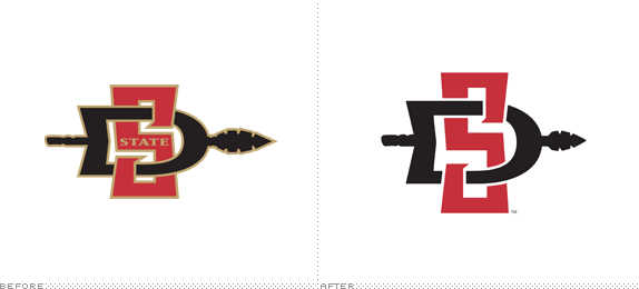
About: “The San Diego State Aztecs are the collegiate athletics and sports teams for San Diego State University (SDSU). San Diego State has organized programs for baseball, basketball, football, soccer, golf, gymnastics, rowing (crew), softball, tennis, track, swimming, diving, women’s volleyball, and water polo. The Aztecs compete in NCAA Division I. Its primary conference is the Mountain West Conference.” (Source: Wikipedia)
Design by: Osaki Creative Group.
Ed.’s Notes: Not much of a change in the main logo, but plenty of work done around secondary marks and consistent typography and other spear-y stuff. Plenty more images below (or after the jump).
Relevant links: Press release. SI.com. SDSU Logo and Style Guide (PDF).
Select quote: “A proliferation of identities and symbols creates confusion in the minds of audiences whose support we seek: students, prospective students, parents, alumni, athletes, and supporters. While logos and symbols are not the sole elements of an institutional ‘brand,’ they are its visual representation and extension. When that visual representation is disconnected or inconsistent, it follows that the perception of the institution can also become disconnected or inconsistent.
These are the reasons the SDSU logo identity has been streamlined, to minimize confusion and to strengthen the brand. SDSU has remained consistent with the brand by keeping the core symbol, the spear.
Aztec spears were long, wooden, and tipped with stone, obsidian or copper points. Among the favorite weapons the Aztecs used were the double-edged obsidian spears. The spear symbolizes offensive strength and power.”
Continue reading this entry
DATE: Jun.07.2013POSTED BY: ArminCATEGORY: Sports The B-Side COMMENTS:
A B-Side BY Armin
Transdev
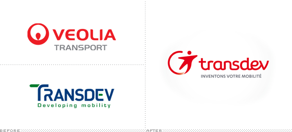
About: Transdev (Est. as Société centrale pour l’équipement du territoire in 1955) and Veolia Transport (Est. 1876) have merged to become “Transdev. A subsidiary of Caisse des Dépôts and Veolia Environnement, Transdev is a world leader in public transport. From pre-project to daily operations of public transport systems to project management assistance, Transdev provides consulting and support to local communities. With 101,000 employees in 27 countries and operating 60,000 vehicles and 24 tram networks, Transdev generated revenues of 7.6 billion euros in 2012.”
Design by: W&Cie.
Ed.’s Notes: If one must use a neutered sprite in a logo this is as good as it gets. It’s really not that bad; could have done without the gradient. The wordmark is questionable. Bigger view of the logo and a couple of applications below (or after the jump).
Relevant links: W&Cie blog post. Press release (French). Merger FAQ.
Select quote: “Commenting on the new identity of the group, Jean-Marc Janaillac said: ‘Transdev and Veolia Transport are two known brands, recognized and appreciated by our clients for more than twenty years, which is why we chose the name of one and the color of the other.’ The Transdev name is preserved and given a new identity. Red, an open and visible color, synonymous with passion, empowers the logo while anchoring the history of the group.”
Continue reading this entry
DATE: Jun.06.2013POSTED BY: ArminCATEGORY: The B-Side Transportation COMMENTS:
A B-Side BY Armin
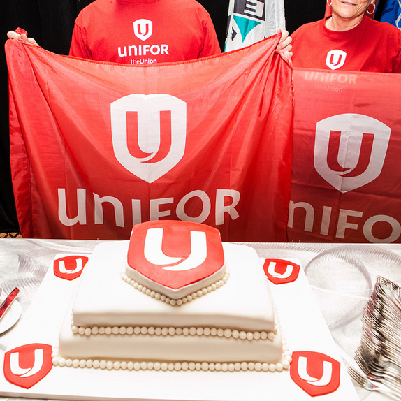
Unifor
![]()
About: (Est. 2013) “Two great Canadian unions — the Canadian Auto Workers union and the Communications, Energy and Paperworkers Union — are forming a new union with a modern, inclusive approach to serve members better and participate more effectively in our workplaces and communities. As the largest private sector union in Canada, Unifor will advocate for and defend the rights of working people, in more than 20 economic sectors and in communities across Canada. We will stand for safer workplaces, secure employment, wages and benefits that provide a decent standard of living, and dignity and mutual respect in the workplace.”
Design by: N/A.
Ed.’s Notes: The “U” looks like it’s a union of two “U”s, so well done there. The upper and lowercase wordmark is, as the genre demonstrates over and over, a fail. Bigger view of the logo and cake below (or after the jump).
Relevant links: Fact sheet about the new name and logo (PDF). Flickr set of launch event.
Select quote:“Members value the strength, protection and security that our union offers. The ‘shield’ logo speaks to that protection and the lower case ‘uni’ and upper case ‘FOR’ give the wordmark strength and momentum. Our new visual identity is strong, simple, clean and clear.”
![]()
Thanks to Pierre-Luc Gagné for the tip.
DATE: Jun.05.2013POSTED BY: ArminCATEGORY: Politics The B-Side COMMENTS:
A B-Side BY Armin
Vietcombank
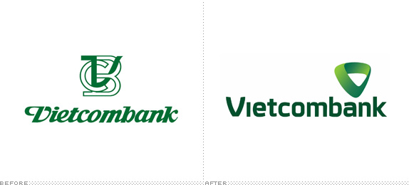
About: (Est. 1963) “Vietcombank was the first Vietnamese state bank to convert into a publicly-traded commercial bank. Over 50 years of construction and development, Vietcombank made important contributions to the stability and development of Vietnam’s national economy, by serving as a role model for major foreign banks, effectively serving local economic development, and creating significant impact to the financial community and global regions. From a specialized bank for foreign economic relations, Vietcombank today has become a multi-bank with multi-disciplinary activities, providing customers a full range of financial services in the field of international trade, and in traditional activities such as treasury, capital mobilization, credit, project finance … as well as an array of modern banking services: foreign exchange and derivative duty, card services, electronic banking.”
Design by: N/A.
Ed.’s Notes: Very American/global. Bigger view of the logo below (or after the jump). Lookit, that “e” is smiling.
Relevant links: Press Release.
Select quote (Google-translated): “The new logo of Vietcombank maintains their traditional green reference to the power of nature, showing growth through the balanced development of standards, and the desire to expand and reach out. The letter V in the logo was redesigned as a modern, stylized icon, linked throughout, demonstrating a successful sustainable connection. It not only symbolizes V VCB but also a symbol of the spirit to win (V victory), the union of the heart with faith comes from the heart for a shared future with the prosperity of Vietnam.”
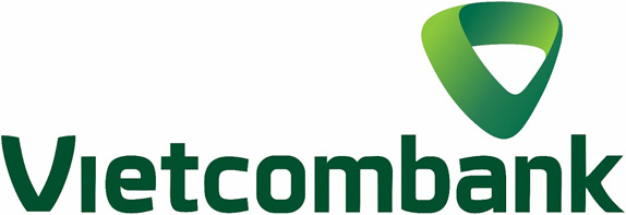
Thanks to Jerome Meyer for the tip.
DATE: Jun.04.2013POSTED BY: ArminCATEGORY: Finance The B-Side COMMENTS:
A B-Side BY Armin
Everton FC
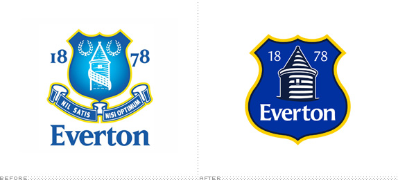
About: (Est. 1878) “Everton FC Everton Football Club is an English Premier League football club based in Liverpool. The club has competed in the top division for a record 110 seasons and have won the League Championship nine times. Everton have a rivalry with neighbors Liverpool F.C. and the two sides contest the Merseyside Derby. The club has been based at Goodison Park since 1892.” (Source: Wikipedia )
Design by: In-house.
Ed.’s Notes: A crappy logo gets less crappy. Fans complain. Organization freaks out. Apologizes. Promises to only use the logo for the next season then redesign it for the season after that with the help of its supporters. Dumbasses all of them: organization and fans. More images and links to the story below (or after the jump).
Relevant links: Evolution of the Crest. CreativeReview. Design Week on the Undo move.
Select quote: “Created following an extensive consultation process with fans, supporters’ groups and branding experts, our new Club Crest combines four historic elements of the outgoing Crest - the Tower, the shield, our name and the year of our formation - to form a concise, modern and dynamic representation of Everton.”
Continue reading this entry
DATE: Jun.03.2013POSTED BY: ArminCATEGORY: Sports The B-Side COMMENTS:
A B-Side BY Armin
American Athletic Conference
![]()
About: (Est. 2013) “The American Athletic Conference (sometimes shortened to The American) is an American collegiate athletic conference that will be established in 2013. Its charter member institutions are located primarily in the eastern and southern part of the United States. It will be headquartered in Providence, Rhode Island. The conference will participate in the National Collegiate Athletic Association (NCAA) Division I in athletic competitions; for football, it will be part of the Football Bowl Subdivision (FBS), formerly known as Division I-A.” (Source: Wikipedia).
Design by: N/A.
Ed.’s Notes: Pardon my French American, but holy shit, that is one terrible logo. Every single graphic decision here is wrong: Slab serif with like 12 different strokes? Wrong. Star with one point sticking out? Wrong. Individual circular gradient for each letter? So fucking wrong. Bigger view of another lock-up below (or after the jump).
Relevant links: Norwich Bulletin story. USA Today story.
Select quote:“It’s a bold look,” Aresco said. “Obviously this is a media world we live in, and we wanted to make sure we had the kind of mark that would be distinctive and would make an impact when people saw it. We wanted it to be something people would like and remember, but the notion really was to make it as simple as possible but also strong.”
![]()
Thanks to James I. Bowie for first tip.
DATE: May.31.2013POSTED BY: ArminCATEGORY: Sports The B-Side COMMENTS:
TAGS: gradient, ncaa, red-white-and-blue, slab serif,
In Brief BY Armin
AS Roma
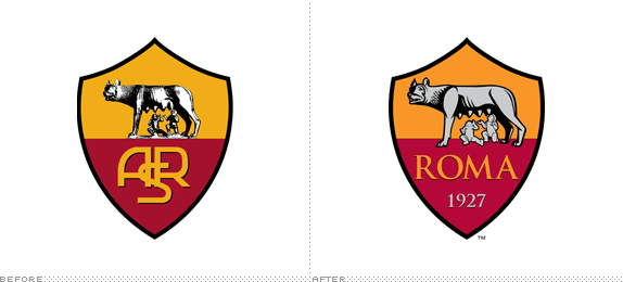
About: (Est. 1927) “Associazione Sportiva Roma (AS Roma), commonly referred to as simply Roma, is a professional Italian football (soccer) club based in Rome. Roma have won Serie A three times (in 1941-42, 1982-83 and in 2000-01) as well as winning nine Coppa Italia titles and two Supercoppa Italiana titles. AS Roma plays home games at the Stadio Olimpico (capacity 72,000+)—a venue they share with city rivals Lazio—which is the second largest of its kind in Italy.”
Ed.’s Notes: I don’t know about y’all but if I were the owner of the team I would have taken this opportunity to get rid of the cherubs sucking on the chupacabra’s tits. (I’m sure there is a logical explanation for it). (There is, obviously: it’s the story of Romulus and Remu). Also: Trajan? Et tu, Rome?
Relevant links: Press release.
Select quote: “The updated logo is a vibrant new take on AS Roma’s memorable crest, which has represented the Club since its inception. … AS Roma has tremendous brand equity that far outpaces that of nearly every European sports club. The Club has carefully evolved the logo to respect the past but represent the future.”
Continue reading this entry
DATE: May.30.2013POSTED BY: ArminCATEGORY: Sports The B-Side COMMENTS:


Books about logo design, the designers that create them and the meaning of branding.
