


Online
- FPO (For Print Only) / Celebrating the reality that print is not dead by showcasing the most compelling printed projects.
- Art of the Menu / Cataloguing the underrated creativity of menus from around the world.
- Quipsologies / Chronicling the most curious, creative, and notable projects, stories, and events of the graphic design industry on a daily basis.
- Speak Up (2002 – 2009) / Discussing, and looking for, what is relevant in, and the relevance of, graphic design. Archives Only.
- Word It (2003 – 2010) / Encouraging creative diversity in the community through monthly, one-word challenges. Archives Only.
- Brand New Classroom (2010 – 2011) / Providing a space for critique and opinions on student identity work. Archives Only.
Publishing
- The 2010 Brand New Awards / 2011, self-published.
- Flaunt: Designing effective, compelling and memorable portfolios of creative work / 2010, self-published.
Events & Judged Competitions
- Brand New Conference / A one-day event on the development of corporate and brand identity projects by some of today’s most active and influential practitioners from around the world.
- Brand New Awards / Celebrating the best identity work produced around the world.
- FPO Awards / Celebrating the best print work from around the world.
Writing
- Graphic Design, Referenced: A Visual Guide to the Language, Applications, and History of Graphic Design / 2009, Rockport.
- Women of Design: Influence and Inspiration from the Original Trailblazers to the New Groundbreakers / 2008, HOW Books.
- The Word It Book: Speak Up Presents a Gallery of Interpreted Words / 2007, HOW Books.
Graphic Design
- Department of Design / Designing corporate and brand identities and full development of printed and digital matter for clients.

Opinion BY Armin
MOM’s the Word
![]()
Established in 1919 in Minneapolis, Minnesota, Malt-O-Meal Company is the largest family-owned cereal company in the country. Well known for its eponymous hot cereal, a combination of malt flavor with farina cereal, Malt-O-Meal Company now offers more than 70 different products through ten individual brands — including Malt-O-Meal, Mom’s Best Naturals, and Three Sisters among others with cold cereal being their biggest sellers at the moment. This week Malt-O-Meal Company announced it would change its name to MOM Brands and introduced a new identity designed by Duffy & Partners.
Continue reading this entry

DATE: Feb.22.2012 POSTED BY: ArminCATEGORY: Corporate COMMENTS:

TAGS: cereal, illustration, serif,

Opinion BY Armin
A Better Dolphin
![]()
Established in 1981, Beiramar is one of the largest real estate companies in Brazil with over 3,000 rental properties and over 30 builder partners with whom they develop properties. A new identity has been designed by Bertoni Design.
Continue reading this entry
DATE: Dec.13.2011POSTED BY: ArminCATEGORY: Corporate COMMENTS:
A B-Side BY Armin
Aimia
![]()
Established in 1984, Aimia (formerly Groupe Aeroplan) is a global loyalty management company, providing rewards programs across various industries, originally well known for its Air Canada frequent flyer program. The new name and logo were created by Interbrand. Press release here. Name and logo rationalization here [PDF]. Brand launch video below (or after the jump).
Continue reading this entry
DATE: Dec.09.2011POSTED BY: ArminCATEGORY: Corporate The B-Side COMMENTS:
TAGS: sans serif,
Opinion BY Armin
Brush and Splatter Talent
![]()
Established in 1991, United Talent Agency (UTA) is one of the leading Hollywood talent agencies with more than 120 agents and 350 employees representing actors like Johnny Depp, Harrison Ford, Gwyneth Paltrow, and Jennifer Lopez as well as directors like the Coen brothers, Judd Apatow, and Wes Anderson. Apart from landing movie credits, UTA also helps it clients launch businesses or sign licensing deals. This past Friday, UTA unveiled a new identity, designed by Siegel+Gale.
Continue reading this entry
DATE: Oct.17.2011POSTED BY: ArminCATEGORY: Corporate COMMENTS:
TAGS: black, brush stroke, hollywood, siegel+gale,
Opinion BY Armin
Beam me up, Jim
![]()
In 1795, Jacob Beam sold his first barrel of whiskey in Kentucky. 216 years later, Beam Inc. is the fourth largest spirits company in the world producing and distributing some of the most well known spirit brands like the eponymous Jim Beam, Maker’s Mark, Sauza Tequila, Courvoisier, Knob Creek, and Effen Vodka, among a portfolio of 65 brands. Previously part of major holding company Fortune Brands, Beam is now an independent company that began trading on the NYSE earlier this month. Their new logo was introduced in August.
Continue reading this entry
DATE: Oct.12.2011POSTED BY: ArminCATEGORY: Corporate COMMENTS:
A B-Side BY Armin
Brown Shoe Company
![]()
Established in 1875, Brown Shoe Company operates more than 1,300 Famous Footwear and Naturalizer retail stores and designs, sources and markets many well-known wholesale shoe brands, such as Via Spiga, Vera Wang Lavender, Sam Edelman, Franco Sarto, Naturalizer, LifeStride, Avia, and Dr. Scholl’s. Here is an interview with their creative director and a look at some pages from their guidelines.
Thanks to Brad Gutting for the tip.
DATE: Oct.07.2011POSTED BY: ArminCATEGORY: Corporate The B-Side COMMENTS:
TAGS: gradient, icon, sans serif,
Opinion BY Armin
Reliant Lacks Energy
![]()
Based in Houston, TX, Reliant is one of the largest electricity and energy providers in the state with 1.5 million customers. More famously, Reliant is the name sponsor of Reliant Park, an entertainment complex that houses Carruth Plaza, Reliant Stadium (home to the NFL’s Houston Texans and 2004’s Super Bowl XXXVIII), Reliant Center, Reliant Arena and Reliant Astrodome. Reliant was acquired in 2009 by New Jersey-based NRG Energy, an, um, energy company (if there was any doubt), that is a Fortune 500 company. Over the summer, Reliant and NRG Energy introduced matching logos.
Continue reading this entry
DATE: Sep.23.2011POSTED BY: ArminCATEGORY: Corporate COMMENTS:
Opinion BY Armin
Heineken-ish
![]()
Heineken International is the corporate company that produces, obviously, Heineken beer but that is only one of 250 beer brands that it brews, sells, and/or distributes across 70 countries, among them popular beers like Amstel and Foster’s. In 2010 Heineken bought the brewery division of Mexico’s giant FEMSA, becoming the owner of Dos Equis, Bohemia (one of my faves), and Sol. Last week, Heineken International — NOT Heineken consumer beer — introduced a new logo and determined that its name shall be written in all caps, HEINEKEN, “to distinguish the corporate name from the company’s iconic beer brand,” and because “It is also the way the company name was originally written when HEINEKEN was founded in 1864”. The logo has been designed by Amsterdam-based VBAT.
Continue reading this entry
DATE: Sep.20.2011POSTED BY: ArminCATEGORY: Corporate COMMENTS:
TAGS: amsterdam, beer, sans serif, vbat,
Opinion BY Rietje Gieskes
OMG it’s OVG
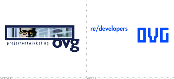
OVG was founded in 1997 in Rotterdam, the Netherlands, by then 27-year-old Coen van Oostrom. The prominent commercial development company has since grown to include a variety of national and international clients. It recently rebranded in order to better connect to its expanding audience and more accurately communicate its offerings. According to Studio Dumbar, the company responsible for the redesign, the new logo is intended to be a “living identity” — flexible enough to adjust to each application, and symbolic of the unique strategy behind each project.
Continue reading this entry
DATE: Aug.25.2011POSTED BY: Rietje GieskesCATEGORY: Corporate COMMENTS:
TAGS:
Opinion BY Armin
Oily Wave
![]()
Founded as the Ohio Oil Company in 1887, the Marathon Oil Company, known as such since 1930, is an oil an energy company that has recently divided its two main businesses: 1) The “upstream” business, which is responsible for the exploration and mining of oil and 2) The “downstream” business, which is about the refining, marketing, and transportation of the oil. In broad terms. The upstream business has been spun-off into its own company called Marathon Petroleum Corporation and is keeping the old logo. The downstream business has kept the Marathon Oil Company name and adopted a new logo, designed by Houston, TX-based BrandExtract.
Continue reading this entry
DATE: Aug.23.2011POSTED BY: ArminCATEGORY: Corporate COMMENTS:


Books about logo design, the designers that create them and the meaning of branding.
