


Online
- FPO (For Print Only) / Celebrating the reality that print is not dead by showcasing the most compelling printed projects.
- Art of the Menu / Cataloguing the underrated creativity of menus from around the world.
- Quipsologies / Chronicling the most curious, creative, and notable projects, stories, and events of the graphic design industry on a daily basis.
- Speak Up (2002 – 2009) / Discussing, and looking for, what is relevant in, and the relevance of, graphic design. Archives Only.
- Word It (2003 – 2010) / Encouraging creative diversity in the community through monthly, one-word challenges. Archives Only.
- Brand New Classroom (2010 – 2011) / Providing a space for critique and opinions on student identity work. Archives Only.
Publishing
- The 2010 Brand New Awards / 2011, self-published.
- Flaunt: Designing effective, compelling and memorable portfolios of creative work / 2010, self-published.
Events & Judged Competitions
- Brand New Conference / A one-day event on the development of corporate and brand identity projects by some of today’s most active and influential practitioners from around the world.
- Brand New Awards / Celebrating the best identity work produced around the world.
- FPO Awards / Celebrating the best print work from around the world.
Writing
- Graphic Design, Referenced: A Visual Guide to the Language, Applications, and History of Graphic Design / 2009, Rockport.
- Women of Design: Influence and Inspiration from the Original Trailblazers to the New Groundbreakers / 2008, HOW Books.
- The Word It Book: Speak Up Presents a Gallery of Interpreted Words / 2007, HOW Books.
Graphic Design
- Department of Design / Designing corporate and brand identities and full development of printed and digital matter for clients.

Opinion BY Armin
Foster’s Brews New Image
![]()
Established in 1907 with the union of Foster’s Brewing Company, the Victoria Brewery, the Carlton Brewery and three other Melbourne breweries, Carlton & United Breweries (CUB), owned by Foster’s Group, is the largest brewer in Australia with a portfolio that features over 20 beers that includes their own brews as well as licensed beers like Corona. CUB is the main focus of Foster’s Group, which also dabbles in cider and spirits. This past July Foster’s Group announced that Carlton & United Breweries would change its name to Carlton United Brewers and introduced a new logo for CUB as well as for itself.
Continue reading this entry

DATE: Aug.11.2011 POSTED BY: ArminCATEGORY: Corporate COMMENTS:

TAGS: australia, blue, gradient, sans serif,

A B-Side BY cole
Whipsaw
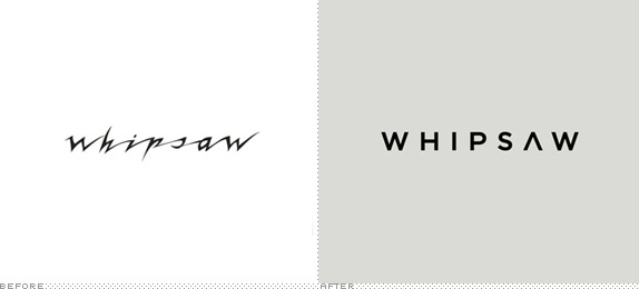
The industrial design studio Whipsaw has undergone an identity and website update by Method. More of which can be found here.
DATE: Jul.22.2011POSTED BY: Cole BaldwinCATEGORY: Corporate The B-Side COMMENTS:
TAGS: sans serif,
A B-Side BY Armin
Canadian Oil Sands
![]()
Canadian Oil Sands is the largest owner of Syncrude, a leader in Canada’s oil sands industry, and what it does is that it provides investment opportunities into Syncrude. Earlier this year they introduced a new identity designed by Toronto-based Craib Design & Communications.
Thanks to Raul Leto for the tip.
DATE: Jul.19.2011POSTED BY: ArminCATEGORY: Corporate The B-Side COMMENTS:
TAGS: canada, droplet, maple leaf, rounded sans serif,
Follow-Up BY Armin
Follow-Up: EDP

One of the elements of the identity redesign of EDP, covered last week, that I missed to address was an animation that played on EDP’s home page, which at the time struck me as quite fetching and smoothly done but still populated by the same icons that I wasn’t too complimentary of. The animation was done by Brand New School, and they squeeze the best traits of the EDP identity to create a fun animation, which you can see below (or after the jump).
Continue reading this entry
DATE: Jul.15.2011POSTED BY: ArminCATEGORY: Corporate COMMENTS:
TAGS: animation, brand new school,
The B-Side BY cole
Schlecker
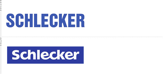
Established in 1975, Schlecker, the Germany based drugstore and one of the largest European retailers, has undergone a recent identity update. The new logo features a bit friendlier type treatment (based on Frutiger, but tweaked for individualization) in an attempt to appear more inviting and approachable. The official press release can be found here but may require Google Translate for the non-German speakers.
Thanks to Ralitza Dilovska for the tip.
DATE: Jul.11.2011POSTED BY: Cole BaldwinCATEGORY: Corporate The B-Side COMMENTS:
Opinion BY Armin
One Fifth of a Third Better
![]()
Established in 1971 as part of Fifth Third Bank — one of my all time most-hated logos — Fifth Third Processing Solutions is one of the largest providers of credit card processing and payment strategies for more than 400,00 financial institutions and other business merchants, processing “more than 11.4 billion ATM and POS transactions and nearly $400 billion in debit and credit sales volume annually.” This june the company announced it would change its name to Vantiv. Not much information on the design or naming is offered by the press release. (Leads and tips welcome).
Continue reading this entry
DATE: Jul.11.2011POSTED BY: ArminCATEGORY: Corporate COMMENTS:
TAGS: sans serif,
A B-Side BY Armin
Wendy’s Company
![]()
Wendy’s/Arby’s Group was formed in 2008, although it traces its history back many years to other holding company names. As the name implies, the group owned both Wendy’s and Arby’s. This week Arby’s was sold to Roark Capital Group and the company changed its name to Wendy’s Company. Press release here. The new logo features one of the worst typographic solutions I have seen in some time. Enjoy it larger below (or after the jump).
Continue reading this entry
DATE: Jul.07.2011POSTED BY: ArminCATEGORY: Corporate The B-Side COMMENTS:
TAGS: restaurant, serif,
Opinion BY Armin
A to S is the New A to Z
![]()
Although strands of the company go back to 1996, Atos was first formed in 2000, the same year it became Atos Origin. This month, with the acquisition of Siemens IT Solutions and Services GmbH, the company is back to being known as Atos. With 78,500 employees in 42 countries Atos is an information technology services company — they also happen to be the worldwide Information Technology Partner for the Olympic Games, so they must know what they are doing. With the new name comes a new identity. According to a brand manual that got floated past me, the concept is credited to Atos Talents & Communications (fancy way of saying “in-house”) and Publicis’ Royalties. Atos has also introduced a couple of tag lines and mottos: “Your business technologists” as the descriptor, “Powering progress” as the signature, and “The power of to” also pops up here and there on their website.
Continue reading this entry
DATE: Jul.07.2011POSTED BY: ArminCATEGORY: Corporate COMMENTS:
TAGS: blue, publicis, script, slab serif,
A B-Side BY cole
Pannone
![]()
Pannone, based out of Manchester, UK is an internationally renowned law firm offering services from corporate to personal and all things in between. They have recently undergone an identity update and launched a new website. More information here.
[Ed.’s note: Our new intern, Cole Baldwin, will be helping out with the B-Side.]
Thanks to J. Jason Smith for the tip.
DATE: Jul.05.2011POSTED BY: Cole BaldwinCATEGORY: Corporate The B-Side COMMENTS:
TAGS: sans serif, uk,
Opinion BY Armin
Attack of the Red Gradients
![]()
Established in 1976, EDP (Energias de Portugal) is not just the largest electricity and energy company in Portugal but also a major player globally with presence in Spain, Brazil, and the U.S. with more than 12,000 employees worldwide. It’s also the third largest wind operator in the world. Last week EDP unveiled a new identity designed by Sagmeister Inc.
Continue reading this entry
DATE: Jul.05.2011POSTED BY: ArminCATEGORY: Corporate COMMENTS:
TAGS: gradient, large logo system, portugal, red, sagmeister, script, wordmark,


Books about logo design, the designers that create them and the meaning of branding.
