


Online
- FPO (For Print Only) / Celebrating the reality that print is not dead by showcasing the most compelling printed projects.
- Art of the Menu / Cataloguing the underrated creativity of menus from around the world.
- Quipsologies / Chronicling the most curious, creative, and notable projects, stories, and events of the graphic design industry on a daily basis.
- Speak Up (2002 – 2009) / Discussing, and looking for, what is relevant in, and the relevance of, graphic design. Archives Only.
- Word It (2003 – 2010) / Encouraging creative diversity in the community through monthly, one-word challenges. Archives Only.
- Brand New Classroom (2010 – 2011) / Providing a space for critique and opinions on student identity work. Archives Only.
Publishing
- The 2010 Brand New Awards / 2011, self-published.
- Flaunt: Designing effective, compelling and memorable portfolios of creative work / 2010, self-published.
Events & Judged Competitions
- Brand New Conference / A one-day event on the development of corporate and brand identity projects by some of today’s most active and influential practitioners from around the world.
- Brand New Awards / Celebrating the best identity work produced around the world.
- FPO Awards / Celebrating the best print work from around the world.
Writing
- Graphic Design, Referenced: A Visual Guide to the Language, Applications, and History of Graphic Design / 2009, Rockport.
- Women of Design: Influence and Inspiration from the Original Trailblazers to the New Groundbreakers / 2008, HOW Books.
- The Word It Book: Speak Up Presents a Gallery of Interpreted Words / 2007, HOW Books.
Graphic Design
- Department of Design / Designing corporate and brand identities and full development of printed and digital matter for clients.

A B-Side BY Armin
Centrum Kultury Zamek
![]()
About: “Centrum Kultury Zamek (Culture Centre Castle) is the largest institution in the greater dissemination of culture and one of the largest institutions of its kind in Poland. During the year [we] organizes hundreds of events: concerts, exhibitions, meetings, film screenings, workshops and lectures. Our headquarters is the former imperial castle, one of the most unique buildings in Poznan. It was built in the years 1905-1910 as a residence Poznan last German Emperor Wilhelm II.”
Design by: Motor Studio.
Ed.’s Notes: Sample of the logo in application below (or after the jump) and a few more images at the Motor Studio case study link. I really love the abstraction and loose spacing of the logo.
Relevant links: CKZ Facebook post. Motor Studio case study.
Select quote (with Google Translate): “The graphic symbol consists of four simple elements that could be a reference to an abstract architectural forms found in building the imperial residence.”
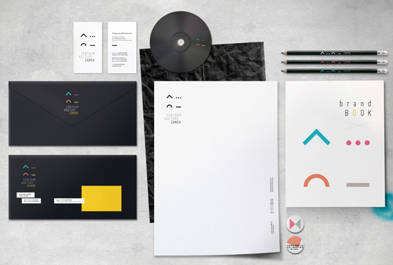
Thanks to Jakub Swiadek for the tip.

DATE: Dec.13.2012 POSTED BY: ArminCATEGORY: Culture The B-Side COMMENTS:

TAGS: abstract, condensed, poland, Sans Serif,

Opinion BY Armin
Architecture Museum at the Edge of the Edge
![]()
Set to open in June of 2013 in the rising city of Nanjing (pop. 6.5 million) in China, the Sifang Art Museum will be a 30,000-square-foot space devoted to contemporary design and architecture. Designed by Steven Holl, the museum is part of the Contemporary International Practical Exhibition of Architecture, a privately financed project that will also include a convention center and 20 villas each with a unique design by architects like Ai Weiwei and David Adjaye. The new identity of the museum has been designed by Singapore-based Foreign Policy Design Group.
Continue reading this entry
DATE: Dec.13.2012POSTED BY: ArminCATEGORY: Culture COMMENTS:
A B-Side BY Armin
The Animation Guild
![]()
About: (Est. 1952) “The Animation Guild is Local 839 of the International Alliance of Theatrical and Stage Employees (IATSE). We are a labor organization that represents animation and visual effects artists. We do for our members what every labor organization does: negotiate wage minimums and working conditions, provide pension and health benefits (specifically through the Motion Picture Industry Pension and Health Plan) and act as an advocate for our members over disputes between employees and employers. Our goal is to provide a seamless cloak of benefits and the strength of a collective voice to our members across the animation industry.”
Design by: Malcolm Grear Designers.
Ed.’s Notes: That old logo simply cannot be true! LOL, man, LOL. New logo has nice, old-school concept to it. Larger view below (or after the jump).
Relevant links: Animation Guild blog post.
Select Quote:“As the lowercase ‘a’ and ‘g’ join together to form the symbol, the letters seem to be in constant movement, animated. They appear linked and interwoven but they also actively flip back and forth, each letter switching from foreground to background.”
![]()
Thanks to Dave Logan for the tip.
DATE: Nov.19.2012POSTED BY: ArminCATEGORY: Culture The B-Side COMMENTS:
A B-Side BY Armin
Hong Kong Philharmonic
![]()
About: (Est. 1957) “The Hong Kong Philharmonic (HK Phil) is one of Asia’s leading orchestras. Enriching Hong Kong’s cultural life for over a century, the HK Phil has grown into a formidable ensemble of Chinese and international talents, attracting world-class artists to collaborate on its stage. The HK Phil annually touches the lives of over 200,000 music lovers through more than 150 performances.”
Design by: N/A
Ed.’s Notes: Bigger view of the logo plus introduction video below (or after the jump).
Relevant links: Logo introduction.
Quote: “The new identity represents the swinging movements of the baton in the hand of the conductor as if it were a wand in the hand of a wizard, creating and orchestrating magical experiences that are at once elevating, enriching and enchanting.”
Continue reading this entry
DATE: Oct.01.2012POSTED BY: ArminCATEGORY: Culture The B-Side COMMENTS:
TAGS: hong kong, red, Sans Serif,
Opinion BY Armin
Myspace Remains Immortal
![]()
Like Jason Voorhees, Myspace is back from the near-dead. Or, well, it’s going to be back. Soon. You just need to give them your e-mail at a new landing site to get an invite to join. After a brave, Hail Mary-like push in October of 2010 to reboot the social networking site with a new identity and functionality under the auspices of News Corp, Myspace crashed badly and was picked up by Specific Media, an interactive media company that “enables advertisers to connect with consumers in meaningful, impactful and relevant ways.” They were joined by Justin Timberlake, who was reported to “take an ownership stake and play a major role in developing the creative direction and strategy for [Myspace] moving forward.” The new creative direction and strategy are here. Yesterday, Timberlake introduced a preview video to his 13,000,000-plus Twitter followers.
Continue reading this entry
DATE: Sep.25.2012POSTED BY: ArminCATEGORY: Culture COMMENTS:
Opinion BY Armin
USA TODAY for Tomorrow
![]()
Founded in 1982, USA TODAY is the second largest newspaper (behind The Wall Street Journal and its 2.1 million copies) in the United States with 1.8 million copies circulating every weekday — reportedly “one in every seven Americans interacts with USA TODAY on a weekly basis.” — and is best known for its concise and visual approach to delivering news. Its online counterpart, USATODAY.com receives 6.6 million readers daily and mobile apps complete the picture for this “multi-platform news and information media company” owned by Gannett. Late last week, USA TODAY announced a complete redesign of all its platforms, including the ubiquitous print edition and its identity, both designed by Wolff Olins — all digital applications were done by Fantasy Interactive covering their strategy, user experience, design, and development. The beta version with the new look can be seen here.
Continue reading this entry
DATE: Sep.18.2012POSTED BY: ArminCATEGORY: Culture COMMENTS:
TAGS: circles, futura, newspaper, wolff olins,
Opinion BY Armin
Museums that Weave Together, Stay Together
![]()
Established in 1906, the American Alliance of Museums (formerly the American Association of Museums) is a nonprofit organization whose mission is to “nurture excellence in museums through advocacy and service.” By developing standards and best practices, providing resources and career development, and advocating for museums to thrive the American Alliance of Museums (AAM) supports 21,000 cultural institutions — from art, history, and science museums to zoos, aquariums, and historic sites — and individuals — from directors to curators to registrars. This month AAM introduced its new name, to reinforce the notion of alliance, and a new identity designed by Portland, OR-based Satori Engine.
Continue reading this entry
DATE: Sep.13.2012POSTED BY: ArminCATEGORY: Culture COMMENTS:
A B-Side BY Armin
Cohen Media Group
![]()
Established in 2008, Cohen Media Group (CMG) is a theatrical production and distribution company specializing in independent and foreign language films. Last month CMG introduced a new identity designed by Pentagram partner Paula Scher. Plenty of applications and story here.
DATE: Sep.06.2012POSTED BY: ArminCATEGORY: Culture The B-Side COMMENTS:
TAGS: monogram, pentagram, Sans Serif,
Opinion BY Armin
Follow-up: Stedelijk Museum Amsterdam
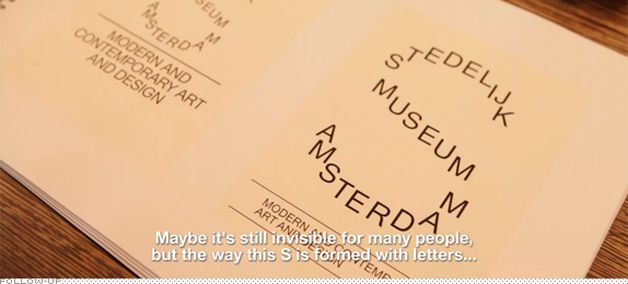
In May we reported on the redesign of the Stedelijk Museum Amsterdam identity by Mevis & Van Deursen that I described with zingers like “To call it a Type 101 exercise would be advanced” and placing its “concept and execution at the lowest end of the scale.” The comments raged on 200-plus strong and many came to the logo’s defense. I admit that it was one of the few times where I really felt that I got my impression and review wrong. That I was being obtuse. But every time I look at that logo I still see nothing that makes me want to like it on its own — now there is a little more graphic context to the logo thanks to a video posted by the Stedelijk, and shown below (or after the jump) where we see more of the application and hear from its designers.
Continue reading this entry
DATE: Aug.30.2012POSTED BY: ArminCATEGORY: Culture COMMENTS:
TAGS: museum,
Opinion BY Christian Palino
Perot Museum Hoists Brackets
![]()
Established in 2006 in Dallas, TX, the Museum of Nature & Science is the sum of The Dallas Museum of Natural History, The Science Place, and the Dallas Children’s Museum that came together that year. In January of 2013, the museum will be relocated to a new building and be renamed as the Perot Museum of Nature and Science. The new identity, inspired by Morphosis Architects’ cube-shaped building, was designed by Pentagram partners DJ Stout and Michael Bierut.
Continue reading this entry
DATE: Aug.28.2012POSTED BY: Christian PalinoCATEGORY: Culture COMMENTS:


Books about logo design, the designers that create them and the meaning of branding.
