
Opinion BY Armin
Boom goes the Sans
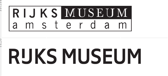
Established in 1800, the Rijksmuseum (State Museum in English) in Amsterdam is home to more than 900,000 items in its collection, including a large amount of masterpieces from the Dutch Golden Age from artists like Rembrandt, Vermeer, and Hals. Housed in an 1827 building, the Rijksmuseum has been under renovation since 2003 and next year will see its reopening with a design by Spanish architects Cruz y Ortiz. Yesterday, Rijksmuseum introduced their new logo and identity, designed by Irma Boom with custom lettering by Paul van der Laan of Bold Monday, replacing the 32-year-old logo designed by Studio Dumbar.
Continue reading this entry

DATE: Aug.23.2012 POSTED BY: Armin
 CATEGORY: Culture
  COMMENTS:

TAGS: custom, irma boom, museum, Sans Serif, the netherlands,

A B-Side BY Armin
Madison Public Library

An agency of the City of Madison, WI, the Madison Public Library has nine branches across the city with 2.3 million visitors and 4.75 million checkouts a year — its main branch is currently under renovation. Earlier this month, they introduced a new logo, designed by local firm Cricket Design Works. Image of the unveiling below (or after the jump).
Continue reading this entry

DATE: Aug.20.2012 POSTED BY: Armin
 CATEGORY: Culture The B-Side
  COMMENTS:


Opinion BY Armin
Here’s Looking at You, P
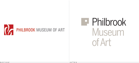
Housed in a 1926 Italian Renaissance-style villa built for oilman Waite Phillips in 23 acres of land and gifted to city of Tulsa, OK, in 1938, the Philbrook Museum of Art is home to an expansive collection of everything from Native American to African to Asian to European to contemporary art. In 2013, the Philbrook will open a new location to complement the villa in the historic downtown Brady District, a growing arts area in Tulsa. The new identity, which is inspired by the two locations, has been designed by Pentagram partner Michael Bierut in collaboration with partner Eddie Opara, who designed the website.
Continue reading this entry

DATE: Aug.14.2012 POSTED BY: Armin
 CATEGORY: Culture
  COMMENTS:

TAGS: icon, museum, pentagram, Sans Serif, window,

A B-Side BY Armin
British Film Institute
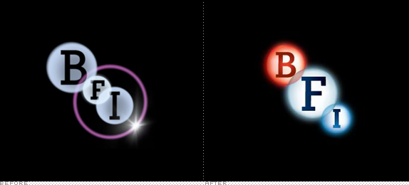
Established in 1933, the British Film Institute (BFI), as its name implies, is dedicated to all that is good and holy about British film. Back in 2006 we reported on BFI’s new flexible-ish identity by johnson banks, which I liked quite a bit and in our early years of Brand New was one of the first heated comment threads. A new, dumbed-down version of the logo has been designed by London-based Dewynters.

DATE: Aug.08.2012 POSTED BY: Armin
 CATEGORY: Culture The B-Side
  COMMENTS:

TAGS: gradient, overlay, slab serif,

Opinion BY Armin
These Books are brought to you by the Letter M

Established in 1957, Móra Publishing is one of the largest publishers in Hungary, specializing in both classic and contemporary children and youth books by Hungarian and international authors. For many generations of kids, Móra books have been part of their upbringing. Without a traditional logo, Móra has simply been typesetting the company name in the same title typeface as whichever book or series its on. Budapest-based Made by Zwoelf has just finished a new identity for the publisher and a logo that will be emblazoned on 76,000 book covers yearly.
Continue reading this entry

DATE: Jul.19.2012 POSTED BY: Armin
 CATEGORY: Culture
  COMMENTS:

TAGS: colorful, flexible identity, hungary, monospace,

Opinion BY Armin
New York City Circles
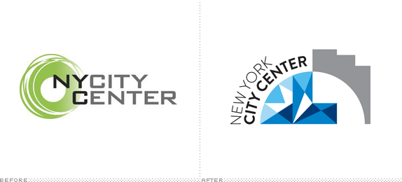
Established in 1943, New York City Center (NYCC) is a performing arts venue, focusing on dance and musical theater, located in Midtown Manhattan, and “dedicated to making the arts accessible to the broadest possible audience.” NYCC is home to the renown Alvin Ailey American Dance Theater and American Ballet Theatre as well as popular events like Encores! Great American Musicals in Concert series and the Fall for Dance festival. After a $75-million-restoration to its historic theatre and façade that re-opened in October 2011, NYCC needed a new identity that was introduced recently and designed by Futurebrand.
Continue reading this entry

DATE: Jul.17.2012 POSTED BY: Armin
 CATEGORY: Culture
  COMMENTS:

TAGS: circles, futurebrand, New York, Sans Serif,

A B-Side BY Armin
Toledo Opera
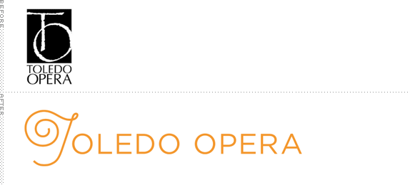
Established in 1959, Toledo Opera is an opera company based in Toledo, Ohio. A new logo was introduced recently, designed by Melissa Wehrman. The ornamental “T” is a twisted treble clef.

DATE: Jun.15.2012 POSTED BY: Armin
 CATEGORY: Culture The B-Side
  COMMENTS:


Opinion BY Armin
Design Stuff: Ready for its Close-Up
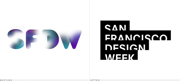
Organized first in 2006, San Francisco Design Week (SFDW) is a “week of events highlighting the diversity and professionalism of the design community around the bay” led by the San Francisco chapter of AIGA in partnership with Adobe and the local chapters of the the American Institute of Architects (AIA), the Industrial Designers Society of America (IDSA), the Interaction Design Association (IxDA), and the Society for Environmental Graphic Design (SEGD). Its goal is to “raise public awareness of the impact that all design-graphic, product, interior, fashion, architecture, advertising, et cetera-has in the San Francisco Bay Area.” We reported on the event’s identity last year. This year, AIGA SF worked with Manual to design a logo that would be established as a consistent mark for all future SFDW events as well as the creative campaign for this year’s edition, which kicks off today.
Continue reading this entry

DATE: Jun.11.2012 POSTED BY: Armin
 CATEGORY: Culture
  COMMENTS:

TAGS: 3d, manual creative, photography, san francisco,

A B-side BY Armin
Luxembourg Philharmonic Orchestra
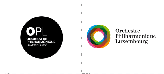
Founded in 1933, the Luxembourg Philharmonic Orchestra is the national orchestra of Luxembourg. The new identity has been designed by Pentagram partner Justus Oehler. More images and explanation here and a bigger view of the logo below (or after the jump).
Continue reading this entry

DATE: May.09.2012 POSTED BY: Armin
 CATEGORY: Culture The B-Side
  COMMENTS:


Opinion BY Armin
Stedelijk Museum Spells Out the Obvious
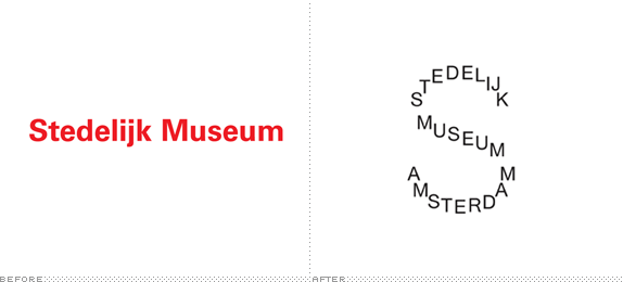
Established in 1895, the Stedelijk Museum Amsterdam (“Municipal Museum Amsterdam”) is a museum for classic modern art, contemporary art, and design in Amsterdam. Currently closed, until September of this year, for a major renovation and expansion by Mels Crouwel of Benthem Crouwel Architects that will adapt the 117-year-old building with a new structure, the Stedelijk will be able to showcase its permanent collection that includes works by Vincent van Gogh, Wassily Kandinsky, Marc Chagall, Henri Matisse, Piet Mondrian, and Jackson Pollock, among others. In late April the museum announced a new logo, designed by the website-less Mevis & Van Deursen, and was immediately met with discontent, gathering more than 300 comments in this Facebook post. Not much other information has been released.
Continue reading this entry

DATE: May.09.2012 POSTED BY: Armin
 CATEGORY: Culture
  COMMENTS:

TAGS: monogram, museum, Sans Serif, the netherlands, typography,


