
A B-Side BY Armin
Creative England
Established in 2011, Creative England has “the core purpose of supporting the sustainable growth of independent creative businesses, and the talent that feeds them, in every part of England outside London” focusing on film, television, games, and digital and creative services. In November, Creative England “put out an open call for applications for a new brand identity in November last year, asking designers to present an image that captured Creative England’s work and values.” (Way to support the creative community asking for spec work!). After 150 submissions, they picked a logo designed by Sheffield-based Peter and Paul. Story here. The logo represents “fluidity” and is about showing them as “dynamic and moving.”
Thanks to Alice Ralph for the tip.

DATE: Apr.20.2012 POSTED BY: Armin
 CATEGORY: Culture The B-Side
  COMMENTS:


A B-Side BY Armin
Guggenheim UBS MAP Global Art Initiative

Launched this month, the Guggenheim UBS MAP Global Art Initiative is “an ambitious five-year collaboration to chart creative activity and contemporary art from around the world,” specifically South and Southeast Asia, Latin America, and the Middle East and North Africa. London-based johnsonbanks created the identity for the initiative, which had a tough challenge: “Our design task was then to create a design system that would accommodate both the world-famous museum brand and its equally famous sponsor, without being able to use any actual art, since the curation process is only just beginning.” See the full result here. A couple of images below (or after the jump).
Continue reading this entry

DATE: Apr.19.2012 POSTED BY: Armin
 CATEGORY: Culture The B-Side
  COMMENTS:

TAGS: johnson banks, museum, Sans Serif,

A B-Side BY Armin
Yiddish Book Center
Established in 1980, the Yiddish Book Center in Amherst, MA is dedicated to the preservation of historical books in the Yiddish language and has recovered over one million volumes to date. A new logo, introduced in March, features a goat. Why? Learn here. The big word in Hebrew over the goat is “Yiddish”. The logo was designed by Redding, CT-based Alexander Isley Inc..
Thanks to Eve for the tip.

DATE: Apr.13.2012 POSTED BY: Armin
 CATEGORY: Culture The B-Side
  COMMENTS:

TAGS: alexander isley, animal, hebrew, serif,

Opinion BY Armin
What’s Der Frequency?
If this looks familiar it’s because it’s part of the overall rebranding of SRG SSR, the Swiss organization responsible for public service broadcast in radio, television, and online in all four official languages of Switzerland. Earlier this month we covered RTS, the French language TV and radio channel. Now comes the German language radio and TV stations, established in 1931 and previously known as SR DRS (Schweizer Radio: Radio der deutschen und rätoromanischen Schweiz, “Swiss Radio: Radio of the German and Romansh Switzerland” in English) which has been renamed SRF (Schweizer Radio und Fernsehen, “Swiss Radio and Television” in English). The logos for the television channels remain the same but the six radio stations have all gotten new logos.
Continue reading this entry

DATE: Mar.26.2012 POSTED BY: Armin
 CATEGORY: Culture
  COMMENTS:

TAGS: german, radio, switzerland,

A B-Side BY Armin
Children’s Museum of the Arts
Founded in 1988, the Children’s Museum of the Arts (CMA) in New York provides exhibits, classes, and other programs. Late last year, with the move to a new space, CMA introduced a new logo designed by Base. Bigger view and different logo iterations below (or after the jump).
Continue reading this entry

DATE: Mar.21.2012 POSTED BY: Armin
 CATEGORY: Culture The B-Side
  COMMENTS:

TAGS: museum, Sans Serif,

Opinion BY Armin
Qagoma
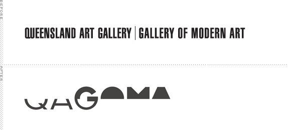
Established in 1895, The Queensland Art Gallery in Australia is one of the leading visual arts institutions in the country with more than 14,000 Australian and international paintings, sculptures, decorative art objects, multimedia installations, and works on paper. In 2006, the Gallery of Modern Art was opened as a sister institution to focus on contemporary work. For a quick distinction the Gallery offers that “the historical (pre-1970) collections are displayed at the Queensland Art Gallery, while the contemporary collections (1970 onwards) are displayed at the Gallery of Modern Art.” This month the “Queensland Art Gallery|Gallery of Modern Art”, a mouthful, has been rebranded as QAGOMA an abbreviated abbreviation of QAG and GOMA, with a new identity by Interbrand Australia.
Continue reading this entry

DATE: Mar.21.2012 POSTED BY: Armin
 CATEGORY: Culture
  COMMENTS:

TAGS: australia, interbrand, museum, Sans Serif,

Opinion BY Armin
Moscow Design Museum on the Grid
Set to open its first exhibition this year, the Moscow Design Museum is “an international exhibition and education platform and the first, the only and the unique design museum in Russia. It is a space where the general public will be able to view the best examples of international and Russian design.” Founded by Alexandra Sankova, Nadezhda Bakuradze, Stepan Lukyanov, and Valery Patkonen — four independent creatives — the museum will have a home base in Moscow’s Artplay culture center but it is mainly imagined as a nomadic, pop-up museum. Its identity has been designed by Amsterdam-based Lava, who also share a partner role in the museum, advising on content and vision.
Continue reading this entry

DATE: Mar.20.2012 POSTED BY: Armin
 CATEGORY: Culture
  COMMENTS:

TAGS: black, flexible identity, lava, russia, white,

Opinion BY Armin
TFO Rules
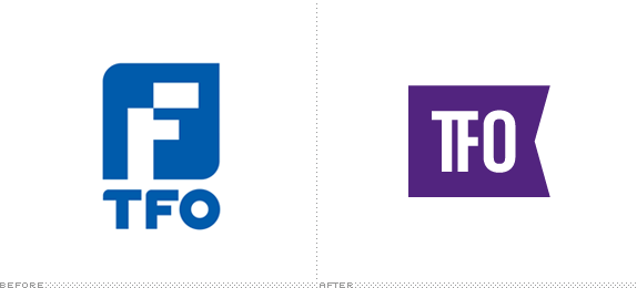
Originally launched in 1985 as La Chaîne Française, TFO (Télé-Française d’Ontario), as it was renamed in 1995, is a Canadian French-language educational and cultural public service television channel owned by the Government of Ontario. TFO has a dual focus on children programming as well as documentaries and other cultural programming for adults. The channel is now one component of the larger Groupe Média TFO, which produces web series and content for other partners. This February, TFO introduced a new identity designed by Toronto-based Lowe Roche.
Continue reading this entry

DATE: Mar.09.2012 POSTED BY: Armin
 CATEGORY: Culture
  COMMENTS:

TAGS: canada, flag, on-air, purple, Sans Serif, television,

Opinion BY Armin
Twisted Swisster
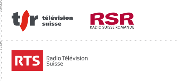
Established in 1931 SRG SSR is the Swiss public broadcasting responsible for overseeing the public service broadcast in radio, television, and online in all four official languages of Switzerland (German, French, Italian, and Romansh). Its French broadcaster, originally two separate entities — Radio Suisse Somande (RSR) and Télévision Suisse Romande (TSR) — have just merged into a single entity, Radio Télévision Suisse (RTS), and have introduced a new family of logos for its different channels across mediums, designed in-house.
Continue reading this entry

DATE: Mar.07.2012 POSTED BY: Armin
 CATEGORY: Culture
  COMMENTS:

TAGS: gradient, radio, ribbon, switzerland, television,

Opinion BY Armin
The Dot Marks the Spot
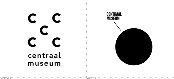
Established in 1838, the Centraal Museum in Utrecht is the oldest municipal museum in the Netherlands with an eclectic collection of old and new items — nearly 50,000 — ranging from 18th century fashion to an early twentieth-century ship stored in the basement to a special collection and wing on the work of Dick Bruna, creator of the adorable Miffy. At the end of last year the Centraal Museum introduced a new identity, designed by Amsterdam-based Lesley Moore.
Continue reading this entry

DATE: Mar.05.2012 POSTED BY: Armin
 CATEGORY: Culture
  COMMENTS:

TAGS: museum, Sans Serif, the netherlands,


