


Online
- FPO (For Print Only) / Celebrating the reality that print is not dead by showcasing the most compelling printed projects.
- Art of the Menu / Cataloguing the underrated creativity of menus from around the world.
- Quipsologies / Chronicling the most curious, creative, and notable projects, stories, and events of the graphic design industry on a daily basis.
- Speak Up (2002 – 2009) / Discussing, and looking for, what is relevant in, and the relevance of, graphic design. Archives Only.
- Word It (2003 – 2010) / Encouraging creative diversity in the community through monthly, one-word challenges. Archives Only.
- Brand New Classroom (2010 – 2011) / Providing a space for critique and opinions on student identity work. Archives Only.
Publishing
- The 2010 Brand New Awards / 2011, self-published.
- Flaunt: Designing effective, compelling and memorable portfolios of creative work / 2010, self-published.
Events & Judged Competitions
- Brand New Conference / A one-day event on the development of corporate and brand identity projects by some of today’s most active and influential practitioners from around the world.
- Brand New Awards / Celebrating the best identity work produced around the world.
- FPO Awards / Celebrating the best print work from around the world.
Writing
- Graphic Design, Referenced: A Visual Guide to the Language, Applications, and History of Graphic Design / 2009, Rockport.
- Women of Design: Influence and Inspiration from the Original Trailblazers to the New Groundbreakers / 2008, HOW Books.
- The Word It Book: Speak Up Presents a Gallery of Interpreted Words / 2007, HOW Books.
Graphic Design
- Department of Design / Designing corporate and brand identities and full development of printed and digital matter for clients.

A B-Side BY Armin
Marina Port Vell
![]()
Built in the early 1990s, Marina Port Vell is a waterfront harbor in Barcelona that is currently undergoing a major transformation. The new identity has been designed by London-based Aesop Agency. “The logo itself is an aperture shaped ‘M’ with a playful nod evocative of boats entering the marina,” from this story. More identity applications here.
Thanks to Marc Nijborg for the tip.

DATE: Oct.05.2011 POSTED BY: ArminCATEGORY: Destinations The B-Side COMMENTS:

TAGS: flexible identity, spain,

A B-Side BY Armin
Santo Domingo
![]()
Cluster Turístico de Santo Domingo, the tourism office of the capital of the Dominican Republic, has just released a new destination logo for the city. More story here.
Thanks to Mirek Janczur for the tip.
DATE: Sep.07.2011POSTED BY: ArminCATEGORY: Destinations The B-Side COMMENTS:
A B-Side BY Armin
Erzgebirge (Ore Mountains)
![]()
Erzgebirge (Ore Mountains) sit at the border of Germany and the Czech Republic. As their name implies, the mountains were rich in ores, including silver, tin, and copper. It became an important mining area. A new logo for Tourismusverband Erzgebirge has been designed by Sandstein.
Via The Branding Source.
DATE: Aug.30.2011POSTED BY: ArminCATEGORY: Destinations The B-Side COMMENTS:
TAGS: germany, icon, sans serif,
Opinion BY Armin
A Hell of a Place
![]()
Established many centuries ago, and its existence debated by many, Hell is a destination for suffering, punishment, and exposure to open flames for those that deserve it. With a long and well documented competition with Heaven, whose existence is also debated by many, Hell has seen a decline in population and brand recognition. This August — fittingly the hottest month of the year — the Hell Office of Travel and Tourism has introduced a new identity designed by Chicago, IL-based Chris Herron Design to position Hell as “the premier global tourist destination.”
Continue reading this entry
DATE: Aug.17.2011POSTED BY: ArminCATEGORY: Destinations COMMENTS:
TAGS: blue, lowercase, rounded sans serif,
A B-Side BY Armin
Parques Nacionales de Canarias
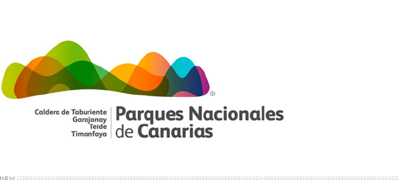
Located to the Northwest of Africa, the Canary Islands are a set of Spanish islands with beautiful national parks. The result of a contest, the new logo for Parques Nacionales de Canarias has been designed by Sevilla, Spain-based Pedro Olivares. A PDF with more applications of the logo can be found here.
Thanks to Nora Gummert-Hauser for the tip.
DATE: Aug.08.2011POSTED BY: ArminCATEGORY: Destinations The B-Side COMMENTS:
TAGS: contest, sans serif, spain,
A B-Side BY Armin
Georgetown BID
![]()
Established in 1999, the Georgetown Business Improvement District makes sure that the lovely Georgetown neighborhood in Washington DC stays lovely. A new logo, tagline, and website were introduced earlier this month. A story about it here.
Thanks to Matthew Collins for the tip.
DATE: Jun.23.2011POSTED BY: ArminCATEGORY: Destinations The B-Side COMMENTS:
TAGS: sans serif, star, washington,
Opinion BY Armin
Moscow Embraces Emoticons
![]()
This introduction might be a little choppy because my Russian goes as far as Google Translate will take me. As a personal initiative architect Nicholas Pereslegina and designer Alexander Pershikova have launched their very own brand for the city of Moscow without any government involvement (or maybe even approval). And this is not just some proposal on a Behance page, this is a full-on brand with merchandise and souvenirs already hitting the streets of Moscow. The concept of the new logo is Surprise + Smile = Wow.
Continue reading this entry
DATE: May.24.2011POSTED BY: ArminCATEGORY: Destinations COMMENTS:
A B-Side BY Armin
St. Petersburg/Clearwater
![]()
St. Petersburg/Clearwater is, as the name implies, a small region in Florida encompassing the area of and between the cities of St. Petersburg and Clearwater, featuring lovely beaches, resorts, and weather. In March a new identity designed by Pentagram was introduced.
DATE: Apr.21.2011POSTED BY: ArminCATEGORY: Destinations The B-Side COMMENTS:
Opinion BY Armin
Peru’s New Brand
![]()
It’s hard to describe countries without making sweeping statements or delving into clichés, so I won’t even attempt to describe Peru, other than to state some (hopefully obvious to everyone) facts: It’s in South America, its official language is Spanish, and it’s beautiful from its landmarks to its people. Last week saw the culmination of a process that started in 2009 led by PromPeru (Peru Exports and Tourism Promotion Comission) with the unveiling of Peru’s country brand, designed by the Buenos Aires office of Futurebrand.
Continue reading this entry
DATE: Mar.15.2011POSTED BY: ArminCATEGORY: Destinations COMMENTS:
TAGS: futurebrand, peru, red, script,
A B-Side BY lauren
Puerto Vallarta
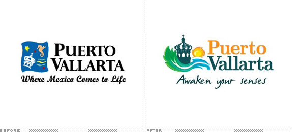
Puerto Vallarta, on a beautiful beach on the Pacific Ocean and Mexico�s second largest tourist destination, has recently undergone a repositioning in response to the changing face of tourism to Mexico. Designed by Puerto Vallarta based Mijo! Brands, “The new identity communicates the attributes which the destination promotes to differentiate itself from a growing list of national destinations competing for a diminishing market share.”
DATE: Feb.23.2011POSTED BY: ArminCATEGORY: Destinations The B-Side COMMENTS:
TAGS: illustration, mexico, serif,


Books about logo design, the designers that create them and the meaning of branding.
