


Online
- FPO (For Print Only) / Celebrating the reality that print is not dead by showcasing the most compelling printed projects.
- Art of the Menu / Cataloguing the underrated creativity of menus from around the world.
- Quipsologies / Chronicling the most curious, creative, and notable projects, stories, and events of the graphic design industry on a daily basis.
- Speak Up (2002 – 2009) / Discussing, and looking for, what is relevant in, and the relevance of, graphic design. Archives Only.
- Word It (2003 – 2010) / Encouraging creative diversity in the community through monthly, one-word challenges. Archives Only.
- Brand New Classroom (2010 – 2011) / Providing a space for critique and opinions on student identity work. Archives Only.
Publishing
- The 2010 Brand New Awards / 2011, self-published.
- Flaunt: Designing effective, compelling and memorable portfolios of creative work / 2010, self-published.
Events & Judged Competitions
- Brand New Conference / A one-day event on the development of corporate and brand identity projects by some of today’s most active and influential practitioners from around the world.
- Brand New Awards / Celebrating the best identity work produced around the world.
- FPO Awards / Celebrating the best print work from around the world.
Writing
- Graphic Design, Referenced: A Visual Guide to the Language, Applications, and History of Graphic Design / 2009, Rockport.
- Women of Design: Influence and Inspiration from the Original Trailblazers to the New Groundbreakers / 2008, HOW Books.
- The Word It Book: Speak Up Presents a Gallery of Interpreted Words / 2007, HOW Books.
Graphic Design
- Department of Design / Designing corporate and brand identities and full development of printed and digital matter for clients.

Opinion BY Armin
Taiwan, a Heartfelt Destination
![]()
I have never been to Taiwan so you will be spared of any personal recollections today. Located in Eastern Asia, Taiwan is a small island that the Central Intelligence Agency compares in size to the combined square milage of the states of Delaware and Maryland — while there is a combined 6 million people in those two, there are 23 million people in Taiwan. In 2010, Taiwan reportedly had 5 million visitors but it seems they want more. Earlier this month, the Taiwan Tourism Bureau introduced a new identity, designed by London-based Winkreative (the brand agency of Monocle’s Tyler Brûlé), and a new slogan that replaces the awkward sounding “Taiwan, Touch Your Heart” for “Taiwan — The Heart of Asia.”
Continue reading this entry

DATE: Feb.22.2011 POSTED BY: ArminCATEGORY: Destinations COMMENTS:

TAGS: gradient, illustration, serif, stencil, taiwan,

A B-Side BY Armin
Vietnam
![]()
The result of a contest organized by the Vietnam Administration of Tourism and the Viettime Media Company, this new logo for, well, Vietnam was designed by Cowan Vietnam Company. Story here.
Thanks to JJ for the tip.
DATE: Jan.31.2011POSTED BY: ArminCATEGORY: Destinations The B-Side COMMENTS:
TAGS: hand-drawn, icon, serif,
Opinion BY Armin
Bretagne’s Stripes
![]()
Bretagne (Brittany in English) is a region in the nortwhest of France. While I have never been to Bretagne, the region holds a special place in my heart as it is the fictional home to Asterix’s village which resided right on the coast of a peninsula sticking out at the northwest of the northwest of France. But Asterix doesn’t pay the region’s bills and it doesn’t attract tourists or businesses, so the Agence économique de Bretagne has just launched a new identity to represent the region and has launched two separate sites with slightly different moods and information, one for tourism and one for businesses. The identity was designed by Lyon-based Communiquez (who were here last week for their design of La Manche — in case you are wondering, they didn’t submit work to be featured, they just happened to be the design firm of two separate identities that caught my attention).
Continue reading this entry
DATE: Jan.31.2011POSTED BY: ArminCATEGORY: Destinations COMMENTS:
TAGS: communiquez, destination, france, sans serif, wordmark,
Opinion BY Armin
Rave at La Manche
![]()
La Manche is a Department of France located in Normandy, at the northern end of the country, perhaps best known for being home to the preternaturally picturesque Mont Saint-Michel, accessible from the Cotentin peninsula through a natural bridge that is covered and uncovered as the tide raises and lowers. The Conseil général de La Manche is rebranding La Manche — and to a certain degree also the larger region of Normandy — as not just an Old World Charm kind of place but a forward looking destination with a new identity designed by Lyon-based Communiquez. A PDF in French with the explained system can be found here — our French readers might prefer it over my butchered interpretations.
Continue reading this entry
DATE: Jan.21.2011POSTED BY: ArminCATEGORY: Destinations COMMENTS:
Opinion BY Armin
Columbus, Indiana Convention and Visitors Bureau
![]()
There aren’t many reasons to care about the redesign of the Columbus, Indiana Convention and Visitors Bureau logo. But want a good one? The old logo was designed by Paul Rand — dig the letterhead.
Thanks to B. Emmit Jones for the tip.
DATE: Jan.06.2011POSTED BY: ArminCATEGORY: Destinations The B-Side COMMENTS:
TAGS: monogram, paul rand, sans serif,
A B-Side BY Armin
City of Rome
![]()
The result of a competition, a new logo — or at least that’s what I think it is — for the city of Rome, designed by Turin company Mediapeople. Some other submissions here.
Thanks to Andrea Desiato for the tip.
DATE: Jan.06.2011POSTED BY: ArminCATEGORY: Destinations The B-Side COMMENTS:
TAGS: Italy, mediapeople,
Opinion BY Armin
Tourism Queensland
![]()
Queensland is one of six states in Australia covering destinations like Brisbane, Gold Coast, and Sunshine Coast.
Thanks to Claire Kelly for the tip.
DATE: Jan.06.2011POSTED BY: ArminCATEGORY: Destinations The B-Side COMMENTS:
TAGS: australia, destination,
Opinion BY Armin
Shape of Singapore
![]()
Geographically small at barely 275 square miles, Singapore is a country big with culture, architecture, scenery, financial prowess, and diversity, playing an important role in keeping the wheels of global business churning. This past March, the Singapore Tourism Board launched a new positioning and identity, Your Singapore, to attract tourism, business and the MICE (Meetings, Incentives, Conferences and Exhibitions) market. The identity and advertising have been created by BBH Asia-Pacific and it replaces the previous “Uniquely Singapore” campaign.
Continue reading this entry
DATE: Nov.01.2010POSTED BY: ArminCATEGORY: Destinations COMMENTS:
TAGS: animation, flexible identity, sans serif, singapore,
Opinion BY Armin
Where the Cold Wind Blows
![]()
Right at the very top of Europe where, if you were to go further North, you would eventually find yourself at the South of the world, lies the Nordkyn peninsula. Home to two municipalities — Gamvik and Lebesby — in the county of Finnmark, Norway. Nordkyn is cold. Arctic cold. It is also scenic. Dreamy scenic. Perfect for a Coen brothers movie. The two municipalities have come together to promote tourism to the peninsula and worked with Oslo-based Neue Design Studio to create an identity that, literally, reflects the nature of this destination: Visit Nordkyn.
Continue reading this entry
DATE: Sep.29.2010POSTED BY: ArminCATEGORY: Destinations COMMENTS:
Opinion BY Clinton Duncan
The Abu Dhabi Brand: Rich
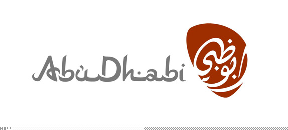
Abu Dhabi is the capital of the United Arab Emirates (UAE). However you may be more familiar with the world’s-tallest-tower-building, 7-star-hotel-opening, artificial-islands-in-the shape-of-a-world-map-making, or palm-creating lunacy of Dubai, the more famous of the two UAE cities. But Abu Dhabi is the capital of the intricately intertwined Emirate states — the Sacramento to Los Angeles, the Albany to Manhattan. The UAE has the good fortune of sitting atop the world’s seventh largest oil reserves, and it’s with these rather handsome profits they have decided to brand themselves and turned to the Sydney office of global ad agency M&C Saatchi and their internal brand consultancy, Re.
Continue reading this entry
DATE: Aug.17.2010POSTED BY: Clinton DuncanCATEGORY: Destinations COMMENTS:
TAGS:


Books about logo design, the designers that create them and the meaning of branding.
