


Online
- FPO (For Print Only) / Celebrating the reality that print is not dead by showcasing the most compelling printed projects.
- Art of the Menu / Cataloguing the underrated creativity of menus from around the world.
- Quipsologies / Chronicling the most curious, creative, and notable projects, stories, and events of the graphic design industry on a daily basis.
- Speak Up (2002 – 2009) / Discussing, and looking for, what is relevant in, and the relevance of, graphic design. Archives Only.
- Word It (2003 – 2010) / Encouraging creative diversity in the community through monthly, one-word challenges. Archives Only.
- Brand New Classroom (2010 – 2011) / Providing a space for critique and opinions on student identity work. Archives Only.
Publishing
- The 2010 Brand New Awards / 2011, self-published.
- Flaunt: Designing effective, compelling and memorable portfolios of creative work / 2010, self-published.
Events & Judged Competitions
- Brand New Conference / A one-day event on the development of corporate and brand identity projects by some of today’s most active and influential practitioners from around the world.
- Brand New Awards / Celebrating the best identity work produced around the world.
- FPO Awards / Celebrating the best print work from around the world.
Writing
- Graphic Design, Referenced: A Visual Guide to the Language, Applications, and History of Graphic Design / 2009, Rockport.
- Women of Design: Influence and Inspiration from the Original Trailblazers to the New Groundbreakers / 2008, HOW Books.
- The Word It Book: Speak Up Presents a Gallery of Interpreted Words / 2007, HOW Books.
Graphic Design
- Department of Design / Designing corporate and brand identities and full development of printed and digital matter for clients.

Opinion BY Armin
Accion gets some Action
![]()
Established in 1961 in 22 small towns in Venezuela to “empower the poor with the knowledge and tools to improve their lives,” Accion, a global nonprofit organization, is currently one of the world’s leaders in microfinance having established 62 microfinance institutions in 31 countries on four continents that in turn reach millions of clients with loans and support, fulfilling its mission of “giving people the financial tools they need to improve their lives.” All the way back in March with a rollout in the middle of the year, Accion introduced a new strategy, established by New York, NY-based IDEON, and new identity, designed by New York-based Joshua Levi.
Continue reading this entry

DATE: Dec.20.2012 POSTED BY: ArminCATEGORY: Non-Profit COMMENTS:


A B-Side BY Armin
PONCHO
![]()
About: (Est. 1963) “PONCHO (Patrons of Northwest Civic, Cultural and Charitable Organizations) is a 501(c)(3) non-profit organization dedicated to enriching the quality of life in the Puget Sound through increasing resources and community support for the arts. PONCHO acts as a catalyst for change in the arts sector by leveraging relationships with arts, philanthropic and education communities to build our civic and cultural life. PONCHO has provided over $35 million in support for 200+ arts organizations.”
Design by: The Garrigan Lyman Group.
Ed.’s Notes: Personally I would have started with changing the name or acronym.
Relevant links: N/A.
DATE: Dec.19.2012POSTED BY: ArminCATEGORY: Non-Profit The B-Side COMMENTS:
TAGS: overlay, Sans Serif,
Opinion BY Rietje Gieskes
A New Vision for New Visions for Public Schools
![]()
New York city public schools benefit greatly from private sector support through organizations like New Visions for Public Schools. Currently the largest of its kind, the nonprofit has prominent supporters like the Bill and Melinda Gates Foundation and the U.S. Department of Education. The organization provides funding to a variety of schools, including over 74 public and charter schools, and helps to develop teacher residency programs. With a new day, comes a new vision, as demonstrated by the organization’s new identity designed by New York, NY-based Chermayeff & Geismar.
Continue reading this entry
DATE: Nov.28.2012POSTED BY: Rietje GieskesCATEGORY: Non-Profit COMMENTS:
TAGS: chermayeff and geismar, education, monogram, New York, slab serif,
A B-Side BY Armin
Safe Place
![]()
About: (Est. 1983) “Safe Place is a national youth outreach program that educates thousands of young people every year about the dangers of running away or trying to resolve difficult, threatening situations on their own. This easily-replicated initiative involves the whole community to provide safe havens and resources for youth in crisis. Safe Place creates a network of Safe Place locations — schools, fire stations, libraries, grocery and convenience stores, public transit, YMCAs and other appropriate public buildings — that display the yellow and black diamond-shaped Safe Place sign. These locations extend the doors of the youth service agency or emergency shelter throughout the community. Youth can easily access immediate help wherever they are.”
Design by: AMP Agency.
Ed.’s Notes: The original sign had been unfortunately pegged as inappropriate. (An adult grabbing a kid’s breasts for those with innocent minds). Number 3 on this list of “20 Accidentally Naughty Company Logos”.
Provided comment: “Businesses around the country can display the Safe Place sign in their window to tell kids that there is trained staff available to help them out when they have nowhere else to turn. Because there is so much recognition equity in the original sign, I had to work within that shape and those colors. And because their logo doubles as a window sign, and the word ‘national’ in that scenario is irrelevant, they choose to not include the word in the logo, even though it is part of their name.” — Kevin Casey, Associate Creative Director, AMP Agency
Relevant links: Press release.
DATE: Nov.21.2012POSTED BY: ArminCATEGORY: Non-Profit The B-Side COMMENTS:
TAGS: diamond, rounded sans serif, yellow,
A B-Side BY Armin
Lupus Foundation of America
![]()
About: (Est. 1977) “The Lupus Foundation of America is the only national force devoted to solving the mystery of lupus, one of the world’s cruelest, most unpredictable and devastating diseases, while giving caring support to those who suffer from its brutal impact.”
Design by: Siegelvision.
Ed.’s Notes: I get the concept, I just wish the execution were competent. The result is painfully amateurish.
Relevant links: Press release.
Select quote: “The organization’s new positioning strategy, messages, and tag line — Help Us Solve the Cruel Mystery — were created in collaboration with the New York branding team Siegelvision, headed by brand guru Alan Siegel. The riveting phrase “cruel mystery” inspired the Siegelvision team to create the new Lupus Foundation of America logo which features a strikingly positioned question mark in place of the letter “P” in the word lupus.”
Continue reading this entry
DATE: Nov.15.2012POSTED BY: ArminCATEGORY: Non-Profit The B-Side COMMENTS:
TAGS: question, Sans Serif, uppercase,
Opinion BY Armin
Moustache Makeover
![]()
Established last Friday, November 2, 2012, team Brand Moustache is an initiative launched by Armin Vit to mobilize the male audience of Brand New to grow facial hair between their upper lips and noses to benefit Movember, the worldwide movement to generate awareness and raise funds to support prostate cancer and testicular cancer initiatives. On a whim, Armin decided to join Movember and lead a team of willing participants as captain of team Brand Moustache, for which he designed a logo that, upon unveiling, ignited controversy among the very readers he was trying to rally: the logo, various of them claimed, looked like Hitler and his iconic rectangle moustache. Armin is Jewish. Armin hates Hitler. Upset, Armin denied the claim and proceeded to call said readers doofuses — then removed the Hitler moustache in exchange for a more walrus-y one and, in a hissy fit, declared he might as well just be designing for “the lowest common denominator.” The PR department of UnderConsideration LLC convened with its C-level executives and after circulating a memo around the office decided the best thing would be to signal change by redesigning team Brand Moustache’s logo. Today, team Brand Moustache unveils its new, flexible identity designed by Austin, TX-based Armin.
Continue reading this entry
DATE: Nov.07.2012POSTED BY: ArminCATEGORY: Non-Profit COMMENTS:
TAGS: branding, flexible identity, Sans Serif,
Opinion BY Armin
Enactus Namus and Logus
![]()
Established in 1975 as Students In Free Enterprise (SIFE), Enactus is “an international non-profit organization that brings together student, academic and business leaders who are committed to using the power of entrepreneurial action to improve the quality of life and standard of living for people in need.” Enactus has 62,000 students enrolled in 1,600 member universities across 39 countries. The new name, created by Landor, was introduced this past September and a new logo, not designed by Landor came along with it.
Continue reading this entry
DATE: Nov.01.2012POSTED BY: ArminCATEGORY: Non-Profit COMMENTS:
TAGS: folds, landor, non-profit, origami, yellow,
A B-Side BY Armin
WDC, Whale and Dolphin Conservation
![]()
About: (Est. 1987) “The Whale and Dolphin Conservation Society (WDCS), is the leading global charity dedicated to the conservation and welfare of all whales and dolphins (also known as cetaceans).” They have changed their name to WDCS has become WDC, Whale and Dolphin Conservation.
Design by: Conran Design Group
Ed.’s Notes: Nice idea. Execution falls a little flat. Video below (or after the jump).
Relevant links: Lengthy redesign page.
Selected quote: “We chose a new grey-blue colour for the organisation - the colour of a dolphin’s skin.”
Continue reading this entry
DATE: Oct.26.2012POSTED BY: ArminCATEGORY: Non-Profit The B-Side COMMENTS:
TAGS: bracket, Sans Serif,
Opinion BY Armin
Blazing Kiddies
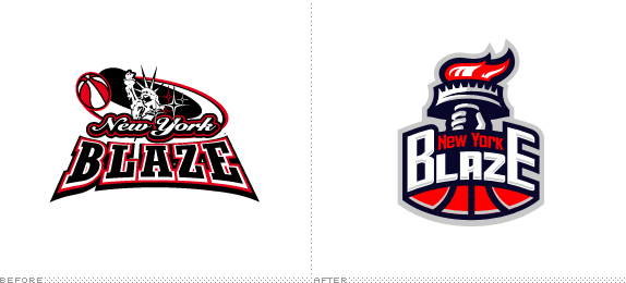
Established in 2008 in White Plains, NY, the New York Blaze Athletic Club is a nonprofit organization that offers kids aged 7 to 18 programs in basketball, homework assistance, and life skills. Its main focus is to get kids into college, ideally through a basketball scholarship. A new identity was released earlier this year, designed by Bialystok, Poland-based Kamil Doliwa — the Blaze’s CEO, Torey Thomas has played in the Polish Basketball League (which explains how a Polish designer designed a logo for an org in White Plains, NY). This is typically not something we would cover on Brand New, since it’s small and it’s far from perfect but, for some reason, it gives me the warm and fuzzies and I felt like it was something worth covering.
Continue reading this entry
DATE: Oct.25.2012POSTED BY: ArminCATEGORY: Non-Profit COMMENTS:
TAGS: basketball, sports,
A B-Side BY Armin
Better Food Foundation
![]()
About: (Est. 2002 as the Jamie Oliver Foundation) “The mission of the Better Food Foundation is to educate and empower as many people as possible to love and enjoy good food. This means learning how to cook, understanding where food comes from, and recognizing the power it can have on our health, happiness, and even finances. We do this through teaching, training and employment, and also by making good clear information available to as many people as possible.”
Design by: Pearlfisher
Ed.’s Notes: Bigger view of the logo and “call to action” badges below (or after the jump).
Relevant links: Creative Review feature.
Selected quote: “We created an identity that could champion this important global fight,” explains Pearlfisher’s creative director Natalie Chung of the agency’s approach. “The megaphone icon is a universal call to action explicitly asking people to pay attention and be part of it,” she continues.
Continue reading this entry
DATE: Oct.10.2012POSTED BY: ArminCATEGORY: Non-Profit The B-Side COMMENTS:
TAGS: angle, pearlfisher, Sans Serif,


Books about logo design, the designers that create them and the meaning of branding.
