


Online
- FPO (For Print Only) / Celebrating the reality that print is not dead by showcasing the most compelling printed projects.
- Art of the Menu / Cataloguing the underrated creativity of menus from around the world.
- Quipsologies / Chronicling the most curious, creative, and notable projects, stories, and events of the graphic design industry on a daily basis.
- Speak Up (2002 – 2009) / Discussing, and looking for, what is relevant in, and the relevance of, graphic design. Archives Only.
- Word It (2003 – 2010) / Encouraging creative diversity in the community through monthly, one-word challenges. Archives Only.
- Brand New Classroom (2010 – 2011) / Providing a space for critique and opinions on student identity work. Archives Only.
Publishing
- The 2010 Brand New Awards / 2011, self-published.
- Flaunt: Designing effective, compelling and memorable portfolios of creative work / 2010, self-published.
Events & Judged Competitions
- Brand New Conference / A one-day event on the development of corporate and brand identity projects by some of today’s most active and influential practitioners from around the world.
- Brand New Awards / Celebrating the best identity work produced around the world.
- FPO Awards / Celebrating the best print work from around the world.
Writing
- Graphic Design, Referenced: A Visual Guide to the Language, Applications, and History of Graphic Design / 2009, Rockport.
- Women of Design: Influence and Inspiration from the Original Trailblazers to the New Groundbreakers / 2008, HOW Books.
- The Word It Book: Speak Up Presents a Gallery of Interpreted Words / 2007, HOW Books.
Graphic Design
- Department of Design / Designing corporate and brand identities and full development of printed and digital matter for clients.

A B-Side BY Armin
Fremantle Football Club
![]()
The Fremantle Football Club, aka The Dockers, is an Australian rules football team that plays in the Australian Football League since 1994. Promo video for new look.
Thanks to Simeon Griggs for the tip.

DATE: Jan.06.2011 POSTED BY: ArminCATEGORY: Sports The B-Side COMMENTS:

TAGS: australia, football, icon, slab serif,

A B-Side BY Armin
Super Rugby
![]()
Super Rugby, previously known as Super 14 (or Super 12 before that) for the amount of participating teams, is a rugby league comprised of teams from Australia, New Zealand and South Africa. This year they’ve added one more team for a total of 15, hence the name change, and have changed the format of the season.
Thanks to Andre Redelinghuys for the tip.
DATE: Jan.06.2011POSTED BY: ArminCATEGORY: Sports The B-Side COMMENTS:
TAGS: australia, gradient, new zealand, rugby,
Opinion BY Armin
Holding Hands in Rio
![]()
Like Peter Gabriel Imson, the United States’ first born baby of 2011, the new emblem for the 2016 Summer Olympics to be held in Rio de Janeiro is the first major unveiling of 2011. Launched on New Year’s eve at Copacabana beach the new emblem is the result of a 130-plus-agency competition won by Brazilian design firm Tátil. A breakdown of the various meanings of the logo can be found at the official Rio 2016 website.
Continue reading this entry
DATE: Jan.03.2011POSTED BY: ArminCATEGORY: Sports COMMENTS:
TAGS: brazil, emblem, summer olympics, tatil,
Opinion BY Armin
Ten is the New Twelve
![]()
Established in 1896, the Big Ten Conference is the oldest athletic division within the ultra competitive Division I level of the NCAA, representing teams in 25 different sports — 12 for men, 13 for women, spanning football, basketball, soccer, rowing, and more. The Big Ten represents some of the leading teams in the country… as its name implies, it started with ten teams (University of Michigan, University of Wisconsin-Madison, University of Iowa, Indiana University, Ohio State University, Michigan State University, University of Illinois at Urbana-Champaign, University of Minnesota, Northwestern University, and Purdue University), adding one in 1990 (Pennsylvania State University, which explains the “11” hidden in the original logo) and one more will begin play in 2011 (University of Nebraska-Lincoln). In terms of football and basketball, these are big deal teams with rabidly passionate fans so it comes as no surprise that the big story yesterday was the announcement of a new Big Ten identity designed by Pentagram partners Michael Bierut and Michael Gericke.
Continue reading this entry
DATE: Dec.14.2010POSTED BY: ArminCATEGORY: Sports COMMENTS:
TAGS: blue, football, ncaa, pentagram, slab serif,
Opinion BY Armin
All Aboard the Round Rock Express
![]()
Round Rock Express is a minor league baseball team located just north of Austin, TX. Earlier this month the team announced that it would be changing leagues and affiliation from Double-A with the Houston Astros to Triple-A with the Texas Rangers, the current American League champions (who defeated the New York Yankees for the title, thank you very much). To coincide with this change the Express unveiled a new identity designed by Louisville, KY-based Studio Simon, that will debut in 2011.
Continue reading this entry
DATE: Dec.13.2010POSTED BY: ArminCATEGORY: Sports COMMENTS:
TAGS: baseball, sports, studio simon,
Opinion BY Armin
The Kansas City Wizards’ Last Trick
![]()
As one of the original ten teams in the inaugural season of the U.S.’s Major League Soccer in 1996, the Kansas City Wizards is one of the most established teams in the league, winning the MLS Cup in 2000. Originally named Kansas City Wiz (no ards and featuring a super retro logo at the time) the team changed its name in 1997 and last week it announced that it wasn’t messing with iterations of the word wizard anymore and instead it was changing to Sporting Kansas City. This coincides with the move to a snazzy new stadium in 2011, bringing to an apex the changes ushered by new ownership that began in 2006.
Continue reading this entry
DATE: Nov.23.2010POSTED BY: ArminCATEGORY: Sports COMMENTS:
TAGS: blue, crest, kansas city sporting, soccer,
Guest Opinion by Rietje Gieskes posted BY Brand New
Oval is the New Circle
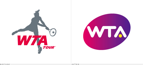
WTA, the Women’s Tennis Association, is the principal organizer of women’s professional tennis, the WNBA of the tennis world. It consists of 2,225 athletes, representing 91 nations, competing for more than $86 million in prize money. The new identity is meant to symbolize the modernization of the organization, and will be showcased throughout its 53 annual events and four Grand Slams in a wide variety of media. WTA recently unveiled its new identity, created by Chermayeff & Geismar
Continue reading this entry
DATE: Nov.11.2010POSTED BY: Brand NewCATEGORY: Sports COMMENTS:
Opinion BY Armin
2015 Pan Am Games are Kickin’
![]()
The Pan American Games are the America continents version of the Olympics, with 42 countries competing in over forty sports. They are held every four years and take place the year prior to the Summer Olympics. The upcoming Games are to take place in Guadalajara, Mexico — as a native Mexican I apologize, dear world, for the amazingly bad logo for those Games. In 2015, the Pan American Games go north to Toronto, Canada. At the end of September the host city unveiled its identity created by the collaboration of Endeavour Marketing and Trajectory, who beat out nineteen other proposals.
Continue reading this entry
DATE: Oct.18.2010POSTED BY: ArminCATEGORY: Sports COMMENTS:
TAGS: canada, endeavour, sans serif, trajectory,
Opinion BY Armin
Gran Branding for Gran Turismo
![]()
This year marked the first season of the FIA GT1 World Championship, a global event sanctioned by the Fédération Internationale de l’Automobile (FIA) and promoted by the Stéphane Ratel Organisation (SRO). And GT, for those as oblivious to car terms as me, stands for Gran Turismo (in Italian) or Grand Touring (in English), which are race cars that are based on standard production road cars, and conform to strict GT1 regulations. The FIA GT1 event brings together “Six iconic brands Aston Martin, Corvette, Ford, Lamborghini, Maserati, Nissan” to a race that features “12 teams, 24 cars and 48 of the world’s leading drivers [competing] on 10 of the leading circuits on four continents.” London-based Interstate Associates, a firm with plenty of motor sport work experience, produced a comprehensive identity for the championship.
Continue reading this entry
DATE: Sep.28.2010POSTED BY: ArminCATEGORY: Sports COMMENTS:
TAGS: flag, gradient, large logo system, motor sports, sans serif,
Opinion BY Armin
ESPN College Football Buffs Up
![]()
For some people the end of Summer is a bummer. It’s back to work and back to school. For a whole bunch of other people — in this case Americans to be specific — it’s the beginning of their obsession. College Football. Bars are full. Conversations are about nothing else. Men scream at TVs wearing faux uniforms whose colors does not befit their skin tones or physiques. But it’s here. And bringing these seemingly life-or-death matches to the screen is ESPN through its ESPN College Football (ESPN CF) programming, which has the rights to air games from the major divisions. To add a little oomph to this season’s package ESPN CF turned to brand agency Troika to overhaul the on-air package.
Continue reading this entry
DATE: Sep.13.2010POSTED BY: ArminCATEGORY: Sports COMMENTS:


Books about logo design, the designers that create them and the meaning of branding.
