


Online
- FPO (For Print Only) / Celebrating the reality that print is not dead by showcasing the most compelling printed projects.
- Art of the Menu / Cataloguing the underrated creativity of menus from around the world.
- Quipsologies / Chronicling the most curious, creative, and notable projects, stories, and events of the graphic design industry on a daily basis.
- Speak Up (2002 – 2009) / Discussing, and looking for, what is relevant in, and the relevance of, graphic design. Archives Only.
- Word It (2003 – 2010) / Encouraging creative diversity in the community through monthly, one-word challenges. Archives Only.
- Brand New Classroom (2010 – 2011) / Providing a space for critique and opinions on student identity work. Archives Only.
Publishing
- The 2010 Brand New Awards / 2011, self-published.
- Flaunt: Designing effective, compelling and memorable portfolios of creative work / 2010, self-published.
Events & Judged Competitions
- Brand New Conference / A one-day event on the development of corporate and brand identity projects by some of today’s most active and influential practitioners from around the world.
- Brand New Awards / Celebrating the best identity work produced around the world.
- FPO Awards / Celebrating the best print work from around the world.
Writing
- Graphic Design, Referenced: A Visual Guide to the Language, Applications, and History of Graphic Design / 2009, Rockport.
- Women of Design: Influence and Inspiration from the Original Trailblazers to the New Groundbreakers / 2008, HOW Books.
- The Word It Book: Speak Up Presents a Gallery of Interpreted Words / 2007, HOW Books.
Graphic Design
- Department of Design / Designing corporate and brand identities and full development of printed and digital matter for clients.

Opinion BY Armin
Rise of the Pelicans
![]()
Originally an NBA expansion team in the 1988-89 season in Charlotte, North Carolina, the Hornets moved to New Orleans in the 2001-02 season, with a two-season break spent in Oklahoma City after hurricane Katrina, returning to New Orleans in 2007. In December of 2012 it was announced that the Hornets would change their name to the Pelicans and last week the New Orleans Pelicans unveiled their new identity designed by RARE, self-described as “one of the most esteemed branding agencies in the country.” (First time I hear of them).
Continue reading this entry

DATE: Jan.28.2013 POSTED BY: ArminCATEGORY: Sports COMMENTS:


A B-Side BY Armin
Seattle Reign FC
![]()
About: (Est. 2012) “Seattle Reign FC is one of eight clubs that will compete in the National Women’s Soccer League (NWSL) beginning in the Spring of 2013.”
Design by: N/A.
Ed.’s Notes: Detail view of the logo and (a nicer) alternate version below (or after the jump).
Relevant links: SB Nation story.
Continue reading this entry
DATE: Jan.07.2013POSTED BY: ArminCATEGORY: Sports The B-Side COMMENTS:
Opinion BY Armin
U.S. Soccer Development Academy
![]()
About: “Following a comprehensive review of elite player development in the United States and around the world, U.S. Soccer created the Development Academy in 2007 to improve the everyday environment for the elite youth player.The Development Academy is a partnership between U.S. Soccer and the top youth clubs around the country to provide the best youth players in the U.S. with an every day environment designed to produce the next generation of National Team players. The Academy’s programming philosophy is based on increased training, less total games and more competitive games.”
Design by: Stone Ward.
Ed.’s Notes: Larger view of the logo below (or after the jump).
Relevant links: N/A.
Provided quote: “The 4 stripes represent the 4 pillars of the academy. 2 stars for the 2 main age groups. Crest is their connection to the U.S. Soccer National Team program and affiliation with U.S. Soccer in general.”
Continue reading this entry
DATE: Dec.17.2012POSTED BY: ArminCATEGORY: Sports The B-Side COMMENTS:
A B-Side BY Armin
Portland Thorns FC
![]()
About: As part of the new, 8-team professional women’s soccer league organized by U.S. Soccer, set to being play in Spring 2013, “Peregrine Sports, LLC — parent company of the Portland Timbers of Major League Soccer — today announced that its new professional women’s soccer club will be named Portland Thorns FC.”
Design by: Brent Diskin.
Ed.’s Notes: The logo has been designed by a Portland Timbers’ superfan and, although it’s not the greatest logo on earth, with the premise of being a fan-designed logo it surprisingly doesn’t suck.
Relevant links: Q&A with the designer. Press release.
Select quote: “The circular badge features team colors of red, green and black with a protective wreath of thorns surrounding a familiar, stylized rose in the center. Further, city-inspired details are presented in the form of a pair of four-pointed stars, or hypocycloids, that house the letters ‘F’ and ‘C’ and anchor the sides of the badge, a callout to the left-centered, directional star prominent on Portland’s official city flag that also flies in the stands and high atop JELD-WEN Field in downtown Portland.”
Thanks to Chris Campbell for the tip.
DATE: Dec.14.2012POSTED BY: ArminCATEGORY: Sports The B-Side COMMENTS:
A B-Side BY Armin
Scranton/Wilkes-Barre RailRiders
![]()
About: (Est. 1919, formerly Scranton/Wilkes-Barre Yankees) “The Scranton/Wilkes-Barre RailRiders is a professional minor league baseball team based in Moosic, Pennsylvania in the Scranton/Wilkes-Barre area. The team plays in Northern Division of International League and they are the Triple-A affiliate of the New York Yankees Major League Baseball club. The team plays at PNC Field (formerly Lackawanna County Stadium), their home since 1989.” (Source: Wikipedia).
Design by: Brandiose. (I’m starting to think the B in B-Side stands for Brandiose).
Ed.’s Notes: A locomotive porcupine? Yes, please! Alternate versions below (or after the jump).
Relevant links: Railriders press release. Brandiose blog post.
Select quote: “The RailRiders moniker pays homage to the very first trolley system in America, one created right here in Northeastern Pennsylvania (NEPA). […] A porcupine conductor, the gritty critter that calls NEPA home, is at the centerpiece of the identity.”
Continue reading this entry
DATE: Dec.12.2012POSTED BY: ArminCATEGORY: Sports The B-Side COMMENTS:
A B-Side BY Armin
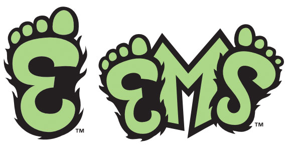
Eugene Emeralds
![]()
About: (Est. 1955) “The Eugene Emeralds (nicknamed the Ems) is a minor league baseball team in Eugene, Oregon, United States. They are a short-season Class A team in the Northwest League, and have been a farm team of the San Diego Padres since 2001.” (Source: Wikipedia)
Design by: Brandiose (surprise, surprise).
Ed.’s Notes: Gotta love it. A sasquatch. See logo sheet linked below for the full scope of logo alternatives, some of them included in images below (or after the jump).
Relevant links: Complete Logo Sheet (PDF). SportsLogos story. Press release.
Select quote: “The Eugene Emeralds Baseball Club have a new identity that pays tribute to America’s greatest urban legend: the legend of Sasquatch in the Pacific Northwest.”
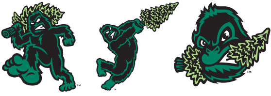
Thanks to Steve Pankow for the tip.
DATE: Dec.06.2012POSTED BY: ArminCATEGORY: Sports The B-Side COMMENTS:
TAGS:
A B-Side BY Armin
Stockton Ports (Alternate)
![]()
About: “The Stockton Ports are a baseball team in Stockton, California. The Ports play in the Northern Division of the Class A - Advanced California League and are a Minor League affiliate of the Oakland Athletics.
Design by: Brandiose (again!).
Ed.’s Notes: This is an alternate logo, not a replacement logo to the Ports’ main logo. Confusing? Yes. Awesome? Yes. Alternates of the alternate below (or after the jump).
Relevant links: Press release. Brandiose blog post.
Select quote: “The Ports new logos honor Stockton’s heritage as the largest in-land port in California and the Asparagus Capital of the World. A new character, 5 O’clock Dock, is the centerpiece of the identity, brandishing his baseball tattoos and asparagus club. Navy, Shipyard Gray and Asparagus green make up the club’s new alternate colors. The Ports are the first professional sports team to use Asparagus green.”
Continue reading this entry
DATE: Nov.29.2012POSTED BY: ArminCATEGORY: Sports The B-Side COMMENTS:
A B-Side BY Armin
Reading Fightin Phils
![]()
About: (Est. 1967, previously Reading Phillies) “The Reading Fightin Phils are a minor league baseball team based in Reading, Pennsylvania, playing in the Eastern Division of the Eastern League. The Reading Fightin Phils were founded in 1967 and they are the Double-A affiliate of the Philadelphia Phillies.”
Design by: Brandiose.
Ed.’s Notes: Plenty more images at both links below.
Relevant links: Press release. SportsLogos.Net news.
Select Quote:“The Fightins’ new name is highlighted by an ostrich logo that symbolizes the feisty bird that is now indigenous to Reading because of the Crazy Hot Dog Vendor. With its fists ready for battle, the new ostrich logo represents the fighting spirit of the franchise, both on and off the field. It will be the first time in the franchise’s history that the team will feature an identifiable mascot. The logo is also the first in professional sports to feature an ostrich as its mascot.”
Continue reading this entry
DATE: Nov.20.2012POSTED BY: ArminCATEGORY: Sports The B-Side COMMENTS:
A B-Side BY Armin
Lexington Legends
![]()
About: “The Lexington Legends are a minor league baseball team of the South Atlantic League (SAL), and the Class A affiliate of the Kansas City Royals. They are located in Lexington, Kentucky.”
Design by: Brandiose.
Ed.’s Notes: On the subject of moustaches, this identity delivers. Logo detail and moustachioed cap below (or after the jump).
Relevant links: Photo gallery. Press Release.
Select quote: Fans will see an old-timey “Big L” gripping two bats over a classic “Legends” script and white farm fences. Caps worn by the Legends for home games will feature a stone-chiseled “LEX” in reference to the historic dry stone walls that line many of the roads in the Bluegrass and a modernized “L-State” (a letter “L” in which the base is an outline of Kentucky). Big L’s famous mustache will appear on the road caps, and the “stache” will be part of several new mustache-themed fan experiences. Big L will continue to represent the Legends as he has since the team began play in 2001.
Continue reading this entry
DATE: Nov.08.2012POSTED BY: ArminCATEGORY: Sports The B-Side COMMENTS:
Opinion BY Armin
Houston Astros Looking Stellar
![]()
Established in 1962 as the Houston Colt 45s, the Houston Astros, as they were renamed in 1965 when they moved into the Astrodome, are the Major League Baseball team for Houston, Texas. The team’s best season came in 2005 when they made it to the World Series but were swept by the Chicago White Sox. In November 2011, it was announced that, after 51 years in the National League, the Astros would move to the American League, a move that balances the two leagues, now each with 15. I’m sure to actual baseball fans this has more philosophical meaning but to me, as math equations go, it makes sense. This past Friday — after MLB stole its thunder by leaking merchandise with the new logo early (and offering an apology) — the Astros unveiled their new logo, uniforms, and mascot at their stadium.
Continue reading this entry
DATE: Nov.05.2012POSTED BY: ArminCATEGORY: Sports COMMENTS:


Books about logo design, the designers that create them and the meaning of branding.
