


Online
- FPO (For Print Only) / Celebrating the reality that print is not dead by showcasing the most compelling printed projects.
- Art of the Menu / Cataloguing the underrated creativity of menus from around the world.
- Quipsologies / Chronicling the most curious, creative, and notable projects, stories, and events of the graphic design industry on a daily basis.
- Speak Up (2002 – 2009) / Discussing, and looking for, what is relevant in, and the relevance of, graphic design. Archives Only.
- Word It (2003 – 2010) / Encouraging creative diversity in the community through monthly, one-word challenges. Archives Only.
- Brand New Classroom (2010 – 2011) / Providing a space for critique and opinions on student identity work. Archives Only.
Publishing
- The 2010 Brand New Awards / 2011, self-published.
- Flaunt: Designing effective, compelling and memorable portfolios of creative work / 2010, self-published.
Events & Judged Competitions
- Brand New Conference / A one-day event on the development of corporate and brand identity projects by some of today’s most active and influential practitioners from around the world.
- Brand New Awards / Celebrating the best identity work produced around the world.
- FPO Awards / Celebrating the best print work from around the world.
Writing
- Graphic Design, Referenced: A Visual Guide to the Language, Applications, and History of Graphic Design / 2009, Rockport.
- Women of Design: Influence and Inspiration from the Original Trailblazers to the New Groundbreakers / 2008, HOW Books.
- The Word It Book: Speak Up Presents a Gallery of Interpreted Words / 2007, HOW Books.
Graphic Design
- Department of Design / Designing corporate and brand identities and full development of printed and digital matter for clients.

A B-Side BY Armin
ESPN Monday Night Football
![]()
ESPN Monday Night Football needs little introduction: It’s the NFL on Monday nights on ESPN. Designed in-house by ESPN Creative Services the new look “was designed with a sculpted framework that adds strength. The color red dominates the palette, and the stadium lights around ESPN illuminate the badge and exemplify that MNF is in primetime. Metal, rubber and pigskin textures also add tactility.” Bigger view below (or after the jump). More story here.
Continue reading this entry

DATE: Jun.15.2011 POSTED BY: ArminCATEGORY: Sports The B-Side COMMENTS:

TAGS: 3d, football, television,

Opinion BY Armin
Sinking Rock
![]()
Established in 1999, the Mountain West Conference is the youngest conference in the NCAA Division I — compare that to those of previous reviews here, the Big 10 (1896) and the Pac10 (1959) — and its original members were the Air Force, Colorado State, New Mexico, San Diego State, UNLV, and Wyoming. Texas Christian University joined in 2005 and in the next two years BYU and UNLV will leave while Boise State, Fresno State, University of Nevada, and University of Hawaii will join. With so many changes the conference considered this a good time to introduce a new logo, designed by San Diego-based Savacool Secviar who were brought into the project by Loma Media, also from San Diego.
Continue reading this entry
DATE: Jun.13.2011POSTED BY: ArminCATEGORY: Sports COMMENTS:
A B-Side BY Armin
Big Ten Network
![]()
Established in 2006, the Big Ten Network — now BTN — is a partnership between th Big Ten Conference and Fox Networks for a channel covering over 600 events featuring the schools of the Big Ten Conference. Press release here. There is also customized color versions of the logo for each of the 12 schools that make up the Big Ten.
Thanks to John Coburn for the tip.
DATE: Jun.02.2011POSTED BY: ArminCATEGORY: Sports The B-Side COMMENTS:
TAGS: football, sports, television,
A B-Side BY Armin
Wichita Wings
![]()
Originally an indoor soccer team that played from 1979 to 2001, the Wichita Wings are getting a second chance and will begin playing in the 2011 – 12 season of MISL. Story here.
In other news: when Whataburger called to get its logo back, it did.
Thanks to J. Jason Smith for the tip.
DATE: May.23.2011POSTED BY: ArminCATEGORY: Sports The B-Side COMMENTS:
Opinion BY Armin
Wizards go Retro, Dodge Bullet
![]()
Known as the Washington Wizards since 1997, this Eastern Conference NBA team goes back to 1961 when it was known as the Chicago Packers, moving to Baltimore in 1963 and changing its name to the Bullets (I guess they never saw The Wire coming), then moving to Washington in 1974. As the Bullets the team won the championship in 1978 and as the Wizards they are best known for hosting Michael Jordan’s twenty-third un-retirement. Yesterday, the Wizards unveiled new uniforms and secondary logos that hark back to their look of decades past. The uniforms and marks have been designed in collaboration with their apparel provider, adidas.
Continue reading this entry
DATE: May.11.2011POSTED BY: ArminCATEGORY: Sports COMMENTS:
TAGS: adidas, basketball, nba, sports, washington,
Guest Editorial by Roy Levitt Posted BY Brand New
Sparky Benched by Nike
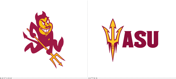
Founded in 1885, Arizona State University is the largest public research university in the United States with a 2010 student enrollment of 70,440. Its Division I athletic teams, known as the Sun Devils, has collectively won 136 national championships to date. The Sun Devils have been recently rebranded and the Sparky mascot illustration, which had been used since 1946, has been replaced as the team’s primary identifier. This rebranding effort was completed by the Nike Graphic identity Group. According to ASU, the objectives of this initiative were “…to create a bold, high- performance athletic image and a promotional campaign that would maximize enthusiasm and interest in supporting the university, but to do so with minimum out-of-pocket costs.”
Continue reading this entry
DATE: May.10.2011POSTED BY: Brand NewCATEGORY: Sports COMMENTS:
Opinion BY Armin
Polish Football Association, More Polished
![]()
Founded in 1919, the Polish Football Association (Polski Związek Piłki Nożnej in Polish, and PZPN for short) is the governing body of football in Poland and is in charge of the Polish national team as well as organizing the top tier league and various tournaments. The PZPN will have its moment in the global spotlight in 2012 when the UEFA European Football Championship is played in Poland and Ukraine. A new logo for the PZPN was introduced last month, designed by Warsaw-based SaltPepper Brand Design.
Continue reading this entry
DATE: May.02.2011POSTED BY: ArminCATEGORY: Sports COMMENTS:
TAGS: eagle, football, poland, sans serif,
Opinion BY Armin
Follow-Up: XXII Olympic Winter Games
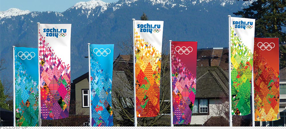
In December of 2009 we reported on the logo and look, created by the Moscow office of Interbrand, of the XXII Olympic Winter Games that will take place in 2014 in Sochi, Russia. This week the Sochi 2014 Organizing Committee unveiled the concept of the Look of the Games which was designed by BOSCO Sports, a sponsor of the Olympics, as well as the official uniform provider for the Russian Olympic team since 2002. They donated the work to the committee. The look revolves around “the principle of the ‘patchwork quilt’ — a combination of 16 designs representing the most famous traditional Russian arts and crafts, ranging from Gzhel to Khokhloma.”
Continue reading this entry
DATE: Apr.29.2011POSTED BY: ArminCATEGORY: Sports COMMENTS:
TAGS: flexible identity, olympics, russia,
Opinion BY Armin
Deutsche Eishockey Liga
![]()
Established in 1994, the Deutsche Eishockey Liga (German Ice Hockey League in English, DEL for short), is the professional Hockey league in Germany, featuring 14 teams and, apparently, the highest number of American and Canadian players outside the NHL. The new logo has been designed by buergerclever.
Thanks to Simon Vatareck for the tip.
DATE: Apr.18.2011POSTED BY: ArminCATEGORY: Sports The B-Side COMMENTS:
A B-Side BY Armin
2015 IIC Cricket World Cup
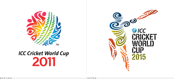
First played in 1975, the International Cricket Council (IIC) Cricket World Cup is the most notable tournament in the world of cricket played every four years. The 2011 Cup, played in India, Sri Lanka, and Bangladesh just finished with India taking the championship. The logo for the 2015 IIC Cricket World Cup, jointly hosted by Australia and New Zealand, was presented this week. The identity was designed by the Australia office of Futurebrand who commissioned Jumbana Group/Balarinji for the logo. Press release here. Bigger view here.
Thanks to Lawrence Nievaart for first tip.
DATE: Apr.07.2011POSTED BY: ArminCATEGORY: Sports The B-Side COMMENTS:
TAGS: cricket, futurebrand, illustration, stencil,


Books about logo design, the designers that create them and the meaning of branding.
