
Opinion BY Armin
The Stars of Roller Derby

Established in 2001, TXRD Lonestar Rollergirls is a 6-team, skater-owned, all-girl roller derby league in Austin, TX. They are credited as one of the main reasons for the modern-day revival of the sport, appearing in the 13-episode reality series Rollergirls on A&E as well as being the namesake of the league in the mildly popular Drew Barrymore film Whip It!. Playing on the harder-core banked track (as opposed to flat) the TXRD is made up of the Hellcats, Putas Del Fuego (Fire’s Whores), Holy Rollers, Rhinestone Cowgirls, Cherry Bombs, and Hired Gun$. A new identity was introduced in May, designed by Austin-based Greatest Common Factory.
Continue reading this entry

DATE: Jun.12.2012 POSTED BY: Armin
 CATEGORY: Sports
  COMMENTS:

TAGS: austin, sans serif, script, star,

A B-Side BY Armin
Cardiff City FC
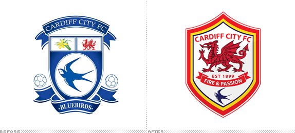
Founded in 1899, Cardiff City FC, known as the “Bluebirds,” are a professional football club based in Cardiff, Wales in the English football league system. After being in debt for many years, a Malaysian businessman took over. This month, a new crest with a big dragon sitting on top of a bluebird was introduced, as well as a change in uniforms with red taking over blue as the home version. Pissing-off of soccer fans ensued. Story here.
Thanks to Brett Stone for first tip.

DATE: Jun.11.2012 POSTED BY: Armin
 CATEGORY: Sports The B-Side
  COMMENTS:


A B-Side BY Armin
LOSC Lille
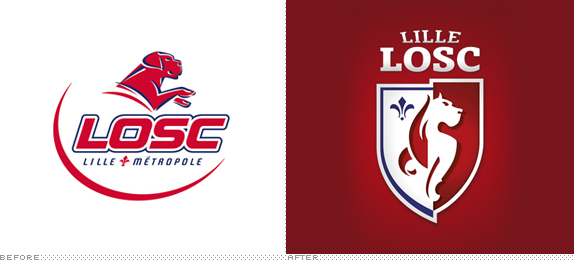
Founded in 1944, LOSC Lille Métropole is a soccer team that plays in the Ligue 1 of French soccer. They have won the championship three times, most recently in the 2010-11 season. A new logo designed by the Paris office of Dragon Rouge was introduced last month, updating their Great Dane/German Mastiff mascot. More info here (in French). Brandtastic video of the new logo below (or after the jump).
Continue reading this entry

DATE: Jun.06.2012 POSTED BY: Armin
 CATEGORY: Sports The B-Side
  COMMENTS:

TAGS: animal, dragon rouge, france, soccer,

A B-Side BY Armin
Badminton World Federation
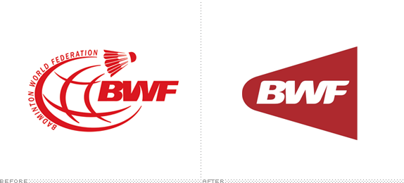
Established in 1934 and headquartered in Kuala Lumpur, Malaysia, the Badminton World Federation is the international governing body for the sport of badminton. A new logo was introduced over the weekend. Press release here. Launch video below (or after the jump).
Continue reading this entry

DATE: May.30.2012 POSTED BY: Armin
 CATEGORY: Sports The B-Side
  COMMENTS:


A B-Side BY Armin
Deutschen Tennis Bundes
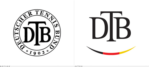
Established in 1902, Deutschen Tennis Bundes (DTB for short, German Tennis Federation for English) is the governing body of tennis federations and clubs in Germany, with more than 1,800,000 members. A new logo was introduced this month. Not clear if the smile was intentional or if it’s meant to be a tennis ball. More at Das Design Tagebuch, translate if needed.
Thanks to Marc Nijborg for the tip. Via Das Design Tagebuch.

DATE: May.22.2012 POSTED BY: Armin
 CATEGORY: Sports The B-Side
  COMMENTS:


Opinion BY Armin
Boca Goes Global
Established in 1905, Club Atlético Boca Juniors (Boca Juniors for short and Boca for even shorter) is one of the best soccer teams in the world and the history of the sport. Based in the La Boca neighborhood of Buenos Aires, Argentina, Boca has won 51 national and international titles, including the most recent championship title of Argentina’s premier league. Beyond soccer, Boca Juniors also manages teams in other sports like basketball and volleyball, runs 24 soccer schools around the world, and even has its own hotel, Hotel Boca. At the end of April, Boca Juniors introduced a new global identity for all of its different properties, designed by Buenos Aires-based BridgerConway. From what I understand, this new logo does not replace the team’s shield but rather acts as a complement and endorser.
Continue reading this entry

DATE: May.07.2012 POSTED BY: Armin
 CATEGORY: Sports
  COMMENTS:

TAGS: argentina, blue, slab serif, soccer,

A B-Side BY Armin
Utah State Athletics

The Utah State Aggies are the Division I athletics teams of Utah State University. Last week, they announced a complete redesign of their logos and uniforms, designed by Nike. Press release here, press gallery and videos here. One more image and one video below (or after the jump). Quick, someone call Wall Street, their bull is on the loose.
Continue reading this entry

DATE: May.03.2012 POSTED BY: Armin
 CATEGORY: Sports The B-Side
  COMMENTS:


Opinion BY Armin
The Brooklyn Nets: I Call Technical Foul
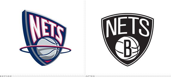
Last week was the final game of the NBA’s New Jersey Nets, who finished with a 22-44 record to end the season at the bottom of its Atlantic division in the Eastern conference — a far cry from its more successful days in the early 2000s when it reached the finals two seasons in a row or its two ABA championships in the 1970s. For the 2012 – 13 season the team will move to a new home while retaining its name, the Brooklyn Nets. A press conference yesterday where the team logo and merchandise were unveiled at a local sports in front of the billion-dollar Barclays Center was the culmination of almost eight years of ownership negotiations, urban planning, and pissing off Brooklyn residents when developer and part owner Bruce Ratner scurried away people from their homes in order to make room for the ambitious Atlantic Yards project. With a terribly sad team — the Nets most well-known player is probably Kris Humphries, aka Kim Kardashian’s ex husband — the Brooklyn Nets have an uphill battle to win the hearts of the proud and skeptical local crowd which they are doing with a very minimalist, almost anti-NBA new look reportedly designed by Nets part owner Jay Z.
Continue reading this entry

DATE: May.01.2012 POSTED BY: Armin
 CATEGORY: Sports
  COMMENTS:

TAGS: black, brooklyn, nba, sans serif, white,

Opinion BY Armin
NFL Media, United it Stands, Divided it is

NFL Media, owned by the National Football League, controls the different media properties of the organization, including its popular NFL Network launched in 2003 and the game day-only channel NFL RedZone. The roster also includes the NFL Mobile and NFL.com as well as NFL Films, first established in 1962 producing acclaimed commercials, television programs, feature films, and documentaries. Yesterday, NFL Media announced an integrated redesign of all the logos of its properties that will officially launch on April 26, the day of the Draft.
Continue reading this entry

DATE: Mar.28.2012 POSTED BY: Armin
 CATEGORY: Sports
  COMMENTS:

TAGS: custom, nfl, slab serif,

A B-Side BY Armin
Kolkata Knight Riders

Founded in 2008, the Kolkata Knight Riders are the Kolkata cricket team in the Indian Premier League. The team is part-owned by Bollywood superstar Shahrukh Khan, who helped unveil the new logo in a smoke-machine powered press event, shown below (or after the jump).
Continue reading this entry

DATE: Mar.15.2012 POSTED BY: Armin
 CATEGORY: Sports The B-Side
  COMMENTS:


