


Online
- FPO (For Print Only) / Celebrating the reality that print is not dead by showcasing the most compelling printed projects.
- Art of the Menu / Cataloguing the underrated creativity of menus from around the world.
- Quipsologies / Chronicling the most curious, creative, and notable projects, stories, and events of the graphic design industry on a daily basis.
- Speak Up (2002 – 2009) / Discussing, and looking for, what is relevant in, and the relevance of, graphic design. Archives Only.
- Word It (2003 – 2010) / Encouraging creative diversity in the community through monthly, one-word challenges. Archives Only.
- Brand New Classroom (2010 – 2011) / Providing a space for critique and opinions on student identity work. Archives Only.
Publishing
- The 2010 Brand New Awards / 2011, self-published.
- Flaunt: Designing effective, compelling and memorable portfolios of creative work / 2010, self-published.
Events & Judged Competitions
- Brand New Conference / A one-day event on the development of corporate and brand identity projects by some of today’s most active and influential practitioners from around the world.
- Brand New Awards / Celebrating the best identity work produced around the world.
- FPO Awards / Celebrating the best print work from around the world.
Writing
- Graphic Design, Referenced: A Visual Guide to the Language, Applications, and History of Graphic Design / 2009, Rockport.
- Women of Design: Influence and Inspiration from the Original Trailblazers to the New Groundbreakers / 2008, HOW Books.
- The Word It Book: Speak Up Presents a Gallery of Interpreted Words / 2007, HOW Books.
Graphic Design
- Department of Design / Designing corporate and brand identities and full development of printed and digital matter for clients.

A B-Side BY Armin
Goal.com
![]()
About: (Est. 1958) “Goal.com is the world’s largest football website and is owned and powered by digital sports media business PERFORM. The success of the site is down to the hard work and dedication of over 400 editorial staff based in over 50 countries around the World who produce an average of 1,500 news stories per day in 15 languages across 22 editions. This unparalleled global reach and in-depth coverage of the world’s most popular game attracted over 23 million unique users in May 2011 (Source: Google Analytics) from more than 220 countries.”
Design by: Elmwood.
Ed.’s Notes: First, WTF was the old logo? Second, how awesome is the ™ symbol in a circle as the ball being kicked right into where it’s the hardest to stop?.
Relevant links: N/A.
Thanks to Nickolai Sukharev for first tip.

DATE: May.14.2013 POSTED BY: ArminCATEGORY: Sports The B-Side COMMENTS:

TAGS: sans serif, soccer, uppercase,

A B-Side BY Armin
Budget Car Rental
![]()
About: (Est. 1958) “Budget Car Rental is one of the world’s best-known car rental brands with more than 3,000 locations in more than 120 countries. Budget is an industry leader in providing vehicle rental services to value-conscious travelers and also operates the second-largest truck rental business in the United States, through a network of more than 2,100 locations. Budget is owned by Avis Budget Group, Inc.”
Design by: N/A.
Ed.’s Notes: Not bad and it goes better with the redesigned logo of its parent company, Avis. An alternate lock-up with the road graphic on the side is below (or after the jump).
Relevant links: N/A.
Continue reading this entry
DATE: May.13.2013POSTED BY: ArminCATEGORY: The B-Side Transportation COMMENTS:
TAGS: lowercase, sans serif,
Opinion BY Armin
Oklahoma City University
![]()
About: (Est. 1904) “Oklahoma City University is a coeducational, urban private university located in Oklahoma City, in the Uptown district. The university is affiliated with the United Methodist Church and offers a wide variety of degrees in the liberal arts, fine arts, sciences and business. The only Oklahoma institution listed in the top tier of the regional, master’s-level university category by U.S. News and World Report, Oklahoma City University is also listed in Forbes’ “Best Christian Colleges” & “100 Best College Buys.”“
Design by: Pentagram (DJ Stout, Austin).
Ed.’s Notes: It’s definitely an improvement but it’s hard to associate that kind of star drawing with higher education than Hollywood/Entertainment industry. Type is super pretty though. A few application image below (or after the jump) and more at the link.
Relevant links: Pentagram case study.
Select quote: “Before Stout and Delgado redesigned it, OCU’s primary logo featured a silhouetted likeness of the university’s iconic Gold Star Tower, a 286-foot red brick tower built in 1953 to honor Methodists who died in World War II. The tower, an Oklahoma City landmark located prominently in the center of campus, is topped off with a 200-pound star positioned at the end of a long pole like a star on a Christmas tree. ‘OCU’s sports teams are called The Stars after the Gold Star Tower, and many of the university’s celebrity alumni, like the Tony Award-winning Kristin Chenoweth, are singers and dancers and ‘stars’ of the stage,’ says Stout. ‘So it only seemed natural to turn their static star into a dancing star, with just a hint of the long pole it’s attached to at the top of that building.’”
Continue reading this entry
DATE: May.10.2013POSTED BY: ArminCATEGORY: Education The B-Side COMMENTS:
TAGS: blue, pentagram, serif, star, university,
A B-Side BY Armin
The Bishop of London
![]()
About: (Est. fourth century or so) “The Bishop of London is the ordinary of the Church of England Diocese of London in the Province of Canterbury.”
Design by: Paperjam.
Ed.’s Notes: I wish the typography were something much better than Copperplate and Zapfino because the coat of arms is excellent. Bigger views of the logo and crest and the Bishop’s own business card below (or after the jump).
Relevant links: Paperjam case study.
Select quote: “From this advice Paperjam decided to recreate a historical crest using a modern illustrative style that brings the crest up to date but at the same time reflects the heritage and authoritative qualities. Paperjam employed a professional illustrator, Marcelo Oliveira, from Portugal to help create a coat of arms that contained Amor Vincit Omnia “Love Conquers All”. At request from Richard John Carew Chartres himself.”
Continue reading this entry
DATE: May.09.2013POSTED BY: ArminCATEGORY: Religion The B-Side COMMENTS:
TAGS: coat of arms, london,
A B-Side BY Armin
Voya Financial
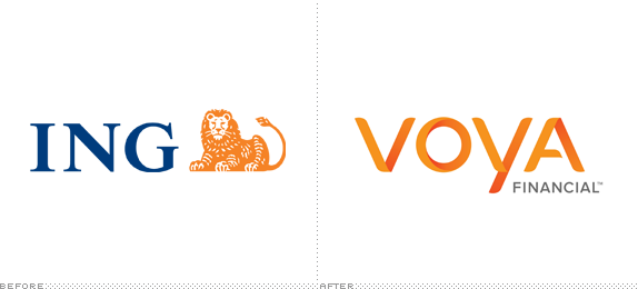
About: (Est. 1975) “Voya Financial, previously ING U.S., is a leading provider of financial products and services, both at the workplace and through an expansive distribution network of financial professionals. Voya’s mission is to guide Americans on their journey to greater retirement readiness and to make a secure financial future possible—one person, one family and one institution at a time.”
Design by: Interbrand.
Ed.’s Notes: The name is described as “an abstract name coined from the word ‘voyage’,” and the same could be said for the typography: an abstract take on what letterforms are supposed to bend like. That’s sort of a dig. The idea seems okay, but the resolution of how the letterforms bend and twist is highly unresolved and inconsistent. Bigger view of the logo and an application below (or after the jump).
Relevant links: ING’s explanation. CoreBrand article. brandchannel article. Advertising Age article.
Select quote: “The selection of a new brand for ING U.S. took months of extensive research and testing. We started with a list of 5,230 potential names. After conducting multiple rounds of creative refinement, 390 legal prescreens and testing it in nearly 60 different languages, we believe the new name best reflects our company’s mission, values and personality – Voya.”
Continue reading this entry
DATE: May.08.2013POSTED BY: ArminCATEGORY: Finance The B-Side COMMENTS:
TAGS: interbrand, lowercase, shading,
A B-Side BY Armin
League of American Bicyclists
![]()
About: (Est. 1880) “The League of American Bicyclists promotes bicycling for fun, fitness and transportation, and works through advocacy and education for a bicycle-friendly America. The League represents the interests of America’s 57 million bicyclists, including its 300,000 members and affiliates.”
Design by: Language Dept.
Ed.’s Notes: Some additional uses of the logo below (or after the jump) and some application images at the case study link.
Relevant links: Language Dept case study. League press release.
Select quote: “Our new look may seem a bit familiar: It draws on our unique history and depth of knowledge, using elements of the original winged wheel logo of the League of American Wheelmen. But, with a modern edge and forward motion, it also showcases our commitment to propel the new, diverse and growing ranks of bicyclists in the United States, recognizing and representing the current and future face of the cycling movement.”
Continue reading this entry
DATE: May.07.2013POSTED BY: ArminCATEGORY: Non-Profit The B-Side COMMENTS:
A B-Side BY Armin
Banelco
![]()
About: (Est. 1985) “Banelco is an ATM network in Argentina. Established in 1985, Banelco offers several services related to the cash flow management, including debit cards, electronic transfers, services payments, etc. Operating 4,500 ATMs (one third of the total in the country)[…]. The company also operates Pagomiscuentas, an electronic bill payment service. Banelco, an acronym for Banca Electr�nica Compartida, is owned by private banks. Link, in turn, is used primarily by state owned banks.” (Source: Wikipedia)
Design by: DAS Branding.
Ed.’s Notes: Fairly nice, in that South American corporate identity kind of way (rounded, bold sans serif, italicized). A few more images below (or after the jump).
Relevant links: DAS Branding case study.
Continue reading this entry
DATE: May.06.2013POSTED BY: ArminCATEGORY: Finance The B-Side COMMENTS:
TAGS: argentina, italic, red, sans serif,
A B-Side BY Armin
Shazam
![]()
About: (Est. 2002) “Shazam is a commercial mobile phone based music identification service, with its headquarters in London, England. […] Shazam uses a mobile phone’s built-in microphone to gather a brief sample of music being played. An acoustic fingerprint is created based on the sample, and is compared against a central database for a match. If a match is found, information such as the artist, song title, and album are relayed back to the user. Relevant links to services such as iTunes, YouTube, Spotify or Zune are incorporated into some implementations of Shazam.” (Source: Wikipedia)
Design by: The Brand Union.
Ed.’s Notes: Although I always hate the combination of upper and lowercase letters this ends up being a decent wordmark and the icon is much improved. A few more images of the icon and its construction below (or after the jump).
Relevant links: Press Release.
Provided quote: “We were thrilled to help Shazam transition from an app used to tag songs to a broader platform of discovery for TV, music, movies, live events and more. The new brand draws from the iconic loading disc that pops up when the app is listening. All of the new elements were derived from that expression, which we’ve enriched and made more responsive.”
Continue reading this entry
DATE: May.03.2013POSTED BY: ArminCATEGORY: Entertainment The B-Side COMMENTS:
TAGS: app, blue, gradient, the brand union,
A B-Side BY Armin
OppenheimerFunds
![]()
About: (Est. 1959) “OppenheimerFunds, Inc. (OFI) is one of the largest and most reputable investment management firms in the country. Since the original Oppenheimer fund was first offered to the public in 1959, OFI has demonstrated it is a high conviction asset manager with a history of providing innovative investment strategies to its investors. OFI and its subsidiaries offer a broad array of products and services to individuals, institutional investors and corporations worldwide. OFI provides advisory services to the Oppenheimer mutual funds, and OFI Global Asset Management provides services to institutional clients. OFI, including its subsidiaries, managed more than $208 billion in assets for over 12 million shareholder accounts, including sub-accounts, as of March 31, 2013.”
Design by: N/A.
Ed.’s Notes: Calling it now: one of the top three worst redesigns of the year. This is absolutely hideous and unnecessary. Bigger view (if you must) of the logo below (or after the jump).
Relevant links: Press Release.
Select quote: “(OFI) today announced plans to unveil a new brand and visual identity that represents the firm’s strategy to leverage its innovative heritage and support its mission to turn its unconventional wisdom into value for investors. […] The rebrand embodies our ability to embrace and initiate change.”
Continue reading this entry
DATE: May.02.2013POSTED BY: ArminCATEGORY: Finance The B-Side COMMENTS:
TAGS: bevel, gradient, small caps,
A B-Side BY Armin
FX (TV Channel)
![]()
About: (Est. 1994) “FX (standing for Fox extended, suggesting “effects”) is an American basic cable and satellite television channel that is owned by the Fox Entertainment Group division of News Corporation.” (Source: Wikipedia) Kick-ass shows include: Archer, The Shield, Nip/Tuck, Damages, Rescue Me, Sons of Anarchy, Justified, The Americans, American Horror Story, It’s Always Sunny in Philadelphia, Louie, The League, and Wilfred.
Design by: N/A.
Ed.’s Notes: In keeping with today’s barely-there changes, here is the radically new FX logo. Yeah, I don’t know what they achieved with this other than perhaps something more protectable by law as “FX” out of the box is probably not very distinctive.
Relevant links: N/A.
DATE: May.01.2013POSTED BY: ArminCATEGORY: Entertainment The B-Side COMMENTS:
TAGS: black, sans serif, tv,


Books about logo design, the designers that create them and the meaning of branding.
