
A B-Side BY Armin
SF72

About: (Est. 2013) Formed by the San Francisco Department of Emergency Management in partnership with the people of San Francisco, SF72 is San Francisco’s gathering place for emergency preparedness. “If we can be prepared for the first 72 hours after a disaster, we will be ready for an emergency, no matter what form it takes. 72 hours might seem like a lot, but that’s really only nine meals. It’s just a long weekend. If disaster strikes, SF72.org will go into emergency mode-you can access live updates and tweets from around the city, check for missing persons, and learn about how you can help.”
Design by: IDEO.
Ed.’s Notes: Very nice wordmark, quirky and different (perhaps not enough emergency-ish and too friendly) and the shorthand version that reduces into a heart is clever. Video that explains this new initiative below (or after the jump).
Relevant links: N/A.
Continue reading this entry

DATE: Apr.30.2013 POSTED BY: Armin
 CATEGORY: Government The B-Side
  COMMENTS:

TAGS: custom, ideo, san francisco, yellow,

A B-Side BY Armin
Apple Worldwide Developers Conference 2013
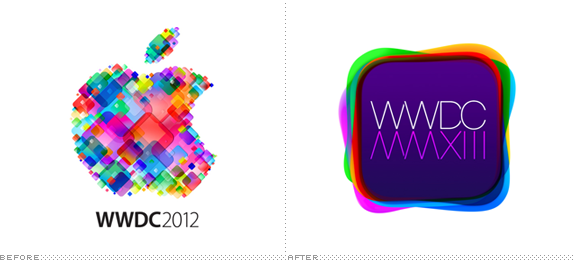
About: (Est. 1983) “The Apple Worldwide Developers Conference, commonly abbreviated WWDC, is a conference held annually in California by Apple Inc. The conference is primarily used by Apple to showcase its new software and technologies for developers, as well as offering hands-on labs and feedback sessions.” (Source: Wikipedia)
Design by: N/A.
Ed.’s Notes: They sure have been on an app-icon-shape kick lately. It’s better than last year’s, but that’s not saying much. Bigger view of the logo below (or after the jump).
Relevant links: N/A.
Continue reading this entry

DATE: Apr.29.2013 POSTED BY: Armin
 CATEGORY: Technology The B-Side
  COMMENTS:


A B-Side BY Armin
Lionsgate (Logo Intro)
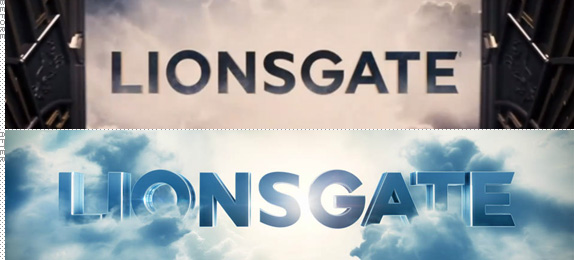
About: (Est. 1995) “Lionsgate is a leading global entertainment company with a strong and diversified presence in motion picture production and distribution, television programming and syndication, home entertainment, family entertainment, digital distribution, new channel platforms and international distribution and sales. Led by THE HUNGER GAMES and THE TWILIGHT SAGA young adult franchises, the Company’s feature film slate generated more than $1.2 billion at the domestic box office and $2.5 billion worldwide in 2012. Lionsgate’s television business includes 28 shows on 20 different networks, including such iconic brands as MAD MEN, WEEDS, ANGER MANAGEMENT and NASHVILLE on ABC.”
Design by: Deva Studios.
Ed.’s Notes: A little too close to Universal? Before and after intro movies below (or after the jump).
Relevant links: Deva Studios case study.
Select quote: “The new design features a light-speed journey through the galaxy, reflecting the vast universe of creativity that exists within Lionsgate. The animation is replete with visual reference to the branding heritage of the studio. Sharp eyed viewers will spot a lion constellation in the galaxy, and note that the logo resolves in a cloudscape that draws its visual DNA from the previous incarnation of the logo (also designed by Devastudios).”
Continue reading this entry

DATE: Apr.26.2013 POSTED BY: Armin
 CATEGORY: Entertainment The B-Side
  COMMENTS:


A B-Side BY Armin
Nevada (Tourism)
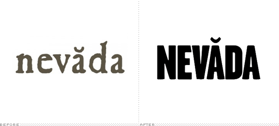
About: As described by the client, the Nevada Commission on Tourism: “Nevada is one of the largest states in the U.S., meaning you won’t find a shortage of action in the Silver State. It’s one of the only places you can ski world-class runs in the morning, then walk world-class greens in the afternoon. You can bike or hike the Tahoe Rim Trail, navigate a kayak on the Truckee River through downtown Reno, take an ATV up Sand Mountain near Fallon and snowmobile miles of wide-open terrain near Elko. You can even test your Indy car or NASCAR skills in the Mario Andretti and Jeff Gordon Racing School at Las Vegas Motor Speedway—after you take in a world-famous show and dine at a five-star resort and casino, of course.”
Design by: Y&R.
Ed.’s Notes: Good update. Any idea what the symbol over the first “a” means? TV spot below (or after the jump).
Relevant links: Press release. Reno Rebirth blog story
Continue reading this entry

DATE: Apr.25.2013 POSTED BY: Armin
 CATEGORY: Destinations The B-Side
  COMMENTS:

TAGS: sans serif, uppercase,

A B-Side BY Armin
Musée de la Civilisation
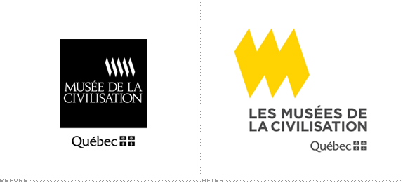
About: (Est. 1984) The Les Musées de la civilisation à Québec (Museum of Civilization of Quebec) is a museum located in Quebec City, Canada. “The Musée de la civilisation links the past, the present and the future. While remaining strongly rooted in the reality of Québec, it projects a new, attentive and dynamic outlook on all of human experience in its whole, and on civilizations from the world over.”
Design by: N/A.
Ed.’s Notes: Charlie Brown called, he wants his sweater stripe back. Kidding aside, decent evolution. Bigger view of the logo and sub-brands as well as introduction video below (or after the jump).
Relevant links: N/A.
Continue reading this entry

DATE: Apr.24.2013 POSTED BY: Armin
 CATEGORY: Culture The B-Side
  COMMENTS:


A B-Side BY Armin
National Kidney Foundation
About: (Est. 1961) “The National Kidney Foundation is the leading organization in the U.S. dedicated to the awareness, prevention and treatment of kidney disease for hundreds of thousands of healthcare professionals, millions of patients and their families and tens of millions of Americans at risk.”
Design by: TIO Agency.
Ed.’s Notes: A cleaner update using a hard-to-work-with shape. Bigger view of the logo and a sample of some effective Skype-themed PSA TV spots below (or after the jump).
Relevant links: Press release. Public service announcement videos.
Select quote: “Inspired by the organization’s rich history, the new signature incorporates the symbols, font and colors — orange and black — associated with the National Kidney Foundation in a modern fashion. Instead of interlocking kidneys , the new logo features a single kidney bean shape along with the text.”
Continue reading this entry

DATE: Apr.23.2013 POSTED BY: Armin
 CATEGORY: Health The B-Side
  COMMENTS:

TAGS: orange, sans serif,

A B-Side BY Armin
Pearle Vision
About: (Est. 1961) “Pearle Optical is an American chain of eye care stores. It was founded by Stanley Pearle, an optometrist in Savannah, Georgia, USA in 1961. He also founded Pearle Vision (market name in the United States) and its express store, Pearle Express, in the same year. The company’s European division, Pearle Europe, is now owned by the Dutch firm HAL Investments, also the parent company of Atasun Optik, Lensmaster and GrandVision. The North American Pearle Vision stores are owned by parent company Luxottica.” (Source: Wikipedia)
Design by: LPK.
Ed.’s Notes: Wow, never would have thought about it: a pair of eyeglasses as a logo for an eyeglasses company. Wonder what kind of proprietary brand process led to that?
Relevant links: VisionMonday story. New national TV spot.
Select quote: “The new Pearle Vision logo reflects the theme ‘Genuine Eyecare’ and reinforces the history of the brand, established in 1961, and takes on what Zarkin describes as ‘almost an apothecary’ message in its eyeglass graphic.”
Thanks to Elevatorman for the tip.

DATE: Apr.22.2013 POSTED BY: Armin
 CATEGORY: Retailers The B-Side
  COMMENTS:

TAGS: sans serif,

A B-Side BY Armin
Marketwired

About: (Est. 1994) “Partnering with companies of all sizes — from start-ups to Fortune 500 enterprises — Marketwired is an innovative, social communications company offering best-in-class global news distribution and reporting. Powered by Sysomos, Marketwired’s products also provide state-of-the-art social media monitoring and analytics. This critical business intelligence provides instant and unlimited access to all social media conversations, allowing brands to see what’s happening, why it’s happening, and who’s driving the conversations.”
Design by: N/A.
Ed.’s Notes: Less than a year ago we covered Marketwire’s logo redesign and it received favorable reviews. Sad to see it convert into this monstrosity and lame name. A video introducing the new name below (or after the jump) — try very hard to not want to punch your computer repeatedly while watching it..
Relevant links: Press release (mostly about the name and business strategy).
Continue reading this entry

DATE: Apr.19.2013 POSTED BY: Armin
 CATEGORY: Corporate The B-Side
  COMMENTS:

TAGS: condensed,

A B-Side BY Armin
Blue Ridge Foundation
About: (Est. 1999) “Blue Ridge Foundation was founded by John A. Griffin, President of Blue Ridge Capital, to foster ground-breaking ideas for social change […]. Over our first decade of incubating social innovations, Blue Ridge has helped to build start-up nonprofits from the concept stage; replicated best-in-class organizations by launching their local NYC offices; fostered collective impact efforts across our portfolio; and offered insights to government drawn from the work of our grantees.”
Design by: Hyperakt.
Ed.’s Notes: I like the implied tittle of “I” and “L” in “BLUE”, and nice typography overall. Bigger view of the logo and some applications below (or after the jump).
Relevant links: Hyperakt case study.
Continue reading this entry

DATE: Apr.18.2013 POSTED BY: Armin
 CATEGORY: Corporate The B-Side
  COMMENTS:


A B-Side BY Armin
The Ringling
About: (Est. 1927) “The John and Mable Ringling Museum of Art [now just The Ringling] is the state art museum of Florida, located in Sarasota, Florida.Florida State University assumed governance of the Museum in 2000. [It] offers twenty-one galleries [and] more than 150,000 square feet have been added to the campus, which includes the art museum, circus museum, and Ca’ d’Zan, the Ringlings’ mansion, which has been restored, along with the historic Asolo Theater. New additions to the campus include the Visitor’s Pavilion, the Education, Library, and Conservation Complex, the Tibbals Learning Center complete with a miniature circus, and the Searing Wing, a 30,000-square-foot (2,800 m2) gallery for special exhibitions attached to the art museum.” (Source: Wikipedia)}
Design by: Wordlstudio.
Ed.’s Notes: This is exceedingly lame. Bigger view of the logo and how the logo works as sub-brands below (or after the jump).
Relevant links: Ringling “Our New Brand” page. Arts Sarasota story
Select quote: “The Ringling’s new brand identity captures the richness and diversity of its venues, collections and programs, as well as inspires curiosity and engagement from its visitors, members and community. It enhances the Ringling’s role as the cultural heart of Sarasota, the State Art Museum of Florida and one of the finest museums in the United States.”
Continue reading this entry

DATE: Apr.17.2013 POSTED BY: Armin
 CATEGORY: Culture The B-Side
  COMMENTS:

TAGS: logo system, museum, serif,


