
A B-Side BY Armin
Cardiff City FC
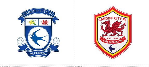
Founded in 1899, Cardiff City FC, known as the “Bluebirds,” are a professional football club based in Cardiff, Wales in the English football league system. After being in debt for many years, a Malaysian businessman took over. This month, a new crest with a big dragon sitting on top of a bluebird was introduced, as well as a change in uniforms with red taking over blue as the home version. Pissing-off of soccer fans ensued. Story here.
Thanks to Brett Stone for first tip.

DATE: Jun.11.2012 POSTED BY: Armin
 CATEGORY: Sports The B-Side
  COMMENTS:


A B-Side BY Armin
Williamson-Dickie Manufacturing Company

Established in 1922, Williamson-Dickie Manufacturing Company is one of the world’s leading providers of authentic work apparel, ranging from footwear to overalls. They are the parent company of the well-known Dickies brand, as well as Workrite, Kodiak, and Terra. According to the press release: “The new brand mark or logo introduces an interlocking, woven “WD” monogram; the firm’s 1922 founding date; a double-stitch graphic honoring apparel design elements; and a contemporary Williamson-Dickie logotype reinforcing the organization’s manufacturing roots.” No design credit given.
Thanks to Roy Levitt for the tip.

DATE: Jun.08.2012 POSTED BY: Armin
 CATEGORY: Corporate The B-Side
  COMMENTS:

TAGS: badge, monogram, sans serif,

A B-Side BY Armin
LOSC Lille
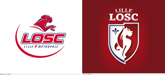
Founded in 1944, LOSC Lille Métropole is a soccer team that plays in the Ligue 1 of French soccer. They have won the championship three times, most recently in the 2010-11 season. A new logo designed by the Paris office of Dragon Rouge was introduced last month, updating their Great Dane/German Mastiff mascot. More info here (in French). Brandtastic video of the new logo below (or after the jump).
Continue reading this entry

DATE: Jun.06.2012 POSTED BY: Armin
 CATEGORY: Sports The B-Side
  COMMENTS:

TAGS: animal, dragon rouge, france, soccer,

A B-Side BY Armin
Orlando Venues
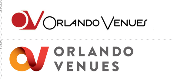
Orlando Venues is a company devoted to the marketing and promotion of all the events for various venues in Orlando, FL, which include the Orlando Magic’s home at Amway Center, as well as the Bob Carr Performing Arts Centre, Florida Citrus Bowl, Tinker Field, Leu Gardens, and the Mennello Museum. Orlando-based Great Big Circle recently redesigned their logo, keeping the “OV” monogram that they’ve been using for over 20 years. I can’t help myself: the new logo is the equivalent of Donald Trump’s hair — where is the combover of the “V” coming from?

DATE: Jun.05.2012 POSTED BY: Armin
 CATEGORY: Real Estate The B-Side
  COMMENTS:


A B-Side BY Armin
Hunchworks

Just established by the United Nations’ Global Pulse initiative, Hunchworks’ mission is to help find solutions for some of the world’s biggest problems, a platform that connects experts from around the world and enables them to collaborate and solve problems on a global scale. The name comes from its process by delving deep into “hunches” that may lead to positive results. The identity has been designed by Brooklyn, NY-based Hyperakt. More images and application shots here. Love that the icon looks like a transistor circuit thingie.

DATE: Jun.04.2012 POSTED BY: Armin
 CATEGORY: Non-Profit The B-Side
  COMMENTS:

TAGS: hyperakt, monogram, united nations,

A B-Side BY Armin
Badminton World Federation
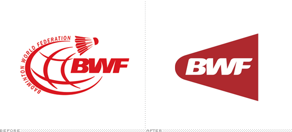
Established in 1934 and headquartered in Kuala Lumpur, Malaysia, the Badminton World Federation is the international governing body for the sport of badminton. A new logo was introduced over the weekend. Press release here. Launch video below (or after the jump).
Continue reading this entry

DATE: May.30.2012 POSTED BY: Armin
 CATEGORY: Sports The B-Side
  COMMENTS:


A B-Side BY Armin
California Historical Society

Established in 1871, the California Historical Society is a non-profit organization “with a mission to inspire and empower people to make California’s richly diverse past a meaningful part of their contemporary lives.” A new logo designed by Palo Alto, CA-based Randle Design was introduced in February. Anybody know what the shapes in the icon mean? Loaves of sourdough bread?
Thanks to Pierre Granier for the tip.

DATE: May.29.2012 POSTED BY: Armin
 CATEGORY: Non-Profit The B-Side
  COMMENTS:

TAGS: icon, orange, sans serif,

A B-Side BY Armin
Google Developers

Originally named Google Code, Google Developers is a source for all the developers who embrace Google’s open-source platforms. Portland, OR-based Instrument designed their new identity. Explanation and further images here.

DATE: May.25.2012 POSTED BY: Armin
 CATEGORY: Technology The B-Side
  COMMENTS:


A B-Side BY Armin
OUTtv

Launched in 2001, OUTtv is a Canadian television channel focusing exclusively on television programming for the Gay and Lesbian audience, available on every cable and satellite service in Canada. This week, OUTtv introduced a new logo designed by San Francisco, CA- and Vancouver, Canada-based B’stro. Variations of the logo for different topics were created too, shown below (or after the jump). Press release here.
Continue reading this entry

DATE: May.24.2012 POSTED BY: Armin
 CATEGORY: Entertainment The B-Side
  COMMENTS:


A B-Side BY Armin
Deutschen Tennis Bundes
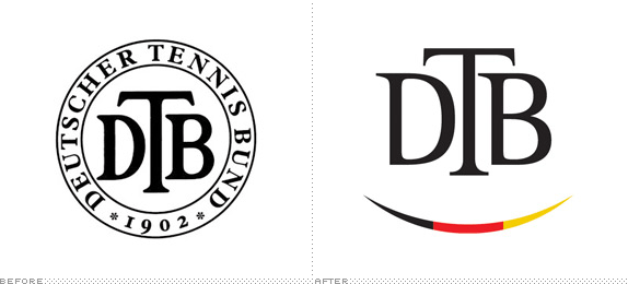
Established in 1902, Deutschen Tennis Bundes (DTB for short, German Tennis Federation for English) is the governing body of tennis federations and clubs in Germany, with more than 1,800,000 members. A new logo was introduced this month. Not clear if the smile was intentional or if it’s meant to be a tennis ball. More at Das Design Tagebuch, translate if needed.
Thanks to Marc Nijborg for the tip. Via Das Design Tagebuch.

DATE: May.22.2012 POSTED BY: Armin
 CATEGORY: Sports The B-Side
  COMMENTS:


