
A B-Side BY Armin
Electric

About: (Est. 2000) “Electric is a global, premium, sport and lifestyle accessory brand rooted in southern California’s rich action sports, music, art and customization culture. Electric designs and markets an extensive line of sunglasses, snow goggles, backpacks, luggage and accessories through a primarily action sport and sporting good global retail network including the Americas, Europe, Japan, China and Australasia. Since 2011 Electric has been a part of PPR, a worldwide leading Luxury and Sport & Lifestyle group.”
Design by: In-house.
Ed.’s Notes: Bigger view of the logo below (or after the jump). Hipster branding at its best! (And I’m not being sarcastic).
Relevant links: Press Release.
Select quote: “The new ‘VOLT’ logo, photography style and brand design celebrates Electric’s Southern California roots with an emphasis on premium quality and timeless style.”
Continue reading this entry

DATE: Feb.13.2013 POSTED BY: Armin
 CATEGORY: Consumer products The B-Side
  COMMENTS:

TAGS: condensed, lightning, sans serif,

A B-Side BY Armin
FSE Energy

About: (Est. 1935) “FSE Energy specializes in the design, manufacture and installation of biomass and solid fuel boilers. Boilers account for more than 80% of the world’s power through nuclear, coal, and biomass, which is renewable energy converted from plants and animals.”
Design by: MetaDesign.
Ed.’s Notes: Bigger view of the logo and sample applications below (or after the jump). See link for additional images and project description.
Relevant links: MetaDesign case study.
Select quote: “A contemporary abstraction of flame, the logo depicts the transfer of biomass to fuel through fire — the heart of FSE’s business and the most dependable source of renewable energy.”
Continue reading this entry

DATE: Feb.12.2013 POSTED BY: Armin
 CATEGORY: Corporate The B-Side
  COMMENTS:

TAGS: metadesign, sans serif, uppercase,

A B-Side BY Armin
Belize
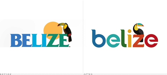
About: Client is Belize Tourism Board. “Belize is a country located on the north eastern coast of Central America. It is the only country in the area where English is the official language, although Kriol and Spanish are more commonly spoken. Belize is bordered to the north by Mexico, to the south and west by Guatemala and to the east by the Caribbean Sea. Its mainland is about 290 kilometres (180 mi) long and 110 kilometres (68 mi) wide.” (Source: Wikipedia)
Design by: Olson.
Ed.’s Notes: Video on the making of the logo and bigger view below (or after the jump).
Relevant links: Olson project page.
Continue reading this entry

DATE: Feb.11.2013 POSTED BY: Armin
 CATEGORY: Destinations The B-Side
  COMMENTS:


A B-Side BY Armin
LAMDA
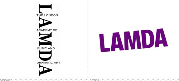
About: (Est. 1861) “LAMDA (London Academy of Music & Dramatic Art) is one of the leading drama schools in the English-speaking world and conducts the most eminent set of public examinations in speech and drama.” “As a world-class drama school, LAMDA has been fuelling the global performing arts industry with new talent for 150 years.” Notable alumni: Donald Sutherland, Richard Harris, Brian Cox, and Benedict Cumberbatch.
Design by: Hudson Fuggle.
Ed.’s Notes: New logo hasn’t shown up on their website yet but it is on their Facebook and Twitter accounts. A small sample of their seasonal brochures below (or after the jump).
Relevant links: N/A.
Continue reading this entry

DATE: Feb.08.2013 POSTED BY: Armin
 CATEGORY: Culture The B-Side
  COMMENTS:


A B-Side BY Armin
The City of St. Augustine

About: St. Augustine is a city in the northeastern region of the U.S. state of Florida. Founded in September 1565 it is the second oldest continuously occupied European-established city and port in the continental United States. St. Augustine lies in a region of Florida known as “The First Coast”, which extends from Amelia Island in the north to Jacksonville, St. Augustine, and Palm Coast in the south. According to the 2010 census, the city population was 12,975. St. Augustine is the headquarters for the Florida National Guard. (Source, modified: Wikipedia)
Design by: We are Charette.
Ed.’s Notes: Y’all will be happy to know the design firm is located in St. Augustine. Bigger view of the logo and the icon below (or after the jump)
Relevant links: St. Augustine’s 450th year celebration site.
Provided quote:“The mark we designed combines the profile of the Castillo de San Marcos with a representation of water, and the colors reflect both our Spanish heritage (in earthy terra cotta oranges and vibrant reds) and our maritime history (in a regal blue). The typography feels both historic and humanistic.”
Continue reading this entry

DATE: Feb.07.2013 POSTED BY: Armin
 CATEGORY: Destinations The B-Side
  COMMENTS:


A B-Side BY Armin
Boston.com

About: “Boston.com is a regional website that offers news and information about the Boston, Massachusetts area. Boston.com was launched in late October 1995 by Boston Globe Electronic Publishing Inc., the Internet subsidiary of the Boston Globe.” (Source: Wikipedia)
Design by: In-house.
Ed.’s Notes: This is not the most groundbreaking story but every time I visited Boston.com’s magnificent The Big Picture feature I cringed at the ridiculousness of that curved logo. Good riddance.
Relevant links: Boston.com Tumblr Post.
Thanks to Hal Tepfer for the tip.

DATE: Feb.06.2013 POSTED BY: Armin
 CATEGORY: Media The B-Side
  COMMENTS:

TAGS: italic, sans serif,

A B-Side BY Armin
StarTrack

About: “StarTrack is the product of the integration of the retail division of Australian air Express and Star Track Express. Backed by parent companies and strategic partners Australia Post and Qantas, the new StarTrack offers its customers the largest network in the country. With 57 branch facilities Australia-wide, StarTrack operates a fleet of more than 3,000 vehicles and transports more than one million parcels across the country for its customers every week.”
Design by: N/A.
Ed.’s Notes: OMG, that old logo. LOL. Bigger view of the logo, an ad, and a truck below (or after the jump).
Relevant links: StarTrack Media Centre (scroll to bottom for announcement and TV spot).
Continue reading this entry

DATE: Feb.05.2013 POSTED BY: Armin
 CATEGORY: Logistics The B-Side
  COMMENTS:


A B-Side BY Armin
Enterprise Florida

About: Enterprise Florida, Inc. is a partnership between Florida’s business and government leaders and is the principal economic development organization for the state of Florida. Headquartered in Orlando, Enterprise Florida’s mission is to facilitate job growth for Florida’s businesses and citizens leading to a vibrant statewide economy. In pursuit of its mission, Enterprise Florida works closely with a statewide network of economic development partners and is funded both by the State of Florida and by private-sector businesses.”
Design by: On Ideas.
Ed.’s Notes: The logo has been met with controversy for its focus on men by using a tie in its logo, earning the label of being sexist. I couldn’t agree more, this logo is sexist because it offends both men and women because it’s a bad concept executed badly.
Relevant links: Tampa Bay Business Journal story.
Thanks to James I. Bowie for the tip.

DATE: Feb.04.2013 POSTED BY: Armin
 CATEGORY: Destinations The B-Side
  COMMENTS:

TAGS: gradient, sans serif,

A B-Side BY Armin
Vine

About: (Est. 2013) “Vine is a mobile app by Twitter that hosts short video clips for sharing through the user’s Twitter feed. Clips have a maximum length of six seconds. It debuted on 24 January 2013 as a free iOS app on the iPhone and iPod Touch. ” (Source: Wikipedia)
Design by: N/A.
Ed.’s Notes: Undecided if I love it or hate it. There is something attractive about it but there is something very unresolved about the script approach. Bigger view of the logo and app icon below (or after the jump).
Relevant links: N/A.
Continue reading this entry

DATE: Feb.01.2013 POSTED BY: Armin
 CATEGORY: Technology The B-Side
  COMMENTS:

TAGS: script,

A B-Side BY Armin
Nebraska Huskers (Secondary Logo)
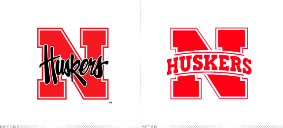
About: (Est. 2013) “The Nebraska Cornhuskers (often abbreviated to Huskers) is the name given to several sports teams of the University of Nebraska-Lincoln. The university is a member of the Big Ten Conference. The Cornhuskers compete in NCAA Division I, fielding 21 varsity teams in 15 sports.” (Source: Wikipedia)
Design by: Design department at The Collegiate Licensing Company.
Ed.’s Notes: This is ONLY for the secondary logo, not the main Nebraska university logo nor the main Huskers logo.
Relevant links: In-depth article from the Huskers about the change.
Thanks to Jim Kosmicki for the tip.

DATE: Jan.31.2013 POSTED BY: Armin
 CATEGORY: Sports The B-Side
  COMMENTS:

TAGS: college, red, slab serif,


