


Online
- FPO (For Print Only) / Celebrating the reality that print is not dead by showcasing the most compelling printed projects.
- Art of the Menu / Cataloguing the underrated creativity of menus from around the world.
- Quipsologies / Chronicling the most curious, creative, and notable projects, stories, and events of the graphic design industry on a daily basis.
- Speak Up (2002 – 2009) / Discussing, and looking for, what is relevant in, and the relevance of, graphic design. Archives Only.
- Word It (2003 – 2010) / Encouraging creative diversity in the community through monthly, one-word challenges. Archives Only.
- Brand New Classroom (2010 – 2011) / Providing a space for critique and opinions on student identity work. Archives Only.
Publishing
- The 2010 Brand New Awards / 2011, self-published.
- Flaunt: Designing effective, compelling and memorable portfolios of creative work / 2010, self-published.
Events & Judged Competitions
- Brand New Conference / A one-day event on the development of corporate and brand identity projects by some of today’s most active and influential practitioners from around the world.
- Brand New Awards / Celebrating the best identity work produced around the world.
- FPO Awards / Celebrating the best print work from around the world.
Writing
- Graphic Design, Referenced: A Visual Guide to the Language, Applications, and History of Graphic Design / 2009, Rockport.
- Women of Design: Influence and Inspiration from the Original Trailblazers to the New Groundbreakers / 2008, HOW Books.
- The Word It Book: Speak Up Presents a Gallery of Interpreted Words / 2007, HOW Books.
Graphic Design
- Department of Design / Designing corporate and brand identities and full development of printed and digital matter for clients.

A B-Side BY Armin
Biodiversity Observatory of the Rhône-Alpes
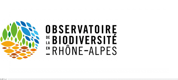
About: “Biodiversity Observatory of the Rhône-Alpes is a center for knowledge and a management tool for the natural habitats and species of France’s Rhône-Alpes. The observatory is structured around three fields: flora, fauna, and managing natural environments.”
Design by: graphéine design graphique.
Ed.’s Notes: That’s a lot of stuff to put into one logo but, hey, it works. A few logo variations and applications below (or after the jump) and a few more pieces at the case study link.
Relevant links: graphéine case study.
Provided quote: “This visual identity takes its starting point in the form of an ellipse. Indeed, this simple geometric shape suggests all the components of biodiversity … in turn, alone or multiplied, the ellipse becomes an eye, a flower, a leaf, a school of fish, a deer track … Using the ellipse as the basic element of this identity avoids any form of figurative representation of biodiversity. The composition and color of these ellipses simply suggest biodiversity.”
Continue reading this entry

DATE: Mar.14.2013 POSTED BY: ArminCATEGORY: Environment The B-Side COMMENTS:

TAGS: circles, colorful, sans serif,

A B-Side BY Armin
LIVESTRONG Foundation
![]()
About: (Est. 1997) “The LIVESTRONG Foundation provides free cancer support services to help people cope with the financial, emotional and practical challenges that accompany the disease. Created in 1997 by cancer survivor and philanthropist Lance Armstrong, the Foundation is known for its powerful brand — LIVESTRONG — and for its advocacy on behalf of survivors and their families. With its iconic yellow LIVESTRONG wristband, the Foundation has become a symbol of hope and inspiration around the world. Since its inception, the Foundation has served 2.5 million people affected by the disease and raised more than $500 million to support cancer survivors. One of America’s top cancer non-profit organizations, the Foundation enjoys a four-star rating from Charity Navigator and has been recognized by the National Health Council and the Better Business Bureau for its excellent governance, high standards and transparency.”
Design by: Rigsby Hull.
Ed.’s Notes: To add insult to injury, Lance Armstrong has not only been stripped off his Tour de France wins, his name has been scraped off the logo of his foundation. Take that. A few more images below (or after the jump) and more work and relevant story links at Rigsby Hull’s case study.
Relevant links: Rigsby Hull case study. LIVESTRONG press release.
Select quote: “The LIVESTRONG Foundation also unveiled its new logo at the Assembly, a visual change designed to underscore that the LIVESTRONG ethos — the belief in fighting for people affected by cancer today — is not abstract and, in fact, drives all of the Foundation’s work. The new logo is a natural next step in the Foundation’s evolution and is intended to provide the Foundation’s corporate and marketing partners — and the public — with an unmistakable way of communicating that buying LIVESTRONG-branded gear or supporting the Foundation equates to helping those affected by cancer right now.”
Continue reading this entry
DATE: Mar.13.2013POSTED BY: ArminCATEGORY: Non-Profit The B-Side COMMENTS:
TAGS: black, sans serif, yellow,
A B-Side BY Armin
CCTV9
![]()
About: (Est. 1856) “CCTV-9 is the documentary channel of the television network, CCTV in the People’s Republic of China. This channel has a local Mandarin Chinese edition called CCTV-9, and an international English language edition called CCTV-9 Documentary which is carried by more satellites.” (Source: Wikipedia)
Design by: Trollbäck+Company.
Ed.’s Notes: Lovely, moody motion work below (or after the jump).
Relevant links: Trollbäck+Company case study.
Select quote: “To express the scope of programming, T+Co created logo animations using six broad themes that reflect CCTV9’s range in natural history, human endeavor, illumination, arts, progress, and infrastructure. From the humid serenity of a bamboo forest just after the rain to the brand new Rem Koolhaas designed CCTV headquarters in Beijing, each ID allows the new multi-faceted cube logo to define its material properties in compliment to its environment.”
Continue reading this entry
DATE: Mar.12.2013POSTED BY: ArminCATEGORY: Entertainment The B-Side COMMENTS:
TAGS: cube, on-air, trollback and company,
A B-Side BY Armin
Minnesota United FC
![]()
About: (Est. 2010) “Minnesota United FC represents the next era of professional soccer in the beautiful state of Minnesota. We are proud of who and what has come before us—from the raucous party that was the Kicks, the magical years the Thunder spent developing local talent, to the recent 2011 NASL Championship. Now we are excited for what the future holds. We seek to help the world’s game grow in the Twin Cities through strong play on the field and constant giveback off it.”
Design by: Zeus Jones.
Ed.’s Notes: Bigger view of the logo and sample applications below (or after the jump).
Relevant links: Zeus Jones case study. Minnesota FC United Press Release.
Select quote: “[We] whittled our many design ideas down into one that centered on Minnesota’s iconic loon, which has an active, aggressive nature that we thought was inspirational for a soccer team. The design also incorporates a star to tie to their past, as well as a blue stripe to represent the Mississippi river.”
Continue reading this entry
DATE: Mar.11.2013POSTED BY: ArminCATEGORY: Sports The B-Side COMMENTS:
A B-Side BY Armin
Western Union
![]()
About: (Est. 1856) “Western Union connects people and businesses around the globe by providing fast, reliable and convenient ways to move money. Our 160-year history and 510,000 Western Union Agent locations in more than 200 countries and territories strengthen our commitment to offering our services in every corner of the globe.”
Design by: N/A.
Ed.’s Notes: Monogram view below. There is something interesting about this or at least there is some potential there for the WU monogram to be interesting.
Relevant links: N/A.
DATE: Mar.08.2013POSTED BY: ArminCATEGORY: Corporate The B-Side COMMENTS:
TAGS: black, monogram, sans serif, uppercase, yellow,
A B-Side BY Armin
BlackJet
![]()
About: (Est. 2013) Co-founded by Uber founder Garrett Camp and with high-profile investors including Ashton Kutcher, Will Smith and Jay-Z, BlackJet launched in 2013. The service allows a wider market of luxury travelers to book individual seats on private planes instantly, at the touch of an iPhone.
Design by: Moving Brands.
Ed.’s Notes: This looks expensive.
Relevant links: Moving Brands case study.
Select quote: “The visual identity Moving Brands developed for BlackJet is bold, confident and elegant. The ‘B’ is abstracted, drawing directly from the design direction’s concept of the fast, frictionless journey. It takes the subtle shape of wings, both in the positive space created by the curves of the ‘B’ and the negative space, which reveals the sleek nose and wings of a jet. A moody, sexy, monochromatic color palette and contrasting, geometric font further advance the personality of the brand and differentiate its identity from its competitors.”
Continue reading this entry
DATE: Mar.07.2013POSTED BY: ArminCATEGORY: Aviation The B-Side COMMENTS:
TAGS: black, icon, monogram, moving brands,
A B-Side BY Armin
Space Channel
![]()
About: (Est. 1997) “Space is a Canadian Category A specialty channel owned and operated by Bell Media. It features science fiction, fantasy, horror, and paranormal programming including films, documentaries, scripted television series and more. SPACE originally used the subtitle The Imagination Station following its name; it is still sometimes used informally by fans today.” (Source: Wikipedia).
Design by: Bell Media Agency.
Ed.’s Notes: I don’t think the old logo was good (it wasn’t) but this new version is as dry as certain parts of earth. A brief montage of new shows shown below (or after the jump) hints at some potential though. A few more clips are available here
Relevant links: Long story on Marketing Magazine. Bell Media press release.
Select quote: “Space’s new logo reflects the channel’s more earthly focus, losing the previous galactic swirl in favour of all lowercase letters inside a sphere. In promo spots, the logo is placed on real-life items that relate to specific shows. For example, for Being Human, there’s a blood splatter with the Space logo on it.”
Continue reading this entry
DATE: Mar.06.2013POSTED BY: ArminCATEGORY: Entertainment The B-Side COMMENTS:
A B-Side BY Armin
White Knight Laundry
![]()
About: (Est. 1904) White Knight Laundry offers domestic laundry services, business and industrial laundry and linen hire operating both in the B2B sector — industry, hotels, restaurants, education and healthcare — as well as serving individual households throughout the South and Southeast of England. They hold a Royal Warrant, meaning they wash the Queen’s undies. (Or not, not sure).
Design by: Coley Porter Bell.
Ed.’s Notes: Haven’t seen a photo-based logo in a while. This is fun. Bigger view below (or after the jump).
Relevant links: N/A.
Provided quote: “White Knight holds the Royal Warrant. This informed the design of the new logo which is based on pieces of White Knight’s linen, folded origami-style, to create a knight’s helmet. It is set against a regal purple background, with lettering in a crisp white Century Gothic. Importantly, it has been created in such a way that it can be consistently reproduced across a very wide range of applications, materials and media.”
Continue reading this entry
DATE: Mar.05.2013POSTED BY: ArminCATEGORY: Corporate The B-Side COMMENTS:
A B-Side BY Armin
Buy.com
![]()
About: (Buy.com Est. 1997 / Rakuten Est. 1997) “Buy.com joined the Rakuten family in 2010, making the joint businesses combined into one of the world’s largest online retail marketplaces. We offer consumers more than 90 million products from 38,500 merchants around the globe. Buy.com becoming Rakuten.com Shopping is the next step of that relationship as the Rakuten Group increasingly unifies its brand internationally. This transition will open up the Rakuten.com Shopping (formerly Buy.com) marketplace to customers globally, as well as introducing merchants and retailers from around the world to its North American customer base. Both its merchants and its consumers will benefit from this open, global market. We are excited at the possibilities to come, and we hope you continue to join us in our global growth.”
Design by: N/A.
Ed.’s Notes: This isn’t so much a logo before/after but a brand before/after and the effects of corporate ownership. Buy.com didn’t have much of a logo before and Rakuten doesn’t have much of a logo either, just an “R” inside a circle that has been passed off to Buy.com. The real problem here is going from the über simple “Buy.com” to the utterly unmemorable and confusing “Rakuten.com Shopping”. If that weren’t enough, there is a video, below (or after the jump) that makes all the employees shown look as humiliated as the old Buy.com logo probably feels.
Relevant links: Buy.com is now Rakuten.com Shopping.
Continue reading this entry
DATE: Mar.04.2013POSTED BY: ArminCATEGORY: Retailers The B-Side COMMENTS:
TAGS: icon, sans serif,
A B-Side BY Armin
Allina Health
![]()
About: “Allina Health is dedicated to the prevention and treatment of illness and enhancing the greater health of individuals, families and communities throughout Minnesota and western Wisconsin. A not-for-profit health care system, Allina Health cares for patients from beginning to end-of-life through its 90+ clinics, 11 hospitals, 15 pharmacies, specialty medical services, including hospice care, oxygen and home medical equipment and emergency medical transportation.”
Design by: Campbell Ewald.
Ed.’s Notes: After preparing this post I realized the identity is from March of last year. So, yeah, this is old. Still, let’s pretend it happened today. Bigger view of the logo and ambulance livery below (or after the jump).
Relevant links: Campbell Ewald case study.
Continue reading this entry
DATE: Mar.01.2013POSTED BY: ArminCATEGORY: Health The B-Side COMMENTS:
TAGS: hospital, icon, sans serif,


Books about logo design, the designers that create them and the meaning of branding.
