


Online
- FPO (For Print Only) / Celebrating the reality that print is not dead by showcasing the most compelling printed projects.
- Art of the Menu / Cataloguing the underrated creativity of menus from around the world.
- Quipsologies / Chronicling the most curious, creative, and notable projects, stories, and events of the graphic design industry on a daily basis.
- Speak Up (2002 – 2009) / Discussing, and looking for, what is relevant in, and the relevance of, graphic design. Archives Only.
- Word It (2003 – 2010) / Encouraging creative diversity in the community through monthly, one-word challenges. Archives Only.
- Brand New Classroom (2010 – 2011) / Providing a space for critique and opinions on student identity work. Archives Only.
Publishing
- The 2010 Brand New Awards / 2011, self-published.
- Flaunt: Designing effective, compelling and memorable portfolios of creative work / 2010, self-published.
Events & Judged Competitions
- Brand New Conference / A one-day event on the development of corporate and brand identity projects by some of today’s most active and influential practitioners from around the world.
- Brand New Awards / Celebrating the best identity work produced around the world.
- FPO Awards / Celebrating the best print work from around the world.
Writing
- Graphic Design, Referenced: A Visual Guide to the Language, Applications, and History of Graphic Design / 2009, Rockport.
- Women of Design: Influence and Inspiration from the Original Trailblazers to the New Groundbreakers / 2008, HOW Books.
- The Word It Book: Speak Up Presents a Gallery of Interpreted Words / 2007, HOW Books.
Graphic Design
- Department of Design / Designing corporate and brand identities and full development of printed and digital matter for clients.

A B-Side BY Armin
Gdańsk University of Technology
![]()
About: (Est. 1945) “The Gdańsk University of Technology (pol. Politechnika Gdańska) is a technical university in Gda?sk-Wrzeszcz, and one of the oldest universities in Poland. It has nine faculties and more than 24 thousand undergraduate, as well as about 400 doctoral students. In 2004 it employed 2500 people, including 1200 academics.” (Source: Wikipedia)
Design by: mamastudio.
Ed.’s Notes: It’s nice to know that it’s not only U.S. students that act all douchey and oppose university logos just because. (See Facebook link below). It’s even more annoying when the logo is actually good: those lion drawings are pretty sweet. Bigger view of the logo below (or after the jump).
Relevant links: Facebook logo opposition page. Press Release (in Polish).
Select quote (Google translated): “Decorative form of lions holding a shield replaced with a regular rhythm figures geometric contour lines. Silhouette of lions and a list of the initials of the name of the university with the emblem of the city of Gdansk in the shield are inseparable, linked at the level of the whole symbolic and figurative meaning.”
Continue reading this entry

DATE: Apr.02.2013 POSTED BY: ArminCATEGORY: Education The B-Side COMMENTS:

TAGS: angle, blue, poland, university,

A B-Side BY Armin
Ooredoo
![]()
About: (Est. 1998 originally as Qtel) “The Ooredoo Group is a leading international communications company, with a significant presence in the MENA region and Southeast Asia, and having a consolidated customer base of 83 million as of December 2011. It operates a portfolio of brands including Ooredoo, Indosat, Asiacell, Wataniya, Nawras, Nedjma and Tunisiana.
The Ooredoo Group’s principle activities are mobile telephone services, broadband solutions, digital futures and fibre technologies, serving both consumer and business markets. Headquartered in Doha, Qatar, the Ooredoo Group is ambitiously growing its global business on the basis of its insights into the needs of customers in emerging markets. Ooredoo Group’s ultimate parent company is Ooredoo Q.S.C. (formerly Qatar Telecom (Qtel) Q.S.C), whose shares are listed on the Qatar Exchange and the Abu Dhabi Securities Exchange.”
Design by: N/A
Ed.’s Notes: Strange-sounding name for global scaling. Lots of circles if that’s your thing. Video of the launch event and alternate square version of the logo below (or after the jump).
Relevant links: Ooredoo FAQs. Qtel is now Ooredoo.
Select quote: “The new name is an Arabic word meaning ‘I want’. It conveys the aspirations of our customers and symbolises our commitment to enrich people’s lives.”
Continue reading this entry
DATE: Mar.28.2013POSTED BY: ArminCATEGORY: Telecom The B-Side COMMENTS:
A B-Side BY Armin
Spotify
![]()
About: (Est. 2008) “Spotify is an award-winning digital music service that gives you on-demand access to over 20 million tracks. Our dream is to make all the world’s music available instantly to everyone, wherever and whenever they want it. Spotify makes it easier than ever to discover, manage and share music with your friends, while making sure that artists get a fair deal. Spotify is available in 17 countries: USA, UK, Sweden, Finland, Norway, Denmark, France, Switzerland, Germany, Austria, Belgium, The Netherlands, Spain, Australia, New Zealand, Ireland and Luxembourg with more than 15 million active users, and over 4 million paying subscribers.”
Design by: N/A
Ed.’s Notes: From terrible logo to bad logo. A success of sorts, I guess.
Relevant links: N/A.
![]()
Thanks to Mark Johnson for first tip.
DATE: Mar.27.2013POSTED BY: ArminCATEGORY: Entertainment The B-Side COMMENTS:
TAGS: green, sans serif,
A B-Side BY Armin
Acxiom
![]()
About: (Est. 1969) “Acxiom is an enterprise data, analytics and software as a service company that uniquely fuses trust, experience and scale to fuel data-driven results. For over 40 years, Acxiom has been an innovator in harnessing the most important sources and uses of data to strengthen connections between people, businesses and their partners. Utilizing a channel and media neutral approach, we leverage cutting-edge, data-oriented products and services to maximize customer value. Every week, Acxiom powers more than a trillion transactions that enable better living for people and better results for our 7,000+ global clients.”
Design by: N/A.
Ed.’s Notes: It’s nice to see that boring, corporate logos can still be done nowadays. Bigger view of the logo and some applications below (or after the jump).
Relevant links: N/A.
Select quote: “The rebrand is an expression of our new powerful reality and reflects our strategy of connecting people, business and their partners. We are ramping up investment in product innovation, and have recently launched two products,” said Jefferies. “We want to make 1:1 marketing at scale, with privacy best practices, a reality.” - Wyatt Jefferies (spokesperson)
Continue reading this entry
DATE: Mar.26.2013POSTED BY: ArminCATEGORY: Technology The B-Side COMMENTS:
TAGS: globe, lowercase, sans serif,
A B-Side BY Armin
Doritos
![]()
This post was updated March 27, 2013.
About: “Doritos (literally, from Mexican Spanish doradito or dorito: “turned golden”) is a brand of seasoned tortilla chips produced since 1964 by the North American food company Frito-Lay (a division of PepsiCo, Inc.).” (Source: Wikipedia)
Design by: Hornall Anderson
Ed.’s Notes: Yeah… I don’t know about that bolting triangle destroying the “o”. See it on the bigger view of the logo and before/after of the packaging below (or after the jump).
Relevant links: Full line-up of Doritos variations. Taquitos.net redesign story (much more in-depth than I would ever care to get about it).
Continue reading this entry
DATE: Mar.25.2013POSTED BY: ArminCATEGORY: Consumer products The B-Side COMMENTS:
A B-Side BY Armin
Vikings (TV Series)
![]()
About: “The HISTORY original series Vikings transports us to the brutal and mysterious world of Ragnar Lothbrok (Travis Fimmel), a Viking warrior and farmer who yearns to explore—and raid—the distant shores across the ocean. His ambition puts him at odds with local chieftain Earl Haraldson (Gabriel Byrne), who insists on sending his raiders to the impoverished east rather than the uncharted west. [&hellip] Vikings was created and written by Michael Hirst (Elizabeth, The Tudors).”
Design by: King and Country.
Ed.’s Notes: Really digging this. Plenty more below (or after the jump).
Relevant links: Bedow case study.
Provided quote:“The left side of the ‘V’ tells us about the lesser-known aspect of Vikings: family and life. It seamlessly blends three key elements of their character: the upper section is efficient and almost scientific, denoting how technologically advanced they were, especially in ship-building expertise; the middle section is a graphic representation of brotherhood and unbreakable bonds, featuring art reminiscent of tribal emblems; the lower section is about growth and life, with an illustration that is similar to a section of weaving tapestry, taking visual cues from a family crest or coat of arms. The right side of the ‘V’ tells the story of war — and the violence, death and conflict that were big parts of Viking society. Shaped like the blade of a sword, small chinks are hacked out of what would have been fastidiously hand-forged steel weaponry, stained from blood of the fallen.”
Continue reading this entry
DATE: Mar.21.2013POSTED BY: ArminCATEGORY: Entertainment The B-Side COMMENTS:
A B-Side BY Armin
Amsterdam Gay Pride
![]()
About: (Est. 1996) “Amsterdam Gay Pride is a week to remember where we have been, celebrate how far we have come and take pride in where we are going. It is a captivating festival that salutes the power and beauty of sexual diversity. Bursting with loving energy and colourful creativity the party makes sure no one escapes the provoking and entertaining vibe of giving everyone the right to be who they are and love whoever they choose.”
Design by: VBAT.
Ed.’s Notes: Nice, subtle take on the rainbow color palette. Bigger and single-color versions of the logo below (or after the jump).
Relevant links: N/A.
Provided quote: “AGP has approached VBAT to create this new identity as the former ‘We Are’ logo, also developed by VBAT in 2008, will be used in a broader context as hallmark for all gay events in Amsterdam in the future. Therefore a new dedicated festival identity was wanted.”
Continue reading this entry
DATE: Mar.20.2013POSTED BY: ArminCATEGORY: Culture The B-Side COMMENTS:
A B-Side BY Armin
iNature Skincare
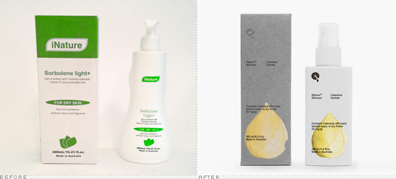
About: “iNature Skincare is an Australian brand with skincare products made of natural ingredients, free from parabens, artificial colours and fragrances. The packaging range consists of three products with different levels of hydration — Calendula Hydrate, Calendula Nourish and Calendula Repair.”
Design by: Bedow.
Ed.’s Notes: Pretty! A few more images below (or after the jump) including big view of the logo, and then some more at the link below.
Relevant links: Bedow case study.
Continue reading this entry
DATE: Mar.19.2013POSTED BY: ArminCATEGORY: Consumer products The B-Side COMMENTS:
TAGS: brush stroke, icon, packaging,
A B-Side BY Armin
Cabot
![]()
About: (Est. 1882) “Cabot Corporation is a global specialty chemicals and performance materials company, headquartered in Boston, Massachusetts. The company is the leading producer of rubber and specialty grade carbon black, activated carbon, inkjet colorants, cesium formate drilling fluids, fumed silica, aerogel, and elastomer composites.”
Design by: N/A.
Ed.’s Notes: I feel like we’ve seen this a dozen times for a corporate logo but, hey, it works and it kills a double-swoosh logo. A rather nice brand video below (or after the jump).
Relevant links: Cabot press release.
Select quote: “Cabot’s new corporate logo, developed to support the new brand, connects the company’s past with its future. To honor Cabot’s heritage, the new logo maintains the all-black, all-capital letters of ‘CABOT.’ The new chevron, meanwhile, represents the brand theme of advancing. The red, orange and yellow color palette emphasizes Cabot’s approachable, collaborative spirit, and energetic approach to innovation and customer service. The added dimension and colors highlight the many facets of Cabot’s businesses.”
Continue reading this entry
DATE: Mar.18.2013POSTED BY: ArminCATEGORY: Corporate The B-Side COMMENTS:
TAGS: overlay, sans serif, uppercase,
A B-Side BY Armin
Conax
![]()
About: (Est. 1986) “Conax protects content for over 350 pay-TV operators, representing 125 million consumers in 85 countries around the globe. Our latest content protection platform, Conax Contego, built on 25 years of pioneering security expertise, is the most secure on the market today. Conax Contego provides secure content delivery and digital rights management across broadcast, broadband or OTT on the devices of your choice, wherever and whenever you need it. Headquartered in Norway, Conax has offices in 14 locations, including 24/7 global support operations based in India. Conax is part of Telenor Group, one of the world’s largest mobile operators.”
Design by: Pajama.
Ed.’s Notes: It’s like a Richard Serra sculpture and video mapping performance all in one! A few more applications and video of the animated logo below (or after the jump).
Relevant links: Pajama case study.
Select quote: “The company had last invested in its branding in 2002. The appointment of a new CEO in 2012 led to a decision to address a rather dated identity which no longer fitted the global company Conax had become. We advised that the identity could not be refreshed without brand strategy.
The creative brief grew out of the strategy we helped Conax articulate. The big idea for the brand, ‘Sustaining Magic,’ encapsulates the crucial role of conditional access in safeguarding valuable TV content. This idea is supported by values rooted in the Conax culture and useful for future growth: Curiosity, Integrity and Agility.”
Continue reading this entry
DATE: Mar.15.2013POSTED BY: ArminCATEGORY: Technology The B-Side COMMENTS:
TAGS: 3d, lowercase, sans serif, texture,


Books about logo design, the designers that create them and the meaning of branding.
