
A B-Side BY Armin
Brno Airport
About: “Brno Airport is the second largest international airport in the Czech Republic and it is an important junction of the region and remote destinations. It handles over 500,000 passengers and more than 25,000 aircrafts annually.” (Provided by design firm).
Design by: Studio Kutululu.
Ed.’s Notes: A couple of application images below (or after the jump) and plenty more at Kutululu’s link below.
Relevant links: Kutululu case study.
Provided quote: “The corpulent word BRNO bears characteristics of the exterior shape of the terminal building and aircrafts. Broad in appearance and causing respect by their size. In contrast to monolithic, compactness and organicity was put the word AIRPORT, of which design draws inspiration from very rugged interior of the building and also represents airiness and technicality. The graphic symbol brings an element of the airport to the logo itself — a take-off and landing of aircraft on runway.” (Provided description).
Continue reading this entry

DATE: Dec.18.2012 POSTED BY: Armin
 CATEGORY: Aviation The B-Side
  COMMENTS:

TAGS: czech republic, sans serif, teal,

Opinion BY Armin
U.S. Soccer Development Academy
About: “Following a comprehensive review of elite player development in the United States and around the world, U.S. Soccer created the Development Academy in 2007 to improve the everyday environment for the elite youth player.The Development Academy is a partnership between U.S. Soccer and the top youth clubs around the country to provide the best youth players in the U.S. with an every day environment designed to produce the next generation of National Team players. The Academy’s programming philosophy is based on increased training, less total games and more competitive games.”
Design by: Stone Ward.
Ed.’s Notes: Larger view of the logo below (or after the jump).
Relevant links: N/A.
Provided quote: “The 4 stripes represent the 4 pillars of the academy. 2 stars for the 2 main age groups. Crest is their connection to the U.S. Soccer National Team program and affiliation with U.S. Soccer in general.”
Continue reading this entry

DATE: Dec.17.2012 POSTED BY: Armin
 CATEGORY: Sports The B-Side
  COMMENTS:


A B-Side BY Armin
Portland Thorns FC

About: As part of the new, 8-team professional women’s soccer league organized by U.S. Soccer, set to being play in Spring 2013, “Peregrine Sports, LLC — parent company of the Portland Timbers of Major League Soccer — today announced that its new professional women’s soccer club will be named Portland Thorns FC.”
Design by: Brent Diskin.
Ed.’s Notes: The logo has been designed by a Portland Timbers’ superfan and, although it’s not the greatest logo on earth, with the premise of being a fan-designed logo it surprisingly doesn’t suck.
Relevant links: Q&A with the designer. Press release.
Select quote: “The circular badge features team colors of red, green and black with a protective wreath of thorns surrounding a familiar, stylized rose in the center. Further, city-inspired details are presented in the form of a pair of four-pointed stars, or hypocycloids, that house the letters ‘F’ and ‘C’ and anchor the sides of the badge, a callout to the left-centered, directional star prominent on Portland’s official city flag that also flies in the stands and high atop JELD-WEN Field in downtown Portland.”
Thanks to Chris Campbell for the tip.

DATE: Dec.14.2012 POSTED BY: Armin
 CATEGORY: Sports The B-Side
  COMMENTS:


A B-Side BY Armin
Centrum Kultury Zamek
About: “Centrum Kultury Zamek (Culture Centre Castle) is the largest institution in the greater dissemination of culture and one of the largest institutions of its kind in Poland. During the year [we] organizes hundreds of events: concerts, exhibitions, meetings, film screenings, workshops and lectures. Our headquarters is the former imperial castle, one of the most unique buildings in Poznan. It was built in the years 1905-1910 as a residence Poznan last German Emperor Wilhelm II.”
Design by: Motor Studio.
Ed.’s Notes: Sample of the logo in application below (or after the jump) and a few more images at the Motor Studio case study link. I really love the abstraction and loose spacing of the logo.
Relevant links: CKZ Facebook post. Motor Studio case study.
Select quote (with Google Translate): “The graphic symbol consists of four simple elements that could be a reference to an abstract architectural forms found in building the imperial residence.”

Thanks to Jakub Swiadek for the tip.

DATE: Dec.13.2012 POSTED BY: Armin
 CATEGORY: Culture The B-Side
  COMMENTS:

TAGS: abstract, condensed, poland, sans serif,

A B-Side BY Armin
Scranton/Wilkes-Barre RailRiders
About: (Est. 1919, formerly Scranton/Wilkes-Barre Yankees) “The Scranton/Wilkes-Barre RailRiders is a professional minor league baseball team based in Moosic, Pennsylvania in the Scranton/Wilkes-Barre area. The team plays in Northern Division of International League and they are the Triple-A affiliate of the New York Yankees Major League Baseball club. The team plays at PNC Field (formerly Lackawanna County Stadium), their home since 1989.” (Source: Wikipedia).
Design by: Brandiose. (I’m starting to think the B in B-Side stands for Brandiose).
Ed.’s Notes: A locomotive porcupine? Yes, please! Alternate versions below (or after the jump).
Relevant links: Railriders press release. Brandiose blog post.
Select quote: “The RailRiders moniker pays homage to the very first trolley system in America, one created right here in Northeastern Pennsylvania (NEPA). […] A porcupine conductor, the gritty critter that calls NEPA home, is at the centerpiece of the identity.”
Continue reading this entry

DATE: Dec.12.2012 POSTED BY: Armin
 CATEGORY: Sports The B-Side
  COMMENTS:


A B-Side BY Armin
Glutino
About: (Est. 1983) “Glutino and Gluten-Free Pantry is a manufacturer and distributor specializing in gluten-free products. Since 1983, the mission of the Glutino Food Group has been to provide healthy gluten-free products and a healthy lifestyle to all those with celiac disease, gluten intolerance, wheat allergies and those who follow a gluten-free or wheat-free diet.”
Design by: N/A.
Ed.’s Notes: Silly type for a silly name, more stuff below (or after the jump).
Relevant links: N/A.
Continue reading this entry

DATE: Dec.11.2012 POSTED BY: Armin
 CATEGORY: Consumer products The B-Side
  COMMENTS:


A B-Side BY Armin
Germanwings
About: (Est. 2002) Germanwings is a low-cost airline based in Cologne, Germany, and is wholly owned by Lufthansa. Its fleet includes 32 Airbus A 319 that flies over 7.5 million passengers a year to over 90 destinations.
Design by: N/A.
Ed.’s Notes: Livery shot and video below (or after the jump).
Relevant links: Press release.
Select quote: “The key element will be a stylised burgundy and yellow ‘W’, transforming the wings in Germanwings into a succinct icon.”
Continue reading this entry

DATE: Dec.10.2012 POSTED BY: Armin
 CATEGORY: Aviation The B-Side
  COMMENTS:


A B-Side BY Armin
Blackened

About: (Est. 2012) Blackened is the new record label established by Metallica, after purchasing the rights of all their existing work from Warner Music Group, to serve as “the home of all of [their] current albums and videos along with all future releases.”
Design by: N/A.
Ed.’s Notes: “Blackened” comes from the first song in Metallica’s fourth album …And Justice for All. I wish the stick of the flag and circle were less “perfect”.
Relevant links: Metallica blog post..
Thanks to Henric Sjösten for the tip.

DATE: Dec.07.2012 POSTED BY: Armin
 CATEGORY: Entertainment The B-Side
  COMMENTS:


A B-Side BY Armin
Eugene Emeralds
About: (Est. 1955) “The Eugene Emeralds (nicknamed the Ems) is a minor league baseball team in Eugene, Oregon, United States. They are a short-season Class A team in the Northwest League, and have been a farm team of the San Diego Padres since 2001.” (Source: Wikipedia)
Design by: Brandiose (surprise, surprise).
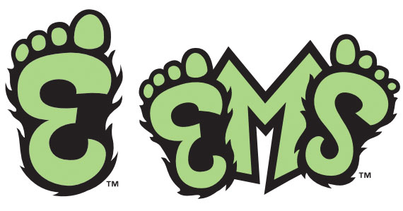
Ed.’s Notes: Gotta love it. A sasquatch. See logo sheet linked below for the full scope of logo alternatives, some of them included in images below (or after the jump).
Relevant links: Complete Logo Sheet (PDF). SportsLogos story. Press release.
Select quote: “The Eugene Emeralds Baseball Club have a new identity that pays tribute to America’s greatest urban legend: the legend of Sasquatch in the Pacific Northwest.”
Thanks to Steve Pankow for the tip.

DATE: Dec.06.2012 POSTED BY: Armin
 CATEGORY: Sports The B-Side
  COMMENTS:

TAGS:

A B-Side BY Armin
Vancouver Community College

About: (Est. 1965) “Vancouver Community College is a public community college in Vancouver, British Columbia, Canada. It is the largest and oldest community college in British Columbia, with over 140 certificate and diploma programs.[1] VCC has two campuses, Broadway and Downtown, both located in the city of Vancouver. The college accommodates 26,000 students each year from a variety of nations, about 8 percent of whom are international students.” (Source: Wikipedia)
Design by: N/A.
Ed.’s Notes: Very swooshy, sparkle-dusty video below (or after the jump) and a quote from the press release that pretty much explains it all.
Relevant links: Press release.
Select quote: “The logo development, part of VCC’s 2011 - 2014 Strategic Plan, included considerable input from internal and external groups, including staff, faculty, students, administrators, as well as stakeholders from business, industry and the community. The final logo selection represents the voices and insights of over 700 individuals.” (Emphasis mine).
Continue reading this entry

DATE: Dec.05.2012 POSTED BY: Armin
 CATEGORY: Education The B-Side
  COMMENTS:

TAGS: sans serif, square, swoosh,


