
A B-Side BY Armin
Rexall
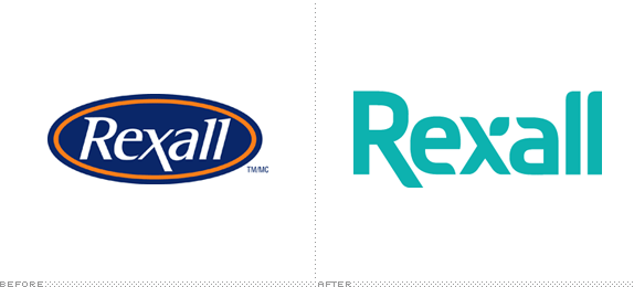
About: (Est. 1904, Canada) “Katz Group Canada Ltd. is a leading drugstore operator with a dynamic history of innovation and growth. Our flagship chain, Rexall, is among the most trusted names in pharmacy with a heritage of serving the health care needs of the community through patient and medication services and quality health products since 1904. Katz Group Canada Ltd. is proudly Canadian owned and operated with more than 400 convenient Rexall and Rexall Pharma Plus locations across Central and Western Canada and more than 8,500 employees.”
Design by: N/A.
Ed.’s Notes: No press release and no change on their site yet, but their store in the renovated First Canadian Place in Toronto shows the new logo (below or after the jump).
Relevant links: N/A.
Continue reading this entry

DATE: Dec.04.2012 POSTED BY: Armin
 CATEGORY: Retailers The B-Side
  COMMENTS:

TAGS: canada, custom, sans serif,

A B-Side BY Armin
Rebel
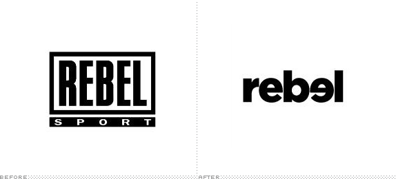
About: (Est. 2010) “Rebel offers a wide range of the latest release, quality, branded sporting and leisure goods. With an extensive list of product categories for the casual and serious fitness enthusiast, Rebel’s range includes fitness equipment, sports equipment, apparel and associated accessories for both the casual enthusiast and serious competitor. [It] has grown to become an extensive network of more than 90 stores located in every state and territory in Australia with the exception of the Northern Territory & Tasmania”
Design by: N/A.
Ed.’s Notes: See what they did there? The second “e” is flipped, going against the grain. You know, like a rebel.
Relevant links: N/A.
Thanks to Jarrad Langdon for the tip.

DATE: Dec.03.2012 POSTED BY: Armin
 CATEGORY: Retailers The B-Side
  COMMENTS:

TAGS: australia, bold, lowercase, sans serif,

A B-Side BY Armin
Lark
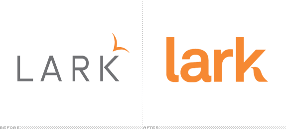
About: (Est. 2010) “Lark is a consumer electronic company that makes wearable wellness monitors, most notably the Lark Pro, a personal sleeping trainer that helps consumers analyze sleep patterns while coaching them to improve and assess better sleep behavior. Lark recently released the new LarkLife wristband: a wearable diet, fitness, sleep tracking and coaching system.”
Design by: Ammunition.
Ed.’s Notes: Packaging and actual product (also designed at Ammunition) below (or after the jump).
Relevant links: LarkLife on Gizomodo.
Continue reading this entry

DATE: Nov.30.2012 POSTED BY: Armin
 CATEGORY: Consumer products The B-Side
  COMMENTS:

TAGS: ammunition, products, sans serif,

A B-Side BY Armin
Stockton Ports (Alternate)

About: “The Stockton Ports are a baseball team in Stockton, California. The Ports play in the Northern Division of the Class A - Advanced California League and are a Minor League affiliate of the Oakland Athletics.
Design by: Brandiose (again!).
Ed.’s Notes: This is an alternate logo, not a replacement logo to the Ports’ main logo. Confusing? Yes. Awesome? Yes. Alternates of the alternate below (or after the jump).
Relevant links: Press release. Brandiose blog post.
Select quote: “The Ports new logos honor Stockton’s heritage as the largest in-land port in California and the Asparagus Capital of the World. A new character, 5 O’clock Dock, is the centerpiece of the identity, brandishing his baseball tattoos and asparagus club. Navy, Shipyard Gray and Asparagus green make up the club’s new alternate colors. The Ports are the first professional sports team to use Asparagus green.”
Continue reading this entry

DATE: Nov.29.2012 POSTED BY: Armin
 CATEGORY: Sports The B-Side
  COMMENTS:


A B-Side BY Armin
Breathe Right
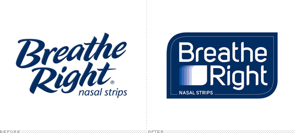
About: “Breathe Right nasal strips are drug-free and clinically proven to lift nasal passages and open your nose the minute you put them on and work for as long as you have them on, relieving nasal congestion and improving airflow.”
Design by: N/A.
Ed.’s Notes: I’m not usually one to ask “Aren’t the before/after images mistakenly reversed?” but when I got this tip I really thought the new one was the old one. The generic happy script typography of mass packaging isn’t necessarily my thing but this new logo makes me yearn for it. Before/after of the packaging below (or after the jump)
Relevant links: N/A.
Continue reading this entry

DATE: Nov.28.2012 POSTED BY: Armin
 CATEGORY: Consumer products The B-Side
  COMMENTS:

TAGS: blue, packaging, sans serif,

A B-Side BY Armin
Couchsurfing
About: (Est. 2004) Couchsurfing is “A global network of travelers, adventure seekers and lifelong learners who value trust among strangers and are dedicated to sharing their cultures, hospitality and authentic experiences — whether they’re on the road or in their hometowns. There are over 5 million Couchsurfers in more than 97,000 cities, with a new user signing up every 11 seconds.”
Design by: In-house.
Ed.’s Notes: Don’t worry, no handwriting was harmed in the making of this logo. It’s just a font. Two versions of the log exist: one without the loop as it appears on their site and one (below or after the jump) with the loop when the logo appears outside of the main website; part of the idea is that people can customize it.
Relevant links: Couchsurfing blog post.
Select quote: “Our objective with this new logo was to focus on the entire word ‘couchsurfing’ and turn it into a term that has meaning in and of itself. We’re not about ‘Couch’ and ‘Surfing’, we are about the act of ‘couchsurfing’, of connecting with people for inspiring experiences all over the world. We’d like to turn the word itself into the symbol that the couch has been. The designers brought this sense of human touch to life with the font they chose for the logo, which suggests handwriting. The more earthy shade of orange was chosen because it gives a sense of authenticity which reinforces the humanity of our brand.”
Continue reading this entry

DATE: Nov.27.2012 POSTED BY: Armin
 CATEGORY: Hospitality The B-Side
  COMMENTS:

TAGS: faux, hand-drawn, orange,

A B-Side BY Armin
Tourism Fiji
About: Tourism Fiji is the organization that promotes the Pacific Ocean nation of Fiji.
Design by: N/A.
Ed.’s Notes: Pardon my French, but holy shit on both logos. Logo with tagline below (or after the jump).
Relevant links: News story. Tourism Fiji Brand launch Facebook album.
Continue reading this entry

DATE: Nov.26.2012 POSTED BY: Armin
 CATEGORY: Destinations The B-Side
  COMMENTS:


A B-Side BY Armin
Safe Place
About: (Est. 1983) “Safe Place is a national youth outreach program that educates thousands of young people every year about the dangers of running away or trying to resolve difficult, threatening situations on their own. This easily-replicated initiative involves the whole community to provide safe havens and resources for youth in crisis. Safe Place creates a network of Safe Place locations — schools, fire stations, libraries, grocery and convenience stores, public transit, YMCAs and other appropriate public buildings — that display the yellow and black diamond-shaped Safe Place sign. These locations extend the doors of the youth service agency or emergency shelter throughout the community. Youth can easily access immediate help wherever they are.”
Design by: AMP Agency.
Ed.’s Notes: The original sign had been unfortunately pegged as inappropriate. (An adult grabbing a kid’s breasts for those with innocent minds). Number 3 on this list of “20 Accidentally Naughty Company Logos”.
Provided comment: “Businesses around the country can display the Safe Place sign in their window to tell kids that there is trained staff available to help them out when they have nowhere else to turn. Because there is so much recognition equity in the original sign, I had to work within that shape and those colors. And because their logo doubles as a window sign, and the word ‘national’ in that scenario is irrelevant, they choose to not include the word in the logo, even though it is part of their name.” — Kevin Casey, Associate Creative Director, AMP Agency
Relevant links: Press release.

DATE: Nov.21.2012 POSTED BY: Armin
 CATEGORY: Non-Profit The B-Side
  COMMENTS:

TAGS: diamond, rounded sans serif, yellow,

A B-Side BY Armin
Reading Fightin Phils
About: (Est. 1967, previously Reading Phillies) “The Reading Fightin Phils are a minor league baseball team based in Reading, Pennsylvania, playing in the Eastern Division of the Eastern League. The Reading Fightin Phils were founded in 1967 and they are the Double-A affiliate of the Philadelphia Phillies.”
Design by: Brandiose.
Ed.’s Notes: Plenty more images at both links below.
Relevant links: Press release. SportsLogos.Net news.
Select Quote:“The Fightins’ new name is highlighted by an ostrich logo that symbolizes the feisty bird that is now indigenous to Reading because of the Crazy Hot Dog Vendor. With its fists ready for battle, the new ostrich logo represents the fighting spirit of the franchise, both on and off the field. It will be the first time in the franchise’s history that the team will feature an identifiable mascot. The logo is also the first in professional sports to feature an ostrich as its mascot.”
Continue reading this entry

DATE: Nov.20.2012 POSTED BY: Armin
 CATEGORY: Sports The B-Side
  COMMENTS:


A B-Side BY Armin
The Animation Guild
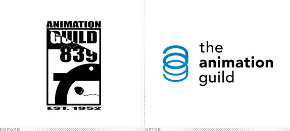
About: (Est. 1952) “The Animation Guild is Local 839 of the International Alliance of Theatrical and Stage Employees (IATSE). We are a labor organization that represents animation and visual effects artists. We do for our members what every labor organization does: negotiate wage minimums and working conditions, provide pension and health benefits (specifically through the Motion Picture Industry Pension and Health Plan) and act as an advocate for our members over disputes between employees and employers. Our goal is to provide a seamless cloak of benefits and the strength of a collective voice to our members across the animation industry.”
Design by: Malcolm Grear Designers.
Ed.’s Notes: That old logo simply cannot be true! LOL, man, LOL. New logo has nice, old-school concept to it. Larger view below (or after the jump).
Relevant links: Animation Guild blog post.
Select Quote:“As the lowercase ‘a’ and ‘g’ join together to form the symbol, the letters seem to be in constant movement, animated. They appear linked and interwoven but they also actively flip back and forth, each letter switching from foreground to background.”
Thanks to Dave Logan for the tip.

DATE: Nov.19.2012 POSTED BY: Armin
 CATEGORY: Culture The B-Side
  COMMENTS:


