


Online
- FPO (For Print Only) / Celebrating the reality that print is not dead by showcasing the most compelling printed projects.
- Art of the Menu / Cataloguing the underrated creativity of menus from around the world.
- Quipsologies / Chronicling the most curious, creative, and notable projects, stories, and events of the graphic design industry on a daily basis.
- Speak Up (2002 – 2009) / Discussing, and looking for, what is relevant in, and the relevance of, graphic design. Archives Only.
- Word It (2003 – 2010) / Encouraging creative diversity in the community through monthly, one-word challenges. Archives Only.
- Brand New Classroom (2010 – 2011) / Providing a space for critique and opinions on student identity work. Archives Only.
Publishing
- The 2010 Brand New Awards / 2011, self-published.
- Flaunt: Designing effective, compelling and memorable portfolios of creative work / 2010, self-published.
Events & Judged Competitions
- Brand New Conference / A one-day event on the development of corporate and brand identity projects by some of today’s most active and influential practitioners from around the world.
- Brand New Awards / Celebrating the best identity work produced around the world.
- FPO Awards / Celebrating the best print work from around the world.
Writing
- Graphic Design, Referenced: A Visual Guide to the Language, Applications, and History of Graphic Design / 2009, Rockport.
- Women of Design: Influence and Inspiration from the Original Trailblazers to the New Groundbreakers / 2008, HOW Books.
- The Word It Book: Speak Up Presents a Gallery of Interpreted Words / 2007, HOW Books.
Graphic Design
- Department of Design / Designing corporate and brand identities and full development of printed and digital matter for clients.

A B-Side BY Armin
FSE Energy
![]()
About: (Est. 1935) “FSE Energy specializes in the design, manufacture and installation of biomass and solid fuel boilers. Boilers account for more than 80% of the world’s power through nuclear, coal, and biomass, which is renewable energy converted from plants and animals.”
Design by: MetaDesign.
Ed.’s Notes: Bigger view of the logo and sample applications below (or after the jump). See link for additional images and project description.
Relevant links: MetaDesign case study.
Select quote: “A contemporary abstraction of flame, the logo depicts the transfer of biomass to fuel through fire — the heart of FSE’s business and the most dependable source of renewable energy.”
Continue reading this entry

DATE: Feb.12.2013 POSTED BY: ArminCATEGORY: Corporate The B-Side COMMENTS:

TAGS: metadesign, sans serif, uppercase,

Opinion BY Armin
Brazil Foods Means Business
![]()
No big projects to start off the week, so we’ll turn to Brazil to get Monday started and perhaps continue with a few simple, logo-only reviews this week. Established in 2009 with the merger of Perdigão (est. 1934) and Sadia (est. 1944), BRF (originally BRF Brasil Foods) is one of the world’s largest food companies managing some of the most popular consumer product brands in Brazil like the previously eponymous Perdigao and Sadia, and Batavo, Elege, and Qualy. BRF operates over 50 production facilities and distribution centers and employs more than 115,000 people. This past January they introduced a new identity designed by Interbrand and A10, the latter responsible for BRF’s previous identity.
Continue reading this entry
DATE: Feb.04.2013POSTED BY: ArminCATEGORY: Corporate COMMENTS:
A B-Side BY Armin
Actavis
![]()
About: (Est. 1956) “Actavis [combination of Watson Pharmaceuticals, Inc. and the Actavis Group] is a global, integrated specialty pharmaceutical company focused on developing, manufacturing and distributing generic, brand and biosimilar products. The Company has global and U.S. headquarters in Parsippany, New Jersey, USA, and international headquarters in Zug, Switzerland. Actavis is the world’s third-largest generics prescription drug manufacturer.”
Design by: Lippincott.
Ed.’s Notes: Bigger view of the logo below (or after the jump).
Relevant links: Actavis CEO message. Lippincott press release.
Select quote: “Our new icon speaks to our Company’s fast-evolving business, as well as its dynamic culture. A close look reveals a “W” shape emerging from a shaded “A”, a subtle historical reference to the Watson heritage and acquisition of Actavis.
Our new color stands out in the universe of pharmaceutical industry competitors and reflects growth — a fundamental foundation for our Company and its future. The result is a new, powerful and accessible visualization that celebrates our Company’s emergence as a global pharmaceutical leader, and visually defines our focus on growth and success in the future.”
Continue reading this entry
DATE: Jan.28.2013POSTED BY: ArminCATEGORY: Corporate The B-Side COMMENTS:
TAGS: lippincott, monogram, pharma, sans serif,
A B-Side BY Armin
Solvay
![]()
About: (Est. 1863) “SOLVAY is an international chemical Group committed to sustainable development with a clear focus on innovation and operational excellence. It is realizing over 90% of its sales in markets where it is among the top 3 global leaders. Solvay offers a broad range of products that contribute to improving the quality of life and the performance of its customers in markets such as consumer goods, construction, automotive, energy, water and environment, and electronics. The Group is headquartered in Brussels, employs about 31,000 people in 55 countries and generated EUR 12.7 billion in net sales in 2011 (pro forma).”
Design by: Vincenti Design.
Ed.’s Notes: Another epically-scored logo introduction video below (or after the jump). I hate to say it, but there is something I like about the new logo. Not much, just something.
Relevant links: Press release (PDF).
Select quote: “We wanted a corporate identity capable of conjuring up the notions of expertise, innovation and modernity. We chose this creation that perfectly expresses the ability of our Group to reinvent itself. The highly symbolic letter “S” and the use of the color blue, maintains a clear link with the Group’s history,” says Michel Defourny, Head of Solvay’s Corporate Communications.
“With this solution, we wanted to create the impression that viewers are plunging into an object, as if it existed in 3D. We used computer graphics to model the shape, to create something half-way between a liquid and a solid in order to refer to Solvay’s core business activities,” explains Laurent Vincenti, CEO of Vincenti Design.”
Continue reading this entry
DATE: Jan.23.2013POSTED BY: ArminCATEGORY: Corporate The B-Side COMMENTS:
A B-Side BY Armin
ams
![]()
About: (Formerly austriamicrosystems and acquired TAOS Inc. in 2011) “ams develops and manufactures high performance analog semiconductors that solve its customers’ most challenging problems with innovative solutions. ams’ products are aimed at applications which require extreme precision, accuracy, dynamic range, sensitivity, and ultra-low power consumption. ams’ product range includes sensors, sensor interfaces, power management ICs and wireless ICs for customers in the consumer, industrial, medical, mobile communications and automotive markets. With headquarters in Austria, ams employs over 1,200 people globally and serves more than 6,500 customers worldwide.”
Design by: N/A.
Ed.’s Notes: Overly explanatory (and unconvincingly so) video of the new logo below (or after the jump).
Relevant links: Press release.
Continue reading this entry
DATE: Jan.18.2013POSTED BY: ArminCATEGORY: Corporate The B-Side COMMENTS:
Opinion BY Armin
Pork Served Three Ways
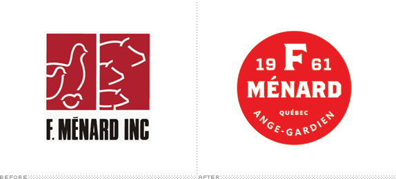
Established in 1961 and based in Ange-Gardien, Canada, F. Menard (in summary) produces pork and poultry products. (In length) it has three distinct operations within the industry: (1) F. Ménard proper, dedicated to the breeding of hogs; (2) Agromex, the “processing” unit (i.e., slaughtering, to the tune of 21,500 pigs per week); and (3) Boucherie 235, a retail butcher shop for consumers in Ange-Gardien. Tying all three operations together, F. Ménard recently introduced a new identity designed by Montréal-based lg2.
Continue reading this entry
DATE: Jan.17.2013POSTED BY: ArminCATEGORY: Corporate COMMENTS:
A B-Side BY Armin
Axiall
![]()
About: (Est. 2013) Axiall Corporation is “the new industry leader created by the pending merger of Georgia Gulf and the commodity chemicals business of PPG. With enhanced vertical integration and portfolio diversification, Axiall emerges as a Fortune 500-size company with tremendous growth opportunities. Axiall represents a new kind of chemistry company; one that responsibly harnesses applied chemistry to solve common problems, improve every-day life and drive human progress.”
Design by: RiechesBaird.
Ed.’s Notes: Haven’t seen a vertical logo in such a long time. Now I remember why. Logo detail and applications below (or after the jump).
Relevant links: RiechesBaird case study. Axiall “our identity” page.
Select quote: “The vertical orientation of the letters signals Axiall as a new and different kind of company. It symbolizes our enhanced vertical integration, a key component in our business strategy and a significant benefit of the merger.
The unique placement of the double ‘ll’ at the bottom of the logo symbolizes the two organizations being blended to form Axiall: Georgia Gulf and PPG’s chlor-alkali and derivatives business. These twin columns represent a solid base and merger of equals, giving the logo structural integrity and a feeling of unification.”
Continue reading this entry
DATE: Jan.16.2013POSTED BY: ArminCATEGORY: Corporate The B-Side COMMENTS:
Opinion BY Armin
From Cable with Love
![]()
Established in 1949 in the city of Rybinsk in Russia, Rybinskkabel is one of the country’s leading producers of cable with 2,500 employees and more than 16,000 kinds of cable and wires with copper and aluminum conductors. With its origins in Soviet Union-era Russia and current new management it was time to bring Rybinskkabel into the twenty-first century with the help of a new identity designed by Moscow-based Nile.
Continue reading this entry
DATE: Nov.27.2012POSTED BY: ArminCATEGORY: Corporate COMMENTS:
A B-Side BY Armin
De Telefoongids BV
![]()
About: “De Telefoongids BV is the incumbent company and market leader for local search and lead generating in the Netherlands. It publishes combined directories for businesses, products, services and residentials on Internet, print and mobile.” (AKA, the Dutch Yellow Pages).
Design by: VBAT.
Ed.’s Notes: Not much to note.
Relevant links: Press Release (in Dutch).
Thanks to Roy Swinkles for the tip.
DATE: Oct.17.2012POSTED BY: ArminCATEGORY: Corporate The B-Side COMMENTS:
TAGS: ampersand, lowercase, the netherlands,
A B-Side BY Armin
Asian Paints
![]()
About: (Est. 1942) “Asian Paints is India’s largest paint solutions provider and Asia’s third largest paint company. Asian Paints operates in 17 countries and has 24 paint manufacturing facilities in the world servicing consumers in over 65 countries.”
Design by: Fitch, Singapore
Ed.’s Notes: Weird picture of VP marketing Amit Syngle and actress Soha Ali Khan casually painting the new logo below (or after the jump).
Relevant links: Press Release. Story.
Continue reading this entry
DATE: Oct.05.2012POSTED BY: ArminCATEGORY: Corporate The B-Side COMMENTS:


Books about logo design, the designers that create them and the meaning of branding.
