


Online
- FPO (For Print Only) / Celebrating the reality that print is not dead by showcasing the most compelling printed projects.
- Art of the Menu / Cataloguing the underrated creativity of menus from around the world.
- Quipsologies / Chronicling the most curious, creative, and notable projects, stories, and events of the graphic design industry on a daily basis.
- Speak Up (2002 – 2009) / Discussing, and looking for, what is relevant in, and the relevance of, graphic design. Archives Only.
- Word It (2003 – 2010) / Encouraging creative diversity in the community through monthly, one-word challenges. Archives Only.
- Brand New Classroom (2010 – 2011) / Providing a space for critique and opinions on student identity work. Archives Only.
Publishing
- The 2010 Brand New Awards / 2011, self-published.
- Flaunt: Designing effective, compelling and memorable portfolios of creative work / 2010, self-published.
Events & Judged Competitions
- Brand New Conference / A one-day event on the development of corporate and brand identity projects by some of today’s most active and influential practitioners from around the world.
- Brand New Awards / Celebrating the best identity work produced around the world.
- FPO Awards / Celebrating the best print work from around the world.
Writing
- Graphic Design, Referenced: A Visual Guide to the Language, Applications, and History of Graphic Design / 2009, Rockport.
- Women of Design: Influence and Inspiration from the Original Trailblazers to the New Groundbreakers / 2008, HOW Books.
- The Word It Book: Speak Up Presents a Gallery of Interpreted Words / 2007, HOW Books.
Graphic Design
- Department of Design / Designing corporate and brand identities and full development of printed and digital matter for clients.

A B-Side BY Armin
Vevo
![]()
About: (Est. 2009) “Vevo is a joint venture music video website operated by Sony Music Entertainment, Universal Music Group, and Abu Dhabi Media with EMI licensing its content to the group without taking an ownership stake. The videos on Vevo are syndicated across the web, with Google and Vevo sharing the advertising revenue.” (Source: Wikipedia).
Design by: Red Antler.
Ed.’s Notes: I like it. Bigger view of the logo, some motion graphics, and a couple applications below (or after the jump).
Relevant links: Red Antler case study.
Select quote: “We’ve introduced a streamlined, lowercase logotype, creating a brand that celebrates fans. expressive, in-your-face graphics, rich color, and strong typography reflect an infectious passion for music.”
Continue reading this entry

DATE: Apr.16.2013 POSTED BY: ArminCATEGORY: Entertainment The B-Side COMMENTS:


A B-Side BY Armin
Lord Mayor’s Charitable Foundation
![]()
About: (Est. 1923) “The Lord Mayor’s Charitable Foundation is a leading philanthropic organisation and Australia’s largest community foundation. The Foundation applies a combination of grants, research, community education and partnerships with donors and other funders to increase life opportunities and promote social inclusion. In 2012 it provided grants to more than 450 charitable agencies supporting people who are socially and economically disadvantaged. The Foundation has a keen interest in Homelessness, Ageing and Youth, and also funds eligible projects in Health, Arts and Heritage and the Environment.”
Design by: Designworks
Ed.’s Notes: Pretty! Bigger view of the logo and some applications below (or after the jump).
Relevant links: Designworks case study. LMCF press release.
Select quote: “Through the use of colour, the vibrant new logo captures the Foundation’s range of programs from philanthropic services to research and grantmaking. Each colour featured in the logo represents an aspect of the Foundation’s business, and at the centre of the logo is the Foundation’s name in a simple, strong grey type face, bordered by a red heart.”
Continue reading this entry
DATE: Apr.15.2013POSTED BY: ArminCATEGORY: Non-Profit The B-Side COMMENTS:
TAGS: australia, colorful, heart, sans serif,
A B-Side BY Armin
Louisville Slugger
![]()
About: (Est. 1894) “Louisville Slugger is synonymous with baseball and softball. It is the leading brand in diamond sports. The company makes the #1 Bat in Major League Baseball, bats that are swung by the best of the best - Derek Jeter, Josh Hamilton, Joey Votto, Curtis Granderson and David Wright, among hundreds of other current MLB stars. […] Louisville Slugger also makes industry-leading equipment for youth, high school and college players. It sponsors top-level NCAA Division 1 baseball programs, including the 2012 National Champion Arizona Wildcats.”
Design by: N/A
Ed.’s Notes: Kind of terrible. The logo is now stuck in the 1980s, early 1990s. If they had just let it be another ten years it would be all retro and stuff, even with how mangled that old typography was. Bigger view, and a shot of the logo on bats below (or after the jump).
Relevant links: WFPL story
Select quote: “Hillerich and Bradsby Company Vice-President of Marketing Kyle Schlegel says this is the first new look for the logo since 1980.
‘What we’ve tried to do is hold true to those pieces of the mark that really speak to the legacy, so the oval is still there but we wanted to introduce a lot of new modern elements to it that allow the brand to really come into the present day,’ he said.”
Continue reading this entry
DATE: Apr.12.2013POSTED BY: ArminCATEGORY: Consumer products The B-Side COMMENTS:
A B-Side BY Armin
Suffolk University
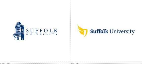
About: (Est. 1906) “Suffolk University is a private, non-sectarian, university located in Boston, Massachusetts and with 9,192 students (includes all campuses, 8,891 at the Boston location alone), it is the eighth largest university in Metro Boston. It was founded as a law school in 1906 and named after its location in Suffolk County, Massachusetts.” (Source :Wikipedia)
Design by: In-house.
Ed.’s Notes: That’s one awkward icon. Is it flames? Wings? Feathers? Lettuce leaves? Type is nice. One more image of the logo with department lock-ups below (or after the jump).
Relevant links: Suffolk University brand guidelines (PDF). Suffolk Journal article.
Select quote: “This new brand system gives us the tools to build a more unified and dynamic university image,” said Greg Gatlin, Vice President of Marketing and Communications. “That will help us with marketing the university, recruiting, fundraising, communicating to current students, prospective students, alumni, employees, you name it. It’s more than just a logo. It’s a whole system of color, photography, typography, language. It’s really a new way of communicating who we are. The idea is to elevate the university’s brand and bring more people into the conversation.”.
Continue reading this entry
DATE: Apr.11.2013POSTED BY: ArminCATEGORY: Education The B-Side COMMENTS:
TAGS: shield, slab serif, university, wings,
A B-Side BY Armin
Dexim
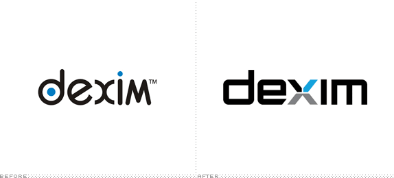
About: “Dexim is a worldwide registered brand manufacturing an extensive line of accessories and applications compatible with popular consumer electronics, including iPhone, iPod, and iPad. Currently selling in over 45 countries, their mission is to provide consumers with products that offer an enjoyable, personalized, and superior experience. Because their corporate image looked so dated, consumers perceived Dexim to be much of the same, and the brand experienced a loss of relevancy and consumer interest in the US. Competing at a higher level required a brand identity redesign to make a statement and better align with their mission and values.”
Design by: Motto.
Ed.’s Notes: Decent. Definitely far better than the original, if a little too envisioning-the-future-in-the-1990s-typography. Plenty of applications below (or after the jump).
Relevant links: N/A.
Continue reading this entry
DATE: Apr.10.2013POSTED BY: ArminCATEGORY: Consumer products The B-Side COMMENTS:
TAGS: blue, custom, sans serif, x,
A B-Side BY Armin
Road & Track
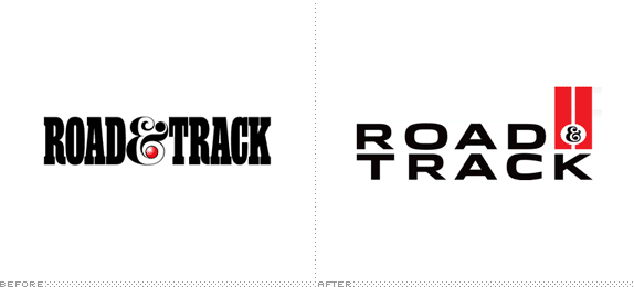
About: (Est. 1947) “Road & Track is the longest-running and most trusted automotive magazine brand in the United States. Its content is geared to the passionate auto enthusiast and contains information about the latest models, industry news and auto shows blended with wide-ranging feature stories, technical insights and coverage of the vintage car scene and motorsports.”
Design by: N/A
Ed.’s Notes: Very nice update. I especially like the R&T monogram version shown below (or after the jump) along with a video and before/after images of the magazine’s cover.
Relevant links: Cover Introduction/a>. Revival Issue Preview. Editor’s Letter .
Continue reading this entry
DATE: Apr.09.2013POSTED BY: ArminCATEGORY: Publishing The B-Side COMMENTS:
TAGS: ampersand, extended, magazine, sans serif,
A B-Side BY Armin
AMC (TV)
![]()
About: (Est. 1984) “AMC is an American basic cable and satellite television channel that is owned by AMC Networks. The channel primarily airs theatrically released movies, along with a limited amount of original programming. The channel’s name originally stood for “American Movie Classics”, though since 2002, the full name has been deemphasized as a result of a major shift in its programming. AMC’s most successful original series include Mad Men, Breaking Bad, The Walking Dead, and Hell on Wheels.” (Source: Wikipedia)
Design by: Troika.
Ed.’s Notes: Not sure this was needed, but okay, I guess. The “gold” effect feels more cheap than premium and reminds me of some of the not so old on-air graphics of HBO.
Relevant links: Troika case study. Press Release.
Select quote: “AMC announced today a new look and brand positioning, ‘AMC: Something More,’ which reflects the network’s ongoing commitment to providing a place for original stories and characters that defy expectations. Now featured on-air and online, ‘AMC: Something More’ punctuates a refreshed graphic identity for the network. AMC’s new identity features an updated logo, with letterforms surrounded by a gold box which suggests both premium quality and popular appeal.”
Continue reading this entry
DATE: Apr.08.2013POSTED BY: ArminCATEGORY: Entertainment The B-Side COMMENTS:
Opinion BY Armin
Country Inns & Suites
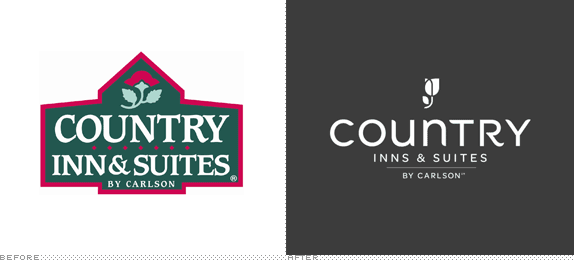
About: “Country Inns & Suites By Carlson is the upper mid-scale hotel brand within the Carlson Rezidor Hotel Group portfolio. Country Inns & Suites hotels are designed for both business and leisure travelers and provide complimentary amenities like hot breakfast and high-speed Internet. Country Inns & Suites hotels are mainly independently owned and operated and franchised under licensing agreements with the Carlson Rezidor Hotel Group. The brand currently operates 480 hotels throughout the world and has over 30 properties contracted and under development.” (Source Wikipedia)
Design by: N/A
Ed.’s Notes: The new logo is pretty decent but in contrast to the old one it’s almost a masterpiece.
Relevant links: USA Today Article. Press Release.
Select quote: “We are looking to the future and are making thoughtful changes that will allow us to grow our brand,” said Gordon McKinnon, executive vice president and chief branding officer for Carlson. “It’s a natural next step to evolve into a product that appeals to a younger generation. But we will be fiercely maintaining our service culture and amenities that have built our strong, loyal customer base.”
Thanks to Joe Mielzarek for the tip.
DATE: Apr.05.2013POSTED BY: ArminCATEGORY: Hospitality The B-Side COMMENTS:
TAGS: hotel, icon, sans serif,
A B-Side BY Armin
O’Charley’s
![]()
About: (Est. 1971) “O’Charley’s is a casual dining restaurants chain in the United States, with more than 230+ company-owned locations. O’Charley’s is located in 17 Southern and Midwestern states, including four franchised O’Charley’s restaurants in Michigan, one franchised O’Charley’s in Ohio, three joint venture O’Charley’s restaurants in Louisiana, and one joint venture O’Charley’s restaurant in Wisconsin.” (Source: Wikipedia)
Ed.’s Notes: Had never heard of this place, or, well, these 230 places. The new one isn’t that great but the old one, with the horribly slanted Bookman, was a true horror. Bigger view of the logo and exterior shot of the restaurant below (or after the jump).
Relevant links: Restaurant News Article. Enhanced Online News Article.
Select quote: “The new identity derives inspiration from the approach of Charley Watkins, the man who founded O’Charley’s, and will be encapsulated in the following Watkins quote prominently featured at all O’Charley’s entrances: ‘Everyone who walks through this door is a friend of mine.’ The quote’s attitude will be born out in the new visual identity and updated menu as well as in the welcoming layout and openness of new floor plans which feature different rooms named to reflect its southern heritage such as The Piedmont, The Charles, and The Porch.”
Continue reading this entry
DATE: Apr.04.2013POSTED BY: ArminCATEGORY: Restaurant The B-Side COMMENTS:
TAGS: green, italic, restaurant,
A B-Side BY Armin
Canberra 100
![]()
About: (Est. 1913) “Celebrating Canberra’s Centenary. In 2013, we mark 100 years since the naming of Canberra, our national capital and home of the Australian story. The Centenary of Canberra offers an opportunity for Australians to revisit and re-imagine their national capital — the city that tells the story of our country’s freedom, spirit, achievements and aspirations. Visit www.canberra100.com.au for the year-long program of celebrations.
Ed.’s Notes: As strange as this is, there is something appealing about it. Doesn’t mean I like it, but it does mean I don’t hate it. A few more applications below (or after the jump).
Relevant links: Canberra 100 site, Canberra 100 Logo Style Guide.
Select quote: “It has a contemporary feel which we believe will appeal to all Australians. It makes central use of a triangle, which references the triangles and circles at the heart of the Burley Griffin design, best displayed in Marion Mahony Griffin’s beautifully rendered ‘City and Environs’. It is also inspired by the iconic nature of new Parliament House which celebrates its 25th Anniversary in 2013. The font is New Johnston evolved from a popular sans-serif typeface from 1913. The logo is strong and clear with a simple message — Canberra and 100 years.”
Continue reading this entry
DATE: Apr.03.2013POSTED BY: ArminCATEGORY: Culture The B-Side COMMENTS:
TAGS: angle, australia, circles, sans serif,


Books about logo design, the designers that create them and the meaning of branding.
