
A B-Side BY Armin
Old Chicago
About: (Est. 1976) “In each of the nearly 100 restaurants, Old Chicago exudes the welcoming appeal of a local neighborhood restaurant. We’re a leader in the traditional casual dining segment, specializing in signature hand-crafted pizzas and a vast craft beer selection served in a comfortable environment.”
Design by: PUSH.
Ed.’s Notes: Click through the link below, plenty of material there.
Relevant links: PUSH case study (in-depth with lots of images).

DATE: Oct.18.2012 POSTED BY: Armin
 CATEGORY: Restaurant The B-Side
  COMMENTS:

TAGS: distressed, restaurant, sans serif,

A B-Side BY Armin
De Telefoongids BV

About: “De Telefoongids BV is the incumbent company and market leader for local search and lead generating in the Netherlands. It publishes combined directories for businesses, products, services and residentials on Internet, print and mobile.” (AKA, the Dutch Yellow Pages).
Design by: VBAT.
Ed.’s Notes: Not much to note.
Relevant links: Press Release (in Dutch).
Thanks to Roy Swinkles for the tip.

DATE: Oct.17.2012 POSTED BY: Armin
 CATEGORY: Corporate The B-Side
  COMMENTS:

TAGS: ampersand, lowercase, the netherlands,

A B-Side BY Armin
La Trobe University
About: (Est. 1967) “La Trobe University is a multi-campus university in Victoria, Australia. Since 2003, we have consistently ranked among the top 500 universities in the world.” 33,198 students were enrolled in 2011.
Design by: N/A.
Ed.’s Notes: Wow. Copperplate. Good riddance.
Relevant links: N/A.
Thanks to Greg Nelson for the tip.

DATE: Oct.16.2012 POSTED BY: Armin
 CATEGORY: Education The B-Side
  COMMENTS:

TAGS: australia, eagle, sans serif, university,

A B-Side BY Armin
Jos. Louis
About: Jos. Louis is a popular and long-standing snack in Canada produced by Vachon. It is officially described as “Delicious sponge cake with vanilla-flavoured creme filling coated in a chocolatey layer.”
Design by: 123Klan.
Ed.’s Notes: Old and new boxes below (or after the jump).
Relevant links: 123Klan project page.
Select Quote: As for the new Jos Louis logo, it’s inspired by the actual cake: it features a creamy fat dark brown outline (chocolate icing), a second outline of a lighter brown (sponge cake), white letters (cream). The crown is a reference to Jos Louis’ status as the best-known/most sold snack cake in Canada.
Continue reading this entry

DATE: Oct.15.2012 POSTED BY: Armin
 CATEGORY: Consumer products The B-Side
  COMMENTS:


A B-Side BY Armin
Tucson Electric Power

About: (Est. 1892) “Tucson Electric Power provides the energy behind Tucson’s economy. We deliver safe, reliable power to more than 400,000 customers in the Tucson metropolitan area.”
Design by: N/A.
Ed.’s Notes: Love that old logo. It’s crazy. It’s also 33 years old.
Relevant links: Press release.
Select Quote: The new logo features a sunny-colored arc suggestive of Southern Arizona’s most prominent characteristic and was designed to resemble the recently introduced logo for UNS Energy. The blue lettering, the same color used in the previous TEP logo, is a tribute to the new logo’s predecessor.
Thanks to James I. Bowie for the tip.

DATE: Oct.12.2012 POSTED BY: Armin
 CATEGORY: Logistics The B-Side
  COMMENTS:


A B-Side BY Armin
Silipint
About: (Est. 2010) “Silipint offers simple innovative products within a culture that is dedicated to exceptional service and our partners. Providing semi-rigid silicone drinkware through a process aimed at brand growth and profitability.”
Design by: Brand Navigation.
Ed.’s Notes: Dude, it’s a squishy pint glass! See proof below (or after the jump).
Relevant links: Brand Navigation Case Study.
Continue reading this entry

DATE: Oct.11.2012 POSTED BY: Armin
 CATEGORY: Consumer products The B-Side
  COMMENTS:

TAGS: hand-drawn, smile, yellow,

A B-Side BY Armin
Better Food Foundation

About: (Est. 2002 as the Jamie Oliver Foundation) “The mission of the Better Food Foundation is to educate and empower as many people as possible to love and enjoy good food. This means learning how to cook, understanding where food comes from, and recognizing the power it can have on our health, happiness, and even finances. We do this through teaching, training and employment, and also by making good clear information available to as many people as possible.”
Design by: Pearlfisher
Ed.’s Notes: Bigger view of the logo and “call to action” badges below (or after the jump).
Relevant links: Creative Review feature.
Selected quote: “We created an identity that could champion this important global fight,” explains Pearlfisher’s creative director Natalie Chung of the agency’s approach. “The megaphone icon is a universal call to action explicitly asking people to pay attention and be part of it,” she continues.
Continue reading this entry

DATE: Oct.10.2012 POSTED BY: Armin
 CATEGORY: Non-Profit The B-Side
  COMMENTS:

TAGS: angle, pearlfisher, sans serif,

A B-Side BY Armin
Institute of Cancer Research

About: (Est. 1909) “The Institute of Cancer Research, London, is one of the world’s most influential cancer research institutes, […] ranked as the UK’s leading academic research centre, and leads the world at isolating cancer-related genes and discovering new targeted cancer drugs. […] As a college of the University of London, the ICR also provides postgraduate higher education of international distinction. It has charitable status and relies on support from partner organisations, charities and the general public.The ICR’s mission is to make the discoveries that defeat cancer.”
Design by: Saffron
Ed.’s Notes: Bigger view of the logo and some kind of logo sample sheet below (or after the jump). Logo inspired by the Fibonacci sequence.
Relevant links: Press Release. FAQs about the logo.
Selected quote: “A new logo features a series of coloured bars reminiscent of the bands on a gel, stained sections of chromosomes or drug capsules — representing the ICR’s research and the benefits it brings for patients. The bars increase in size in proportion to the mathematical Fibonacci sequence, combining with the optimistic colour palette to convey a sense of progress, discovery and innovation.”
Continue reading this entry

DATE: Oct.09.2012 POSTED BY: Armin
 CATEGORY: Non-Profit The B-Side
  COMMENTS:

TAGS: saffron, sans serif, uk,

A B-Side BY Armin
Asian Paints
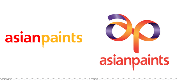
About: (Est. 1942) “Asian Paints is India’s largest paint solutions provider and Asia’s third largest paint company. Asian Paints operates in 17 countries and has 24 paint manufacturing facilities in the world servicing consumers in over 65 countries.”
Design by: Fitch, Singapore
Ed.’s Notes: Weird picture of VP marketing Amit Syngle and actress Soha Ali Khan casually painting the new logo below (or after the jump).
Relevant links: Press Release. Story.
Continue reading this entry

DATE: Oct.05.2012 POSTED BY: Armin
 CATEGORY: Corporate The B-Side
  COMMENTS:


A B-Side BY Armin
SEAT
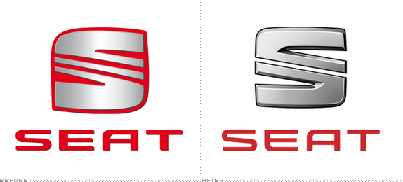
About: (Est. 1950) “A member of the Volkswagen Group, SEAT has its headquarters in Martorell (Barcelona), exporting approximately 75% of its production to 72 countries. SEAT is market leader in Spain, and in 2010 reached a turnover amounting to 4.7 billion euros, with total sales of 339,500 vehicles.SEAT Group employs 13,000 professionals at its three production centres in Barcelona — Zona Franca, El Prat de Llobregat and Martorell, where it manufactures the highly successful Ibiza and Leon, amongst other models.”
Design by: N/A
Ed.’s Notes: It’s not the funnest game of spot the differences, but there are some between the old and new.
Relevant links: Press Release (extensive!). More images and a timeline of the logos.
Thanks to Pierre des Courtis for the tip.

DATE: Oct.04.2012 POSTED BY: Armin
 CATEGORY: Automobile The B-Side
  COMMENTS:

TAGS: bevel, chrome, gradient, sans serif,


