
A B-Side BY Armin
Warta
About: (Est. 1920) “Warta is a subsidiary of Talanx International AG, which concentrates the activities of the Retail International division within the Talanx Group. The Warta Group provides property, liability and personal insurance and life insurance. Warta has a customer base of around 1.5 million The Group employs a staff of more than 2,700 people and has a sales network with approximately 8,000 tied and free agents, 4,000 agencies and some 240 branch offices.”
Design by: N/A
Ed.’s Notes: The new logo is based on Talanx’s logo, the new parent company of Warta. Warta is a Polish company.
Relevant links: Press release. PDF of “What’s behind the new logo of Warta?”
Select quote: “[Not] usual and fancy ‘t’ indicates the flexibility, openness and ensures clients individual treatment.” And there is plenty more at the PDF link above where this came from.
Thanks to Mateusz Piotrowski for the tip.

DATE: Nov.01.2012 POSTED BY: Armin
 CATEGORY: Insurance The B-Side
  COMMENTS:

TAGS: lowercase, poland, sans serif,

A B-Side BY Armin
Rockmelt
About: (Est. 2009) “Rockmelt is providing a fundamentally better Web experience by re-imagining the browser around how you use the internet today.”
Design by: N/A.
Ed.’s Notes: We covered Rockmelt’s logo back in 2011. I liked the end-of-the-world look to it. Bigger view of the logo below (or AtJ).
Relevant links: Detailed blog post from Rockmelt about the change.
Select quote: “The final concept started conceptually as a mobius strip, to represent the endless path you could take through the Internet. (Yes, we know a mobius strip is supposed to be connected, but that was gonna be really hard to pull off unless we changed our name to Bockmelt.)”

Thanks to Christopher Jones for the tip.

DATE: Oct.31.2012 POSTED BY: Armin
 CATEGORY: Technology The B-Side
  COMMENTS:

TAGS: orange, ribbon, sans serif,

A B-Side BY Armin
Dallas
About: Dallas as described by the client in this project, the Dallas Convention & Visitors Bureau: As the ninth-largest city and part of the fourth-largest metropolitan area in the nation, Dallas covers approximately 343 square miles and has a population of 1,223,229. The ultra modern and sophisticated city attracts worldwide travelers, making the area the No. 1 visitor and leisure destination in Texas.”
Design by: N/A.
Ed.’s Notes: In the embedded video below (or after the jump) you can see the logo can change the shape inside the “D”.
Relevant links: NBC DFW story.
Continue reading this entry

DATE: Oct.30.2012 POSTED BY: Armin
 CATEGORY: Destinations The B-Side
  COMMENTS:

TAGS: city, neutraface, star, texas,

A B-Side BY Armin
The Rockettes
About: (Est. 1925) “The Radio City Rockettes are the world’s most famous precision dance company. The Rockettes are the stars of the Radio City Christmas Spectacular - a show that is seen by more than 2 million people a year and has played in more than 60 cities across the country.”
Design by: N/A.
Ed.’s Notes: Decent idea (synchronized “R”s as if they were the high-kicking ladies) but pretty bad execution.
Relevant links: N/A
Thanks to Michele Byrne for the tip.

DATE: Oct.29.2012 POSTED BY: Armin
 CATEGORY: Entertainment The B-Side
  COMMENTS:

TAGS: custom, sans serif,

A B-Side BY Armin
WDC, Whale and Dolphin Conservation
About: (Est. 1987) “The Whale and Dolphin Conservation Society (WDCS), is the leading global charity dedicated to the conservation and welfare of all whales and dolphins (also known as cetaceans).” They have changed their name to WDCS has become WDC, Whale and Dolphin Conservation.
Design by: Conran Design Group
Ed.’s Notes: Nice idea. Execution falls a little flat. Video below (or after the jump).
Relevant links: Lengthy redesign page.
Selected quote: “We chose a new grey-blue colour for the organisation - the colour of a dolphin’s skin.”
Continue reading this entry

DATE: Oct.26.2012 POSTED BY: Armin
 CATEGORY: Non-Profit The B-Side
  COMMENTS:

TAGS: bracket, sans serif,

A B-Side BY Armin
Deluxe
About: (Est. 1915) “Deluxe lives at the intersection of artistry and technology and is the industry’s leading provider of digital media & entertainment services. We make, move, manage and monetize content for the film, television, and advertising industries providing world-class talent and technology innovation with well-known sub-brands: Beast, Company 3, Filmcore, MediaVu and Method Studios.”
Design by: Futurebrand
Ed.’s Notes: No relevant link, so a few applications and video in this post.
Relevant links: N/A.
Provided quote: “Wanting to integrate is diverse holdings under one brand, reflect a transition from analog to digital and signal its shift away from one-off sales to enterprise service agreements, Deluxe partnered with FutureBrand in 2011 to create a new brand story, architecture and modernized visual identity.”
Continue reading this entry

DATE: Oct.25.2012 POSTED BY: Armin
 CATEGORY: Technology The B-Side
  COMMENTS:

TAGS: dots, futurebrand, red,

A B-Side BY Armin
Izmir

About: “Izmir is a historical metropolis in the western extremity of Anatolia and the third most populous city in Turkey with nearly 4 million inhabitants. It is widely believed that Homer lived and wrote ‘The Odyssey’ in Izmir. The city has been one of the principal mercantile cities of the Mediterranean Sea for much of its history. Over the last two decades, Istanbul remerged as the financial, social, and cultural capital of Turkey, attracting the creative class of Izmir. As a response, in 2010 the Izmir Development Agency embarked on a city marketing strategy and kick started Turkey’s first city branding project. As a result, I Mean It Creative was commissioned in 2012 to create the visual and verbal identity of Izmir.”
Design by: I Mean It Creative
Ed.’s Notes: There isn’t a link with all the info or images, so plenty is posted here.
Relevant links: N/A.
Continue reading this entry

DATE: Oct.24.2012 POSTED BY: Armin
 CATEGORY: Destinations The B-Side
  COMMENTS:

TAGS: hand-drawn, turkey,

A B-Side BY Armin
Say Media
About: (Est. 1988) “Say Media is a digital publishing company that creates amazing media brands. Through its technology platform and media services, Say Media enables its portfolio of independent content creators to build passionate communities around key consumer interest areas such as Style, Living, Food and Tech. The company provides simple and accountable ways for the world’s top brands to engage with these passionate audiences, at scale, with a reach of more than 400 million people around the world.”
Design by: In-house
Ed.’s Notes: This is a really nice wordmark. Simple and clever. Plus: it’s a serif typeface; we rarely see those anymore. Making-of video about the logo below (or after the jump).
Relevant links: N/A.
Continue reading this entry

DATE: Oct.23.2012 POSTED BY: Armin
 CATEGORY: Entertainment The B-Side
  COMMENTS:

TAGS: serif,

A B-Side BY Armin
Business Software Alliance
About: (Est. 1988) “BSA | The Software Alliance is the leading global advocate for the software industry. It is an association of more than 70 world-class companies that invest billions of dollars annually to create software solutions that spark the economy and improve modern life. Through international government relations, intellectual property enforcement, and educational activities, BSA expands the horizons of the digital world and builds trust and confidence in the new technologies driving it forward.”
Design by: N/A.
Ed.’s Notes: Brand video below (or after the jump).
Relevant links: Press Release.
Continue reading this entry

DATE: Oct.22.2012 POSTED BY: Armin
 CATEGORY: Government The B-Side
  COMMENTS:

TAGS: condensed, sans serif, square,

A B-Side BY Armin
Mirácoli
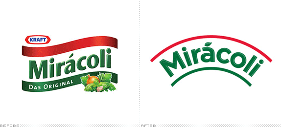
About: Mirácoli is a popular line of pasta and sauces in Germany. Previously owned by Kraft Foods and now by Mars (the same company that, yes, makes the chocolates).
Design by: Turner Duckworth.
Ed.’s Notes: Worth noting that when the logo is used on packaging it becomes a plate. Before/After of packaging below (or after the jump).
Relevant links: Design Tagebuch (with a few more images).
Continue reading this entry

DATE: Oct.19.2012 POSTED BY: Armin
 CATEGORY: Consumer products The B-Side
  COMMENTS:

TAGS: germany, packaging, turner duckworth,


